


Next Recession Robust Case For The Largest Stock Market Losses In History
Stock-Markets / Stock Markets 2019 Aug 01, 2019 - 04:19 PM GMTBy: Dan_Amerman

 Stock market indexes are currently at record or near record highs, even as the chances for recession within the next 1-2 years seem to be rising. So how great would the losses be from these record heights, if the business cycle continues and we get another round of recession and bear market?
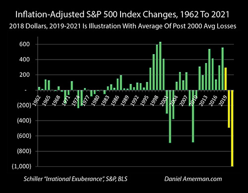
As explored in this analysis and as shown in the graph above, there is a strong case that a new recession would lead to the greatest stock market losses in history. The base case developed herein estimates a $12 trillion loss in stock market wealth, which would be by far the largest ever seen (even in inflation-adjusted terms), with major consequences for the nation and the economy, as well as for retirees and investors in general.
Two other ways of estimating bear market losses are explored, each of which support a reasonably robust case for the largest stock market losses ever seen.
This analysis is part of a series and the 15th chapter in a free book. The earlier chapters are of essential importance for achieving full understanding, and an overview of the rest of the series is linked here.
Higher Asset Prices Mean Larger Percentage Losses In Recessions
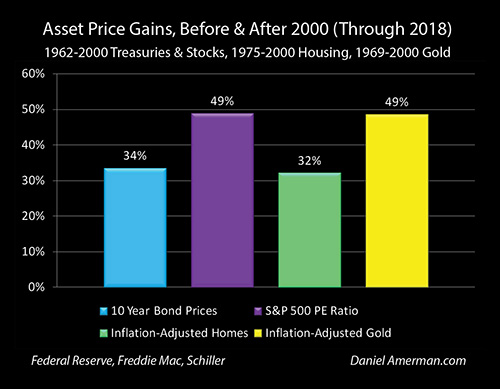
In the analyses contained in previous chapters, we developed the summary information above - in the United States, we currently have some of the highest asset prices in history for stocks, bonds, real estate and gold. Even when we take inflation into account, since the year 2001 we have experienced average valuations for future interest and principal payments, corporate earnings, home values and gold prices per ounce that exceed prior long-term historic averages by about 30% to 50%.
(This is true even after fully including the multiple years of sharp market losses experienced in the last two recessions.)
These simultaneous and far higher valuations in four major and quite different investment categories are not random, but as previously developed - share a common causality. As covered in previous chapters, we have been experiencing cycles of crisis and the containment of crisis over the last almost 20 years.
In very, very brief terms: the Fed contained the collapse of the tech stock bubble with the lowest interest rates in 50 years. This set the foundation for the real estate bubble, and the collapse of that asset bubble set in motion the Financial Crisis of 2008. The containment of that crisis was achieved with forcing seven years of zero percent interest rates for the first time in history, and this environment of extremely low interest rates - which still persists when compared to long-term averages - has created the mathematical foundation for the highest average investment valuations in history across the categories.
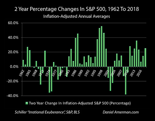
In the immediately preceding analysis (link here), we developed the graph above, and showed how in this environment of much higher investment values, the percentage stock index losses resulting from the two recessions after the year 2000 far exceeded anything experienced in the 1960s, 1980s or 1990s. As explored, the simple logic is that stock valuations which are abnormally high by historical standards should experience larger percentage losses during recessions (all else being equal), and sure enough - as is visually obvious above - that is exactly what we have experienced.
Percentage Losses Are Only One Input
Averaging the two year losses in average annual index value for the S&P 500, we developed a 36% two year inflation-adjusted loss in the event of another recession as being a reasonable base case.
When it comes to unusually high market valuations, however, percentage losses are only half of the picture. What matters more is dollar losses, both for individuals and for the nation as a whole. The higher the valuation, the more money there is to be lost - and the greater the change in wealth (and potential change in behavior) - for both individuals and for the nation.
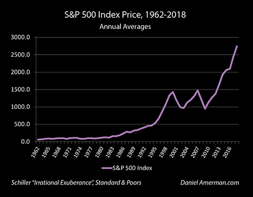
To see the difference between total losses and percentage losses, let's start with the S&P 500 in the way that most people look at it, which is in simple dollar terms. As is visually obvious, the index levels - and the degree of losses during recessions - has been far greater since around the year 1995 than what was previously seen.
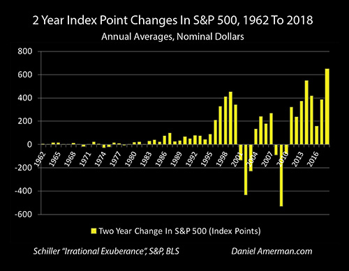
When we return to our chart of two year losses for the S&P 500, and we look at changes in wealth rather than just percentage changes - then only two losses really matter when it comes to financial history. There were the losses in conjunction with the recession that followed the two asset bubble collapses of the 2000s, which were essentially "off the scale" compared to any prior recessions or bear markets.
Comparing simple annual averages for 2000 and 2002, the S&P 500 lost 431 points. As discussed in the previous analysis, going to comparisons of two year annual averages almost completely wipes out the shallower and shorter bear markets of the 1960s, 1980s and 1990s.
Where we can still see losses is in the 1970s, where for example there was a 27 point loss between 1972 and 1974. This was about 5% of the 530 point loss between the annual averages for 2007 and 2009.
(Keep in mind that as with the previous analysis, the methodology used herein is based on a smoothed and somewhat conservative approach to losses. Instead of the "high drama" approach of comparing the highest day to lowest day - which implicitly assumes buying everything on the worst possible day, and then selling everything on the worst possible day - annual averages are compared from two years apart. This is the equivalent of buying equal amounts every day for a calendar year, and starting two years later, selling equal amounts every day for a year. With this approach, which is perhaps closer to reality for most investors, many of the smaller or more fleeting historical bear markets almost disappear.)
Inflation-Adjusted Losses In Stock Market Wealth
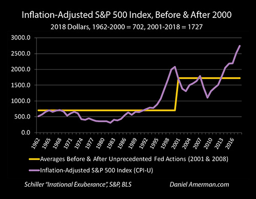
It would have taken $4.35 in 2009 to purchase what $1 would have bought in 1974, so we need to adjust for inflation to get a true picture of the relative losses. Adjusting for inflation we get the revised picture of the S&P 500 index above - and a more dramatic change in market valuation since around 1995 or so.
The S&P 500 no longer reliably increases in value over the decades when adjusted for inflation, but is now worth less through most of the 1970s and 1980s than it was in the 1960s (not including dividends). But yet - the point losses seen in the two most recessions still seem to dwarf those seen with any prior bear market or recession.
This perception is confirmed in the graph above, which looks at two year index point changes in inflation-adjusted terms. Yes, when we use 2018 dollars and look closely, we can now see that the S&P had some real two year losses in 1960s and 1980s, losing 21 points between 1967 and 1969, and 50 points between 1980 and 1982.
The biggest visual changes are seen in the 1970s, where we have an inflation-adjusted loss of 174 points between 1968 and 1970, and a loss of 233 points when comparing the annual averages for 1972 and 1974.
What we are really looking at when we compare index point losses in inflation-adjusted terms is changes in real stock market wealth. The less the starting wealth of the stock market - then obviously, the less the loss in wealth with a given percentage decrease in the value of the index. And the greater the starting wealth contained in the stock market, the more devastating the loss in wealth with a given percentage decrease.
As is visually obvious above, even after fully adjusting for inflation - the losses from the last two rounds of recession and crisis have been staggering. The losses in stock market wealth for the nation as a whole were an order of magnitude beyond anything previously seen. In 2018 dollars, the losses were 690 points between the averages of the years 2000 and 2002, and then a remarkably similar 681 points between 2007 and 2009.
Again, these are not random, but the logical downstream consequences of asset prices that are far higher than historic norms, as a result of how the Fed has changed interest rates, real (inflation-adjusted) interest rates, and market valuations through its increasingly heavy handed interventions in our current cycles of crisis and the containment of crisis.
Much higher valuations mean a vulnerability to greater percentage decreases in price during crisis, all else being equal. If we start from a much greater degree of wealth, whether as a society or as individuals, and we then multiply that starting wealth by a higher loss in percentage terms - then the actual amount of our losses should indeed be an order of magnitude greater than what was previously seen.
This rational relationship is not only something that should exist - but is exactly what we have seen with the previous two recessions, when compared to all prior recessions and bear market losses in the years analyzed.
Simple Averages & Losses In A Future Recession
Returning to the graph of inflation-adjusted values for the S&P 500, we can see not only the enhanced point losses with the last two iterations of recession - but also just how much higher the current valuation of the stock market is, relative to the two previous peaks.
A much higher asset valuation should created a far larger loss in stock market wealth, if we keep the percentage loss equal. So, what would the size of the loss in stock market wealth be if we take that far higher valuation, and apply to it the same percentage loss seen in the last two iterations?
In the graph below, we add three years, which are shown in yellow rather than green to make clear that they are illustrations, rather than the historical data of the rest of the chart. The yellow bar for 2019 is the inflation-adjusted average of the S&P 500 for the first five months of 2019, which is 2,800, and a two year gain of 293 points over the average for 2017. That level is extrapolated forward for the entire year.
The yellow bar for 2020 takes the first year losses from 2001 and 2008, averages them, and shows a projected (two year) loss for 2020 of 492 points in the S&P 500.
The yellow bar for 2021 takes the average of the two year losses, and shows a projected loss for the inflation-adjusted S&P 500 of 998 points for the year 2021, which is a decline of 35.6% from the average for 2019.
This approximately thousand point loss in stock market wealth is not only far greater than any loss ever experienced before the year 2000, it also far larger than the 690 point (inflation-adjusted) loss taken when the tech bubble collapsed.
It would also be 317 points greater than the stock market losses experienced between 2007 and 2009, with inflation-adjusted losses equaling 147% of those experienced during the our previous cycle of financial crisis.
The situation is in some ways really very simple, and the treatment involved here is not all that negative or pessimistic. We currently have what are by far the highest stock market valuations in U.S. history, and this is particularly true when we look at the levels as of the summer of 2019, which are substantially higher than what is included herein.
The greater the stock market wealth, then the greater the loss in wealth with any percentage decline - that is just simple multiplication.
As developed in more detail in the previous chapters as well as the immediately preceding analysis, there has been a "change in state" in the U.S. stock markets since about the mid-1990s. Stock market levels are far higher than they used to be.
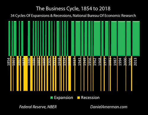
As also explored in previous chapters, we have had 34 cycles of expansion and repressions since 1854 - it is the natural business cycle. Recessions are every bit as natural as expansions, as a matter of economic history. And as of July of 2019, we are now in the longest expansion on a record, a true historical outlier, with numerous indications that the next round of recession could indeed arrive within the next 1-2 years.
Two of those recessions have occurred since the change in state for stock market valuations. We would expect that from substantially higher highs, that there would be greater losses during times of recession and a loss of investor and economic confidence.
And sure enough, when we graph it out, that is exactly what we get. Looking at two year inflation-adjusted losses in percentage terms, the last two recessions, each of which began during a time of historically elevated stock market valuations, each produced percentage losses that far exceeded anything seen in the 1960s,1980s or 1990s, with the only comparables being the deeply troubled 1970s.
The final step is the simple multiplication of what is by far the highest amount of stock market wealth in history, by the average of the two year losses experienced during times of elevated stock market valuations - and we get the yellow bar on the right hand side of the graph above.
The single largest collapse in stock market wealth in history becomes the logical base case scenario.
It should be noted that this is not some "gloom and doom" scenario - and there are lots of those out there. If there is a global trade war, or a "hot war" in the Middle East or Asia, or if the next attempted containment of crisis by the Fed were to fail, or if the dollar were to collapse, or if we were to have a new great depression - any of those could produce losses in stock market wealth that could far exceed what is illustrated above.
All that is shown above is the extrapolation of averages, with the implicit assumption that everything else holds. The Fed's next containment of crisis does work, we don't return to long term averages for stock valuations, and another cycle of expansion follows the next cycle of recession. This could be called the optimistic version of the future, compared to some of the alternatives. But yet, nonetheless - the price of having what is the most elevated stock market in history coming into the historical normality of a cycle of recession would produce the greatest loss of stock market wealth ever experienced in the United States.
It's just simple multiplication and averages.
Placing A $12 Trillion Loss In Wealth In Perspective
So what would the loss be in dollar terms?
To get in the ball park, we will use a simplification. The S&P 500 is not the total stock market, though it does carry a huge portion of the overall market valuation. If we look at all stocks, then the World Bank estimates that in 2018 the total market capitalization of all U.S. stocks was a little over $33 trillion (this would be substantially higher as of the summer of 2019, but we will set that aside for now).
Taking the simplifying step of using a 36% loss that is derived from the actual history of the S&P 500, and applying it to all stocks, we multiply times $33 trillion and come up with a loss in stock market wealth of $12 trillion.
The stockholders of America, including individuals, institutions and pension funds, would take a $12 trillion hit. This would exceed the previous record losses seen in 2000-2002 and in 2007-2009 by around $4 trillion, in inflation-adjusted terms.
Another way of looking at this is that the inflation-adjusted value of the S&P 500 did not pass 1,000 until the year 1996 (using 2018 dollars). So, a 36% decline from the current extreme elevations would produce a loss in wealth that is larger than the total capitalization of the U.S. stock markets in any year prior to 1996.
How big of change would we see in spending behavior with that degree of lost wealth? What would that do to corporate earnings and the economy?
A financial term that went from obscurity to prominence with the last two rounds of major market losses was "sequence of returns risk". The problem is that for those unlucky enough to experience a truly major market loss close to or shortly after retirement, long term averages lose much of their protective power, and there can be a permanent loss when it comes to standard of living in retirement.
The next few years will be some of the peak years for planned Boomer retirement - what will happen to those retirements if they coincide with a $12 trillion loss in stock market wealth for the nation? Will those people retire as planned?
What will happen to the standard of living of current retirees in general who are depending on their investment portfolios to support their standard of living in retirement?
Many state & local governments are facing major pension shortfalls - even with heavy investment in the highest stock market valuations in history. What happens to the financial viability of pension funds across the nation if we lose 36% of the wealth of the stock market?
Trillions of dollars is so large as to be abstract, so one way of looking at this is in comparison to the size of the national debt. It took the United States until 2010 to pass $12 trillion in national debt (in 2018 dollars). So, a $12 trillion wealth loss would exceed the size of the total U.S. national debt accumulated over the first more than 200 years of the nation.
This then brings in the tax aspects of such a loss. All else being equal, state and federal tax revenues would plunge, even as the need for stimulus spending skyrocketed. What would that do to the federal deficit? In combination with the collapse in pension fund investment values - what would that do to the fiscal viability of states such as Illinois and California?
Earlier chapters of this book focused on analyzing how very low interest rates and cycles of crisis and the containment of crisis have fundamentally changed the real estate market, creating both much higher valuations (on average) and much greater price volatility. How would the 1-2 combination of a possible $12 trillion loss in the stock markets along with potentially crippling reductions in home values impact household net worth, spending and retirement decisions?
The good news is that we currently have a stunning degree of stock market wealth, it is by far the largest in history. The bad news is what likely happens with the next recession, given this extraordinary starting valuation (and all else being equal). They are really just two aspects of the same thing, and are more or less inseparable (unless the business cycle has been repealed). Hopefully this analysis has been helpful in your seeing both sides of this single coin.
Two More Paths To The Worst Stock Loss In History
This analysis is not a precise projection, but the attempt to establish a reasonable base case. The future is unlikely to exactly follow the past - it could be better, it could be worse.
That said, the case for the next bear market creating the largest stock market losses in history - and the most devastating blow to investors and the economy - is reasonably robust, it isn't dependent simply on the averages experienced within the last couple of decades.
As a starting point, as of July of 2019 the S&P 500 closed as high as 3,019.56, in record territory and well above the 2,745 annual average for 2018 that was used as the high point in the quite conservative methodology used in this analysis. Rounded and in inflation-adjusted terms, let's call it 3,000. The usual definition for a bear market is a 20% loss. A 20% loss would then be have to be over 600 points, simply by definition.
On an inflation-adjusted basis, the 2000 to 2002 bear market (annual averages) produced a 690 point loss, and the 2007 to 2009 bear market produced a 681 point loss. So, by definition, in order to get a bear market off of a 3,000+ point high for the S&P 500, we would need a loss that is far, far greater than any experienced before 2000 (even on an inflation-adjusted basis), and quite close to the worst of what we saw in the last two markets.
Because of the current stupendously high valuation for the stock markets, there is only a relatively narrow range where we could get what would meet the minimum standards for a bear market, without also generating the largest stock market losses in all of history. It is all part of the package that comes with such high valuations, and why there is indeed a robust case for the losses being the worst ever seen.
This would not be a $12 trillion loss, but there would still be a necessary minimum of $7.2 trillion in losses (based upon the World Bank 2018 estimate, adjusted upwards by the ratio between the July of 2019 index, and the average for 2018).
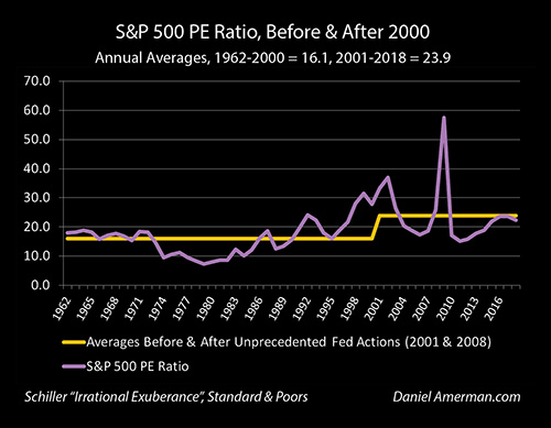
Coming in from a third and completely different angle (and as covered in previous chapters), the PE ratio between 2001 and 2018 averaged 23.9, versus a 16.1 average between 1962 and 2000, which is an increase of 49%. If all we do is assume a regression to the mean, a return to long term averages in the aftermath of a major market correction, then that would produce a 33% reduction in average stock market prices (1 - (1.49 / 1)).
A 33% reduction from our 2018 average would be a loss of 905 index points for the S&P 500 - far worse than anything experienced in the last two bear markets, or anything prior to that (even in inflation-adjusted terms). In dollar terms, if we start with a $33 trillion stock market capitalization, then the total reduction in stock market wealth would be close to $11 trillion. (As explored in Chapter Twelve, this third approach is not stand-alone, but could actually be multiplicative with either of the other two approaches.)
Three different approaches all lead to the same robust conclusion. When we start with what is by far the highest degree of stock market wealth in history, and we then look at normal losses during a potential recession and bear market from any of three different perspectives - what we necessarily get is what would be the single largest "kick to the gut" ever seen for stock market wealth, the economy when it comes to the "wealth effect", and the financial security of retirement investors (at least for the short term).
Cycles & Intersections
The above analysis may seem very negative to many readers, particularly if they have not read any of the previous chapters in this book that is in the process of being written. For those of you who have been reading along - this is just one critical component of understanding the cycles of crisis and the containment of crisis that have transformed markets and investor returns over the last couple of decades.
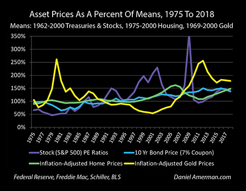
As explored, the Federal Reserve's heavy handed interventions have produced the changes shown above, and not just for stocks, but also for real estate, bonds and precious metals. As a result of the Fed's unprecedented actions with regard to interest rates, inflation-adjusted interest rates and monetary creation, we have what are on average record valuations across all four major investment categories - and we also have substantially greater volatility than what is historically normal.
One rather important aspect of these new cycles is that when record asset prices intersect with greater volatility - then at some stages in the cycles (and possibly within the next 1-2 years), we can expect to get what was explored herein. We could see the single largest "kick in the gut" that stock investors (and household net worth) have ever seen. This would not be unexpected - but is instead the result of simple multiplication and it could be called the new base case expectation, once what creates the higher asset prices is fully understood, as well as the limitations that the Fed faces, and what its available tools are.
Again, critically - the specifics differ in each category, but the stock market is not the only investment asset category that is vulnerable to the intersection between record asset prices and greater volatility.
Unfortunately, many people do not understand this new reality at all. They would be completely blind-sided by a loss of the magnitude shown herein, and could face devastating personal consequences when it comes to their financial security and standard of living in retirement.
But yet, while this particular chapter could be characterized as being bit on the depressing side, we have to keep in mind the bigger picture, which is that part of what creates this situation is - record asset prices. When we have cycles of record prices and greater volatility, then yes, the losses grow greater in some places - but so do the profits in other places, or in other investment categories.
To help readers understand how the Fed's extraordinary interventions have changed all the major markets, creating enhanced profit opportunities as well as larger losses at different stages for different investment categories, I created the organizational framework below.
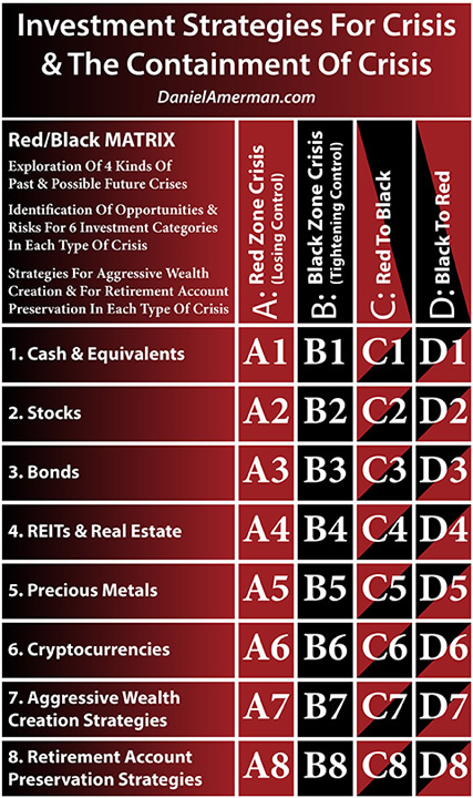
(More information on the matrix and how to use it is linked here).
In earlier chapters, we focused on exploring the 3rd and 4th rows of bonds and real estate. This current chapter moves the focus to the 2nd row, that of stocks.
Each matrix cell is an intersection between the columns of the changes in the economic cycles and the corresponding change in Federal Reserve interventions, with the particulars of the row for that type of investment asset. This particular analysis explored the "D2" cell, which is the potential impact on stock prices of the "D" column, which covers moving from the Black zone of the containment of crisis and into the Red zone of crisis.
Daniel R. Amerman, CFA
Website: http://danielamerman.com/
E-mail: mail@the-great-retirement-experiment.com
Daniel R. Amerman, Chartered Financial Analyst with MBA and BSBA degrees in finance, is a former investment banker who developed sophisticated new financial products for institutional investors (in the 1980s), and was the author of McGraw-Hill's lead reference book on mortgage derivatives in the mid-1990s. An outspoken critic of the conventional wisdom about long-term investing and retirement planning, Mr. Amerman has spent more than a decade creating a radically different set of individual investor solutions designed to prosper in an environment of economic turmoil, broken government promises, repressive government taxation and collapsing conventional retirement portfolios
© 2019 Copyright Dan Amerman - All Rights Reserved
Disclaimer: This article contains the ideas and opinions of the author. It is a conceptual exploration of financial and general economic principles. As with any financial discussion of the future, there cannot be any absolute certainty. What this article does not contain is specific investment, legal, tax or any other form of professional advice. If specific advice is needed, it should be sought from an appropriate professional. Any liability, responsibility or warranty for the results of the application of principles contained in the article, website, readings, videos, DVDs, books and related materials, either directly or indirectly, are expressly disclaimed by the author.
© 2005-2022 http://www.MarketOracle.co.uk - The Market Oracle is a FREE Daily Financial Markets Analysis & Forecasting online publication.