


Soaring Debt = Slow Growth = Even More Debt = Systemic Crisis
Interest-Rates / US Debt Jun 05, 2017 - 03:59 AM GMTBy: John_Rubino

 It’s just common sense: Borrow too much money and the weight of this debt makes it hard to do things that used to be easy. This truism is now (finally!) hitting home, and blame is being apportioned. A couple of recent examples:
Over The Last 10 Years The U.S. Economy Has Grown At EXACTLY The Same Rate As It Did During The 1930s
(Economic Collapse Blog) – Even though I write about our ongoing long-term economic collapse every day, I didn’t realize that things were this bad. In this article, I am going to show you that the average rate of growth for the U.S. economy over the past 10 years is exactly equal to the average rate that the U.S. economy grew during the 1930s.
The hard fact is that the past decade’s $10 trillion in deficit spending has produced the worst economic growth as measured by Gross Domestic Product in our nation’s history. You read that right, in the past decade our nation’s economy grew slower than even during the Great Depression. This stagnant, new normal, low-growth economy is leaving millions of working age people behind who have given up even trying to participate, and has led to a malaise where many doubt that the American dream is attainable.
The following are U.S. GDP growth rates for every year during the 1930s…
1930: -8.5%
1931: -6.4%
1932: -12.9%
1933: -1.3%
1934: 10.8%
1935: 8.9%
1936: 12.9%
1937: 5.1%
1938: -3.3%
1939: 8.0%
When you average all of those years together, you get an average rate of economic growth of 1.33 percent.
That is really bad, but it is the kind of number that one would expect from “the Great Depression”.
So then I looked up the numbers for the last ten years…
2007: 1.8%
2008: -0.3%
2009: -2.8%
2010: 2.5%
2011: 1.6%
2012: 2.2%
2013: 1.7%
2014: 2.4%
2015: 2.6%
2016: 1.6%
When you average these years together, you get an average rate of economic growth of 1.33 percent.
———————————
When the “Fix” Increases Systemic Fragility, Things Fall Apart
(Of Two Minds) – All the “fixes” have fatally weakened the real economy, and created a dangerous illusion of “wealth,” “growth” and solvency.The “fix” of the last eight years worked, right? This was the status quo’s “fix”:
1. Massive expansion of debt: sovereign, household and corporate, all in service of a) bringing consumer demand forward b) fiscal stimulus funded by debt c) corporate stock buybacks to boost stock valuations d) asset bubbles in real estate, bonds, stocks, bat guano futures, etc.
2. Monetary stimulus, i.e. creating and distributing money at the top of the wealth/power pyramid so corporations and the super-wealthy could buy more assets with free money for financiers issued by central banks.
3. Gaming statistics such as unemployment and metrics such as stock indices to generate the illusion of “growth,” “stability” and “wealth.”
4. Saying all the right things: the “recovery” is creating millions of jobs, inflation is low, virtue-signaling is more important than actual increases in inflation-adjusted wages, etc.
The cost of maintaining the illusions of “growth,” “stability,” “wealth” and solvency is extremely high, and hidden from view: systemic fragility has increased to the point of brittleness.
The status quo is now like a wafer-thin sheet of ice over a deep lake of killing-cold water.
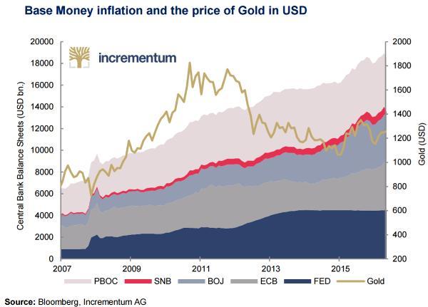
And here are a couple of charts from the always excellent Incrementum In Gold We Trust report:
The first shows how central bank balance sheets – that is, the amount of currency governments have created and dumped into the marketplace – have soared in the past decade. Note that this is not solely – or even especially – a US policy issue. The central banks of China, Europe and Japan are inflating more aggressively than the Fed.
The result of that insane level of money printing? Asset values relative to GDP are at record levels. And this chart is probably unduly conservative, given the fact that most stock and real estate markets have outpaced GDP growth since the depicted peak of 2014:
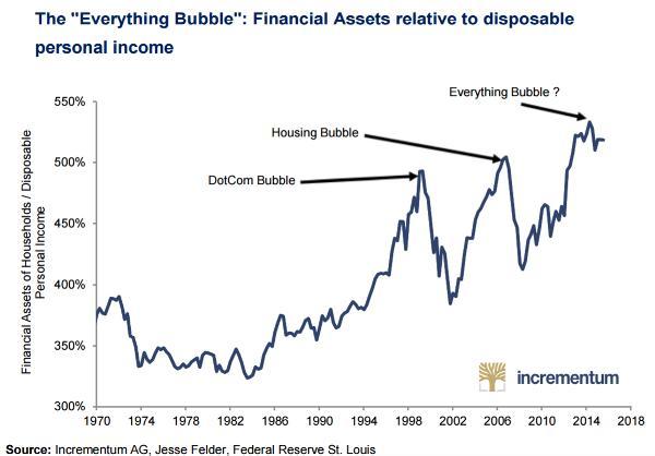
What’s amazing about these charts is that monetary stimulus on this scale produces soaring asset prices yet only Depression-level real growth. But that’s just what too much debt does to a system. And the crisis that follows is, unfortunately, just as predictable.
By John Rubino
Copyright 2017 © John Rubino - All Rights Reserved
Disclaimer: The above is a matter of opinion provided for general information purposes only and is not intended as investment advice. Information and analysis above are derived from sources and utilising methods believed to be reliable, but we cannot accept responsibility for any losses you may incur as a result of this analysis. Individuals should consult with their personal financial advisors.
© 2005-2022 http://www.MarketOracle.co.uk - The Market Oracle is a FREE Daily Financial Markets Analysis & Forecasting online publication.