Gold Charts Back to The Future
Commodities / Gold and Silver 2015 Jun 01, 2015 - 02:54 PM GMT In today's report I would like to show you some old charts, that we've not looked for the most part, in a long time. Some of the long term members may remember some of these charts that go all the way back to when we first opened our doors at Rambus Chartology. When you build long term weekly or monthly charts things change very slowly vs the minute charts. What you were thinking several years or longer ago can still be relative to today's price action. It lets you know if what you were seeing in the charts back then was way off base or if what you were thinking back then was correct or at least fairly close to what the present day's price action is showing. It forces you to be honest with yourself.
It's impossible to catch every little twist and turn the markets make on the short term sharts but the long term view can stay consistant for many years. It's human nature to try and catch every little wiggle the markets make but in reality the big money is made when you can catch the beginning of a major trend and hold on through thick and thin having the confidence in your charts or whatever trading system you're using to keep you on the right side of the trend. With that said lets look at some old charts.
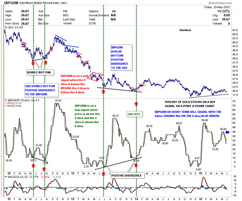
This first chart is a combo chart that has the $BPGDM on bottom and GDX on the top. The BPGDM measures the gold stocks that are on a buy signal using a point and figure. First lets look at the bottom right hand side of the chart that shows the BPGDM has been falling for the last several weeks. It topped out at 40 and is currently down to 26. This tells us fewer gold stocks are on buy signals vs two weeks ago which isn't what you want to see in a strong impulse move up. The BPGDM also has a 5dma and an 8dma that gives short term buy and sell signals. When the price action of the BPGDM falls below the faster 5dma and then the 5dma falls below the 8dma you get a sell signal.
Another way I like to use the BPGDM is to look for a divergence when the GDX is close to making an important low. As you can see on the lower chart there can be a divergence where the BPGDM made a lower low back in 2012 while the GDX made a higher low. Just the opposite happened in late 2013 when the GDX made a lower low but the BPGDM made a higher low. It will be interesting to see what these two charts look like when this bear market is finally finished. It wouldn't surprise me to see the GDX make a positive divergence to the BPGDM similar to what we seen back in 2012.
Gold Miners Bullish Percent Daily Chart
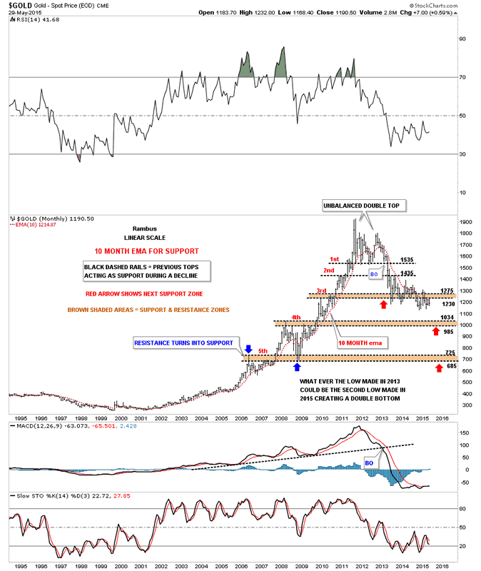
This next long term chart I built right after the bull market top to look for possible support zones during the bear market. The brown shaded areas are the important support zones I'm paying close attention as those were the highs made on the way up. When the tops of those brown shaded S&R zones were broken to the upside, during the bull market years, they were backtested before the new impulse move up began in earnest. Note the 3rd S&R zone that held initial support during the that last impulse move down in late June of 2013 at 1230. As you can see the price action penetrated that 3rd S&R zone by a little bit but it did hold support. The initial bounce took gold backup to the underside of the 2nd S&R zone at 1435 which held resistance and was the start of this nearly two year consolidation period we find ourselves in presently. What's important to see is the series of lower lows and lower highs since gold topped out in September of 2011 vs the left side of the chart where gold made higher highs and higher lows during its bull market run.
Next I would like to draw your attention to the 10 month ema which did an outstanding job of holding support during the bull market years. It has done a very good job also during the bear market that started in 2011. Since the high at 1535 over two years ago gold has only manage to close above the 10 month ema just twice by a small margin but then quickly reversed back down the next month. The high for this month, May, was 1232 which is the underside of the brown shaded S&R zone number three and the 10 month ema. The 10 month ema now comes in at 1215 which is about 25 points higher from the close on Friday which was the end of the month so that last bar is now history.
One last note on the chart below which is showing the next brown shaded S&R #4 coming in between 985 and 1034 which maybe a place to look for a small consolidation pattern to develop. Then the potential ultimate low which would come in at the 5th S&R zone between 685 and 725 which could be just a quick spike. We'll worry about that when the time comes.
Monthly Gold Chart
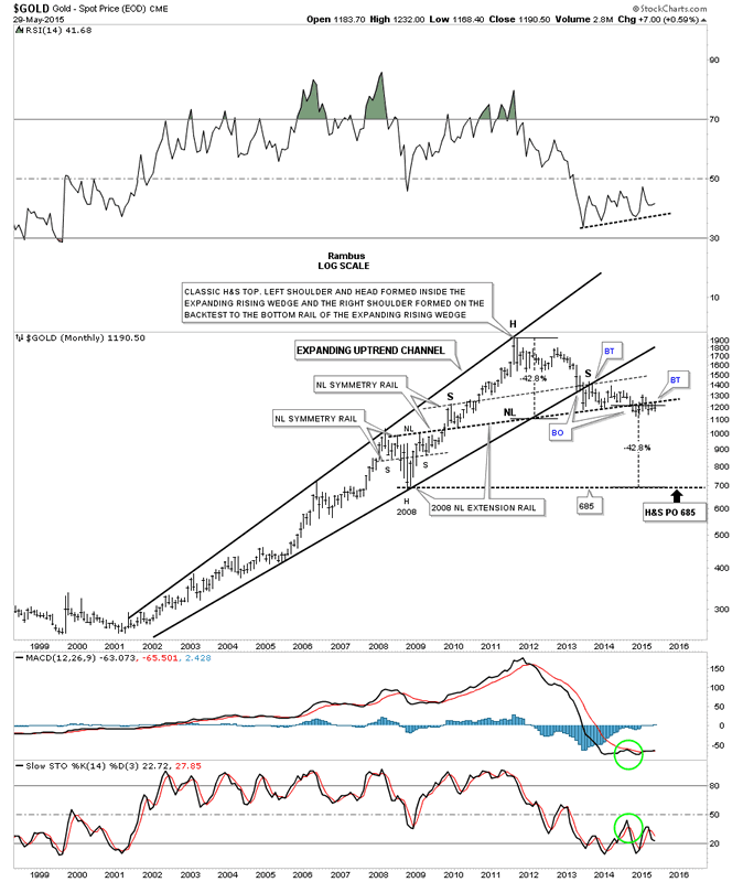
Below is another long term chart for gold I first built once the bottom rail of the expanding rising wedge broke down in 2013. There were several things back then that caught my attention. The first thing I was looking for was a backtest to the underside of the bottom rail of the expanding rising wedge which we got. Once that was completed I began to look at the possibility of a H&S top as I was pretty confident that the bull market was over at that time. As you can see, so far, gold has formed a classic H&S top which I've been showing you on some other charts where the left shoulder and head form inside the wedge or flag and the right shoulder forms on the backtest to the bottom rail of that wedge or flag. There is another big piece of the puzzle for why I think the H&S top is valid. Again some of our longer term members may remember when I extended the neckline from the H&S consolidation pattern that formed at the 2008 crash low, labeled neckline extension rail on the chart below. Outside of that little spike in January of this year above the big neckline the neckline extension rail is still functioning as resistance. There is one more piece of beautiful Chartology that I've been showing you on this chart and that is the neckline from the 2008 crash low also shows the lows for the left and right shoulders during the 2008 H&S consolidation pattern and the exact same angle shows the tops for the left and right shoulders on the massive H&S top. They're labeled Neckline symmetry rails.
There is one last important aspect of this potential massive H&S top. This H&S top measures out to the 2008 crash low at exactly 685 or about another 42.8% lower. Keep in mind we've been watching this pattern develop since 2013 which is going on close to two years now. Its been frustration because of all the sideways chopping action but nothing has or is broken. You're probably getting tired of hearing me say, it is what it is until it isn't. Some time in the future we'll know the outcome but for the time being all we can do is wait and see what takes place over the short term. The very first thing we'll need to see is gold making a new low for this bear market.
Monthly Gold Chart 2
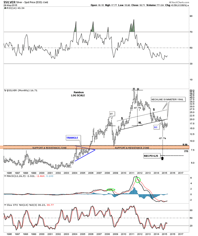
Lets take a quick look at silver that is showing a very big massive H&S top, similar to that of gold, which we've been follow for about the same amount of time. It to has some very nice symmetry as shown by the neckline symmetry rail. This potential H&S top has a price objective all the way down to the 6.25 area but there is a brown shaded support and resistance zone that comes in between 7.75 and 8.50 which will be my main price target. If silver can make it down to the brown shaded S&R zone that will be close enough for me. It's a little hard to see on this chart but silver put in an unbalanced double top as its parabolic move ended in April of 2013.
Monthly Silver Chart
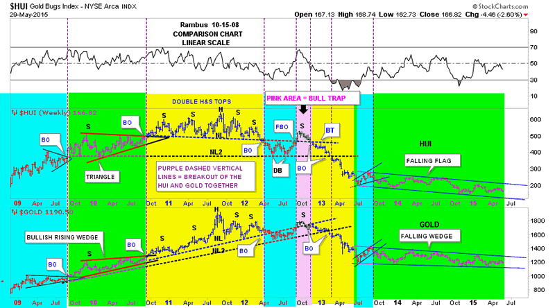
This next chart I haven't posted in probably a year and a half if not longer. This is a comparison chart where I compare the HUI and Gold. What this chart shows you is how they tend to breakout together even if one is stronger than the other or they have different chart patterns. The purple vertical dashed lines shows how they broke out of their respective chart patterns at the same time. Back when the HUI was forming its massive double H&S top I was showing gold was also building out a massive double H&S top. Note the green shaded area on the left hand side of the chart that shows the HUI building out a triangle consolidation pattern while gold was building a bullish rising wedge. Even though their chart patterns were different they still broke out at the same time. Also note there are three shoulders on the left side of the head for both the HUI and gold and three shoulders on the right side of their heads. The pink shaded area shows where each had a false breakout to the upside which I labeled as a bear trap once the price action traded below their NL #1. From there each broke below their respective neckline #2 and declined to that important late June low of 2013. From that low they have been chopping out their next consolidation pattern which will be 2 years old this June.
Gold Bugs Index Weekly Chart
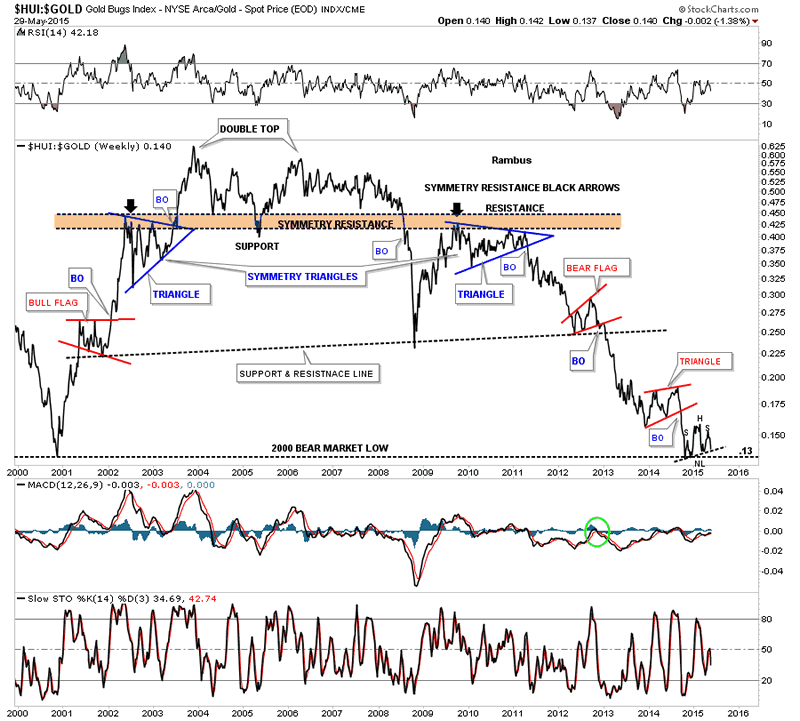
This next chart is a long term weekly look at the HUI to gold ratio chart which goes back a long time. I first showed you this chart back in early 2013 about the time the HUI was breaking below its massive H&S neckline. I remember speculating if we would see the all time low for this ratio at .13 come into play at some point. As you can see the all time low was hit. Now we have another important piece of Chartology we need to recognize. I have shown you many times in the past that when a stock approaches an important support or resistance line there are several ways it can break through that line. Many times a stock will form a consolidation pattern right on top of the trendline or it may break the trendline and form a pattern just below the trendline before it moves lower. Sometimes it can form a pattern on top of the trendling and one below before the impulse move begins. If you look down to the bottom right hand side of the chart you can see a possible H&S consolidation pattern forming with the neckline being tested from above right now. This is a perfect place for some type of consolidation pattern to form if this ratio is headed lower. I know it seems impossible for this ratio to go any lower but if the neckline and the 2000 low made at .13 give way I'm afraid that's whats going to happen. So far the neckline is holding support.
HUI:GOLD Weekly Chart
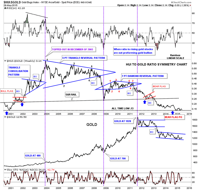
Below is a long term combo chart that has the HUI to GOLD ratio chart on top and gold on the bottom which shows the HUI to GOLD ratio bull market actually topped out in December of 2003. What this means is, even though the HUI went on to make new all time highs, it never outperformed gold like it did during the initial thrust of the new bull market that began in 2000. This chart shows the clear devastation for those holding the precious metals stocks bought during the early part of the bull market and held on to this day. The ratio actually topped out in late 2003 with gold at 400. There is no way anyone could have known back then, the under performance of the HUI, of what was to take place during the next 11 years or so. The gold chart on the bottom tells the story.
HUI:GOLD Weekly Chart 2
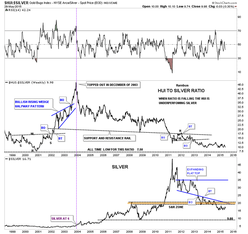
This next ratio chart compares the HUI to Silver which I haven't shown you in a long time. Again like the HUI to Gold ratio chart above the HUI topped out vs silver in 2003 also. Silver was a $6.00 at the time.
HUI:Silver Weekly Chart
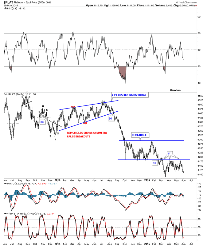
There is one more metal I would like to update you on that we've not looked at in some time and that is Platinum. Below is a daily chart that shows Platinum breaking out of the blue rectangle consolidation pattern back in early March of this year. It has made three backtests to the underside of the blue rectangle so far which is still holding resistance.
Daily Platinum Chart
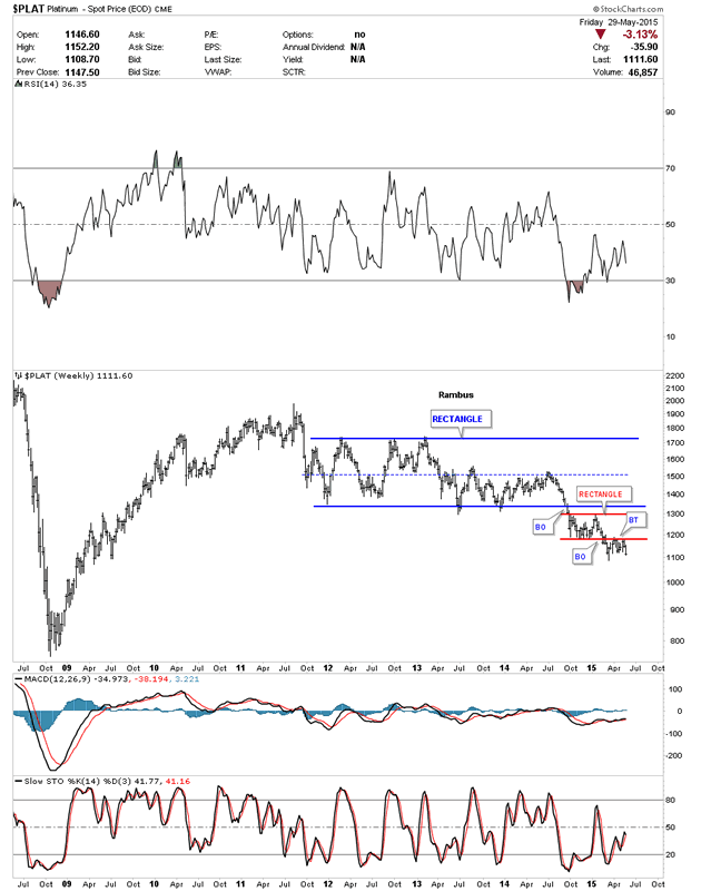
This long term weekly chart for Platinum shows the small red rectangle, which I showed you on the daily chart above, forming just below the bottom rail of a much bigger blue rectangle consolidation pattern. As I explained to you on the HUI to gold ratio chart that many times a small consolidation pattern will form above, below or right on and important trendline before the impulse move begins in earnest. Here is a perfect example of a small consolidation pattern forming just below an important trendline.
Weekly Platinum Chart
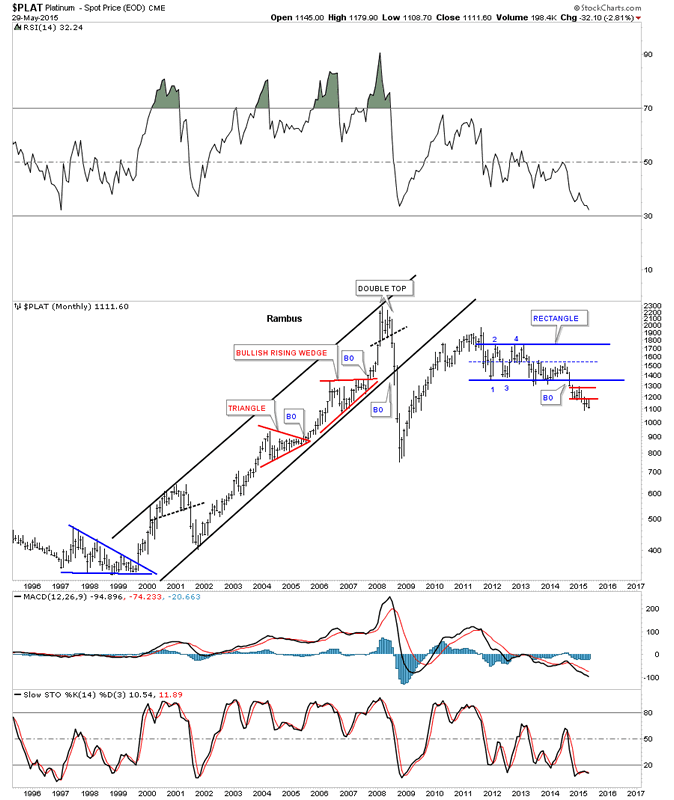
This last long term look at Platinum shows its bull market that began in 1999 and topped out in March of 2008 a full three years ahead of silver and gold. You can see Platinum's bull market topped out with a double top formation which ended its bull market run. It looks like Platinum closed the month of May at a new multi year low going back to 2008 or so. It had a nice run but all good things must come to an end at some point.
Monthly Platinum Chart
The thing about building long term monthly charts is it shows you what your thinking was in the past when you look back from the future. They're like a time capsule with important bits of information about what you were thinking years in the past in some case. The most important thing is to know the direction of the major trend either up or down in which to trade. Trading against the major trend can be very difficult as I can attest to trading the Kamikaze stocks. We had our biggest profit when we shorted the PM stocks in December of 2012 and held on until August of 2013. Since that low the PM complex has been chopping around in a consolidation pattern, for the most part, going nowhere. I guess it's the challenge in us that makes us think we can out trade the primary trend but in all actuality it's very hard no matter what trading system you're using. Going with the major trend will fix your mistakes in time which is just the opposite when you trade against the major trend. When you trade against the major trend and are wrong and don't get out that's when your problems really begin. Many a gold bug who held on against the bear market forces can relate to that last sentence.
All the best
Gary (for Rambus Chartology)
FREE TRIAL - http://rambus1.com/?page_id=10
© 2015 Copyright Rambus- All Rights Reserved
Disclaimer: The above is a matter of opinion provided for general information purposes only and is not intended as investment advice. Information and analysis above are derived from sources and utilising methods believed to be reliable, but we cannot accept responsibility for any losses you may incur as a result of this analysis. Individuals should consult with their personal financial advisors.
© 2005-2022 http://www.MarketOracle.co.uk - The Market Oracle is a FREE Daily Financial Markets Analysis & Forecasting online publication.


