Stock Markets– Bear Market Rally or Bull Market UP Turn?
Stock-Markets / US Stock Markets Jun 13, 2008 - 03:24 PM GMT

 Since topping out in October 2007, global stock markets have been characterized by two distinct phases: a decline through January/March this year, and then a rebound until mid-May. The predominantly weak undertone of the past few weeks has naturally again raised the question of whether the strength from January/March until three weeks ago has simply been a bear market rally, or whether it in fact was a longer-term upturn in stock markets' fortunes.
I went on record last year calling a primary bear trend for the US (and most other developed) stock markets, and more recently described the most likely medium-term scenario as a “muddle-through” type of pattern. I briefly want to review a few graphs in this post to ascertain whether this view still makes sense, and then next week investigate whether the fundamental picture (especially valuation levels) conveys the same message.
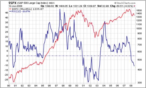
First up is a long-term chart of the S&P 500 Index (red line) together with a simple 12-month rate of change (or momentum ) indicator (blue line). Although monthly indicators are of little help when it comes to market timing, they do come in handy for defining the primary trend. An ROC line below zero depicts bear trends as experienced in 1991, 1994, 2000 to 2003, and again since December 2007.
Charts Courtesy of StockCharts.com
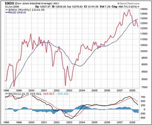
Next up is a monthly graph of the Dow Jones Industrial Index (top section) and its MACD oscillator (bottom section). The fact that the blue histograms have been in negative territory since December 2007 serves as confirmation of a primary bear trend.
Primary bear trends, however, are not non-stop declining trends and are made up of secondary up and down wiggles. In order to determine where in the bear phase we find ourselves at this point in time, let's look at a number of shorter-term indicators.
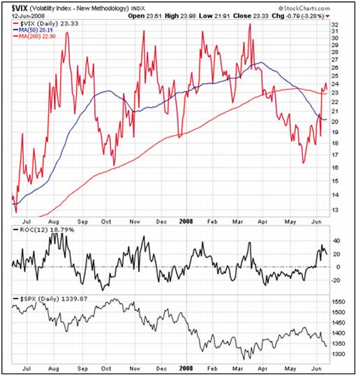
The next chart is the CBOE Volatility (VIX) Index , an indicator that moves in the opposite direction to stock prices and shows the level of complacency (lower values) or nervousness (higher values) of market participants. The present level of 23.3 still has a way to go before reaching the 30 plus levels of August and October 2007 and January and March this year, but may not necessarily reach those levels in this movement as various oscillators are starting to approach overbought conditions.
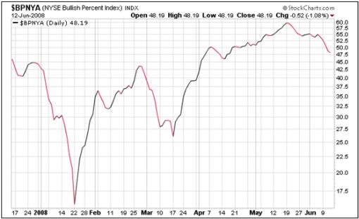
A rather surprising chart is the New York Stock Exchange Bullish Percent Index , showing approximately half the stocks still in primary up-trends. Compared to the January and March lows, there is certainly more downside potential, but this must be watched closely as failure to break down should be construed as a positive sign.
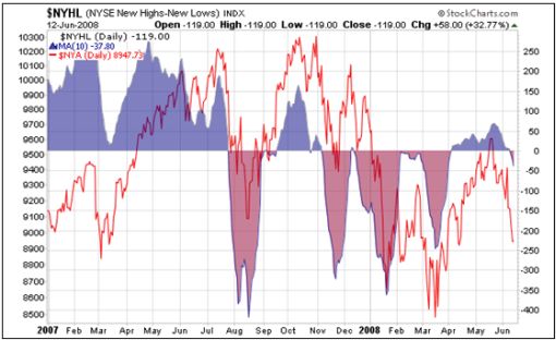
The index of net new highs/lows on the New York Stock Exchange (shaded areas in the chart below) has also been holding up surprisingly well and should be monitored carefully as a possible sign of non-confirmation of index weakness.
The cumulative graph of net advancing/declining issues on the New York Stock Exchange held up quite well during the initial declines, but has now embarked on a path in the direction of the March low. The jury is out on whether it will decline to a fully oversold situation.
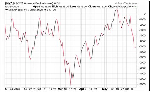
The short-term indicators do not offer conclusive evidence that US stock markets have significant downside potential in the near term, neither do they point to markets about to embark on a strong upward path again. The situation has that “no man's land” type of feel about it.
In my opinion, the direction of banking stocks will be paramount in determining the trend of the broader market. In this regard, I am keeping a beady eye on a host of indicators, some of which are shown in the chart below. The Philadelphia Bank Index's RSI indicator and Bollinger Bands are certainly nearing the stage where banks may at least bounce, if only temporarily.
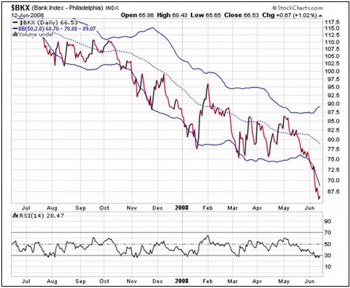
Although banks are looking oversold on short-term considerations, they would need a longer convalescence period in order to rebuild their balance sheets. And until this key sector shows clear signs of a reversal, I have difficulty seeing the primary bear trend turning around in a hurry. I am not in the “end of the world” school, but also have little reason to see a more optimistic scenario than “muddle-through” action, typified by sub-optimal returns.
I will post some material on fundamental considerations within the next few days, but in the meantime would like to stress again that the emphasis at this juncture should be on the return of capital rather than the return on capital.
Did you enjoy this posting? If so, click here to subscribe to updates to Investment Postcards from Cape Town by e-mail.
By Dr Prieur du Plessis
Dr Prieur du Plessis is an investment professional with 25 years' experience in investment research and portfolio management.
More than 1200 of his articles on investment-related topics have been published in various regular newspaper, journal and Internet columns (including his blog, Investment Postcards from Cape Town : www.investmentpostcards.com ). He has also published a book, Financial Basics: Investment.
Prieur is chairman and principal shareholder of South African-based Plexus Asset Management , which he founded in 1995. The group conducts investment management, investment consulting, private equity and real estate activities in South Africa and other African countries.
Plexus is the South African partner of John Mauldin , Dallas-based author of the popular Thoughts from the Frontline newsletter, and also has an exclusive licensing agreement with California-based Research Affiliates for managing and distributing its enhanced Fundamental Index™ methodology in the Pan-African area.
Prieur is 53 years old and live with his wife, television producer and presenter Isabel Verwey, and two children in Cape Town , South Africa . His leisure activities include long-distance running, traveling, reading and motor-cycling.
Copyright © 2008 by Prieur du Plessis - All rights reserved.
Disclaimer: The above is a matter of opinion and is not intended as investment advice. Information and analysis above are derived from sources and utilizing methods believed reliable, but we cannot accept responsibility for any trading losses you may incur as a result of this analysis. Do your own due diligence.
Prieur du Plessis Archive |
© 2005-2022 http://www.MarketOracle.co.uk - The Market Oracle is a FREE Daily Financial Markets Analysis & Forecasting online publication.


