Gold Gets Safe Haven Bids But COMEX Has Stopping Power
Commodities / Gold and Silver 2015 Feb 02, 2015 - 11:25 AM GMTBy: GoldSilverWorlds
 This article is part of a series of in-depth market analyses for gold investors. Our aim is to publish this type of analysis on a weekly basis. It is not meant to be investment advice, but it should provide precious metals investors key insights about the ongoing and expected gold price trend(s).
Our focus is on chart analysis. With an average of 10 to 15 charts per article, we will cover not only the gold market but also intermarket analysis. It is our core belief that all financial assets, including gold and silver, attract bids relative to the (perceived) value of other financial assets. In other words, the attractiveness of gold is not only influenced by “internal” factors within the gold market but also by “external factors” like stocks, bonds, commodities, currencies. Makes sense probably, but a thorough and objective analysis is mandatory to identify intermarket influences.
The reason we rely on charts is that it is the best way to remain objective. We do not rely on news stories, for sure not in the financial media, because authors have the tendency to match a story with a price movement. It is always possible to detect an event or news story which logically “explains” the change of the price of gold. We believe the value of stories is mostly useless, and only creates “noise” for investors.
Gold charts: trend lines and patterns
We start our review with several gold price charts. The aim is to identify basic chart patterns, trend lines and check two basic technical indicators (i.e., relative strength index RSI and moving averages indicator MACD).
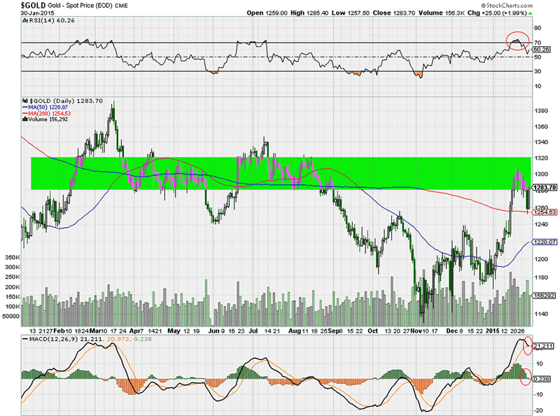
The daily gold price chart has a huge resistance zone in the $1300 – $1320 area, as indicated by the green bar on the first chart. Throughout 2014, the price of gold has been hovering around that area, before breaking down in September. Gold is currently attempting to break through resistance, and close the bearish gap.
Technical indicators on the daily chart suggest that gold is about to take a break.
From a chart perspective, the importance of the $1300 – $1320 resistance area is determined by its duration and the number of attempts to break through it. That type of insight can only be identified on the weekly and monthly chart.
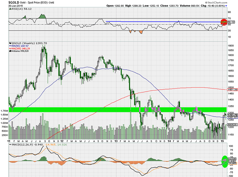
The weekly price chart carries several insights. First, the importance of the key resistance area seems to date back to (at least) May 2013. Also, it appears it is the fourth attempt of gold to break through that area, adding value to its importance.
The technical indicators on the weekly are more constructive than on the daily chart. The momentum indicator RSI shows that gold has not traded above the current reading for more than two years. In simple terms, it confirms the importance of the resistance area on the price chart. The moving averages indicator MACD is about to turn positive (a reading above zero). That is undoubtedly very constructive.
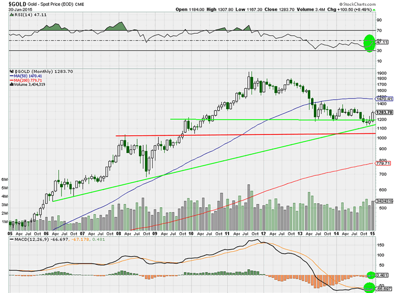
The monthly chart reveals the long term trends at play. First, it indicates the huge importance of the $1200 area, marked with the horizontal green line, because it dates back to 2009 (when it was resistance) and 2010 (when broken resistance became support). Second, gold recently bounced off an ascending trendline going back to 2006, which is the other green trendline on the chart. What’s more, both trendlines are forming a triangle, which mark a “make or break” area.
A healthy indicator is the uptake in volume with the recent price rally. Also, the RSI is moving nicely higher (currently close to 50) while the short term moving average is about to cross the longer term moving average, surely a constructive evolution. However, note how the MACD is still way below zero, which indicates more work is required before confirming a bullish uptrend.
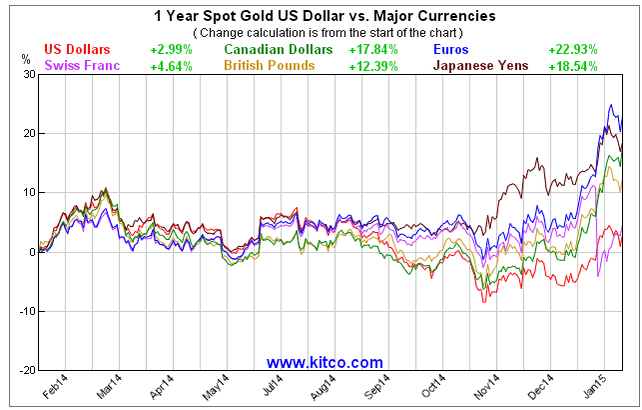
Most investors are used to look at gold in US Dollars. However, it is equally important to monitor gold in other major currencies. The next chart shows the one-year gold price in 6 major currencies. Clearly, and unsurprisingly, gold in US Dollars is the weakest performer. Gold in Euros, Japanese Yens, British Pounds, and Canadian Dollars is up substantially. Although not visible on any chart in this article, we can reassure readers that gold has broken out in those currencies. This simply confirms the exceptional strength of the US Dollar rally which started last summer, as well as gold’s strength in all other currencies.
Gold futures positions in COMEX
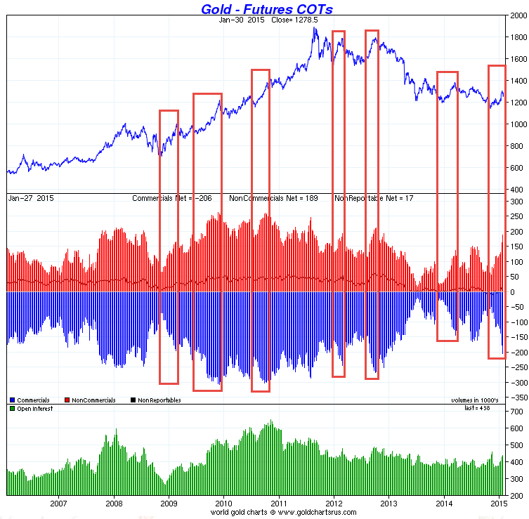
As explained many times before (courtesy of Ted Butler), the gold and silver price are set in the futures market (COMEX), just like most other commodities and currencies. The weekly Commitment of Traders report (COT) reveals the positions of the key COMEX market participants, mainly commercials and non-commercials. The chart below shows the current positions of commercials and non-commercial traders in the gold market with the blue and red bars (center of the chart).
The positions of large traders in COMEX gold and silver, as reported by the Commitment of Traders report (COT), have changed quickly in the last couple of weeks, as seen on the next chart. The key takeaway is the pace of change of the short positions of commercials during each price rally, as marked by the red rectangles on the chart: the faster the commercials accumulate short positions during a price rally, the higher the chance that the rally will be short-lived.
As indicated with the red rectangles, a sudden spike in short positions of commercials has the “stopping power” to cap a rally. Unfortunately for gold bulls, the last couple of weeks there was a significant spike in commercial shorts. That does not bode well for the price of gold in the short run. Mind that the COT report is not a perfect timing tool, so “inevitable” does not equal “imminent” in this context.
Sentiment: gold optimism index
Along with the change of the gold price price, it is useful to monitor how sentiment changes. The next chart indicates the evolution of optimism towards gold (lower part of the chart) with the change of the gold price (upper part). As on most charts, 80% of the data are “noise”, so it is important to focus on the 20% which carry important information. In this case, the extreme readings in optimism are of great importance. Why? Because in the last two years, the optimism index has been “capped” consistently around the 50 area, as evidenced by the green dotted lines. Not coincidentally, those extreme readings coincided with an intermediate top in the gold price.
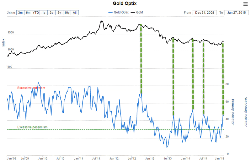
Currently, gold is at a “make or break” level. This is in line with the daily and weekly gold price chart. No divergence here. Another take-away from this chart is that there is quite some “upside” potential, or, in other words, given the recent price rally there is in no way any extreme optimism towards gold.
Going forward, it is key to monitor how sentiment changes along with price changes.
Intermarket analysis
The really exciting insights at present time, at least in our opinion, are to be found in the developing trends in intermarket analysis. In this section, we compare key assets like stocks, bonds, commodities, currencies, and gold with each other.
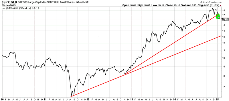
The first chart in this section displays the US stock index (S&P 500) to gold ratio. The chart has two important trendlines, both drawn in red: one goes back to mid-2011 while the other one goes back to the end of 2012 when QE3 was announced. The latter trend line has been breached in January of this year. Theoretically, there is some upside in gold and/or some downside in stocks until the second trendline is reached. Mind that this ratio does not imply a price target, but rather a preference among investors between stocks and gold. Even with a stable gold price but declining stock prices, the ratio could go lower, implying that gold would offer better value than stocks.
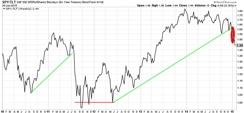
The previous chart is confirmed by the stocks (S&P 500) to bonds (20 year Treasury bond) ratio, as seen on the next chart. The stocks to bond ratio reveals a growing preference for risk aversion. This ratio has been signaling a “risk off” attitue among investors since early 2014. However, it was not until December 2014 that it became a confirmed trend. Since then, bonds have been outpeforming stocks on a relative basis. This is an important insight, as it confirms growing “safe haven” demand. As we will prove in one of the following charts, gold is getting safe haven bids as well. This has the potential to be a game changer for the yellow metal.
Another take-away from the chart below is that the market expects interest rates to go lower, not higher. That is clearly contrarian, as the consensus view is that the US Fed is about to hike interest rates later this year. The market is thinking otherwise.
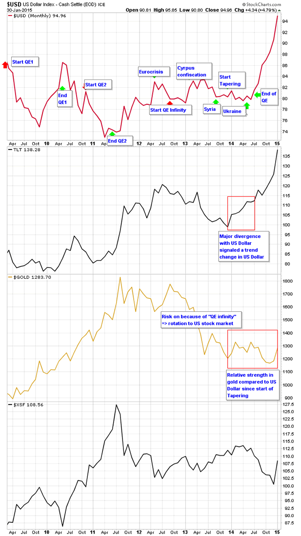
Safe havens are being bid lately. That is a significant trend change compared to 2013 and the bigger part of 2014. With QE3, investors have been in a “risk on” mindset, bidding stocks significantly higher. As per the next chart, traditional safe havens like the US Dollar, the Swiss Franc, US Treasuries, and gold are moving higher simultaneously.
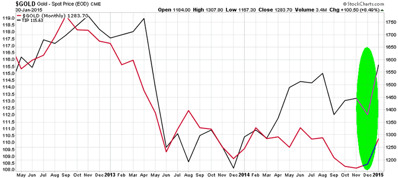
Inflation expectations and the price of gold have been historically positively correlated. One of the ways to track inflation expectations is through the price of the iShares TIPS Bond ETF (symbol: TIP). The following chart shows TIP with the black line and gold in red. Interestingly, both have moved higher ‘in tandem’ since November 2014. TIP has not been trading this high since April 2013 (the gold price crash). Strictly speaking, this indicates that inflation is expected to rise. Logically, this does not make sense in the light of the recent collapse of crude oil and copper, along with the rising US Dollar (highly deflationary). However, when we connect the insight from the bond chart which signals lower interest rates ahead with ongoing deflationary pressure, there is an expectation that the net outcome is (slightly) higher inflation. That is indeed a healthy environment for gold to go higher, albeit not in an explosive way. Herein lies the value of intermarket analysis.
Physical market
We have chosen not to include any charts about the physical market. The reason is that there is no change in the ongoing trends since 2013: gold demand out of Asia (in particular China, and recently also from India) is huge. In the West, the physical gold demand as evidenced by holdings from gold ETF’s has started to slightly rise after collapsing since 2012.
The point here is that gold demand does not primarily drive the price of gold, as explained several times in previous writings. Gold demand has the potential to put a floor below a price decline, which is fundamentally different than driving the price.
Precious metals complex
It is useful to analyze the other assets within the precious metals complex in order to identify any confirmation or divergence on the previously discussed findings.
As far as silver is concerned, there is no divergence with the previous conclusions. The daily silver price chart has a similar chart structure and similar readings of the basic technical indicators.

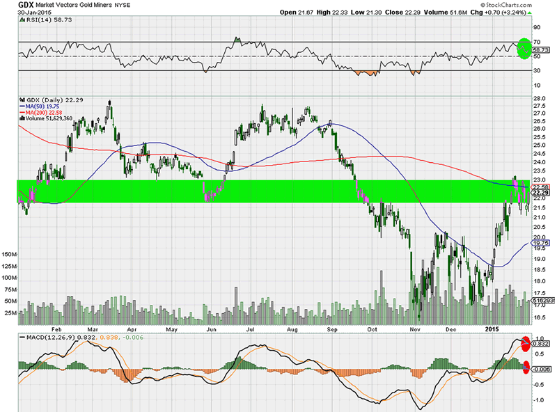
Miners have a tradition of leading the metals in both directions (higher and lower). So far, miners and metals have tracked each other closely in 2014 and in January 2015. The GDX ETF, which represents the largest gold and silver producers and mid-tiers, have the same challenges to overcome as the ones discussed on the daily gold price chart.
Conclusion
In sum, it is clear that gold has had a nice ride since its November lows, refusing to structurally break below a critical support area. An important driver has been the flight to safety, away from stocks, into “risk off” assets like the US Dollar, US Bonds and gold. This seems to be a major trend change which has the potential to become a key trend in 2015.
It is key to differentiate between gold denominated in US Dollars and non-US currencies. Clearly, gold in non-US Dollars has a much more constructive outlook because of the monstrous US Dollar rally of late (which will probably not reverse course in the near future, unless the US Fed intervenes unexpectedly).
In the short run, the gold chart setup suggests a pause. Longer term, towards the second half of this year, depending on how risk on / risk off will play out, gold could be in the position to break through its long term resistance.
Even with all the conclusions confirming each other, there is one major divergence, and it deserves a yellow flag in our opinion: COMEX futures positions. It has the potential to cap the rally, and even reverse it, at least in the short run.
Do not exclude a possibility, however small, that gold could surprise to the upside in the short run with a continued increase in safe have bids if market sentiment continues to favor risk aversion.
Going forward, it is key to monitor how futures positions in COMEX gold evolve as the price of gold changes. Also, the key trendlines, chart patterns, and technical indicators should be monitored.
We are planning to provide this analysis on a weekly basis, although exclusively to premium members. We are committed to offer maximum value. That is why we will let subscribers determine what they want to pay for our service. We really do not care whether it is 1 USD per month, 25 USD, or whatever figure in between. We just want to ask the “right” value. If you would be interested in our service, please send us a short email and indicate the desired frequency (once a week, every two weeks, once a month) and the price you believe this service is worth. Our email address: goldsilverworlds at gmail dot com.
Source - http://goldsilverworlds.com/investing/gold-gets-safe-haven-bids-but-comex-has-stopping-power/
© 2015 Copyright goldsilverworlds - All Rights Reserved Disclaimer: The above is a matter of opinion provided for general information purposes only and is not intended as investment advice. Information and analysis above are derived from sources and utilising methods believed to be reliable, but we cannot accept responsibility for any losses you may incur as a result of this analysis. Individuals should consult with their personal financial advisors.
© 2005-2022 http://www.MarketOracle.co.uk - The Market Oracle is a FREE Daily Financial Markets Analysis & Forecasting online publication.


