Everything You Think You Own Has Been Borrowed
Stock-Markets / Global Debt Crisis 2014 May 28, 2014 - 06:11 PM GMTBy: Raul_I_Meijer
 Let’s take another look at debt. We’ve probably all gotten so used to huge debt numbers that we’re losing sight of what they actually mean. In the following article, Tyler Durden made me rethink both the debt issue and the perverse consequences of 7 years of zero interest policies (ZIRP) and/or ultra low interest rates. The destruction to society is far greater than anyone seems to be willing to let on. But that doesn’t make it any less real. Here goes:
Here Is The Mystery, And Completely Indiscriminate, Buyer Of Stocks In The First Quarter
According to the most recent CapitalIQ data, the single biggest buyer of stocks in the first quarter were none other than the companies of the S&P500 itself, which cumulatively repurchased a whopping $160 billion of their own stock in the first quarter! Should the Q1 pace of buybacks persist into Q2 which has just one month left before it too enters the history books, the LTM period as of June 30, 2014 will be the greatest annual buyback tally in market history. And now for the twist. Unlike traditional investors who at least pretend to try to buy low and sell high, companies, who are simply buying back their own stock to reduce their outstanding stock float, have virtually zero cost considerations: if the corner office knows sales and Net Income (not EPS) will be weak in the quarter, they will tell their favorite broker to purchase $X billion of their shares with no regard for price.
The only prerogative is to reduce the amount of shares outstanding and make the S in EPS lower, thus boosting the overall fraction in order to beat estimates for one more quarter. Compounding this indiscriminate buying frenzy is that ever more companies (coughaaplecough… and IBM of course) are forced to issue debt in order to fund their repurchases. So since the cash flow statement merely acts as a pass-through vehicle and under ZIRP companies with Crap balance sheets are in fact rewarded (as even Bloomberg noted earlier) the actual risk of the company mispricing its stock buyback entry point is borne by the bond buyer who in chasing yield (with other people’s money) serves as the funding source for these buybacks.
Corporations buy back their own shares in order to fool investors about their performance numbers. It’s a profitable undertaking for them because they can borrow at next to nothing. A very simple calculation: if we buy and borrow $1 billion worth, what’s the effect on our balance sheet? How about $10 billion? The essence: there is a reason junk bonds are so popular: there are no ‘normal’ yields left because of central banks’ ZIRP. That’s not to say Apple issues junk, but the principle is the same. Bond buyers, e.g. money market funds, will buy anything. VIX volatility is ultra low, everyone’s doing it, what could go wrong? Well, the answer to that question might to a large extent lie in private and public debt numbers. If only because much of the money corporations borrow to do buybacks has in turn also been borrowed.
When you follow the dots, you must wonder where there is still any ‘money’ left that has not been borrowed. You may even want to wonder whether you have any of it. And you might ask how it is possible that while any and all borrowing is supposed to be collateralized, it’s hard to find ‘hard’ collateral anywhere in the cycle. We can understand that when a Chinese state owned enterprise uses one load of iron ore, bought with credit, as collateral for the next one, something’s amiss. But do we also understand that in our own economies, despite the huge existing debt, and because of ZIRP policies, there is more borrowing instead of less, as would seem to be the smart thing to do. ZIRP thus leads to more debt, and – inevitably – exponentially more bad debt. You can’t heal a sick economy with more debt if it already has historically high levels of it, but that’s still exactly what central bankers claim they try to do.
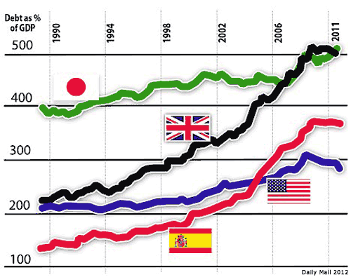
First, a Daily Mail graph from 2012 gives an indication of total debt numbers for a handful of countries
And if you think that looks bad (not that it doesn’t, mind you), there’s this 2011 Haver/Morgan Stanley one we’ve seen before here:
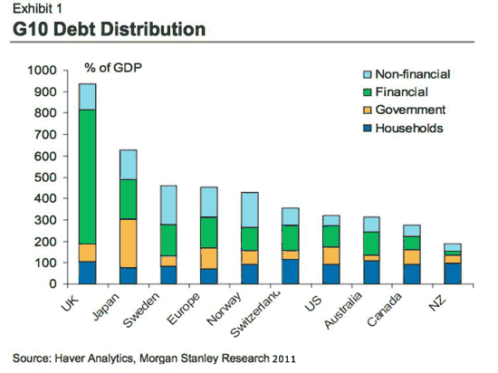
In which total debt for the US, but even more for Japan and especially the UK, are much higher than in the first graph. This may largely be due to underestimating debts in the financial sector, though it’s hard to say. And for the argument I’m trying to make, it doesn’t even matter all that much. Though I would like to say that it’s crazy that we have no better insight in bank debt than we have. We’re asked to recognize that some of our banks are so big they could bring down our entire economies, but we’re not supposed to know how close they are to doing just that. Honesty would kill us, apparently. The 2nd graph shows a huge, 600% of GDP, debt for the UK, but only perhaps 100% for the US. Oh, really? Let’s see the books.
What’s a little easier to figure out concerning all this debt are the household and government parts. Here’s a comparison:
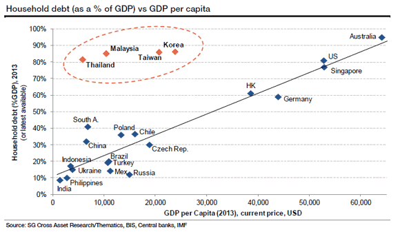
Let’s take the US as an example. There are 300 million Americans, so about 100 million families. 2013 GDP was $16.7 trillion, the graph says household debt was 80%, so there’s $13.3 trillion in household debt, or $133,000 debt per family, $44,333 per capita. That’s just household debt. Now, forgetting about the details, because we would just get stuck in discussions about which graph is better, Let’s move on to a country that stands out when it comes to household debt, the Netherlands. A 2011 Wall Street Journal graph:
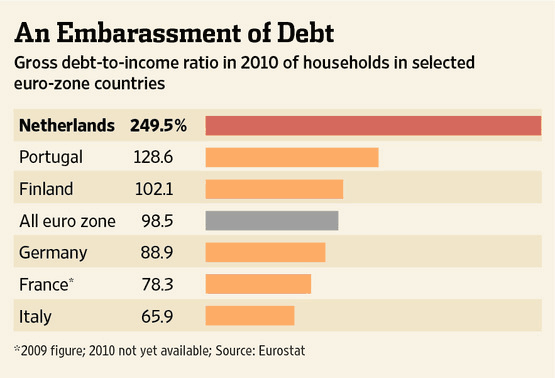
Netherlands GDP is about $800 billion. Household debt is 250% of that, or $2 trillion. Population is 16.8 million, so household debt per capita is $119,000, or $357,000 per family of 3. Again, that’s just household debt. What people, certainly in government, like to say when they see numbers such as there, is that these are just liabilities, and they have even larger assets. That seems reasonable at first sight, and after all The Netherlands hasn’t completely collapsed under its debt load yet, but it doesn’t cover the whole thing.
As Ann Pettifor said recently about Britain: people don’t sell their assets to pay their debts, they pay them out of their income. The Dutch think they have a lot of value in their homes and their pension plans. But that is true only if both retain their values. And to find out whether that is true or not, in a global economy where, as we’re seeing, everything has been borrowed, we’d have to presume that cheap credit will be available as long as these families have mortgages outstanding on their homes, while their pension plans would have to achieve the returns they aim for, which you can bet they won’t if cheap credit vanishes and asset markets sink. What will remain, however, are the debts.
Dutch public debt is relatively benign at about 75% today, $680 billion, $40,476 per capita, $121,428 per family:
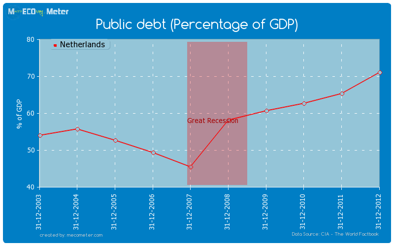
Between public and household debt, but before corporate debt, both financial and non-financial, every Dutch household is on the hook for $478.428, and every individual, newborn or 95 years old, for $159,476. That’s quite a welcoming gift into this world. And, even though the debt is divided somewhat differently between various countries, a total debt level of 300-400% of GDP is not unusual. Japan is much higher than that, but Japanese sovereign bonds are sold domestically to a large extent. And British debt is much higher because its banking sector is much bigger. The general picture is bad enough. For instance, US total debt at about 350% of GDP is close to $60 trillion, which means some $200,000 per capita, and $600,000 per family of 3.
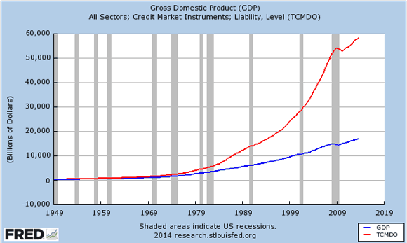
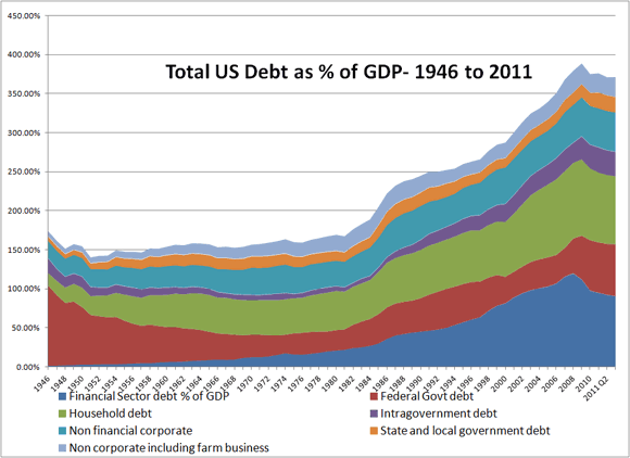
The Netherlands is about in that vicinity. Many countries are. Japan is a case to watch. Abenomics is adding a lot of yen to the public debt that is already through the roof. Sweden and Norway look much less healthy than you might think. The Mediterranean nations are – burned – toast as long as they have the euro. China’s in a debt league of its own.
There’s a nice correlation between (TCMDO) total credit market debt and the S&P in this next graph, a pretty eerie way of showing how we keep our economies looking good: by throwing more debt after what we already owe. It’s the only way we seem to have left to look good. That’s what low interest rates are for. They allow more people and corporations to borrow more so they can buy stuff they can’t afford. At those rates, who could refuse?
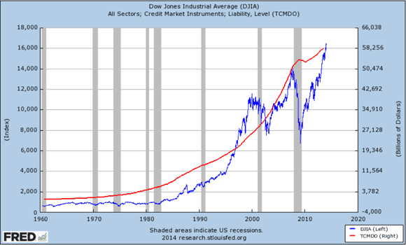
But it’s not terribly smart to think rates can stay that low forever. And when they start rising, it’ll be like we’re watching the walls of Jericho. The longer rates stay artificially low, the less believable an economy becomes. because there’s no telling who’s healthy and who’s not: cheap credit allows parties to put on a mask. It’s like everyone’s playing with a stacked deck of cards, and everyone’s winning too. But what’s going to happen when governments will need to pay a normal 5% or so on sovereign debt, and when you have to pay 7-8% on your mortgage? Why do you think home sales and mortgage originations are under such pressure? Could it be the air’s exiting the bubble? More important than when that will happen is THAT it will. And when it does, we’ll find out what our assets are worth. We already know what our debts are. And unlike asset values, they won’t vanish. Or be forgiven.
So the title of this article is dead on. Whatever part of your assets you haven’t borrowed yourself, someone else has either borrowed or borrowed against. And the value of your assets will plummet once cheap credit is no longer available and interest rates rise, while your debt stays, household, public and your share of corporate. And that debt is really all yours. A country’s government can only borrow against the assets of its citizens, and their future labor. A corporation can borrow to look better, but it can only continue to look healthy if you buy its products. But what are you going to do that with? What will be left? Debt will.
By Raul Ilargi Meijer
Website: http://theautomaticearth.com (provides unique analysis of economics, finance, politics and social dynamics in the context of Complexity Theory)
Raul Ilargi Meijer Archive |
© 2005-2022 http://www.MarketOracle.co.uk - The Market Oracle is a FREE Daily Financial Markets Analysis & Forecasting online publication.


