


NY Fed Mortgage Debt Data Says No US Economic Recovery
Economics / US Debt Nov 30, 2012 - 07:42 AM GMTBy: Raul_I_Meijer

 Let me try to keep this short and still make the point I want to make. Lately, I've seen a huge amount of people talking about an economic recovery, certainly in the US, so much so that people who disagree with that assessment are labeled "doomer" or things like that. Again. It's an easy thing to do.
I'll start with a graph from this New York Fed report. It depicts the - almost - 10-year development of US household debt, which culminates in a total of $11.31 trillion at the end of Q3 2012.
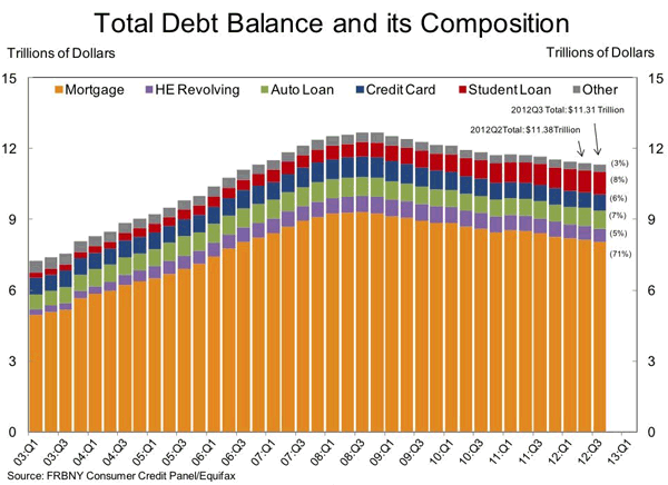
The conclusion many people draw from the graph is that total debt is "still" falling. And that is supposed to mean that things are going well, or better if you will. But when I look at the graph, that's not the first thing I notice. What I see is mortgage debt at around $5 trillion in Q1 2003 and, after a peak just over $9 trillion in Q3 2008, slightly lower, at $8.03 trillion (the report provides the exact number), in Q3 2012.
Which means that mortgage debt may have come down by about 11% over the past 4 years (while home prices, mind you, fell 33%, as per Case-Shiller), but it's still 60% (!) higher than it was in 2003. And one thing is certain: it can't stay there, and it won't. We can discuss till we're blue in the face how much it still has to go on the way south, and we can argue about how long that will take, but I would think the main point is very clear.
That is, an economic recovery in the US is not possible when households still have to deleverage to the tune of $2-3 trillion. And no, it's not different here, or this time, and no, Americans cannot carry a 40% mortgage debt increase in 10 years either, so another $2 trillion move south is really the minimum.
Home prices are rising a little, says Case-Shiller now. If that were to last, mortgage debt would even rise again. Unless enormous amounts of the old existing debt were cancelled, forgiven, restructured. Well, it took more than four years to shave off 11%. So you tell me, where would that sudden drop come from?
It's not going to happen, is it? So unless you would want to argue that $8.03 trillion is the new black, something's got to give. Rising home sales and rising home construction only serve to increase the debt. While the graph leaves no doubt that the debt must decrease. By about 25-30% from where it is now ($2-3 trillion of $8 trillion), and 40-60% of the $5 trillion it was in 2003.
Now, you could argue that people will simply need to spend a - mostly substantial - larger part of their income on paying off their mortgage debt. And many undoubtedly do exactly that as we speak. But that tears into their disposable income. And personal consumption is good for 70% of US GDP. Poof! goes your recovery.
Wait, talking about GDP, today's GDP report from the BEA came in at +2.7%. Everybody happy! Not ideal, but not at all bad either, right? I mean, compared to Europe, compared to a few years ago, it spells recovery all over. So I couldn't help laughing when I read this quote at Business Insider:
"The uptick in economic activity was driven almost entirely by the sharp upward revision to the estimate of inventory accumulation," wrote TD Securities Millan Mulraine. "The upswing in inventory alone contributed a chunky 0.89ppt to the increase in headline GDP, more than offsetting the 0.53ppt drag from personal consumption activity - which was revised lower from 1.9% to 1.4%, marking the slowest pace of consumption growth since Q2 last year.
" ..Sharp upward revision to the estimate of inventory accumulation". I'll be the first to admit I don't even really know what that's supposed to mean. But I do have an idea. And that idea is that someone's trying to make a fool out of me. Estimate? Who's doing the estimating? Based on what? An upward revision of 0.89% of headline GDP compared to last quarter, just in that inventory estimate? Is that all new stuff, or has existing inventory gone up in value? Any shadow inventory involved?
It's sort of like this quote that struck me in an interview Joe Weisenthal ran with Bill McBride of Calculated Risk last week. Which contains a lot of the very happy news I have my doubts about and that I wanted to write this article for:
... I’m pretty sure about the timing that auto sales were going to collapse a lot further, and he had some arguments on it and I went and looked and thought “auto sales also can’t go too much further, people have to replace their cars.” And so I wrote this article that says look, auto sales are near the bottom – we were at a 9 million annual rate then- I said there’s just no way – we have to be selling 12, 13,14 million because people need new cars every 5-7,8 years.
I do like Bill McBride, and his work, and I do like Joe Weisenthal, but I'm sorry, I simply don't think you can say things like that. It harks back all the way to the dry semantic discussion of what it is that people may a) need, b) demand and c) want. You can't say that people will buy cars because they need a new one every 5-8 years. Because they will still need to have the money to buy them. Demand is what people can afford, not what they want.
And if you look at overall household debt levels, as I've been doing here, you realize that there's no way a bottom or even uptick in US car sales is NOT paid for with more credit/debt. And at this point in the game, with debt levels where they are, that can hardly be a good idea. Sure, it may lift stocks for a bit, since everyone still thinks the S&P reflects something real, but that one simple graph hammers any recovery conclusion you may draw from that.
What a graph like the NY Fed one above tells you is that the low-hanging fruit has been picked when it comes to household deleveraging. On top of that, the fact that the debt itself has come down only a third of the drop in actual home prices, tells you there's much more to come on the way southbound. Or, rather, in this day and age, the way underwater.
Anyway, I just meant to say that I think this drive towards promoting the idea of recovery is way premature. All Optimism Bias all the way. People like Bill McBride may claim they simply follow the data, but I think they simply pick the data they follow. That said, if anyone has a better, re: more positive but still credible, interpretation of the NY Fed data - and graph - , I'm all game. I can do with some good news. It's been a while. But that by itself doesn't make me a doomer. I'm just not as desparate for good news as some people seem to be. I still prefer reality. For now.
By Raul Ilargi Meijer
Website: http://theautomaticearth.com (provides unique analysis of economics, finance, politics and social dynamics in the context of Complexity Theory)
© 2012 Copyright Raul I Meijer - All Rights Reserved Disclaimer: The above is a matter of opinion provided for general information purposes only and is not intended as investment advice. Information and analysis above are derived from sources and utilising methods believed to be reliable, but we cannot accept responsibility for any losses you may incur as a result of this analysis. Individuals should consult with their personal financial advisors.
Raul Ilargi Meijer Archive |
© 2005-2022 http://www.MarketOracle.co.uk - The Market Oracle is a FREE Daily Financial Markets Analysis & Forecasting online publication.