Stock Market Intermediate Target In Sight, Calm Before the Storm?
Stock-Markets / Stock Markets 2012 Jul 30, 2012 - 04:56 AM GMTBy: Andre_Gratian
 Current position of the market
SPX: Very Long-term trend – The very-long-term cycles are down and, if they make their lows when expected (after this bull market is over) there will be another steep and prolonged decline into late 2014. It is probable, however, that the steep correction of 2007-2009 will have curtailed the full downward pressure potential of the 120-yr cycle.
SPX: Intermediate trend – SPX is in a limited intermediate uptrend which is estimated to end in the first week of August.
Analysis of the short-term trend is done on a daily basis with the help of hourly charts. It is an important adjunct to the analysis of daily and weekly charts which discusses the course of longer market trends.
Daily market analysis of the short term trend is reserved for subscribers. If you would like to sign up for a FREE 4-week trial period of daily comments, please let me know at ajg@cybertrails.com
Market Overview
Although the short-term decline exceeded the 1345 target by a good margin (low 1329.24), my prognosis of the market direction was nevertheless correct. I had stated that, as long as 1323 was not breached, the intermediate trend remained intact, and the ultimate target of 1404 was still a possibility. Whether or not we eventually get there over the remaining week or so of this uptrend, my next lower target of 1387 has already been reached with the SPX making a new intermediate high in the process. From the June 4 low of 1266.74, the index has had a run of 122 points and it has completely validated the call that was made in the newsletter of June 3 entitled “MARKET LOW FORMING”.
Now, it is time to think about the potential high which is drawing nearer. We could just as well put a stop to the rally right here and start building a top formation as extending the move to the ultimate projection of 1404 in the time that remains. All along, the time frame for the conclusion of this rally has been early August. In the last letter I pointed to several negative patterns which normally appear as we draw near an important market top. In spite of the strength of last week’s rally, they have not gone away. If anything, they were strengthened in some critical areas, as you will see a little later. But we must not be in a hurry to call for a top. Last week, the daily indicators gave a weak short-term buy signal with negative divergence already forming, especially in the A/D. It’s unlikely that it will be fully erased over the next few days, but time is needed to turn the buy signal into a sell.
Let’s look at charts!
Chart analysis
Here is a Daily Chart of the SPX. Below it, I have placed the McClellan oscillator. There is not too much wrong with the price action. Since June 4, the index has been making a series of higher highs and higher lows. Last week, it made a new high, which keeps the uptrend going. The momentum indicator started to show some weakness when it made a new low on the drop to 1329, which it is confirming (so far) by being unable to clear its former high decisively while the SPX has made a new high.
That negativity can be neutralized quickly if the indicator moves higher next week, but it won’t be so easy for the breadth indicator to recover its uptrend. Instead of participating in last week’s strong rally, it is barely positive and still in a downtrend. It would take an exceptional amount of market strength over the near-term to get it back in gear with the price indicator.
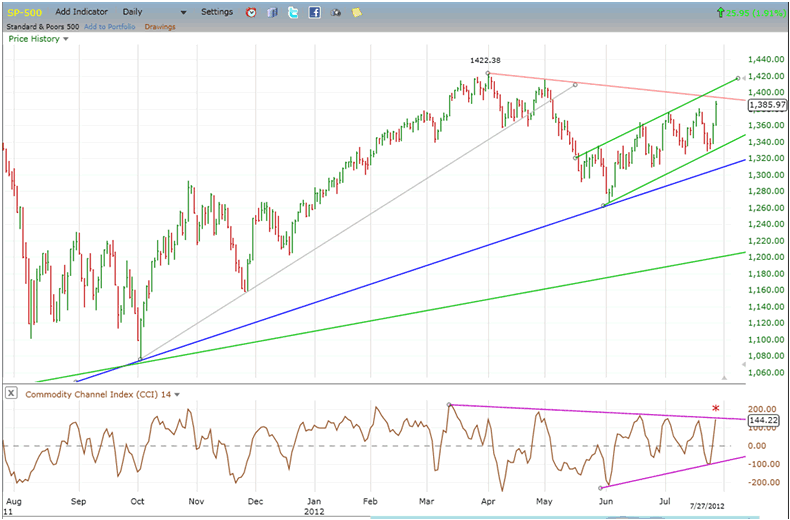
We can’t totally discount that possibility. The rally was the result of comments made by the president of the ECB which stated his determination to save the Eurozone. What if, on Wednesday, the Fed follows up with a positive statement about implementing QE3? Would that completely alter the scenario which currently calls for a top in the beginning of August? We’ll see!
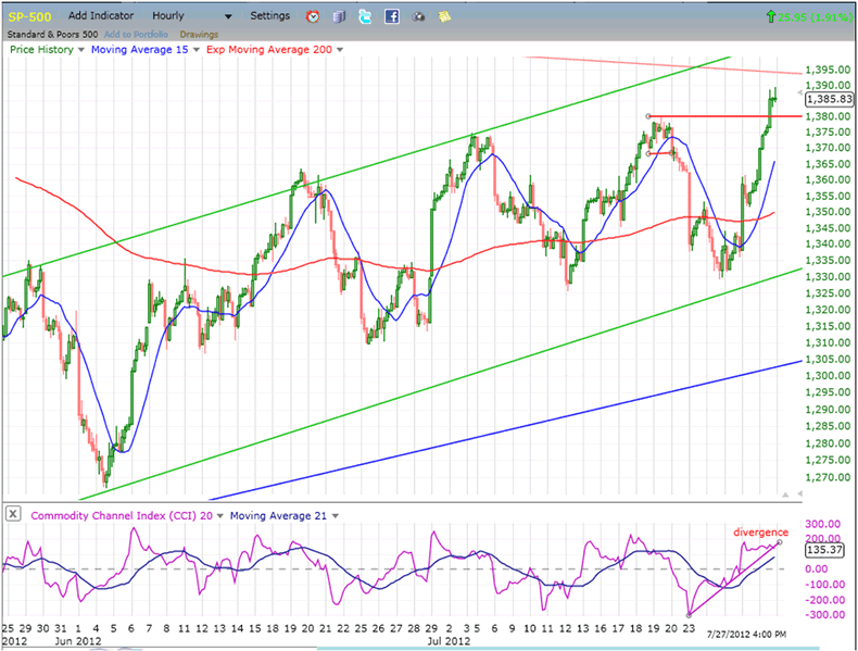
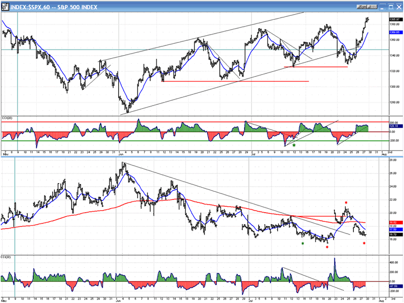
Next, we look at the SPX Hourly Chart. The same trend lines that are on the daily chart are also shown here, but amplified by the smaller time scale. The former high has been exceeded by 5 points in a huge 30+-point wave which kept the oscillator in a flat state of negative divergence. It can’t remain that way forever and with the index having now met its projection target and trend line resistance directly above, it’s probably time to pull-back.
Considering the position of the moving averages, the price is so far above them that it’s unlikely to give a sell signal on an initial retracement. That fits in with the ideal time frame for a high being still a few days away.
Cycles
“The only thing to add for the short-term is that, as mentioned above, minor cycle lows are expected around the 25th.”
The next cycle cluster takes place in early August. It is expected to be a market high, but if it turns out to be a low instead, we will probably not be done with the intermediate uptrend.
Breadth
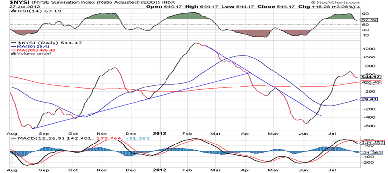
Below is the NYSI (Summation Index, courtesy of StockCharts.com). A minor pull-back of the index has enabled the RSI and MACD to correct their overbought position. With a new high in the price index, it puts both the NYSI and its indicators in a position of negative divergence from which they will have to recover quickly if they want to eliminate the potential sell warning that it has created. Considering the position of the NYMO, this will not be easy unless next week is punctuated with significant strength in the A/D.
Sentiment Indicators
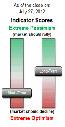
Based on this indicator, the short-term is over-extended which is what shows up above, on the hourly chart indicator. But the longer-term indicator remains neutral and gives no hint of which way the market should move on an intermediate basis. This could signal that, even if the intermediate trend comes to an end (as expected) in the first week of August, the following correction will not be all that severe.
The VIX (volatility index)
The first really significant indication that the move from 1267 is coming to an end appears when we compare the SPX to the VIX on the following charts (courtesy of Qchart).
Ever since the beginning of the intermediate uptrend which started on June 4, VIX has made short-term trend patterns contrary to that of the SPX, thereby supporting the uptrend of the latter by a downtrend of its own. On June 24, that trend began to change. The SPX made a fractional higher low while the VIX surpassed its former high by a fair margin. Now, as the SPX makes a new high, VIX refuses to confirm it with a new low of its own. This is a clear sign of negative divergence, the worst since the SPX uptrend started, and a red flag.
XLF (Financial SPDR)
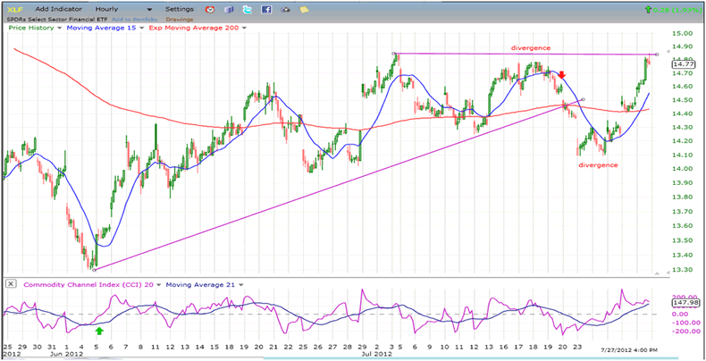
Up until the last move, negative divergence was beginning to assert itself relative to the SPX on the XLF. If this had continued into this last thrust, we could have concluded that an important top was forming on the Latter, but since the XLF managed to make a new short-term high this past week, we will have to change the relativity to neutral.
The Weekly trends comparison is anything but neutral. The SPX exceeded its 2011 high by a large margin, while the XLF made a lower low. On the intermediate to long term time frame, there is no question that XLF has lost a lot of ground to the SPX. In 2007, XLF stopped making new highs about seven months before the SPX did. Are we witnessing a recurrence of an early warning for what lies ahead?
BONDS
Last week, after trading in the same direction as the SPX for about six weeks, TLT decided to reverse course, suddenly giving up five points in two days. That brought it to a support level and it regained part of its loss on Friday. It’s too early to know if that is just a normal correction in an uptrend, with
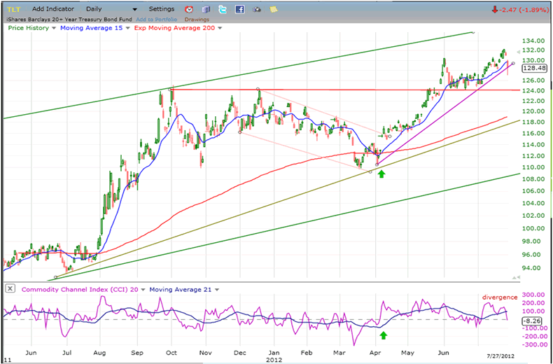
higher prices ahead. The P&F chart count across the re-accumulation level of 126 gives it a potential for 137. That would seem to put the odds in favor of this retracement being nothing more than an interim correction. Let’s see if that’s what it turns out to be over the next couple of weeks.
UUP (Dollar ETF) Daily Chart
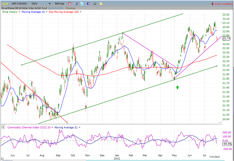
The action of UUP looks very much like that of TLT’s, last week. No doubt, both were affected by European Central Bank president Draghi’s pledge that he would not let the Eurozone fail. His words sent the euro and equity markets around the world soaring, and bonds and the dollar moving sharply in the opposite direction. It remains to be seen if these words will have more than an ephemeral effect.
GLD (ETF for gold)
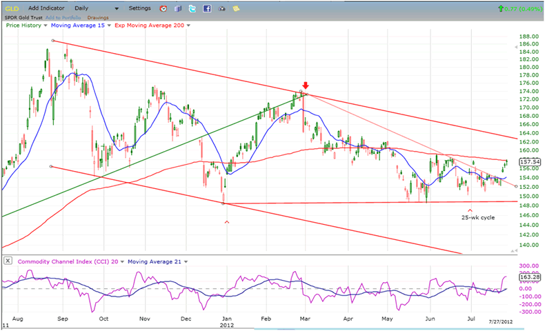
Gold also profited from the bounce in the Euro, but by the end of the week, it looked as if it was already running out of steam. That could suggest that massive short-covering occurred as a result of the pronouncements by the ECB president, but not much more.
The 5-point rise by GLD quickly brought it up against the bottom range of a thick layer of resistance that extends all the way back to September 2011. It is also butting its head against its 200-DMA. That combination should be enough to repeal its effort at ending its intermediate correction, especially if the substance of the sudden excitement quickly evaporates.
Like the market, it may be in need of some helpful words by the Fed on Wednesday, to keep its uptrend going.
FXE (Euro Trust ETF)
This is the culprit which was responsible for all the bullish market commotion last week, and this is what I wrote about the Euro in my last newsletter: “Positive divergence is showing in the weekly, daily, and hourly indicators, and FXE has met an intermediate projection, which suggests that it is more likely to find support in this area than to continue declining.” Clearly, the index was primed for a rally from its low and the ECB president provided the trigger.
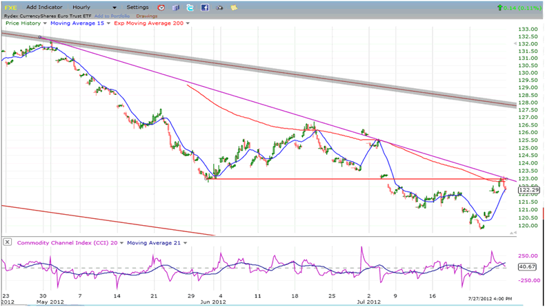
And now what? Will it keep going, or will it fall back to re-test its low of 120. In fact, it may already have started to do so in the last four hours of trading, and for good technical reasons. Look at the chart! As a result of Friday’s surge, it bumped its head on some pretty severe overhead resistance, a junction produced by a former low, a downtrend line, and the 200-hr MA. Before it keeps on going, it will probably have to consolidate for a while (at the very least) to gather the energy needed to move through all that resistance.
It’s possible, and even likely, that there was little substance behind the words that were spoken by Mr. Draghi. He only stated his intentions and it will take more than that to mend the Eurozone problems. The move of the Euro may have only been a flash in the pan and, as it settles back, so will all the areas affected by its sudden spike.
Instead of commenting on USO this week, I would like to show another chart which, in concert with the VIX chart (above) should give concern to those who are bullish on the market.
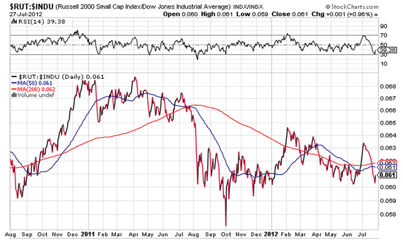
Below is a relative strength chart of the Russell 2000 vs. the Dow Jones Industrials (courtesy of StockCharts.com). The former represents small caps, and the latter, large caps. It is pretty well accepted that when small caps underperform large caps, it is usually a precursor of an important market top. With that in mind, let’s analyze the following chart.
Although this is not shown on here, from the stock market low of 2009, the two indices performed similarly until February 2012. From that point on, the Russell started to lose relative strength to the DJIA which went on to make a new high, while the Russell failed to do so. Then from April 2012 on, things started to get worse. The chart shows that the relative strength of the Russell declined sharply until June 4th, when it made a valiant effort to get back in sync with the large cap index, but this only lasted for one month. During the month of July, RUT seemingly lost all its RS and has already declined to the lows of early June. Its relative weakness appears to be accelerating at a pretty fast clip.
This is not a positive picture for the market, especially if you consider the negative divergence which has started to creep up in VIX. It’s time to exercise some caution.
Summary
Last week, the Market Oracle appropriatelygave my newsletter the heading of “Stock Market Gathering Storm Clouds”. The clouds have not gone away but have grown a little darker instead. However, the rain has not yet begun to fall and the wind is still relatively calm – the calm before the storm?”
Andre
FREE TRIAL SUBSCRIPTON
If precision in market timing for all time framesis something that you find important, you should
Consider taking a trial subscription to my service. It is free, and you will have four weeks to evaluate its worth. It embodies many years of research with the eventual goal of understanding as perfectly as possible how the market functions. I believe that I have achieved this goal.
For a FREE 4-week trial, Send an email to: ajg@cybertrails.com
For further subscription options, payment plans, and for important general information, I encourage
you to visit my website at www.marketurningpoints.com. It contains summaries of my background, my
investment and trading strategies, and my unique method of intra-day communication with
subscribers. I have also started an archive of former newsletters so that you can not only evaluate past performance, but also be aware of the increasing accuracy of forecasts.
Disclaimer - The above comments about the financial markets are based purely on what I consider to be sound technical analysis principles uncompromised by fundamental considerations. They represent my own opinion and are not meant to be construed as trading or investment advice, but are offered as an analytical point of view which might be of interest to those who follow stock market cycles and technical analysis.
Andre Gratian Archive |
© 2005-2022 http://www.MarketOracle.co.uk - The Market Oracle is a FREE Daily Financial Markets Analysis & Forecasting online publication.


