Stock Market Glass Ceiling Revealed
Stock-Markets / Stock Markets 2012 Jan 28, 2012 - 03:12 AM GMTBy: Joseph_Russo
 Following up on our most recent post "Glass Ceiling Bullish or Bearish," today, we unveil the two markets illustrated in that feature.
Below, we display the two phantom price charts presented for side-by-side comparison. We had mentioned that both were popular indices, and hinted that we had rendered one of the charts with monthly closes and the other using a chart of daily closes.
We consider one of these a potential analog to present conditions.
Analog an'a'log (noun) U.S CHEMISTRY A chemical with a similar structure to another but differing slightly in composition.
Though fascinating to discover, ponder, and observe, all analogs inevitably blow-up. Despite this truth, analog comparisons can be useful in observing how past price patterns resolved.
One can also compare what conditional similarities and foundational differences exist relative to the analog chart of the past and the doppelganger price pattern of the present.
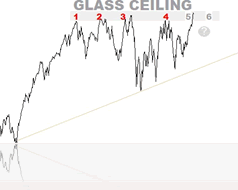
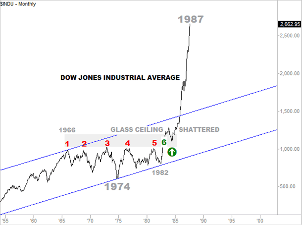
Above, the chart on the left renders monthly closes of the Dow Jones Industrial Average. The Dow's first encounter with its "glass ceiling" occurred in 1966, while its sixth such encounter took place at the tail end of 1982.
The chart below illustrates how the Dow resolved this pattern, not once looking back in the five years after it had finally shattered its glass ceiling on the sixth try in November of 1982.
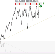
Above, the small chart on the right renders daily closes of our modern-day doppelganger, the NASDAQ 100. The NASDAQ 100's first encounter with its "glass ceiling" occurred on February 16, 2011, while its fifth and recent encounter took place on January 18, 2012.
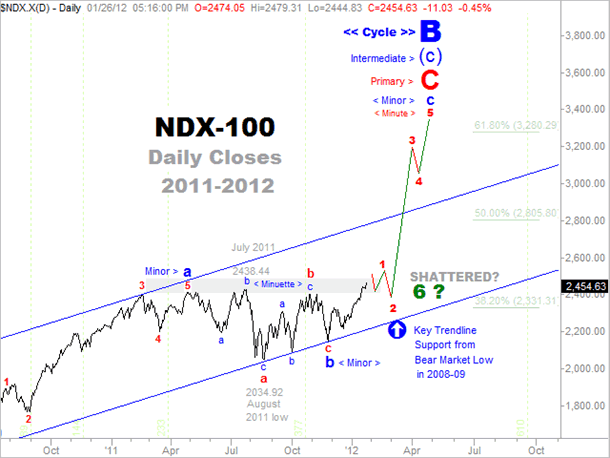
The chart below illustrates the NASDAQ 100 currently amid its fifth attempt within the last twelve months at breaking out above, and shattering its overhead glass ceiling.
If the NASDAQ-100 produce an outcome with any semblance to the analog depicted in the 1966 - 1982 Dow, the prospective wave count, amplitude, and degrees of trend noted below, will jettison the NDX toward the 3300 level in no time flat.
Perhaps, insofar as its 83.4% two-year wipeout in 2002, which clearly broke its degree of trend correlations with the Dow, the NASDAQ may be about to embark upon another disconnect of sorts, one that may seek to realign its broken trend correlation with the Dow and S&P.
After all, another mini tech-boom that rockets the NDX away from the pack toward 3000, will merely amount to a common 61.8% retracement of its previous two-year wipeout in 2002, which we consider as the base terminal of Cycle Degree "A."
Here are a few interesting facts about the NASDAQ disconnect during its unrelenting bubble-spike into 1999, its total destruction in 2002, and its stunning full recovery last year from the 2008 bear market lows.
- In the bear market of 2002, the NASDAQ was completely wiped out (-83.4%) while the Dow lost only 38% of its value.
- In 2007, the Dow reached a new historic all-time-high while the NASDAQ struggled with a paltry 38.2% retracement of its complete annihilation in 2002.
- In 2008-09, the NDX held above its 2002 lows, while both the Dow and S&P breached well below their respective 2002 lows.
- In 2011, the NDX retraced 100% of its 2008-09 declines, and trades higher today than at its peak in 2007. We cannot say the same for the Dow or the S&P 500.
Comparing Analogous Fundamental Conditions
So what was foundationally similar in the period spanning 1966 - 1983 for the Dow relative to the (twenty-times-condensed) doppelganger illustrated in the NASDAQ 100 in 2011?
For one thing, in the late 70's and early 80's, the world was enmeshed in a situation that is somewhat analogous to the conditions it faces today.
- Tension in the Middle East
- High Energy Prices
- High Gold Prices
- Runaway Inflation
- Rising Interest Rates
Looking at the list above, it appears that we are only missing two crucial ingredients, runaway inflation, and rising interest rates.
Institutions like the Fed, ECB, World Bank, or the IMF, who are in positions of influence over these things; fancy themselves as having the necessary control over all aspects of what they are doing to address the world's current problems; are they correct in their assumptions or are they wrong.
One can argue that global and financial challenges occurring between 1966 and 1982 were just as dire if not more so than they are at present.
Yet somehow, perhaps with the assistance of Nixon moving the world completely off any remnant of the Gold Standard, we managed to unleash a powerful and sustained inflation, which provided the miracle-elixir that enabled economies to breakthrough their seemingly insurmountable challenges.
Closing Thoughts
Will events unfold differently this time? Though the past and present may rhyme to some extent, in our view, one must consider two profound foundational differences.
The first is that the hyper-inflationary effects unleashed by Nixon in 1971 removing the last remaining anchor to Gold, (which provided some level of efficient free-market moderating effects on global trade) has expended its entire payload.
The second, is that the flawed and distorted application of a centrally planned Keynesian approach to managing global economies void of tangible anchors or restraints, has created unfathomable levels of debt from which there is no escape and no turning back.
The most likely reason that we are lacking runaway inflation and rising interest rates is due to global banking cartels going "all-in" and fighting the free-market with their perpetually flawed interventionist policies in attempt to once again avert, delay, or subdue the markets natural deflationary forces of unwinding and cleansing itself of excessive malinvestment.
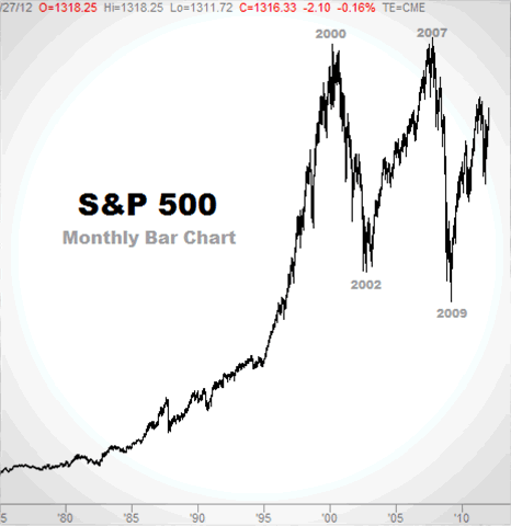
Lastly, we leave you with another puzzle to play with. Given all that is known about flawed monetary policy and its effect on nominal values, from an Elliott Wave perspective, how would you label the S&P-500's 2000, 2002, 2007, and 2009 market terminals relative to their respective degrees of trend.
Until next time,
- The first thirteen non-subscribers (all of our current subscribers already know the answers) who get the two markets correct will get a complimentary issue of our Near Term Outlook.
- The first eight (non-subscribers) who get the two markets and analog outcome correct will get a complimentary issue of EWT’s Charting Bundle.
- Finally, the first five (non-subscribers) to also provide the general time-periods for each of the charts, will get a complimentary issue of the Chart-Cast Pilot.
We will give you one last hint. One of the indices is a chart of daily closing prices, while we have rendered the other using a chart of monthly closes.
Now post/mail in your answers and we will report all winners with the follow-up feature and analysis by the weekend.
Until then,
Trade Better/Invest Smarter
By Joseph Russo
Chief Publisher and Technical Analyst
Elliott Wave Technology
Email Author
Copyright © 2011 Elliott Wave Technology. All Rights Reserved.
Joseph Russo, presently the Publisher and Chief Market analyst for Elliott Wave Technology, has been studying Elliott Wave Theory, and the Technical Analysis of Financial Markets since 1991 and currently maintains active member status in the "Market Technicians Association." Joe continues to expand his body of knowledge through the MTA's accredited CMT program.
Joseph Russo Archive |
© 2005-2022 http://www.MarketOracle.co.uk - The Market Oracle is a FREE Daily Financial Markets Analysis & Forecasting online publication.


