The U.S. Federal Government Debt and Deficit - Congressman, Heal Thyself!
Economics / US Debt Jun 15, 2010 - 02:47 PM GMTBy: Paul_L_Kasriel
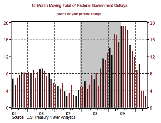
 On one of this past Sunday's morning political talk shows, I heard a congressman say that the runaway federal government spending had to stop. Congressman, sir, although the spending continues to increase, the rate of growth in that spending has slowed enormously. In the 12 months ended May 2010, the accumulated spending by the federal government totaled $3.437 trillion, enough to keep the late Senator Dirksen spinning in his grave for near eternity. Although an admittedly high level, this 12-month accumulated total federal spending was only 2.6% higher than the 12-month accumulated total federal spending for May 2009 (see Chart 1).
This is quite a deceleration in growth from the 15.3% registered for the 12 months ended 2009 vs. 2008, near the trough of the last recession. Moreover, the 2.6% year-over-year growth in the 12-month accumulated total federal outlays in May 2010 is considerably lower than the 8.4% year-over-year growth in the 12-month accumulated total federal outlays in May 2006. Why do I mention May 2006? Because at that time, the congressman's political party controlled Congress and the White House. Congressman, heal thyself!
Chart 1
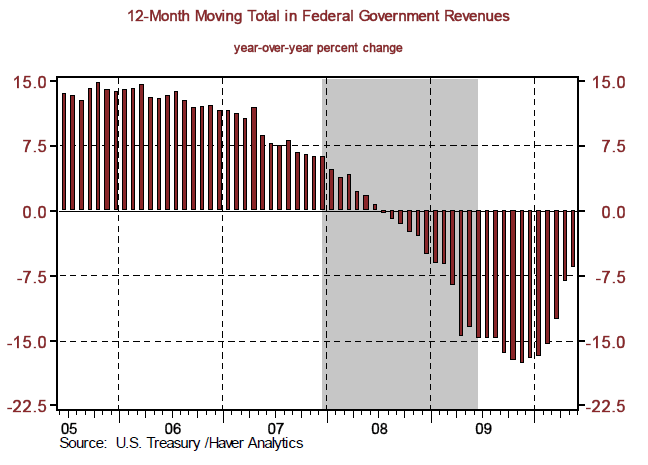
At the same time that the growth in federal outlays has slowed dramatically, the rate of contraction in federal revenues also has slowed dramatically. The year-over-year percent change in the 12-month accumulated federal revenues in May 2010 was minus 6.6%, a slower rate of contraction than the 13.6% contraction for May 2009 (see Chart 2).
Chart 2
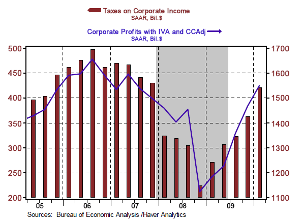
Why the slowdown in that rate of growth in federal spending and the rate of contraction in federal revenues? The economic recovery, for one thing. As the economy started to grow again in the second half of 2009, the rate of growth in government transfer payments to households, such as unemployment insurance benefits, has slowed sharply (see Chart 3). Also, as the economic recovery has set in, corporate profits and, thus, corporate tax receipts have picked up (see Chart 4). Again on the spending side, there has not been a repeat of the $500 billion+ in TARP expenditures in 2008.
Chart 3
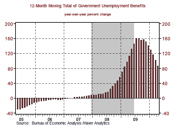
Chart 4
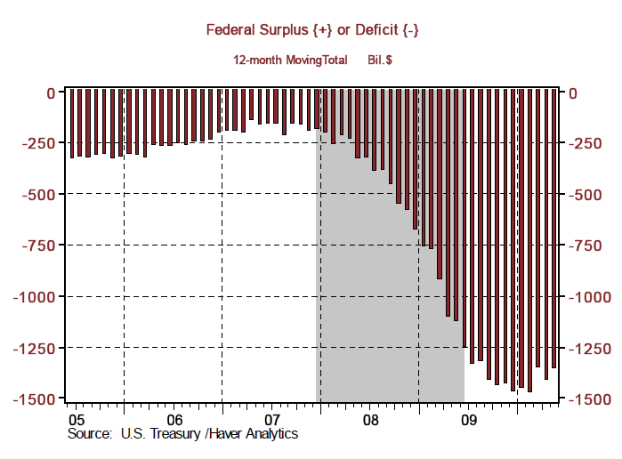
Barring the economy slipping back into another recession, which I do not believe is likely, the worst of the cyclical deficit is behind us (see Chart 5). Now, if the aforementioned congressman will offer some constructive reforms to curb the projected increases in Medicare spending over the next 20 years, spending that he and his fellow baby boomers will be the beneficiaries of, then the structural deficit issue will have been solved. As an aside, it was when the congressman's political party controlled Congress and the White House that legislation went into effect (January 1, 2006) increasing the "out-year" projections of Medicare spending, the unfunded entitlement program known as Medicare Part D. We are waiting for your constructive reform proposals on Medicare, Congressman.
Chart 5
U.S. Economy Still Starved for Credit Creation
Last week, the Fed finally got around to releasing its flow-of-funds data for the first quarter of 2010. Based on the Fed's first guesstimates (regrettably, the Fed will keep revising these data over the coming years), the U.S. economy remained starved for credit emanating from the financial sector during the first quarter. Chart 6 shows that the most important of the financial intermediaries - commercial banks, money market mutual funds, ABS issuers and funding corporations (funding subsidiaries, nonbank financial holding companies, and custodial accounts for reinvested collateral of securities lending operations) - continued to contract their net lending in the first quarter to the tune of about $1.6 trillion at an annual rate.
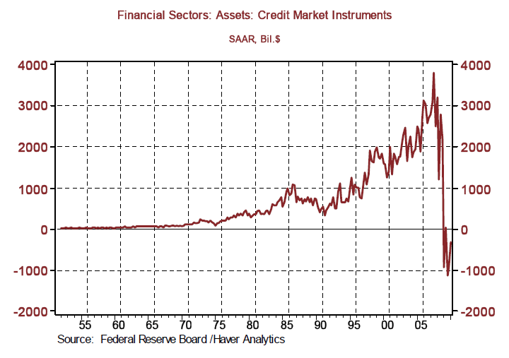
Although that is an improvement over last year's fourth-quarter annualized contraction of $1.7 trillion, it still marks the fifth consecutive quarter of net credit contraction by this important group of intermediaries. Even when the entire financial sector is taken into consideration, including the Federal Reserve, net lending continued to contract through the first quarter of this years, albeit at a much reduced annualized rate of only $334.3 billion. But as Chart 7 shows, from 1952 through 2008, net lending by the entire financial system had never contracted. I consider this financial sector net credit contraction the major headwind for the economy, preventing a more normal robust cyclical recovery.
Chart 6
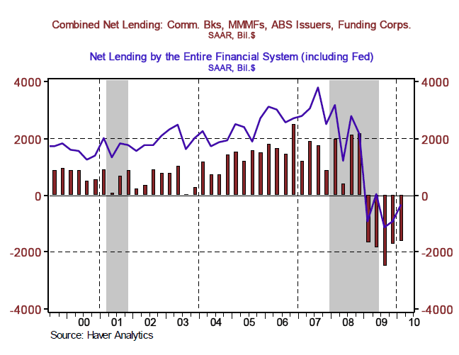
Chart 7
Money - Supply vs. Demand
Chart 8 shows the year-over-year percent change in currency, deposits and money market mutual funds held by U.S. households. It also shows this concept of money as a percent of total U.S. household financial assets. The year-over-year change represents the growth, or lack thereof, in the supply of money, which, by the way, is related to the amount lending banks are engaged in. Money held as a percent of total financial assets is related to the demand (to hold) for money. When households are more confident about expected returns on riskier financial assets, they reduce their demand for money and vice versa.
Chart 8
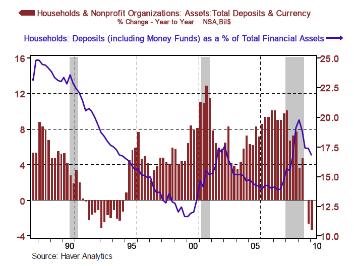
Notice that there was a steady downward trend in the ratio of money-to-total financial assets from the late 1980s through 1999, when the NASDAQ was topping out. Since then, there has been an uneven rise in this ratio, perhaps as investors have become more risk averse after the NASDAQ implosion and the recent bear market in equities. Now, let's look at what has happened to the supply of money. In the first half of the 1990s, this concept of money was contracting. Similarly, this concept of money is contracting once again starting in the third quarter of 2009. In the early 1990s, when the supply of money was contracting, the demand for money (the ratio of money-to total financial assets) also was falling.
Thus, the restrictive effect of a contracting household money supply was partially offset by a declining household demand for money. Today, the supply of money is contracting and, in recent quarters, the demand for money has declined. But the decline in the demand for money does not appear to be of the same trend nature as what occurred in the early 1990s. Moreover, with the recent correction in the global equities markets, U.S. households could become more risk averse, thus increasing their demand for money. If the supply of money does not start increasing soon and/or the demand for money does not continue declining, U.S. economic activity could slow significantly.
Now Is the Time to Buy a House, Not 2005-2006
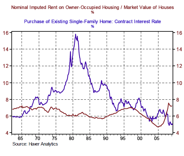
By comparing the imputed rent on owner-occupied housing with the market value of that housing, a "yield" on owner-occupied housing can be calculated. That yield on owner-occupied housing is shown in Chart 9 along with the contract mortgage interest rate charged on loans for the purchase of existing homes. As shown in Chart 9, the norm is for the mortgage interest rate to be above the yield on owner-occupied housing. In the third quarter of 2008, however, the yield on housing rose above the mortgage rate and has remained so through the first quarter of 2010. Although the purchase of an owner-occupied house may be an even better investment in the coming quarters, that purchase was a much better-than-normal buy in the first quarter of 2010 - and a considerably better buy than it was in 2005 or 2006.
Chart 9
Deleveraging? Not Nonfinancial Corporations
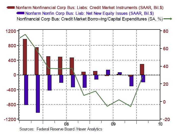
We hear a lot of talk these days about private-sector deleveraging. Although household leverage ratios are falling - probably not voluntarily but because no one will lend to households - the ratio of debt to assets for nonfinancial corporations has climbed to a post-war record high (see Chart 10). Chart 11 illustrates what nonfinancial corporations were up to in the first quarter. They issued a net $289 billion of debt at an annualized rate and "retired" a net $208 billion of equity at an annualized rate. The solid line in Chart 10 represents corporate debt issuance as a percent of capital outlays. When the percentage is positive and rising, it indicates that corporations are issuing debt for reasons other than buying capital equipment. It is clear that in the first quarter, nonfinancial corporations were issuing debt to retire equity. This bit of financial engineering increases their earnings per share and rewards stockholders at the expense of bond holders.
Chart 10
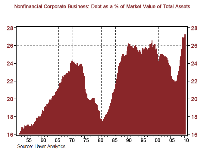
Chart 11
by Paul Kasriel
Paul Kasriel is the recipient of the 2006 Lawrence R. Klein Award for Blue Chip Forecasting Accuracy
by Paul Kasriel
The Northern Trust Company
Economic Research Department - Daily Global Commentary
Copyright © 2010 Paul Kasriel
Paul joined the economic research unit of The Northern Trust Company in 1986 as Vice President and Economist, being named Senior Vice President and Director of Economic Research in 2000. His economic and interest rate forecasts are used both internally and by clients. The accuracy of the Economic Research Department's forecasts has consistently been highly-ranked in the Blue Chip survey of about 50 forecasters over the years. To that point, Paul received the prestigious 2006 Lawrence R. Klein Award for having the most accurate economic forecast among the Blue Chip survey participants for the years 2002 through 2005.
The opinions expressed herein are those of the author and do not necessarily represent the views of The Northern Trust Company. The Northern Trust Company does not warrant the accuracy or completeness of information contained herein, such information is subject to change and is not intended to influence your investment decisions.
Paul L. Kasriel Archive |
© 2005-2022 http://www.MarketOracle.co.uk - The Market Oracle is a FREE Daily Financial Markets Analysis & Forecasting online publication.


