The End of the World History Stock Market Chart : Big Pattern = Big Move
Stock-Markets / Stock Market 2021 Jan 26, 2021 - 12:33 PM GMTWe hear so much negativity from both sides of the isle that if a Republican is elected to the presidency then everything is going to hell in a hand basket and if a Democrat is elected then you will be better off to find another country to live in because things will be so bad in the US you won’t want to live here anymore. Conspiracy theories are running so rampant right now that the average American doesn’t know what to believe.
Beside the stock markets giving me financial freedom it has also taught me how to think for myself which can be pretty tough these days. You’ve heard me say this a million times, “playing the stock market is a game of psychological warfare more than anything else.” A good example right now is how most members keep wanting to short the stock markets because everything they read says the markets can’t keep going up for a myriad reasons.
The Great Rescission that began in 2007 and lasted until early 2009, scarred many investors for a lifetime. I saw the same thing with my dad who grew up in the Great Depression. During the 1990’s bull market, which was the greatest bull market of all time at that time, he could never understand how the stock markets could keep going up because of all the fundamental reasons he thought should stop secular bull market dead in its tracks. We had some great debates on the direction of the markets but I wasn’t scarred emotionally by what happened in the Great Depression so I had an open mind and could view the charts with an objective point of view.
One of the hardest things to do as a human being is the ability to change how we perceive things once they become ingrained in our psyche. We are who we are by everything that has ever happened to us which makes us a unique individual. The thing is the stock markets don’t care about our uniqueness it only cares about taking every last penny it can get from you.
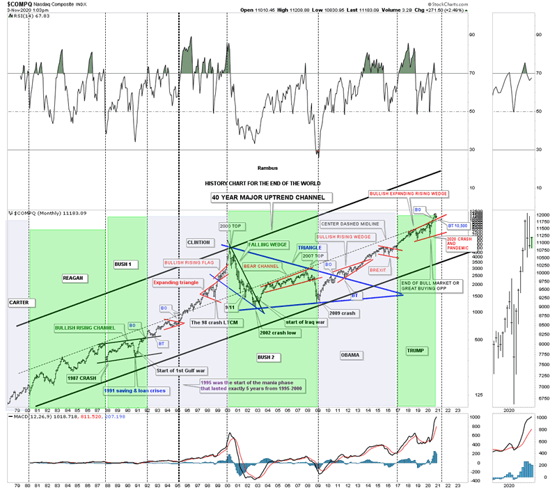
Here is a Market Update I did on Election Day November 3, 2020 which shows the End of the World History Chart.
November 3, 2020:
I’m headed out to do my civic duty and vote. I have no idea how long it will take so I’m going to post this chart now.
For those that have been with Rambus Chartology for awhile know about this long term monthly chart that goes all the way back to the late 1970’s which I call, The End of the World History Chart. It is a satirical look at all the important lows that felt like the end of the world if you were trading back then. Every time there is an end of the world type of event I just add it to the chart to see what happens. The 2020 crash was the latest end of the world event in which I stated, “end of the bull market or a great buying opportunity,” shortly after the low was in place.
The center dashed midline has been holding resistance for the last 20 years or so. I can’t tell you how long I’ve been waiting for the breakout above that 20 year center dashed midline which I believe could lead to a rally up to the top rail of the major uptrend channel similar to what we saw back in 1995. When the center dashed midline gave way back in 1995 that was the beginning of the parabolic rise into the 2000 secular bull market top which took five years to complete. It is simple, above the center dashed midline is bullish and below is bearish, everything else is noise.
I recently added the presidential cycles to this chart so you can see how the COMPQ responded to a Republican or Democratic president. I won’t go into detail as it is pretty self explanatory. The green shaded areas show what the market did when a Republican was in office and the blue shaded areas show what the stock market did during a Democratic president.
I’m going on record right now with my prediction on what the stock market is going to do if a Republican or Democrat is elected. One year from today the stock market is going to be higher whether a Republican or Democrat is elected. We are not going to see the end of the world or the end of our Democracy regardless of who is elected.
My cup has been and still is half full regardless of all the conspiracy theories that are so widespread right now which probably seems pretty naive to many of you. We are entering into a technological revolution that is just being born that is going to change the world in ways we can’t even imagine yet whether we like it of not. I’ve touched on it a time or two in the past and nothing has changed my outlook on what is about to take place over the next 5 to 10 years.
For those that want to fight the last battle and expect the world to come to an end be my guest. I’m going to look to the future which is not going to be perfect by any stretch of the imagination, and welcome change which is the lifeblood of being a human being.
I hope you take the time to cast or vote if you haven’t already done so. All the best…Rambus

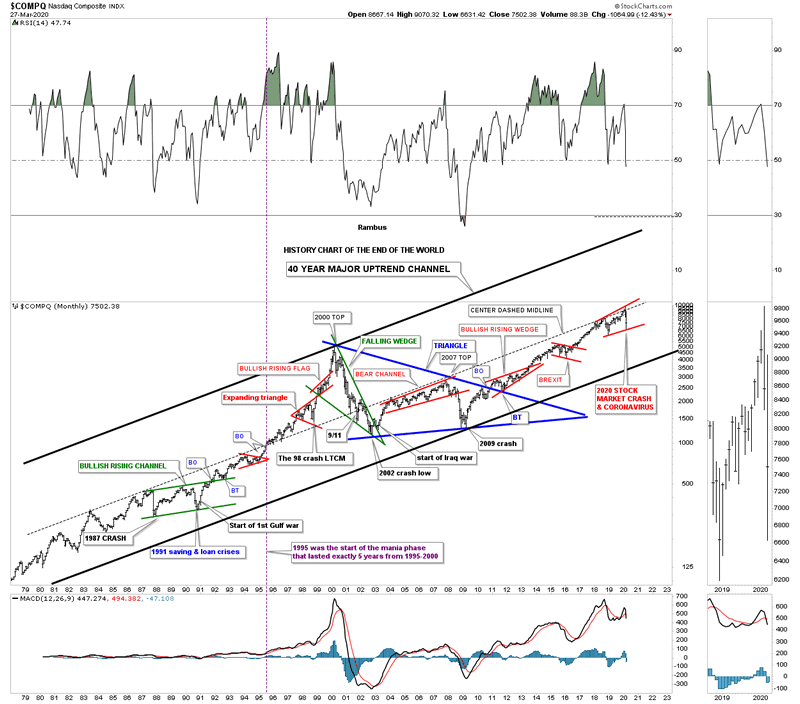
Below is a post I did back on March 29, 2020 showing the 2020 crash low with the price action still trading below the center dashed midline of that massive uptrend channel. Note the red bullish expanding rising wedge consolidation pattern that formed just below that 40 year S&R line which is classic Chartology.
March 29, 2020 only 10 months ago:
There are just a handful of events in ones lifetime that are truly history making in their magnitude. For instance the 1918 Spanish Flu pandemic, the 1929 stock market crash, Pear Harbor, the 1987 stock market crash and 911 to name a few. When all of those historical events took place it felt like the end of the world for those that were living in that time period. How could our world ever be the same after everything around them was crashing?
Since the beginning of 2020 we are currently witnessing two historical events going on at the same time that people in the future will be analyzing in detail, the 2020 Coronavirus pandemic and the 2020 stock market crash. As citizens of the world we are truly living smack dab in the middle of these two history making events which we won’t know how things are eventually going to turn out until they come to an end. In a year or two from now it will become very clear what the outcome was, but when you are living through these historical events it can feel like the end of the world.
Years ago I built a long term monthly chart for the $COMPQ that goes back 40 years which I call, “History Chart of The End of The World.” This chart shows all the important end of the world events going back to 1980.
If you look at this chart starting at the bottom left hand corner I’ve labeled all the important historical events that felt like the end of the world if you were trading in the markets back then. There was one day during the 1987 crash that is still the biggest one day percentage decline in history where the markets were down around 23% or so.
The COMPQ quickly recovered from that low and rallied into the September 1989 high which began another correction caused by the Saving and Loans crisis. If that was’t bad enough a year or so later began the start of the Gulf war which the markets shrugged off as not important. Those 3 history making events created the green bullish rising flag with a nice clean breakout and backtest. Less than 10 years later the COMPQ finally put in its bull market high. Just before the bull market high was established there was one more historical event which most have forgotten about, but at the time the markets were really rattled by the 1998 LTCM, Long Term Capital Management, debacle.
After the 2000 top was completed came the first real bear market since the 1970’s as shown by the green falling wedge. The percentage decline for the COMPQ was massive and it felt like the end of the world back then. Many thought another Great Depression was beginning that would last for years to come. Again, if that wasn’t bad enough then came the start of the Iraq war at the bear market low. How could the markets ever rally with all this bad news? The markets did find a way to stabilize and found a way to rally higher into the 2007 housing and banking crises. At the November 2007 high began the infamous bear market decline that this time for sure was going to put the US in the next Great Depression.
As the INDU and the SPX began their great bear market decline taking out their 2002 lows the COMPQ on the other had declined far less because its 2000 to 2002 bear market was much more severe than the INDU and the SPX which produced a clear positive divergence for the tech stocks. Finally in March of 2009 the bear market that was going to last for many years came to an abrupt end and the SPX rallied strongly out of that 2009 bear market low creating the biggest bull market of all time with one consolidation pattern forming on top of the previous one. Note the 10 year blue triangle consolidation pattern which was needed to consolidate more than 20 years of the last secular bull market. You can also see the clean breakout and backtest to the top rail of that 10 year blue triangle consolidation pattern.That 10 year blue triangle is a halfway pattern between the two secular bull markets with the first one starting in the mid 1970’s and our current one that began at the 2009 low. When we look at this, History Chart for the End of the world in a year or two from now are we going to see the end of the world or will it be delayed until the next crises?

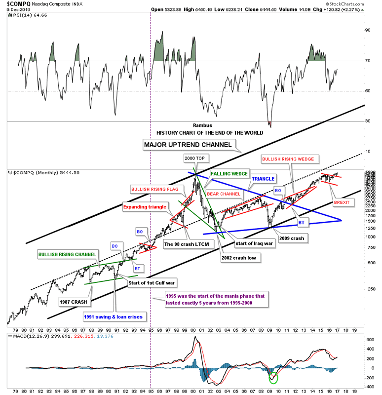
Below is a post I did back in December of 2016 which shows the, History Chart for the End of the World. Note how far below the center dashed midline the COMPQ was trading back then.
December 2016:
I try to show this long term monthly chart for the $COMPQ which I call the “End of the World History Chart” at least once a year or if something interesting takes place. When you look at the 1987 crash it felt like the end of the world at the time but that ended up being the second reversal point in the green bullish rising channel. How many remember the months leading up to the first Gulf war in 1991? No one knew at the time how that conflict would play out as the US was going up against the 5th largest army in the world. On the first night of bombing it was very clear that the conflict would be over quickly and the stock markets took off the very next day which made the fourth reversal point in the green bullish rising channel.
Which also helped put that fourth reversal point in the green bullish rising channel was the Savings and Loan crises which was dominating the headlines at that time. As you can see the COMPQ launched into one of the greatest bull markets of all time that ended nine years later when the tech bubble finally burned out.
How many remember the crash in 1998 that doesn’t look like anything on this chart but it was the LTCM, Long Term Capital Management debacle that felt like the end of the world at the time. It’s easy to look at a chart like this and see how important events in the world look in hindsight but when you are living and trading during one of these events it’s a totally different story.
After the $COMPQ topped out in 2000 it declined in a very strong move down building out the green bullish falling wedge which broke to the upside during the start of the Iraq war. The markets were crashing and the US was going to war. It doesn’t get much more negative than that but that was the low. I know most of you are familiar with the 2009 crash low which felt like the end of the world at the time but as you can see it launched a seven year bull market that is still making new all time highs.
The last chart pattern on the right hand side of the chart is the little red bull flag that just completed a backtest to the top rail last month and is now making new all time highs. The fourth reversal point on that little red bull flag was the BREXIT vote that tanked the markets which quickly reversed back up after just a couple of days.
The last point I would like to make with this chart is shown by the ten year blue triangle consolidation pattern. Note how clean the breakout and backtest was to the top rail which began the formation of the red bullish rising wedge. There are many individual stocks that made a similar consolidation pattern that have broken out and are well into new all time high territory. When looking at this big picture you can see how the blue ten year triangle consolidation pattern is forming as a possible halfway pattern which should show a similar move leading out of the triangle to the one leading into the triangle.
I’m viewing our current breakout and impulse move up, could take the price action up to the black dashed mid line before we see a decent correction. The move up could resemble the move up out of the red bullish rising wedge which would then show the red bull flag as a halfway pattern. The good news is this next impulse leg up is just getting started. As long as the game plan keeps play out this is how I see things unfolding over the coming years which will be punctuated with some strong corrections and maybe even a black swan event such as the 1987 crash which ended up being a great buying opportunity. I will have a ton of charts to post tomorrow that will shed some more light on the big picture which is the most important time frame to get right. If you know and understand the big trend it is so much easier to stay in the game. There are times when one can trade against the dominate trend but it’s much more difficult to do, the trend is your friend.

January 2021:
This last chart for tonight shows the, History Chart for the End of the World, as of today’s close. Even with a Democrat being elected as president, Trump’s impeachment, the US capital building being over run by right wing extremists and the Covid virus taking its toll on the economy the COMPQ is trading at new all time highs.
The difference between a bull market and a bear market: If the US stock markets were in a bear market all the negative events that occurred in 2020 would have been the excuse to trash the markets. In a bull market all those negative events have little or no affect on the stock markets. For many that is a hard concept to grasp but it is how markets work.
All the best
By Rambus Chartology
FREE TRIAL - http://rambus1.com/?page_id=10
© 2021 Copyright Rambus- All Rights Reserved
Disclaimer: The above is a matter of opinion provided for general information purposes only and is not intended as investment advice. Information and analysis above are derived from sources and utilising methods believed to be reliable, but we cannot accept responsibility for any losses you may incur as a result of this analysis. Individuals should consult with their personal financial advisors.
© 2005-2022 http://www.MarketOracle.co.uk - The Market Oracle is a FREE Daily Financial Markets Analysis & Forecasting online publication.


