Precious Metals Trading Range Doing It’s Job to Confound Bulls and Bears Alike
Commodities / Gold & Silver 2020 Sep 25, 2020 - 02:19 PM GMTThe trading range on the HUI and other PM stock indexes continues its job of confusing both the bulls and bears alike. I’ve always said that trading an impulse move is much easier than trading during a consolidation phase. During a strong impulse move up it is easy to see the price action making higher highs and higher lows. Trading during a consolation phase is usually completely different.
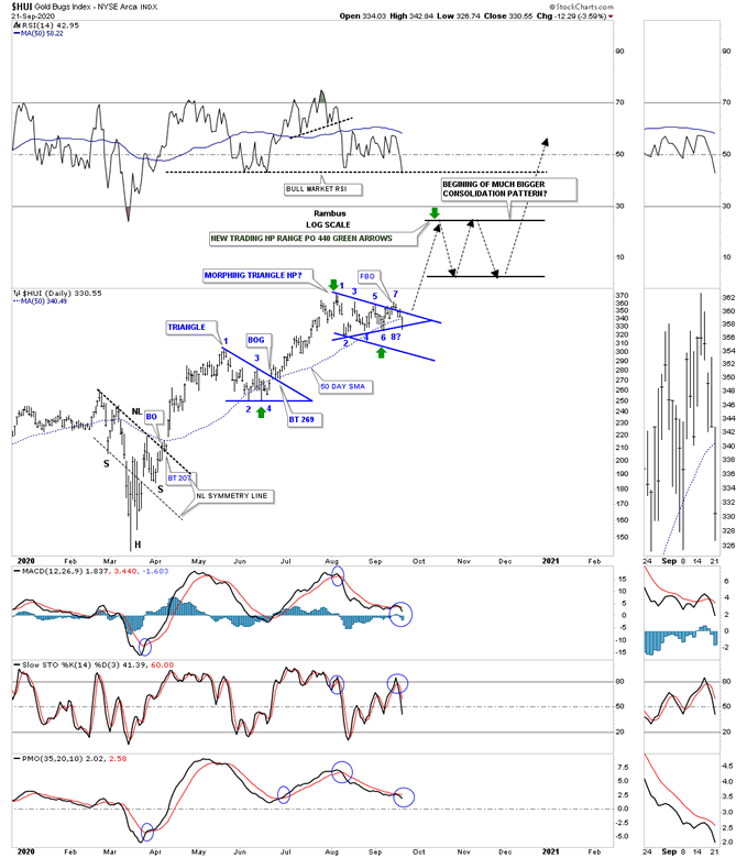
Below is the daily chart we’ve been following for the HUI which shows the morphing triangle that has been in play since the first of August. Last week the price action made a feeble attempt to breakout above the top rail which was quickly negated when the HUI traded back inside of the triangle. Today the price action gapped below the 50 day sma and found support on the bottom rail which completed the 7th reversal point.
I added a parallel blue trendline taken from the top rail of the blue triangle if that pattern morphs into a bigger consolation pattern that could either be a bull flag or a bullish falling wedge depending where the last reversal points comes into play. I’ve also said this many times as well in the past that the 4th or last reversal point in a consolation pattern is always the hardest to spot in real time. They don’t become visible until the price action can rally far enough above the last reversal point that it finally shows itself. Whatever the consolation pattern ends up being it should still be looked at as a halfway pattern to the upside as shown by the green arrows.

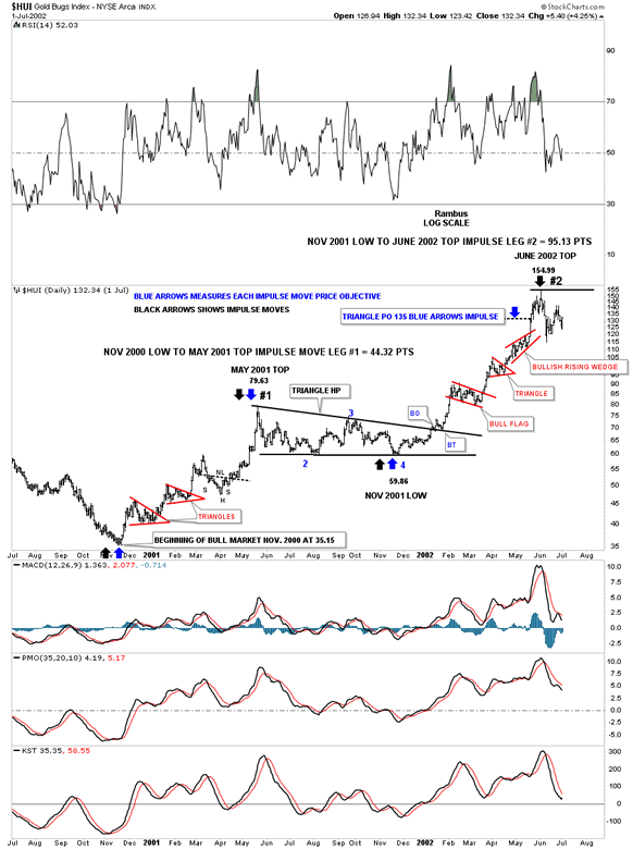
This next chart for the HUI shows you the first impulse move out of its bear market low in 2000. I just want to make sure you know what an impulse move looks like. The move from the 2000 low to the May 2001 high is what your typical impulse move looks like which was made of up of 3 small consolidation patterns. I also consider the move between each consolidation pattern an impulse move in its own right but on a much smaller time scale. As you can see it took right at 6 months for the HUI to consolidate that first impulse leg of the brand new bull market. After that 6 month black triangle completed it job of consolidating the first leg up a new impulse began that also had 3 consolation patterns before the HUI ran out of gas and needed to consolidate those gains. The blue arrows show how the black triangle consolation pattern formed as a halfway pattern that had a price objective up to the 135 area.
If you compare this chart to the one above we should theoretically be in the 2nd consolation pattern that has formed since the low on March 23rd low. There is no law that says we have to have 3 consolation patterns that make up an impulse move but it is more typical than not. Sometimes there will only be 2 consolation patterns that make up a strong impulse move but very rarely just one.

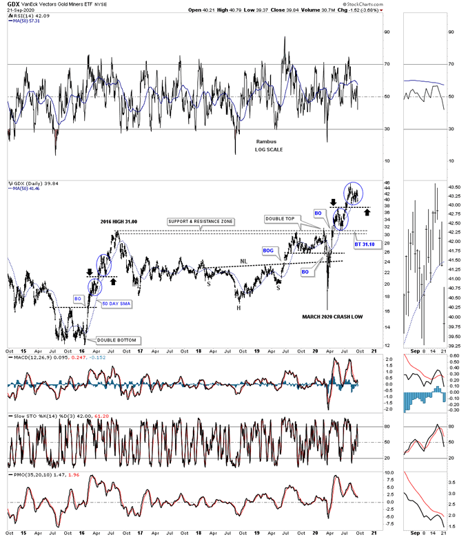
I’ve posted this next chart for the GDX several times which compares our current bull market run out of the March 2020 low to the 2016 impulse move. The small consolidation patterns don’t show up very well on this long term daily chart so I put a blue circle around the two consolidation patterns that formed in the 2016 rally and our current rally. What the black arrows show is no impulse move between the two consolation patterns but one forming on top of the previous one which is still a bullish setup as you can see from the 2016 rally.
Note how well the support and resistance zone worked for so many years. If you recall we were watching that S&R zone beginning at the touch in 2019 which held resistance. Then earlier this year the S&R zone was hit once again and held resistance once again that led to the crash into the March 23rd low where our current impulse move began. As you can see the last time the S&R zone was hit, after the March 23rd low, the price action sliced through it like a hot knife through butter. We got a perfect backtest which is actually the first triangle on the HUI chart we looked at earlier. If our current rally plays out anything like the 2016 rally we should see at least one more strong impulse move to the upside before entering into the next consolation phase.

This last chart for tonight is the long term monthly chart for the PM complex which goes back 14 years and shows the 2011 H&S tops on most of the PM stock indexes and the bear market that followed. I’ve been showing this monthly combo chart for the last 3 months or so when most of the PM stock indexes broke out above their respective 2011 H&S neckline extension line except for the HUI. Zeroing in on the GDX, blue circle, it shows some very nice Chartology. Note how the breakout from its 2016 consolidation pattern hit the neckline extension line and sold off which was the backtested the top rail that held support just as it should. From that backtest the GDX rallied strongly again this time breaking out above the neckline extension line. A perfect backtest to the neckline extension line would come in around the 37 area. Once resistance is broken it should reverse its role to support and vise versa.

The bottom line is that there is nothing broken in the PM complex just the pain and suffering that most investors feel as the trading range builds out and matures.
All the best
By Rambus Chartology
FREE TRIAL - http://rambus1.com/?page_id=10
© 2020 Copyright Rambus- All Rights Reserved
Disclaimer: The above is a matter of opinion provided for general information purposes only and is not intended as investment advice. Information and analysis above are derived from sources and utilising methods believed to be reliable, but we cannot accept responsibility for any losses you may incur as a result of this analysis. Individuals should consult with their personal financial advisors.
© 2005-2022 http://www.MarketOracle.co.uk - The Market Oracle is a FREE Daily Financial Markets Analysis & Forecasting online publication.


