Coronavirus Straightforward Calculations on COVID-19 Risks
Politics / Pandemic Mar 07, 2020 - 08:09 PM GMTBy: Submissions
Daniel Nevins writes: As recently as two weeks ago, it wasn’t clear which infectious disease experts had the best handle on COVID-19’s likely path.
Among the optimists, one operation ran a model in February that showed the following maximum case counts by the “end of the epidemic.” (I’ve included the running case tally as well, using data from the Johns Hopkins dashboard.)
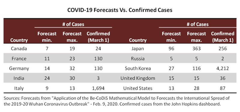
With the benefit of hindsight, these well-intentioned forecasts were clearly too low. But I’ve shared them anyway because they support the premise for this article—that it seems time to listen to those experts who were telling us all along that a pandemic is inevitable. In comparison to the misplaced forecasts above, the experts who expected a global health crisis can point to the chart below as validation:
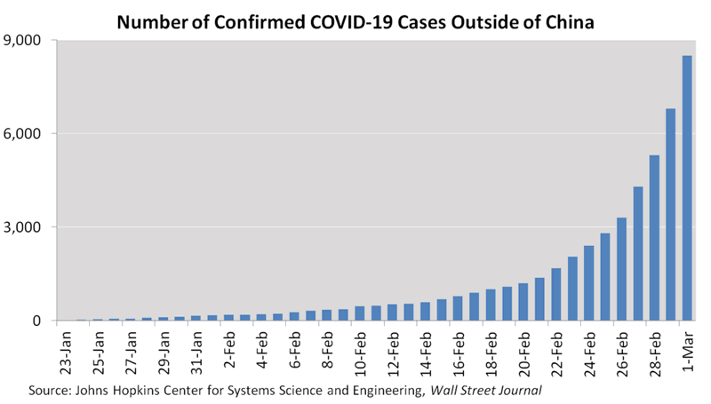
So recent events seem to settle the question of which experts have the best grasp on what’s happening.
And recent data also provide another way to look into the future, one that doesn’t require complex epidemiological models. I’m suggesting the following:
- Ignore the case data from China, which falls somewhere between glitchy and grossly incomplete.
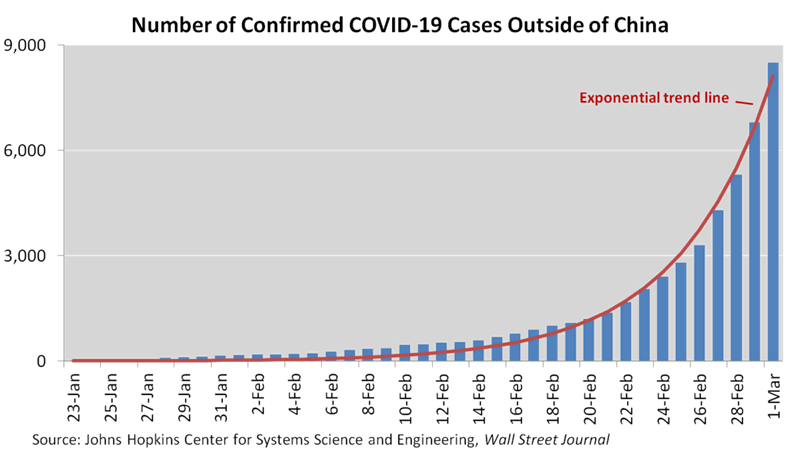
- Fit an exponential curve to the daily number of confirmed cases outside China.
- Create a “base case” by following the curve’s trajectory until the pandemic reaches proportions expected by those experts who’ve been most accurate to date.
- Experiment with flatter trajectories to map the interplay between the pandemic’s intensity and its duration.
This approach offers three advantages. First, it produces plausible scenarios that are easy to rerun and calibrate to the latest data. Second, it requires only a few assumptions. Third, those assumptions are transparent and easily understood.
More to the point, while the approach doesn’t substitute for complex modeling, it gives reasonable answers to a few important questions. Essentially, I’m trying to answer the following:
- How many new cases could appear each day (the intensity) at the pandemic’s peak?
- How long will the pandemic last?
The endgame, in numbers
So let’s crunch the numbers. I’ll start with the predictions of Harvard epidemiologist Marc Lipsitch, who said in mid-February that he expected 40% to 70% of adults worldwide to be infected. I’ll apply that prediction to the world ex-China, using the following initial calculations:
- Subtract 1.8 billion under-15s from a world ex-China population of 6.4 billion. That’s 4.6 billion adults.
- Apply the 40% lower end of Lipsitch’s estimated infection rate to those 4.6 billion adults. That’s 1.8 billion infections.
- Allowing that many cases will never be recorded, reduce the 1.8 billion infections to an even 1.0 billion. (Imperial College recently estimated that only about a third of infections outside China are being recorded. That proportion—should I say optimistic estimate?—should increase with more testing, but it should still fall well short of 100%, considering that 80% or more of cases are mild.)
- Assume further that the growth rate slows after the number of cases reaches somewhere between 10% and 50% of the eventual one billion. Mathematically, the growth rate has to slow, since a growing number of infections means a shrinking number of people susceptible to new infections. Applying 10% and 50% to one billion, we’re looking for the growth rate to slow after it reaches somewhere between 100 and 500 million recorded cases.
(Note that I’m assuming all infected survivors build immunity. If that’s wrong—and according to various reports, it could be at least partly wrong—that calls for a completely different analysis. It means the pandemic probably continues until a vaccine becomes available.)
Follow the curve
Now for the easy part. Here’s an exponential curve that fits the daily case data:
The next chart extends the fitted curve until late April, when it reaches the 100–500 million case count I estimated above. I’ve highlighted the point where the case count exceeds 500 million, which I’ll call “Half a Billion Day”:
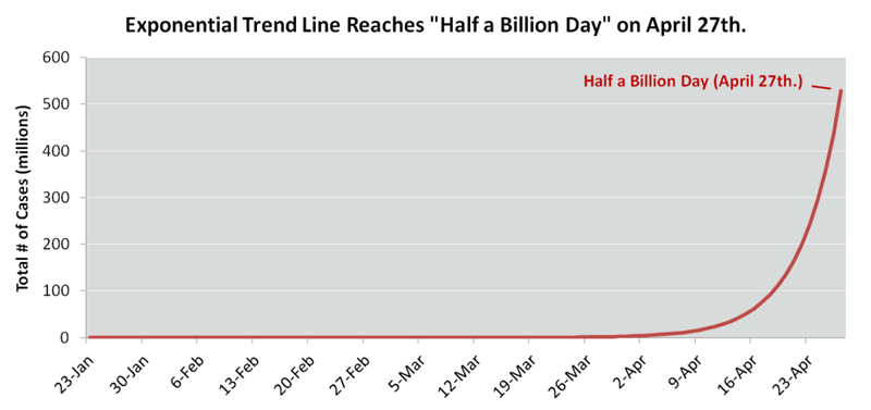
To be sure, the first projection is a base case, not a likely one, and probably not even a realistic one. It simply answers the question: If the closest-fit exponential curve continues towards a 40% infection rate, when does the pandemic begin to run out of steam?
Moreover, the curve will need refitting as time passes. The actual case count might soar above it, and it will certainly fall below it, eventually.
One reason for the case count to overshoot the curve is that test kits are becoming more widely available and actively used. So the percentage of actual cases included in published statistics should rise.
On the other hand, the trajectory should eventually flatten, for at least four reasons. First, the propensity to test suspected cases should level off and might even decline in some countries as resources become stretched. Second, governments, businesses and other organizations are likely to impose stricter containment measures. Third, the virus will eventually run out of unprepared communities to attack while their defenses are low. Fourth, the pool of uninfected people will increasingly tilt towards those who take extreme precautions against infection.
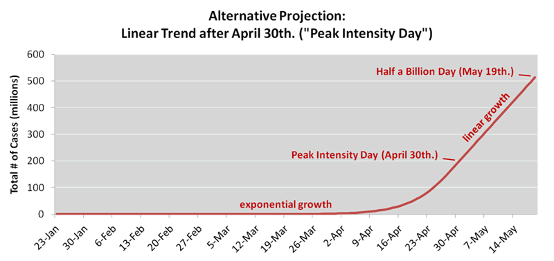
To show how the eventual flattening could affect the pandemic’s path, I created a second projection with an inflection point. As of April 30, I toggled the trajectory from exponential to linear, freezing the number of daily new cases. And between March 16 and April 30, I gradually flattened the trajectory to make the transition smooth. In other words, the projection now has three phases:
- Up until March 15: Exponential growth along the fitted path
- March 16 – April 30: Gradual transition to linear growth
- After April 30: Linear growth, meaning the number of daily new cases remains at the April 30 peak
(Note that the March 15 timing for the transition to linear growth is subjective. The fitted curve steepened over the past week as testing activity increased, and testing activity continues to increase, so a transition towards linear growth seems unlikely during the next few weeks.)
The new curve pushes Half a Billion Day back to May 19. Labeling April 30 as “Peak Intensity Day,” here’s the picture:
Finally, the crux of the analysis is to examine the interplay between intensity and duration. I looked at eight possibilities for Peak Intensity Day, calculating the implications for both peak intensity (new cases per day) and Half a Billion Day.
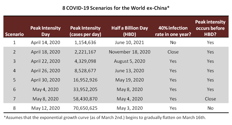
Note that Scenario 1 fails to deliver a 40%–70% infection rate over the next year, which is how Lipshitz framed his prediction.
At the other extreme, Scenario 8 raises a question of whether it’s realistic for the pandemic to grow exponentially beyond Half a Billion Day.
So Scenarios 2 through 7 appear to be the most realistic 40% infection scenarios. They show the pandemic reaching peak intensity in the second half of April or the first half of May, with daily new cases running anywhere from a couple of million to just over fifty million.
Conclusions
At a first pass, if a 40% infection rate proves accurate (and I haven’t yet seen a convincing case that such an extensive global diffusion—whether 40%, 30%, 20% or in that general vicinity—can be prevented), the pandemic should continue to intensify for another couple of months. Daily new cases could reach into the tens of millions. Alternatively, daily new cases will flatten after reaching a peak of between two and fifteen million. But an early flattening would have the undesired effect of prolonging the pandemic. That’s just a mathematical observation—if COVID-19 passes through the population at a slower pace, it’ll remain active for longer before it runs out of targets.
As far as the economic implications, a 40% infection rate would mean COVID-19 persisting long enough to cause a global recession, and probably not a mild one. Call it somewhere between moderate and severe. In that scenario, we can only hope the shoes have already dropped—that people don’t get infected more than once, that the mortality rate doesn’t worsen, and that the health care sector moves quickly towards a vaccine.
More optimistically, those who stress that “this, too, will pass” will surely be proven right. The problem is that we don’t know when. We only know that the optimistic estimates of just two weeks ago are clearly wrong. But we can use that information—together with a month and a half of data—to explore the possibilities. We can cast a cold light on the pandemic’s sudden exponential growth.
By Daniel Nevins, CFA
Copyright 2020 © Daniel Nevins - All Rights Reserved
Disclaimer: The above is a matter of opinion provided for general information purposes only and is not intended as investment advice. Information and analysis above are derived from sources and utilising methods believed to be reliable, but we cannot accept responsibility for any losses you may incur as a result of this analysis. Individuals should consult with their personal financial advisors.
© 2005-2022 http://www.MarketOracle.co.uk - The Market Oracle is a FREE Daily Financial Markets Analysis & Forecasting online publication.


