


Precious Metals, Copper, CRB Commodity Markets Step By Step , Inch by Inch
Commodities / Gambling Dec 16, 2019 - 12:37 PM GMT

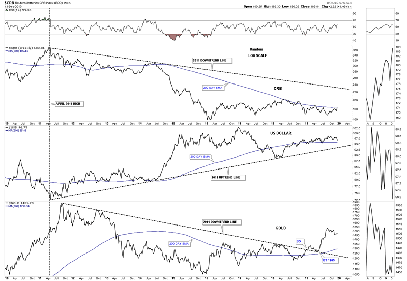
Tonight I would like to update some commodities charts we haven’t looked at in a while. There have been some subtle changes taking place that need to be addressed. Just like the PM complex that topped out in 2011 many commodities also topped out that same year and have been correcting ever since. With the US dollar at an important inflection point it may be time for commodities in general to show some relative strength which they haven’t done for a very long time.
Lets start with this very long term monthly combo chart which has the CRB index on top with the US dollar in the middle and gold on the bottom. Back in April of 2011 the CRB index topped out while the US dollar bottomed out exactly at the same time with gold topping out 5 months later in September. As you can see there is a mild correlation between the CRB and gold with their 2011 trendline both sloping down while the US dollar is sloping up.
There is an old saying that goes something like this, gold leads commodities at the beginning of a bull market and then when the time is right commodities will begin their bull market following gold higher. If you look at the CRB chart on top and the gold chart on the bottom you can see gold broke out above its 2011 downtrend line in January of this year while the CRB index is significantly below the top rail of its 2011 downtrend line. Has the CRB index finally reached the point where it might start outperforming gold? As the inverse correlation between commodities and the US dollar is fairly good that time might be at hand.
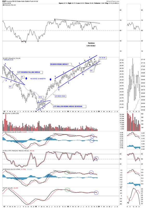
Last week the UUP backtested the bottom rail of its August 2018 rising wedge formation around the 26.80 area after it bounced off the neckline of the possible H&S top and the 30 week ema. The price objective for a rising wedge is down to the bottom of the rising wedge at reversal point #2 at a minimum. Many times the impulse move down can be very strong without much in the way of strong bounces. Note the 5 point bearish falling wedge on the left hand side of the chart.
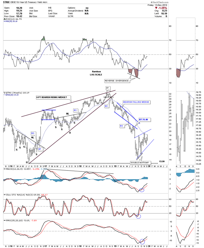
Here is an example of what can happen when a large rising wedge finally runs its course and breaks out to the downside. The $TNX, 10 year bond yield, built out a 2 year bearish rising wedge which declined almost all the way down to where the rising wedge began to form just above 13.50. You can see the blue bearish falling wedge, which we know shows up in a fast moving impulse move, was its only consolidation pattern that formed. Since the initial low on September 3rd the TXN has been chopping out a possible small rising wedge formation which still has more work to do before we know if will be a bullish or bearish rising wedge or part of a consolidation or reversal pattern. Just something to keep an eye for now.
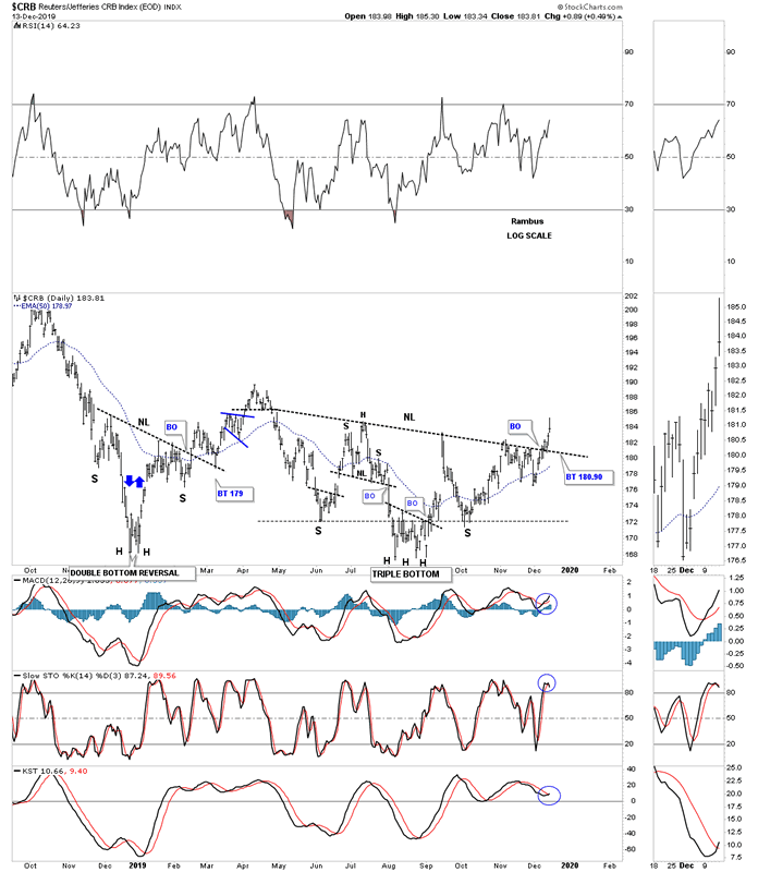
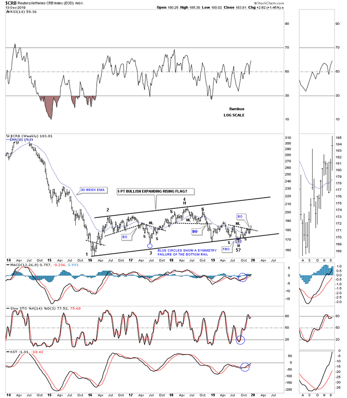
If the inverse correlation holds up between the US dollar and the CRB index then if the US dollar is building out a possible H&S top then there is a good chance that the CRB index is building a possible H&S bottom. Below is a one year 3 month daily chart for the CRB index which shows a H&S bottom with a breakout and backtest above the neckline last week.
Since 2016 the CRB index has been building out a possible 5 point bullish rising flag reversal pattern. Initially I had connected the bottom rail using the 2016 low followed by reversal point #3 which didn’t give a very clear bottom trendline when the price action worked its way out to reversal point #5. In the summer it looked like the CRB index was going to breakout to the downside, but there was very little follow through which is when I saw the symmetry failure of the bottom rail as shown by the two blue circles. If you take the distance below the bottom rail, false breakout, and add that distance to reversal point #3, that fills in the gap. Basically if you subtract the distance from the false breakout and add it to the failure at reversal point #3 you then have a very symmetrical rising flag formation where the distance between all the reversal points are the same.
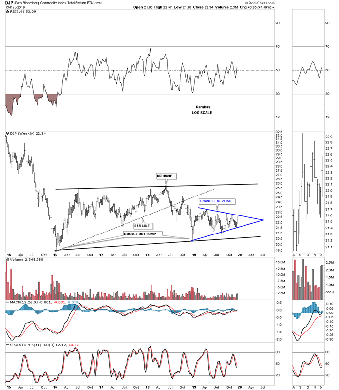
Next is a long term weekly chart for the DJP which shows a similar trading range we just looked at on the CRB index above which started to form at the 2016 low. Since the first of this year it looks like the DJP has been building out the blue triangle which will need an odd number of reversal points to be a reversal pattern to the upside. If the blue triangle breaks out to the upside it will send a very strong message that the top rail of the 2016 rising flag formation is going to give way.
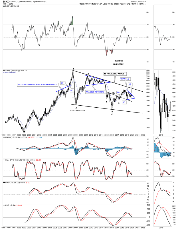
This last commodities index we’ll look at is the long term 25 year look at the $GNX which is showing a very large 10 year falling wedge formation. What is interesting about this chart is the fairly large H&S bottom that formed at the 4th reversal point in the 10 year falling wedge. You can see the blue triangle that has formed right on top of the neckline as the backtest which is now starting to breakout to the upside. At a minimum the price action should make it all the way up to the top rail of the 10 year falling wedge formation and if the bull market really catches fire we’ll see a breakout which would then complete a very large consolidation pattern.
Copper is an important commodity that generally shows the health of the world economy which is why they call it Dr. Copper. Just like the daily chart for the CRB index we looked at earlier, Copper has also built out a nice H&S bottom on this daily chart below that also had its breakout early last week. The left shoulder formed the blue expanding rising wedge while the right shoulder built out the blue triangle.
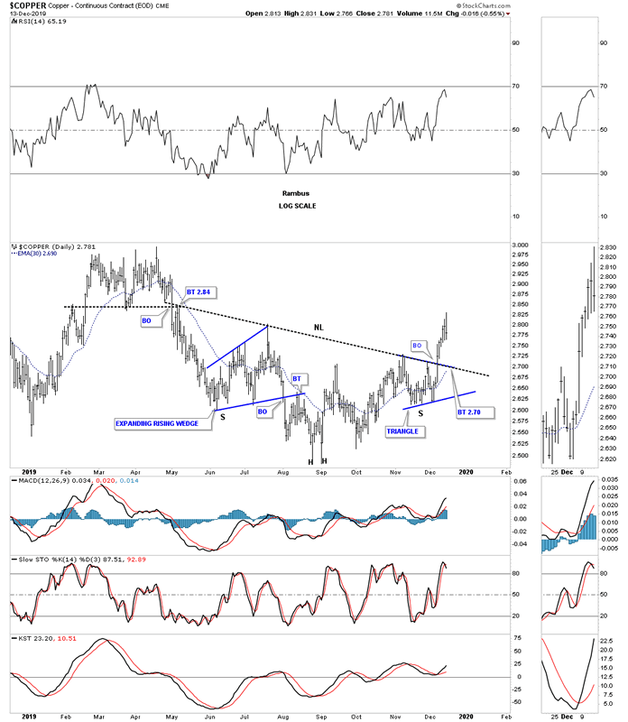
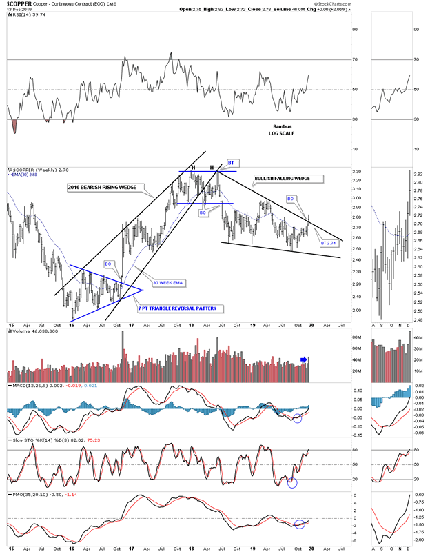
This weekly chart for the Copper index shows its 2016 bearish rising wedge which had a hard initial breakdown, but failed to follow through. When you see a well defined chart pattern and the impulse move fails to deliver that is generally a sign there is more strength under the surface. Since 2018 the price action has been building out the black falling wedge which shows a breakout above the top rail last week on a nice increase in volume.
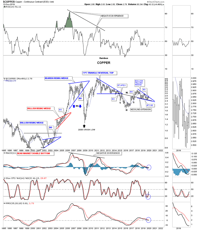
I mentioned at the beginning of this Weekend Report that gold generally leads commodities higher and then they can play catch up. Here you can see the large double bottom that formed at the bear market low in 1999 and 2001 which launched Copper on its bull market run following on the heals of gold. On the right hand side of the chart you can see where Copper bottomed in January of 2016, head of the H&S bottom, a month after gold bottomed in December of 2015. For the last several years Copper has built out the bullish falling wedge right on top of the H&S neckline extension line.
A lot now hinges on the US dollar for the direction of the PM complex and commodities in general. If the H&S top on the US dollar plays out we could see a sharp move higher in Commodities. I have many more charts for commodities that I will post in the Wednesday Report
All the best
By Rambus Chartology
FREE TRIAL - http://rambus1.com/?page_id=10
© 2019 Copyright Rambus- All Rights Reserved
Disclaimer: The above is a matter of opinion provided for general information purposes only and is not intended as investment advice. Information and analysis above are derived from sources and utilising methods believed to be reliable, but we cannot accept responsibility for any losses you may incur as a result of this analysis. Individuals should consult with their personal financial advisors.
© 2005-2022 http://www.MarketOracle.co.uk - The Market Oracle is a FREE Daily Financial Markets Analysis & Forecasting online publication.