Fed Acknowledges “Recession Risks”. Run for the Hills!
Forecasts / Financial Markets 2019 Mar 22, 2019 - 06:12 AM GMTBy: Troy_Bombardia
 Today’s biggest news was that the Fed predicts no more rate hikes this year. Given that we are extremely late in this economic expansion cycle, this probably means that the Fed is also done hiking rates for this economic expansion cycle.
Of course, the news outlets and social media took this as “the Fed now acknowledges ‘recession risks’, so it’s time to run for the hills!”
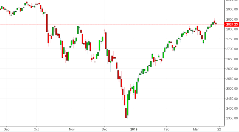
Go here to understand our fundamentals-driven long term outlook.
Let’s determine the stock market’s most probable medium term direction by objectively quantifying technical analysis. For reference, here’s the random probability of the U.S. stock market going up on any given day.

*Probability ≠ certainty. Past performance ≠ future performance. But if you don’t use the past as a guide, you are blindly “guessing” the future.
Recession Fears
Here’s how the media and social media typically react to the Fed.
- The Fed hikes rates. Bearish! (How could stocks possibly go up when the Fed is hiking rates?)
- The Fed pauses rate hikes. Bearish! (The Fed acknowledges recession risks.)
- The Fed cuts rates. Bearish! (The economy is definitely in a recession.)
The second point is somewhat valid. When the Fed stops hiking rates for the last time in each economic expansion cycle, you are typically 0.5-1.5 years before a recession begins.
Here’s the last rate hike of the previous 3 economic expansions.
- February 1989
- May 2000
- June 2006

Here’s what the S&P 500 did next.

Is this late cycle? Yes
Is this immediately and menacingly bearish? Not consistently.
Yield curve
With the Fed no longer hiking rates, long term interest rates cratered today. Here’s the 10 year – 3 month yield curve.
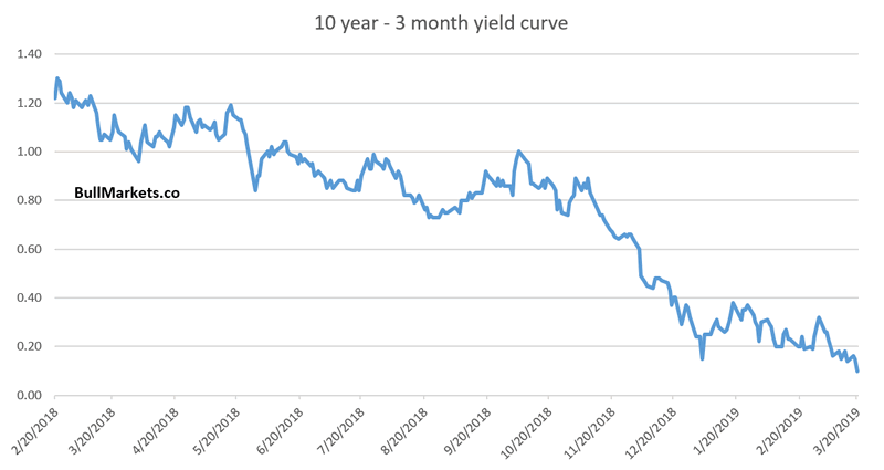
Here’s what happens next to the S&P when the 10 year – 3 month yield curve inverts.

Will the yield curve invert?
Some readers are probably wondering “with the Fed no longer raising short term interest rates, will the yield curve invert”?
*I find the 10 year – 3 month section of the yield curve to be more predictive than other parts of the yield curve.
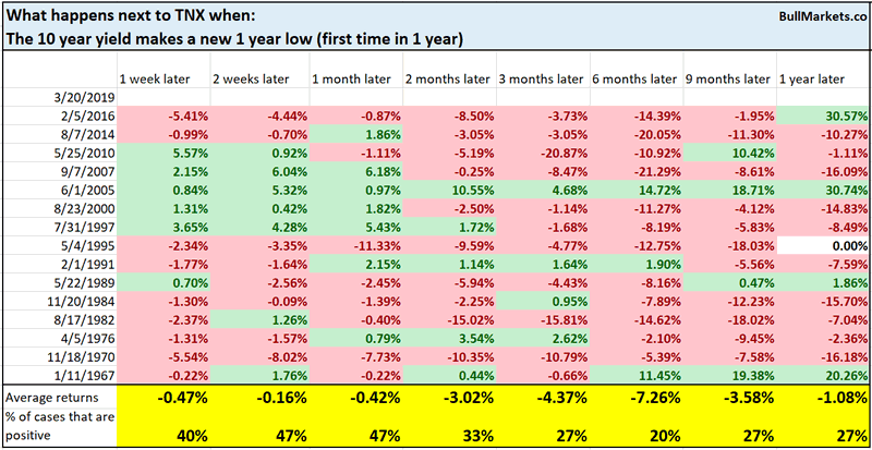
The 10 year yield made a new 1 year low today for the first time in 1 year.
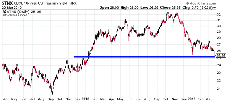
Historically, this is a bearish sign for the 10 year yield. Yes, it does seem that the 10 year yield will keep drifting lower as the rest of the yield curve inverts.
An interesting look at the entire yield curve
Otavio Costa presented an interesting chart on Bloomberg recently, which demonstrates what % of the yield curve is inverted.
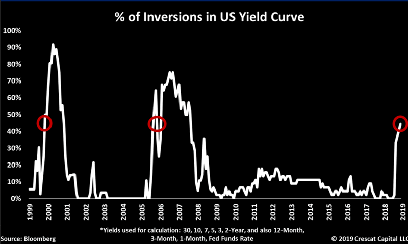
On the surface, this looks scary. HOLY SHIT THIS HAPPENED BEFORE 2000 AND 2007
I am generally wary of charts that limit themselves post-1999. Doing so usually hides false SELL signals pre-1999. As objective traders, we need to look at all the data: those that confirm our view and those that go against our view.
So I took the data from StockCharts and created a similar chart.
The following chart (from 1990 – present because that’s all the data that’s available) looks at what % of the yield curve is perfectly inverted. I used the following Treasury yields:
3 months, 1 year, 2 years, 3 years, 5 years, 7 years, 10 years, 20 years, 30 years
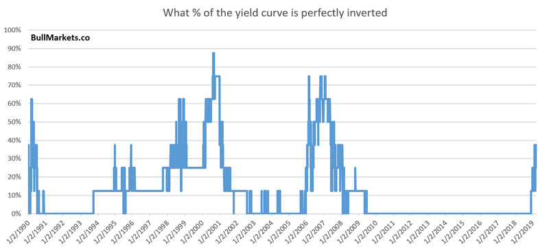
As you can see, this also happened in 1998, 1.5 years before the bull market topped.
By removing the 7 year Treasury yield and 20 year Treasury yield, I was able to push the chart back to 1982.
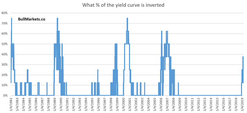
So just how scary is this?
Here’s what happens next to the S&P when at least 37.5% of the yield curve becomes inverted (first case in 1 year)

Late cycle? Yes
Immediately bearish for stocks? Not so much. Know your risk:reward.
Banks
Bank stocks tanked on today’s Fed news. As a result, the S&P 500 has made a “divergence” from various bank indices such as the KRX Regional Bank Index.
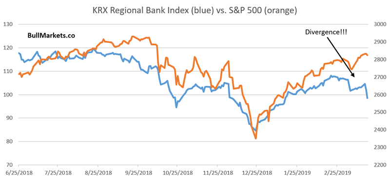
How bearish is this “divergence”?
Here’s what happens next to the S&P when the KRX Regional Bank Index falls more than -8% over the past month, while the S&P rises more than 1%.

Yes, this did happen before 2007. But it also happened in other less bearish cases.
USD
To be popular in the finance community, you generally need to be bullish on gold, bearish on stocks, predict a recession, and hate the fiat USD paper $$$.
And believe me, living in Australia I would love to be bearish on the USD. I keep 2 years worth of living expenses as a cash reserve (in AUD), and the USD value of this cash reserve is getting killed by the strong USD.
But the data suggests otherwise.
Currency markets have experienced low volatility for quite a long time. As a result, the USD Index’s 10 monthly standard deviation is now less than 1% of its value.
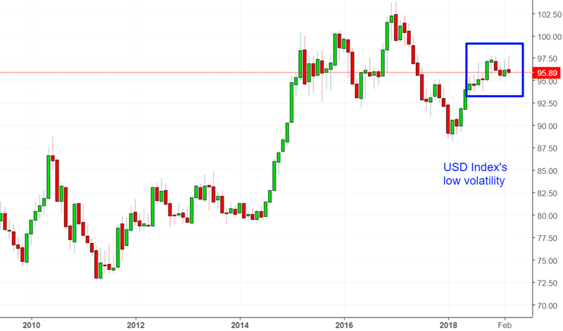
Here’s what happens next to the USD Index when its 10 month standard deviation is less than 1% of its value.

Is a rising USD bearish for stocks?

MACD histogram
A prominent permabear presented the following chart recently.
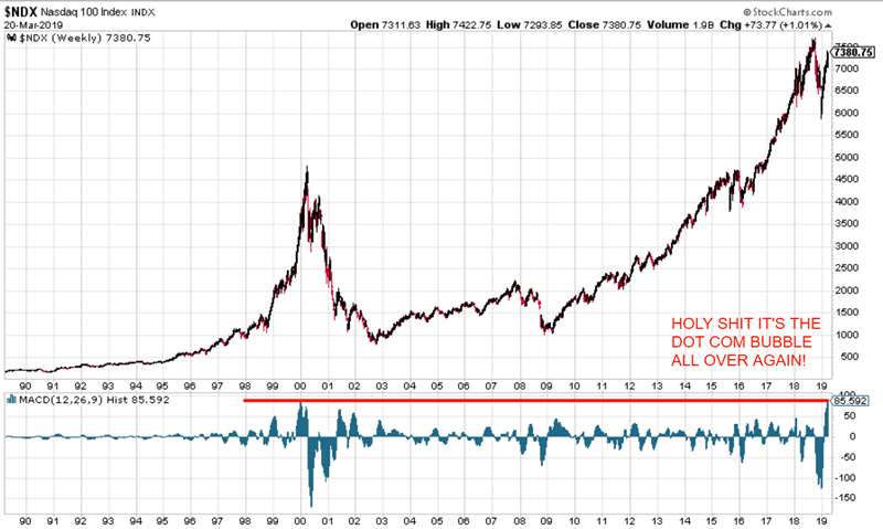
As you can see, NDX’s weekly MACD histogram is as high as it was in the dot-com bubble. HOLY SHIT IT’S THE DOT-COM BUBBLE ALL OVER AGAIN.
Is it?
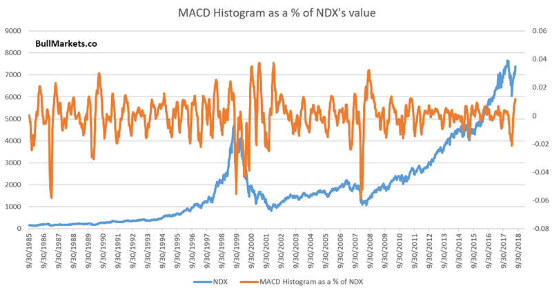
The MACD Histogram is a nominal value. It’s not a relative % value. Since NDX today is almost double of where it was in 1999, such a high MACD reading is not equivalent to the same MACD reading in 1999.
Comparing today to the dot-com bubble is similar to another trick used by the permabears. “The Dow fell -400 points today. The Dow fell -400 points in 2008. HOLY SHIT IT’S 2008 ALL OVER AGAIN”! (Never mind that the Dow is 4x higher today than where it was in 2008. But don’t let the simple truth get in the way of a good story).
Here’s NDX’s MACD Histogram adjusted as a % of the NDX’s value. Just like the dot-com bubble indeed.
Click here for yesterday’s market analysis
Conclusion
Here is our discretionary market outlook:
- The U.S. stock market’s long term risk:reward is no longer bullish. In a most optimistic scenario, the bull market probably has 1 year left. Long term risk:reward is more important than trying to predict exact tops and bottoms.
- The medium term direction (e.g. next 6-9 months) is more bullish than bearish.
- The stock market’s short term has a bearish lean due to the large probability of a pullback/retest. Focus on the medium-long term (and especially the long term) because the short term is extremely hard to predict.
Goldman Sachs’ Bull/Bear Indicator demonstrates that while the bull market’s top isn’t necessarily in, risk:reward does favor long term bears.
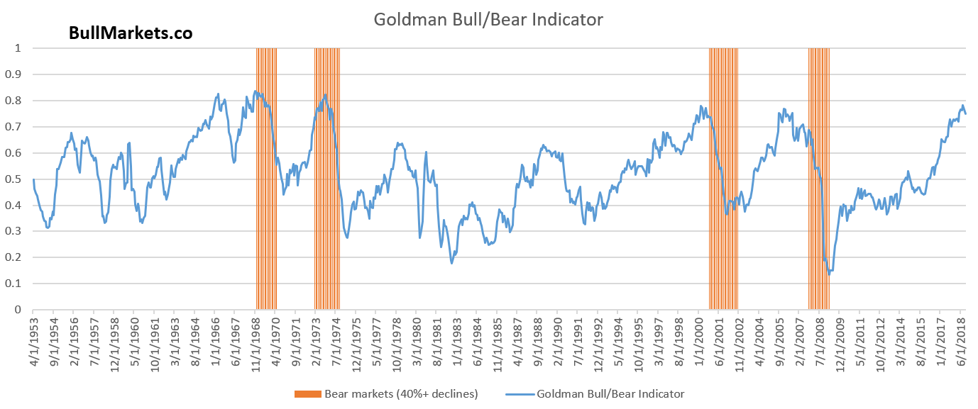
Our discretionary outlook is not a reflection of how we’re trading the markets right now. We trade based on our quantitative trading models.
Members can see exactly how we’re trading the U.S. stock market right now based on our trading models.
Click here for more market studies
By Troy Bombardia
I’m Troy Bombardia, the author behind BullMarkets.co. I used to run a hedge fund, but closed it due to a major health scare. I am now enjoying life and simply investing/trading my own account. I focus on long term performance and ignore short term performance.
Copyright 2019 © Troy Bombardia - All Rights Reserved
Disclaimer: The above is a matter of opinion provided for general information purposes only and is not intended as investment advice. Information and analysis above are derived from sources and utilising methods believed to be reliable, but we cannot accept responsibility for any losses you may incur as a result of this analysis. Individuals should consult with their personal financial advisors.
© 2005-2022 http://www.MarketOracle.co.uk - The Market Oracle is a FREE Daily Financial Markets Analysis & Forecasting online publication.


