


Yield Curve Harbinger of Stock Market Doom
Stock-Markets / Inverted Yield Curve Dec 05, 2018 - 05:32 PM GMTBy: Gary_Tanashian

 “The Harbinger of Doom”? Of course we (well, the media) are talking about the yield curve AKA Amigo #3 of our 3 happy-go-lucky riders of the macro. I have annoyed you repeatedly with this imagery in order to show that three important macro factors needed to finish riding before situation turns decidedly negative.
Amigo 1: SPX (or stocks in general)/Gold Ratio
Amigo 2: 30 Year Treasury Yield
Amigo 3: Yield Curve
In honor of Amigo 3’s arrival to prime time let’s have a good old fashioned Amigos update (going in reverse order) and see if we can annoy a few more people along the way. :-)

Yield Curve
Clicking the headline yields a Bloomberg article all about various yield curves and all the doomed news you can use, including a hyperactive interview with an expert bringing us all up to speed on the situation.
With respect to the headline, I would say that tumbling stocks actually show stocks are in a volatile whipsaw that we have anticipated in the making of a top because the yield curve has been flattening since 2013 (when NFTRH noted a Semiconductor Equipment sector cycle up signal) and our early bird Semi signal registered again, this time to the negative side in 2018.
But the media are giving you sound bites and easy answers to digest so let’s not muddy this simplistic picture with the grinding long-term work that is actually needed (← sarcasm). Let’s just give you another headline (again, click to get the article).
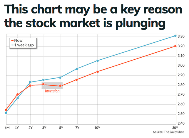
So the key reason is that some lesser watched aspects of the Treasury curve are starting to invert. Inversions tend to precede recessions, after all. But in the cases of the last two inversions (10yr-2yr) the stock market continued to a new high after the curve finished flattening in inversion territory. Today the curve has not inverted, although the media is really titillating itself (and you) with the word “inversion”.
But as we’ve been noting all along, the curve does not need to invert to bring on the bad stuff; that tends to happen when it begins steepening, whether or not an inversion is in place.
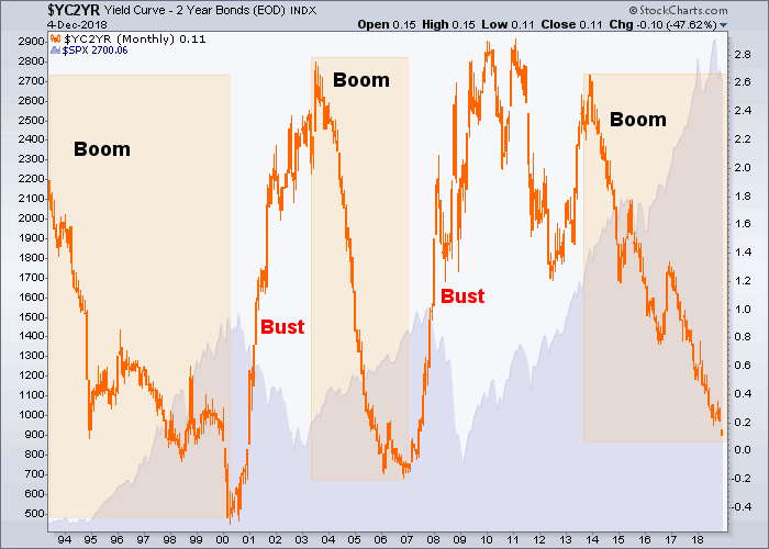
So here’s the 10-2, its boom/bust indications and the S&P 500 shaded in the background. We’ve been noting all year that risk is high by this indicator, but a boom runs with a flattening (dropping) curve and it has not yet turned up. There is certainly no guarantee that the market has not topped ahead of the indicator. Indeed, I believe it has. But the last 2 stock market downturns began after the steepening had begun.
30 Year Treasury Yield
Perhaps noise about the yield curve is misplaced and should be more focused on the 30 year yield, which has just failed at the limiter after a macro whipsaw to put everybody (and his uncle) in the “BOND BEAR!” camp. Surely you remember that hysteria.
Well check it out. Forever and a day did we track TYX to its limiter (100 month EMA). As it got close, moving upward from a bullish pattern we noted that this time could be different, to a degree. Specifically, the red arrows indicate previous attempts at killing the bond bull that were reversed either at the limiter or within the month of breakout. We loosened the parameter to Q4 instead of in-month (October). Boink… TYX has reversed back below the EMA 100 here in month #3 of Q4.
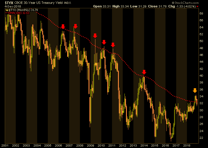
But what does this mean? Ask the experts in the linked articles above. Or just consider that a renewed breakout (the yield just hit the lateral support of the bull flag that marked the majority of 2018 yesterday) would likely come with renewed inflation expectations (the Fed is squarely in the eye of the world, after all) and a continued failure would come with increasing deflationary pressures.
Regardless, at this moment the yield curve is flattening under pains of the failure in long-term yields while the short end has not yet responded to a similar degree. When the yield curve does begin to steepen it will likely be driven by either inflationary or deflationary pressure.
SPX/Gold Ratio
Finally, the view of a market inflated first by the Bernanke Fed’s monetary policy and then by the Trump administration’s fiscal policy vs. a metal that just sits and marks time (and value) amid the chicanery. We have had SPX/Gold on watch for years because in my view it is simply a barometer to the market’s perceptions.
Exactly 10 years ago the perceptions were bleak indeed. In January of 2018 investor sentiment blew off and SPX/Gold smashed into the target area at the 38% Fib retrace. Recall the terror of Q4 2008. Recall the unsustainable euphoria of January 2018. Case closed.
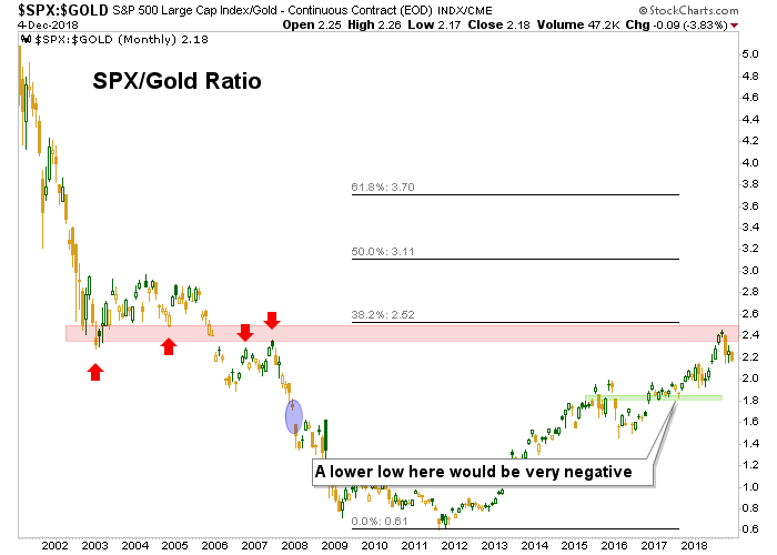
For now we are only managing a projected 2019 pullback in SPX to the noted thick support area at 2100-2200. A commensurate level for SPX/Gold is noted above. No great shakes, right? No, if any coming downside is just a cyclical interruption instead of a major bear market.
As for the media hysteria about Amigo 1’s arrival on the scene? It’s best to tune out stuff like the “harbinger of doom” because it has been in play all along as the 3 key macro indicators rode for a long while toward their destinations. In a practical sense, take a look at weekly SPX and figure that the green dashed neckline to a still hypothetical * Head & Shoulders top will be an acute harbinger and trigger to the downside target.
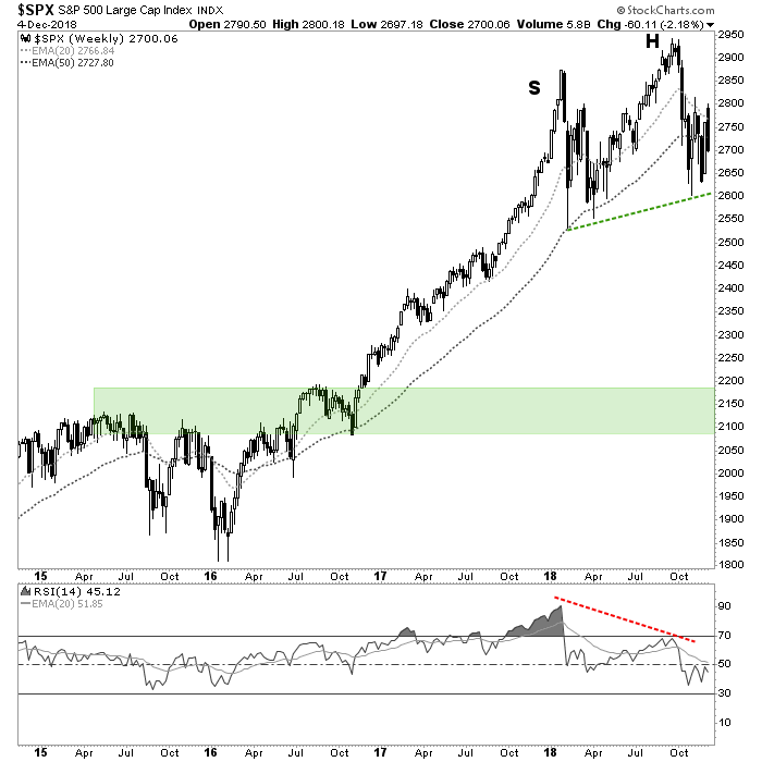
Meanwhile, I continue to lean toward a multi-week grind, quite possibly with an upward bias to bring the pattern into symmetry before the doom hits.
* The hypothesis is supported by the major bearish RSI divergence in the lower panel, as momentum was much greater at the unsustainable January momentum/sentiment high than the higher high in September.
Subscribe to NFTRH Premium (monthly at USD $33.50 or a 14% discounted yearly at USD $345.00) for an in-depth weekly market report, interim market updates and NFTRH+ chart and trade setup ideas, all archived/posted at the site and delivered to your inbox.
You can also keep up to date with plenty of actionable public content at NFTRH.com by using the email form on the right sidebar and get even more by joining our free eLetter. Or follow via Twitter ;@BiiwiiNFTRH, StockTwits or RSS. Also check out the quality market writers at Biiwii.com.
By Gary Tanashian
© 2018 Copyright Gary Tanashian - All Rights Reserved
Disclaimer: The above is a matter of opinion provided for general information purposes only and is not intended as investment advice. Information and analysis above are derived from sources and utilising methods believed to be reliable, but we cannot accept responsibility for any losses you may incur as a result of this analysis. Individuals should consult with their personal financial advisors.
Gary Tanashian Archive |
© 2005-2022 http://www.MarketOracle.co.uk - The Market Oracle is a FREE Daily Financial Markets Analysis & Forecasting online publication.