


US Stock Markets Higher Until November 2018 - Part 1
Stock-Markets / Stock Markets 2018 Aug 08, 2018 - 01:01 AM GMTBy: Chris_Vermeulen

 Our research team at Technical Traders Ltd. have been laboring over the recent market moves attempting to identify if and when the market may be likely to turn lower or contract. We’ve been pouring over all types of various data from numerous sources and have concluded the following is the most likely outcome for when the US stock markets may find a reason to pause of contract. As you read this research post, please allow us a brief introduction of the facts that supported our research.
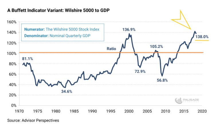
(source: https://palisade-research.com/warren-buffet-indicator-signaling-market-crash/)
First, our research team started this investigative work after watching the Buffet Indicator climb from the 2015~16 rotation levels to new highs and achieve some recent news events. This indicator, being one of Warren Buffet’s favorite tools for understanding market valuations in comparison to debt levels provides some interesting components for our team to study. Yet, we believed this indicator chart lacked something relating to the global markets and the use of the debt capital to spur future global economic activity.
Therefore, our team went off in search of something that could help us rationalize these high Buffet Indicator levels in true relation to the global markets and in relation to the capital shift that we believe is currently taking place throughout the planet. The first component of our assumption about the global markets is that capital is rushing away from riskier markets and towards more stable markets. The second component of our assumption is that national debt obligations are being re-evaluated based on perceived risks and contagion issues throughout the globe. The last component of our assumption is that the new US President is shaking up quite a bit of the old constructs throughout the globe and that the processes and policies put in place by President Trump are creating a very dynamic global capital market environment at the moment.
When you consider these three components and their combined results on the global capital markets, we have to understand that there is a very strong possibility that the largest GDP producing countries on the planet, and their banking, institutional and investor classes, are all operating within some aspect of these three components. This means there is a potential for at least $7 to $15 Trillion (10~20% of total global GDP) US Dollars that are actively sourcing and seeking secure returns while avoiding risks and debt contagion. This is a massive capital shift that is taking place currently – likely the largest the planet has ever seen.
As the Buffet Indicator is showing, the US stock market is nearing or passing all-time highs in valuation in relation to US debt levels. Yet, how does the Buffet Indicator correlate the global capital shift that is taking place and equate these dynamics into fair value. The US market, being the likely target of this massive capital shift, is a fair source for valuations comparisons, but we are experiencing a capital shift that has never before been seen at the levels we are currently experiencing. Sure, there have been shifts of capital before – but not at the $10 to 20 trillion USD level.
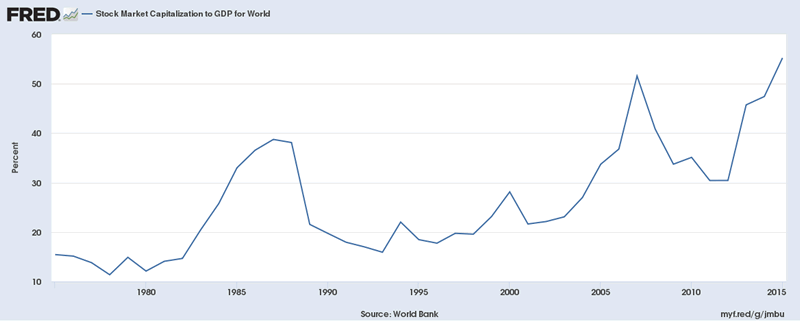
If we compare the Buffet Indicator to this Fred Global Stock Market Capitalization to GDP chart, some interesting facts begin to take shape. First, the peaks in 1974, 1999, 2008 and 2018 on the Buffet Indicator are not as evident on this chart. The 1974 peak is relatively nonexistent. The 1999 peak is a much more muted (28%) peak than on the Buffet Indicator chart and the 2008 and 2018 peaks are relatively correlated to the Buffet Indicator chart. One should be asking the question, “why are the two most recent peaks more correlated than previous peaks on this global capitalization to GDP chart?”. Our answer to that question is that after the 1999~2000 US market peak, the globe entered into a much more cooperative economic phase with the EU, China, South America and many other nations operating as global peers vs. global competitors. It was after this time that the capital markets began to “sync” in some form to the central banks policies and the unification processes that were taking place throughout the globe.
We should, therefore, assume that any global market contagion or crisis will likely take place in some measured form throughout nearly all global markets when it happens. Additionally, as regional debt or capital market crisis events occur in certain nations, capital that was deployed in these nations or capital markets will likely rush to new, safer environments for periods of time. Capital is always hunting for the safest and most secure returns while attempting to avoid risk and devaluation.
The central bank policies of the past two decades have allowed a massive increase in the available capital throughout the globe. Global GDP has risen from $33.57 Trillion in 2000 to $80.68 Trillion today – a whopping 140% increase in only 18 years. Historically, global GDP has risen by approximately these levels every 15~20 year for the past 50+ years. This is likely the result of the US moving away from the Gold standard and foreign nations following along with fiat currency central banks since after the 1960s~70s.
This tells us that the peak in 2000 on this global capital market to GDP chart resulted in a moderately isolated capital market peak that was uniquely available within the US and major economies – not globally. The 2008 peak represented a more globally equal capital market peak. This means the majority of the global capital market experienced capital appreciation. The same thing is happening right now – the global markets are experiencing an overall capital market appreciation that is a result of the past 20+ years of central bank policies and economic recovery efforts.
Stay Tuned for PART II Next with Charts and Trading Analysis!
53 years experience in researching and trading makes analyzing the complex and ever-changing financial markets a natural process. We have a simple and highly effective way to provide our customers with the most convenient, accurate, and timely market forecasts available today. Our stock and ETF trading alerts are readily available through our exclusive membership service via email and SMS text. Our newsletter, Technical Trading Mastery book, and 3 Hour Trading Video Course are designed for both traders and investors. Also, some of our strategies have been fully automated for the ultimate trading experience.
Chris Vermeulen
www.TheTechnicalTraders.com
Chris Vermeulen has been involved in the markets since 1997 and is the founder of Technical Traders Ltd. He is an internationally recognized technical analyst, trader, and is the author of the book: 7 Steps to Win With Logic
Through years of research, trading and helping individual traders around the world. He learned that many traders have great trading ideas, but they lack one thing, they struggle to execute trades in a systematic way for consistent results. Chris helps educate traders with a three-hour video course that can change your trading results for the better.
His mission is to help his clients boost their trading performance while reducing market exposure and portfolio volatility.
He is a regular speaker on HoweStreet.com, and the FinancialSurvivorNetwork radio shows. Chris was also featured on the cover of AmalgaTrader Magazine, and contributes articles to several leading financial hubs like MarketOracle.co.uk
Disclaimer: Nothing in this report should be construed as a solicitation to buy or sell any securities mentioned. Technical Traders Ltd., its owners and the author of this report are not registered broker-dealers or financial advisors. Before investing in any securities, you should consult with your financial advisor and a registered broker-dealer. Never make an investment based solely on what you read in an online or printed report, including this report, especially if the investment involves a small, thinly-traded company that isn’t well known. Technical Traders Ltd. and the author of this report has been paid by Cardiff Energy Corp. In addition, the author owns shares of Cardiff Energy Corp. and would also benefit from volume and price appreciation of its stock. The information provided here within should not be construed as a financial analysis but rather as an advertisement. The author’s views and opinions regarding the companies featured in reports are his own views and are based on information that he has researched independently and has received, which the author assumes to be reliable. Technical Traders Ltd. and the author of this report do not guarantee the accuracy, completeness, or usefulness of any content of this report, nor its fitness for any particular purpose. Lastly, the author does not guarantee that any of the companies mentioned in the reports will perform as expected, and any comparisons made to other companies may not be valid or come into effect.
Chris Vermeulen Archive |
© 2005-2022 http://www.MarketOracle.co.uk - The Market Oracle is a FREE Daily Financial Markets Analysis & Forecasting online publication.