


Our Best Stock Market Indicator Is Flashing Yellow
Stock-Markets / Stock Markets 2018 Jul 31, 2018 - 09:53 AM GMTBy: F_F_Wiley

“Do not fight the Fed!”—Many a market pundit
At one time or another, you’ve surely been advised not to fight the Fed, maybe by the same guy who likes to remind you that the trend is your friend (until it isn’t) and that pigs get slaughtered.
But how should you use that advice during the third year of a tightening cycle that’s currently adding 25 basis points to the fed funds rate every three months?
Is it time to cut risk or even go to cash?
Let’s look at a Fed policy–related indicator that has a history of signaling market tops and might help you decide.
Do not overlook the “curve”
The indicator, which I call VCURVE, combines monetary policy and inflation risks. By wrapping the two risks together, I approximate where the Fed stands versus the curve, as in whether policy is ahead of the curve, behind the curve or somewhere in between. Here’s the calculation:
- From the current fed funds rate, subtract the lowest rate since the last market correction.
- Add the change in inflation over the past twelve months.
Stocks are most exposed to a tumble when VCURVE is high, whereas a low VCURVE reading is good for stocks. And the indicator is highest when the Fed tightens aggressively but inflation is rising nonetheless, suggesting policy makers are behind the curve. But the indicator can still flash a warning when just one of the two major risks (policy risk and inflation risk) is elevated.
VCURVE spiked upward near all S&P 500 (SPY) corrections of the last 64 years, as shown in the chart below. If you can take a minute to look at the corrections individually, you’ll see VCURVE increasing every time—either before, during or (usually) before and during the correction.
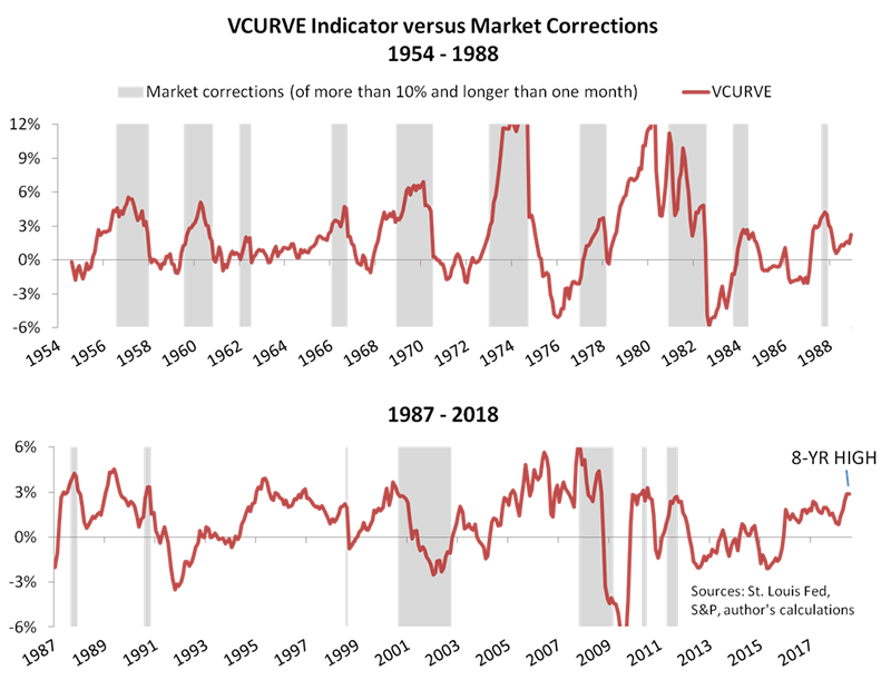
As market indicators go, the chart shows a stellar track record. For example, VCURVE predicted market corrections better than that Hollywood diva of economic and market indicators, the slope of the yield curve, and that’s a result you wouldn’t have guessed from the relative sizes of the indicators’ respective followings.
But VCURVE’s effectiveness wasn’t quite as strong during the recent tech and housing booms as in the period from the mid-1950s to the late 1980s. Showing a few more head fakes than it did previously, the indicator became a 50-50 proposition as to whether a high reading signaled a correction.
We can’t know exactly why the indicator’s performance tailed off during the tech and housing booms, but I would say the Greenspan put had something to do with it. Alan Greenspan’s policies encouraged stock investors to power through setbacks, lest they find themselves on the wrong side of a Fed-led rescue. I don’t expect Jerome Powell to be as market-friendly as Greenspan (see here and here for discussion), so maybe the indicator’s earlier history (before the 1990s) and more recent history (last ten years) are better guides to what we should expect going forward.
VCURVE flashes yellow
So the indicator’s history is intriguing, but if you’re evaluating the current reading, line charts aren’t the best way to parse the data. For that, it’s helpful to create a histogram that shows subsequent real S&P 500 returns:
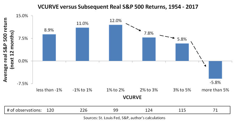
When we last discussed VCURVE in January, it was distinctly nonthreatening at 1.4%, which is right in the middle of the histogram’s third bar. But after two more rate hikes and a pop in inflation, the indicator currently stands at 2.9%, more than twice its January reading and higher than any other reading since the market correction in mid-2010. Moreover, the Fed’s tightening bias should keep VCURVE trending upward for the foreseeable future, although with recurring dips and jumps due to inflation volatility.
In other words, we’re now at the right-hand edge of the histogram’s fourth bar, and more bad news on inflation would bring the fifth into play. That doesn’t mean VCURVE is predicting an immediate market reversal, but it is signaling increased risk. Or you can interpret the current reading as implying a lower return. Let’s say that whatever your expectations were in 2015 (before the Fed started raising rates), you might knock them back by about a third, matching the data shown in the histogram.
Of course, that’s before widening your perspective to consider earnings, fiscal policy, Trump’s trade war and anything else you think might affect market performance.
And don’t forget: the trend is your friend (until it isn’t).
Oh, and pigs get slaughtered.
Happy trading.
F.F. Wiley
F.F. Wiley is a professional name for an experienced asset manager whose work has been included in the CFA program and featured in academic journals and other industry publications. He has advised and managed money for large institutions, sovereigns, wealthy individuals and financial advisors.
© 2018 Copyright F.F. Wiley - All Rights Reserved
Disclaimer: The above is a matter of opinion provided for general information purposes only and is not intended as investment advice. Information and analysis above are derived from sources and utilising methods believed to be reliable, but we cannot accept responsibility for any losses you may incur as a result of this analysis. Individuals should consult with their personal financial advisors.
© 2005-2022 http://www.MarketOracle.co.uk - The Market Oracle is a FREE Daily Financial Markets Analysis & Forecasting online publication.