


SPX/Gold, Long-term Yields & Yield Curve 3 Amigos Update
Stock-Markets / Financial Crisis 2018 Jun 22, 2018 - 02:48 PM GMTBy: Gary_Tanashian

 It has been a while since we’ve had a 3 Amigos update because a) Italy and global tariffs noise aside, nothing much has changed with the macro and b) I felt my ‘image-based metaphorical content to straight content’ ratio was getting a little excessive. So I gave it a rest.
Now it is time again for an update of these important macro riders in order to touch base with their signals. As always, I’ll remind you that there is much more to the macro market backdrop that NFTRH manages on an ongoing basis, but these three are important.
The quick answer is that only Amigo #2 (long-term yields on a rise to our preset limits) has reached destination. I marked up the graphic as he was approaching our targets.

[edit] The monthly charts driving the view that current trends remain intact can be considered big, dumb (i.e. not overly sensitive) indicators. Shorter-term views of these and other indicators can be used to gauge signs of oncoming changes. As one example, if daily SPX/Gold were to take a hard plunge on any given day or week (as was the case in February and March) we’d pay close attention as we did then before the larger trends ultimately took over again.
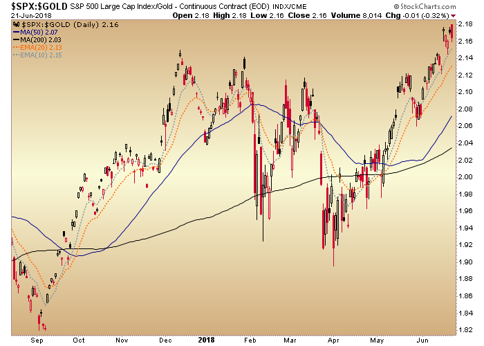
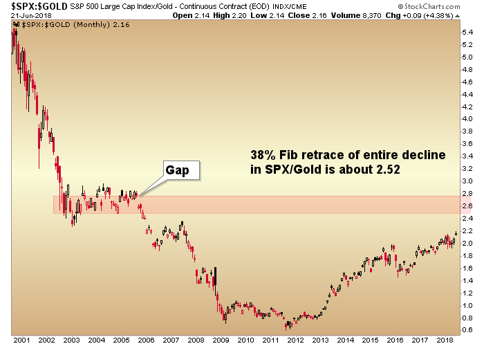
Amigo #1: Gold vs. the S&P 500 (or stock markets in general)
The theme for this Amigo is that the stock market (cyclical, risk ‘on’) has been trending up vs. gold (counter-cyclical, risk ‘off’) since 2011 in order to close out the negative cycle that completed that year.
The daily chart shows that despite the stock market’s recent weakness the ratio is making a new recovery high.
The monthly chart has for many months laid out a case for a full 38% retrace of SPX/Gold and that objective is higher still. As such, risk is still ‘on’ in cyclical asset markets by this measure and an important macro fundamental consideration for gold and gold stocks is not in place.
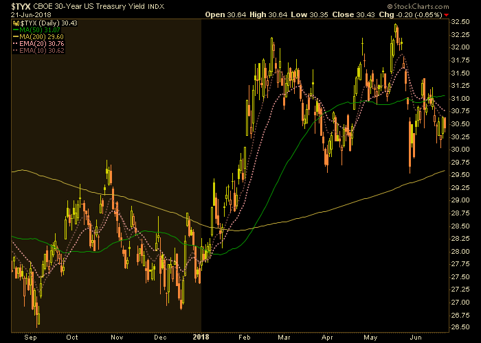
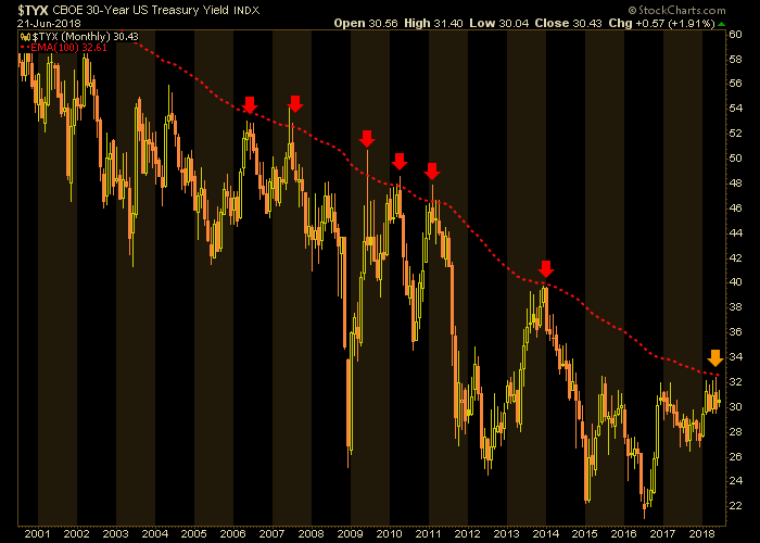
Amigo #2: Long-term (10yr & 30yr) Treasury Yields
Here we have our Amigo who has made it home and is waiting for the other two in order for macro signaling to come together. We’ll use the 30yr yield since that has been our go-to macro chart for years.
Despite much media hoopla about the new bond bear market (and a new era of rising yields) the 30yr yield has thus far been halted at 3.2%.
This was forecast by our Continuum ™ chart and its EMA 100 (a decades old limiter), each of which you’ll have only seen in NFTRH, and at nftrh.com or biiwii.com over the years. As a stand alone indicator, Amigo #2 does not mean a lot because the status at the limiter may be a rest stop to a breakout and secular macro change to inflationary (the genie out of the bottle scenario or, if you like, the von Mises Crack Up Boom scenario) or a prelude to yet another failure into a future deflationary liquidation.
Either way, over time the debt needs to be resolved. Other indicators will come into play to hone the view of what yields eventually will ultimately do at this decision point.
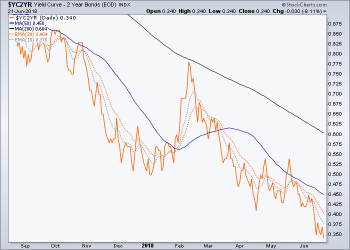
Amigo #3: The 10yr-2yr Yield Curve
The curve continues to flatten and that is a still-positive signal for the risk ‘on’, pro-cyclical world. It is important to tune out media hysterics about inversion because inversion is arbitrary, especially with all the man-made (i.e. engineered) inputs that have been inserted through the Treasury bond market post-2007). What matters most is the status of the curve (i.e. flattening or steepening).
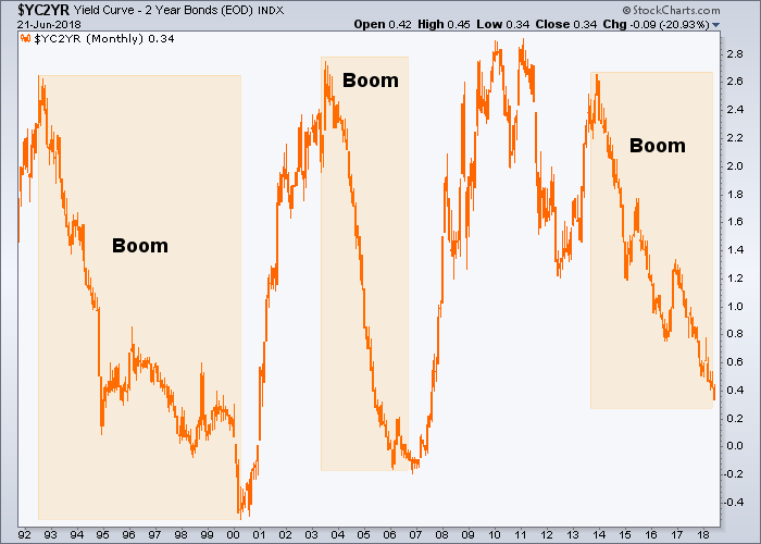
The monthly chart shows the boom and bust cycles longer-term. After some up and down years post-2008 (flash crash, Euro crisis, Fiscal Cliff and various sovereign debt crises) the boom took hold in 2013 (in line with our cyclical Semiconductor sector view of the time) and by the gauge of a still flattening curve, is still on. The cycle, though probably very mature, is still indicated as positive.
So there you have it, the 3 Amigos of the Macro; one has reached his decision point and two are still in process. Despite the market’s recent jitters and NFTRH‘s view of rising risk, the cycle is still positive.
Subscribe to NFTRH Premium for your 40-55 page weekly report, interim updates and NFTRH+ chart and trade ideas or the free eLetter for an introduction to our work. Or simply keep up to date with plenty of public content at NFTRH.com and Biiwii.com. Also, you can follow via Twitter ;@BiiwiiNFTRH, StockTwits, RSS or sign up to receive posts directly by email (right sidebar).
By Gary Tanashian
© 2018 Copyright Gary Tanashian - All Rights Reserved
Disclaimer: The above is a matter of opinion provided for general information purposes only and is not intended as investment advice. Information and analysis above are derived from sources and utilising methods believed to be reliable, but we cannot accept responsibility for any losses you may incur as a result of this analysis. Individuals should consult with their personal financial advisors.
Gary Tanashian Archive |
© 2005-2022 http://www.MarketOracle.co.uk - The Market Oracle is a FREE Daily Financial Markets Analysis & Forecasting online publication.