


A Contrarian Take on the Great Yield Curve Scare
Interest-Rates / US Interest Rates Apr 30, 2018 - 09:09 AM GMTBy: F_F_Wiley

 Media coverage of most business-cycle indicators waxes and wanes with changes in the economy, but so far in 2018, the yield curve indicator is all wax. It seems like everyone has something to say about the yield curve slope, and many commentators are jumping from a flatter curve to a growing risk of recession.
Even central bankers have joined in, with a recent article from the San Francisco Fed declaring that “the term spread is by far the most reliable predictor of recessions.”
But is the yield curve really a cause for alarm?
We’ll be contrarians on this topic—not just to be argumentative, but because we look at it differently than in many other articles you might be reading.
Recession or Expansion Indicator?
Here’s our perspective, which we’ll back with data in just a moment.
- Historically, the yield curve has been one of the most reliable expansion indicators.
- When it persists at a positive slope, it suggests the economy will continue to grow.
- But once it inverts, the expansion protection expires.
- As of this writing, we’re still well short of the expiration date.
To be sure, expansions and recessions are opposite halves of the same whole, but we start with expansions, not recessions, because the yield curve has predicted them with remarkable accuracy. Sixty-five years of history shows that as long as the curve has remained positively sloped in an expansion, the expansion has continued. Consider this picture, which leaves out recession-period data to get a clear look at expansions:
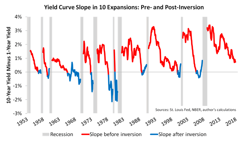
Whereas we used 10- and 1-year note yields to calculate the curve slope, you may have seen similar charts with the 2-year yield or the fed funds rate instead of the 1-year. After testing all three of those choices in the additional analysis I’ll share below and finding that the results were about the same, we chose to show the 1-year because it has the longest history.
So the choice of data isn’t all that important, but we interpret it differently—namely, we disagree with pundits who identify the recent downward trend as a current recession risk. We don’t doubt there’s a recession in our intermediate-term future, especially with the Fed pushing in that general direction, but we see the yield curve as an offset to that view. In other words, after taking account of the yield curve, recession risks are probably a bit lower than they would otherwise be.
Why are we so unbothered by the obvious downward trend? Or, allowing for the usual trolling comments to follow this article, how can we be so stupid?
Here’s our rationale.
First, the curve remains positively sloped. As noted above, history tells us to expect further expansion for as long as that remains the case.
Second, even after the curve inverts, recession timing is uncertain. The next recession might follow an inversion by nine months (as in 1973), eighteen months (as in 1990), twenty-four months (as in 2008) or even as long as forty-nine months (as in 1970).
As a recession indicator, we would say the yield curve is less LeBron James (who delivers peak performances right on schedule in virtually every NBA finals) and more Chris Paul (who isn’t a bad player but his seasons have ended at different times and always well before the finals).
Today’s Yield Curve is Historically Early- or Mid-Cycle, Not Late-Cycle
But if the basketball analogy doesn’t work for you, we have a better way to make the same two points, and that’s by starting with a second chart that changes the colors from those in the chart above—to show a slope threshold of 0.70% instead of 0.00%:
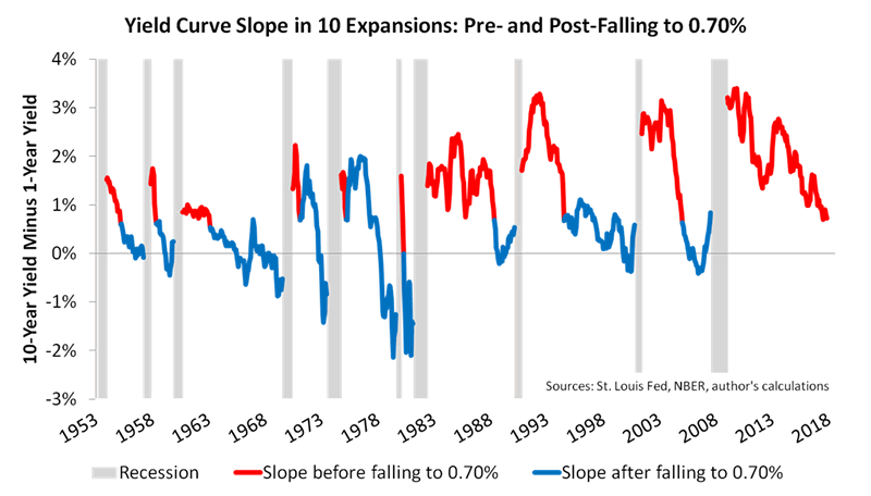
In this chart, we continued the red portion of the lines only until the curve slope fell to 0.70%, because that’s the lowest (month-average) level recorded during the current expansion. In other words, the chart shows how far along we were in each expansion when the curve slope had behaved similarly to its recent behavior.
And here’s the same data in bar form, which makes our argument about as clear as we can make it:
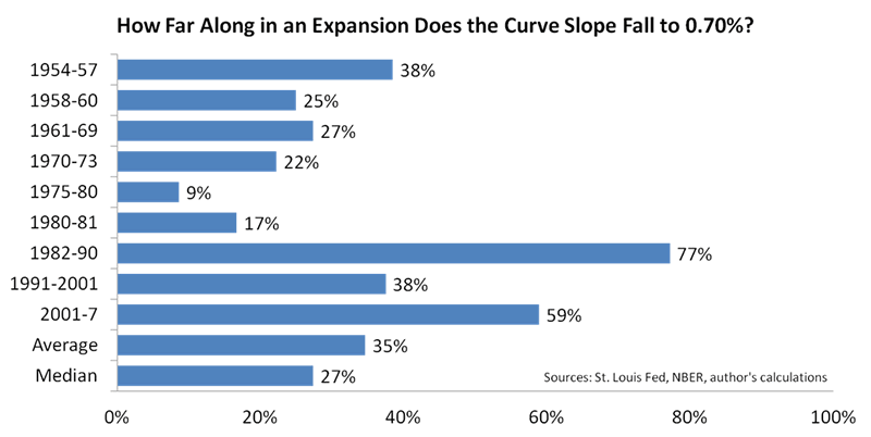
Unlike what you might hear elsewhere, the chart suggests that today’s curve slope doesn’t tell us much at all about where we stand in the current business cycle. We’ve seen similar curve slopes both before and after the midpoints of the last nine expansions, and mostly before. Notice that the average is only 35%, meaning that the average point at which the curve slope fell to 0.70% was only slightly more than a third of the way through an expansion. The median is even lower at 27%.
Conclusions
Overall, the data tell us to look elsewhere for signs of recession, because that’s not what we’re seeing in today’s yield curve. Sure, the downward trend may appear threatening, but it hasn’t fallen to a level that says we’re nearing the peak of the business cycle.
That’s not to say the Fed’s monetary tightening won’t eventually help trigger the next recession, by dampening credit conditions and weakening asset markets. Moreover, the yield curve will probably flatten more as the fed funds rate continues to rise, and that process bears watching—we’re not saying attention to the yield curve is unwarranted. As of this writing, though, the weight of the evidence tells us the expansion isn’t dead yet, and the yield curve fully supports that view.
Thank you for reading. If you’d like more background on the economic thinking behind our research, please consider buying our book, Economics for Independent Thinkers. You can find more information, including sample chapters, at nevinsresearch.com.
F.F. Wiley
F.F. Wiley is a professional name for an experienced asset manager whose work has been included in the CFA program and featured in academic journals and other industry publications. He has advised and managed money for large institutions, sovereigns, wealthy individuals and financial advisors.
© 2018 Copyright F.F. Wiley - All Rights Reserved
Disclaimer: The above is a matter of opinion provided for general information purposes only and is not intended as investment advice. Information and analysis above are derived from sources and utilising methods believed to be reliable, but we cannot accept responsibility for any losses you may incur as a result of this analysis. Individuals should consult with their personal financial advisors.
© 2005-2022 http://www.MarketOracle.co.uk - The Market Oracle is a FREE Daily Financial Markets Analysis & Forecasting online publication.