An Inflation Indicator to Watch, Part 2
Economics / Inflation Feb 26, 2018 - 03:46 PM GMTBy: F_F_Wiley
“Inflation comes from too much money chasing too few goods.” –Many an economics professor
But does it really?
In Part 1 of this series, I said I would challenge popular beliefs about inflation, while at the same time proposing an alternative theory. I also promised that the theory leads to an inflation indicator with an excellent prediction record, and I’ll define the indicator in this article. Considering inflation determines bull and bear markets in both stocks and bonds, that’s my big pitch.
But first, here’s a recap.
In the last article, I argued we should stop fixating on M2, as economists do, and focus instead on the amount of money banks pump into the economy when they deliver loan proceeds. Bank-created money, which I call “M63,” flows directly into GDP, thanks to the charters that allow banks to produce money from nothing when they make loans or buy securities.
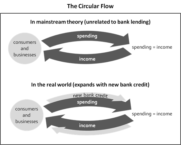
Here’s a chart from the earlier article:

The chart shows bank loans lifting spending above the amount spenders can fund from prior income, which fattens the circular flow, boosting GDP. Bank-funded spending might lift real GDP or inflation, or both, but however it works into the economy, we can find a correlation with nominal GDP. And we can demonstrate the correlation with either loan or money data, as long as we define money as bank-created money (M63), not M2.
God’s A-Gonna Trouble the Water
You might wonder, though, if bank-created money outperforms M2, why do mainstream economists rarely discuss it?
To restate a few more points from Part 1, the answer lies partly in the backstory of the 1960s and 1970s, when the economics gods pulled a bait-and-switch. The gods baited Milton Friedman and Anna Schwartz with ninety-four years of M63 data, and Friedman and Schwartz then analyzed and wrote up the data in their magnum opus, A Monetary History of the United States, 1867-1960. Within ten years, the book was a classic, and Monetarism had become a key building block in mainstream economics. Thanks to M63, Friedman and Schwartz reached their profession’s pinnacle while becoming household names outside of it.
But somewhere along the way, the gods pulled their switch.
Instead of continuing to channel M63, they directed economists toward measures such as M2, which better matched the profession’s long-time fascination with the intrinsic characteristics of money (such as liquidity, stability and value as a medium of exchange). Economists were well-accustomed to treating money as an independent force that’s mostly unrelated to bank lending, and a close look at ninety-four years of history wasn’t powerful enough to break old habits. In fact, most economists were unaware of the differences between the traditional money measures that dominated their discussions and the M63 measure that Friedman and Schwartz studied, and they might still be unaware. Even Friedman and Schwartz gave no indication they considered the differences significant.
To be sure, the bait-and-switch wasn’t a big deal at first, because the various money measures were highly correlated. But the correlations soon weakened, and only M63 retained a strong correlation with economic growth. In other words, up-to-date research reaffirms Friedman and Schwartz’s original conclusions about M63 while refuting the supposed value of M2, adding to the ample evidence that M2 failed as an economic indicator.
Of course, that brief history of Monetarism isn’t well-known, if known at all outside a few small tribes of economics rebels. But the more you delve outside the mainstream, the more obvious it becomes that it’s the only history that matches real events. Spend enough time running with the rebels, and you’ll come to appreciate three facts that mainstreamers typically sweep aside or deny:
- Bank charters authorize commercial banks to create money from nothing when they extend loans, making bank lending fundamentally different than other types of lending.
- We can measure the amount of money that banks create.
- Bank-created money is often uncorrelated with the money measures you hear about in the media, such as M2.
Once you accept those three facts, you only need to look at the connections between the various money measures and the economy (see my article “Learning from the 1980s”) to confirm the case for refocusing on M63. And as noted above, it also helps to know that Friedman and Schwartz produced their seminal research using M63, not M2, for which data didn’t exist over the full period of study. Plot twists like that almost make the history of economic thought entertaining, as if written by Stephen King or M. Night Shyamalan.
There’s a Leak in This Old Economy
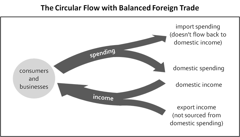
Needless to say, M63 feeds into the alternative inflation theory, but it’s not the only input. Let’s complete the theory by adding other inputs, and the next one also drops from the circular flow. It accounts for exports and imports, which I’ve added to the flow in the chart below (leaving out bank loans this time to keep it simple):

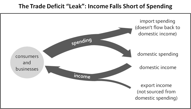
The chart shows exports boosting the income accruing to domestic producers (at the bottom), whereas imports have the opposite effect of channeling business to foreigners at domestic producers’ expense (at the top). Pretty basic, right? Maybe not especially interesting? In fact, foreign trade becomes interesting within the circular flow only when exports and imports fail to balance, as in the United States. Because of America’s trade imbalance, her circular flow doesn’t self-replenish, as shown in the next chart:

Notice that domestic income is shrinking with respect to spending, which is the piece I find interesting—that’s what I mean when I say the circular flow doesn’t self-replenish. Or, you can think of the flow springing a leak, whereby purchasing power leaks from the domestic economy with potential consequences for inflation. Before weighing those consequences, though, we need to consider the bigger picture.
In particular, we need to consider how foreigners use the dollars they accumulate when they sell more stuff to us than we sell to them. They have excess dollars they need to invest, thanks to the trade imbalance, but how? Are they investing their dollars directly into our “real” economy, or do those dollars first flow into our “financial” economy? Economists often downplay that difference, noting that the two economies connect, but my experience as an everyday observer, analyst and investor tells me it’s important.
If foreigners use their dollars to build a factory in, say, South Carolina, our real economy gets a boost that neutralizes the circular flow’s leak. But if they only buy stocks and bonds in our financial economy, that shouldn’t provide as much of an offset to the leak. (If you’re used to talking about the velocity of money, another way to make the same argument is to say that the circular flow slows down—meaning lower velocity—when purchasing power has to take a detour through financial markets.)
So which is it?
Well, data show the foreign sector mostly draining dollars from our real economy and then investing them in our financial economy. The real-economy drain (or leak) reduces pricing power and dampens inflation, while financial-economy investments boost asset prices. For this article, we’ll consider only the inflation effect. (I may write later about whether trade imbalances help U.S. stocks trade at higher multiples than other markets, which seems a reasonable secondary conclusion.)
Two Words You’ll Be Hearin’
Essentially, America’s trade deficit is deflationary, and you probably already believed that without me trying to convince you. I’ve supported the case using the charts above to show similarities between foreign trade and bank-created money—namely, both affect inflation by disturbing the circular flow. Once we connect inflation to the circular flow, we can see that
- Inflation should rise when purchasing power injected into the spending flow causes it to exceed the amount of domestic income from the prior period. The most common example, which I discussed in Part 1 and recapped above, is a surge in money-creating bank loans.
- Inflation should fall when purchasing power leaking from the spending flow causes it to undershoot the amount of prior-period domestic income. The most common example is a trade deficit that redirects the spending flow from domestic to foreign producers, meaning it no longer circles back cleanly and directly to the real economy, as discussed above.
More simply, inflation forecasters should be aware of injections to and leaks from the spending flow. Or even more simply, just think injections and leaks. In my opinion, those two words should appear in the job description of every would-be macroeconomist.
But that’s not all, because I haven’t yet accounted for the supply side, which could expand or contract to absorb the injections and leaks. Depending on the supply side, injections and leaks could have greater effects on real growth than on inflation. We can use a reasonable method for isolating inflation, though—we just compare the spending injections and leaks to real GDP growth, and that approximates whether spending is overshooting or undershooting supply.
All Together Now (Bom Bom Bompa Bom)
So my suggested inflation indicator is easy to calculate—we add M63 growth to the trade balance and then subtract real GDP growth. M63 growth and the trade balance measure spending injections and leaks (have I mentioned those terms?), whereas real GDP growth tells us about the supply side.
Conceptually, the indicator modifies the saying that inflation comes from too much money chasing too few goods. Instead of fixating on money, we’d like to know whether too much purchasing power is chasing too few goods, or, in the case of disinflation, whether too little purchasing power is chasing too many goods. The difference between money and purchasing power may sound trivial, but consider the following:
- When Milton Friedman predicted high inflation in the 1980s (see Part 1), he cited strong M2 growth as the reason for his prediction. Had he allowed that purchasing power was leaking from the spending flow as America’s trade deficit soared, he may not have sounded his errant inflation alarm.
- Also in the 1980s, M2 lost its strong correlation to the amount of purchasing power created by commercial banks. It no longer gave an accurate reading on the amount banks were injecting into the spending flow, and I would say it’s no coincidence that M2 lost its effectiveness as a leading indicator at the same time.
- Data shows quantitative easing (QE) failing to inject much purchasing power into the spending flow, confounding those who expected the money created through QE to lead to high inflation. (See my article “QE’s Untold Story” for the “argyle chart” that shows how banks responded to QE.)
Clearly, money and purchasing power can be different, and I’m suggesting the better way to understand inflation is to look at purchasing power within the circular flow, not money.
You might think of a tug-of-war between purchasing power, on one hand, and capacity, on the other. The tug-of-war’s outcome depends on the circular flow’s particular pattern, which depends on spending injections and leaks, and that’s the crux of the alternative theory I’m proposing. To my knowledge, you won’t read the same theory in any other blog, book or paper, but that’s not to say it doesn’t build on the history of thought. You can find the theory’s origins in my recently published book, Economics for Independent Thinkers, which covers the circular-flow approach in more detail.
I haven’t yet shown the theory works, though, and I’ll do that in Part 3. As already promised, I’ll show that the circular-flow indicator has an excellent historical record.
F.F. Wiley
F.F. Wiley is a professional name for an experienced asset manager whose work has been included in the CFA program and featured in academic journals and other industry publications. He has advised and managed money for large institutions, sovereigns, wealthy individuals and financial advisors.
© 2018 Copyright F.F. Wiley - All Rights Reserved
Disclaimer: The above is a matter of opinion provided for general information purposes only and is not intended as investment advice. Information and analysis above are derived from sources and utilising methods believed to be reliable, but we cannot accept responsibility for any losses you may incur as a result of this analysis. Individuals should consult with their personal financial advisors.
© 2005-2022 http://www.MarketOracle.co.uk - The Market Oracle is a FREE Daily Financial Markets Analysis & Forecasting online publication.


