


Some Commodity Charts are Breaking Out
Commodities / Commodities Trading Dec 21, 2017 - 02:53 PM GMT

 Today I would like to update some charts for the commodities complex as we are starting to see some action in this sector. Back in the summer months when we first started to get long some of the different commodities sectors, we got many breakouts from some very nice H&S bases. After the initial move up came the first consolidation phase that has been going on for nearly four months or so. We are now starting to see some of these consolidation patterns breaking out which should lead to the next impulse move higher in most cases.
Lets start with BHP, one of the biggest miners on the planet, that shows a good example of where we are at in the bull market. Today the price action broke out with a gap above the top rail of an almost 5 month triangle consolidation pattern. A backtest to the top rail would come in around the 43.50 area.
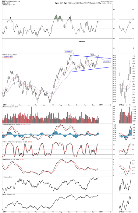
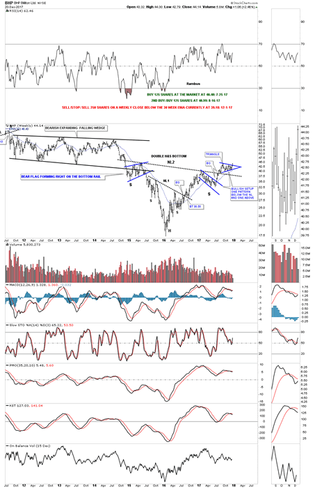
Now lets look at a long term weekly chart which shows some classic Chartology. We have discussed many times in the past when you see a small consolidation pattern form just below an important trendline, in this case the neckline, and one above, that is usually a very bullish setup which BHP is now showing.
Also keep in mind the size of that double H&S bottom that took three years to buildout. Big patterns lead to big moves. The minimum price objective of that double H&S bottom is measured from the head straight up to the neckline # two. Add that distance to the breakout point to get your minimum price objective.
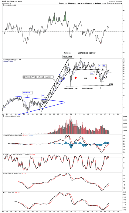
This monthly chart put the double H&S bottom in perspective.
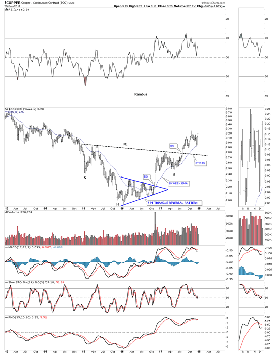
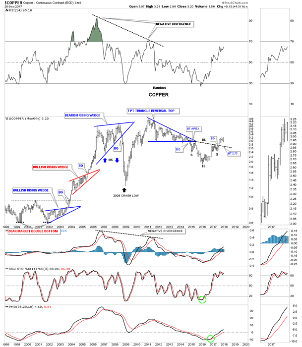
Copper is an important commodity as it can show the strength or weakness of the economy which is why it’s called Dr. Copper. This weekly chart shows copper’s big H&S bottom with the breakout in the summer. The head formed a 7 point triangle reversal pattern which actually reversed the bear market. Here is a case where we didn’t see a backtest to the neckline when the breakout took place. The 30 week ema has done a good job of holding support so far during Coppers new bull market.
This 20 year monthly chart shows how the H&S fits into the very big picture.
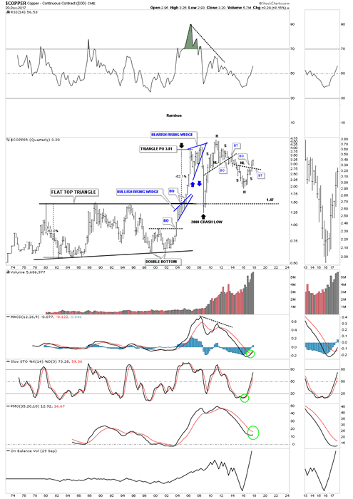
Below is the quarterly chart which shows some nice Chartology especially that 24 year flat top triangle’s price objective.
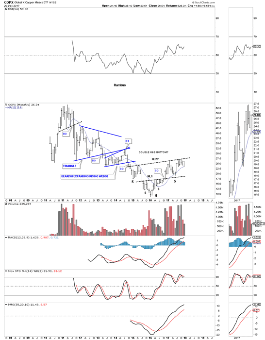
I originally took two positions, one in July and one in August of this year for the COPX, Copper Miners etf, in anticipation of the eventual breakout above the neckline which so far hasn’t happened just yet. It’s close but no cigar.
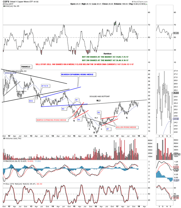
This monthly chart shows a double H&S bottom which many of the different commodities are showing. The 12 month simple moving average has done a good job of showing support during the new bull market.
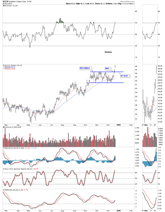
SCCO, Southern Copper, is the strongest stock in this sector. The daily chart below shows it has just broken out from a rectangle consolidation pattern with a breakout gap.
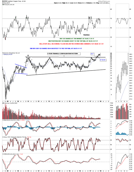
If big patterns lead to big moves then this weekly chart for SCCO says we should expect a very large impulse move higher as it’s trading at a new all time high after breaking out from a six year triangle consolidation pattern.
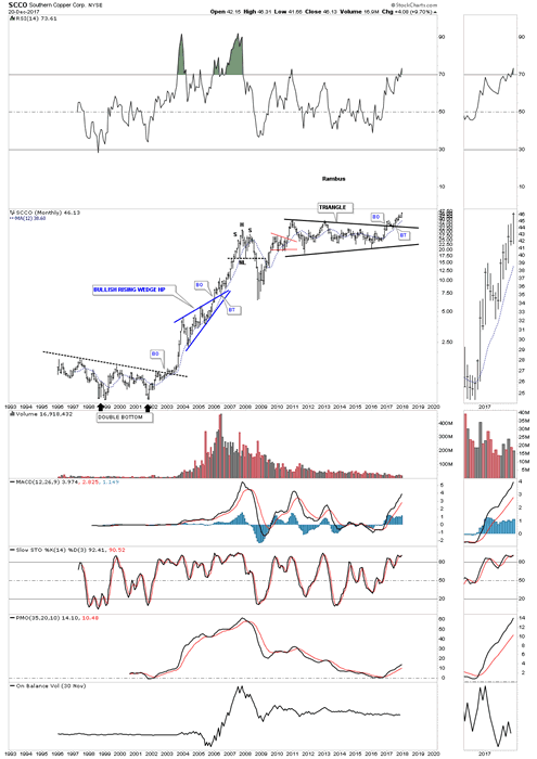
This 25 YEAR monthly chart below shows the breakout taking place above the six year triangle consolidation pattern which is now making new all time highs. Note the blue bullish rising wedge that formed as a halfway pattern back in the early 2000’s.
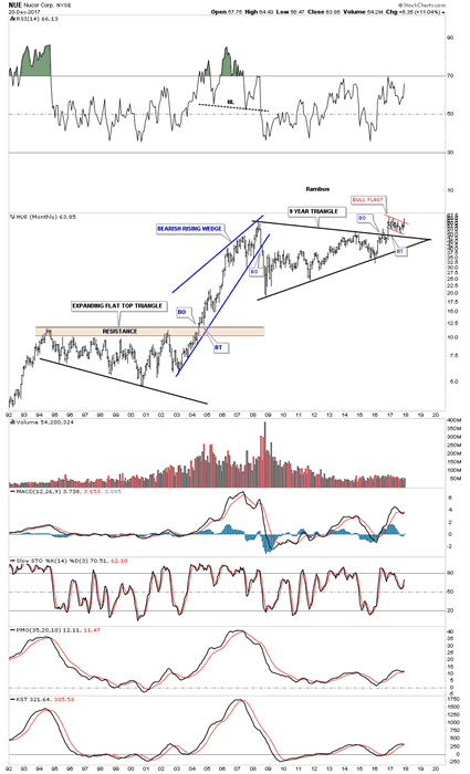
Some of the steel stocks are starting to show their pent-up bullishness as they are breaking out from major consolidation patterns. This monthly chart for NUE shows it broke out from its 9 year triangle consolidation pattern in 2016 and has been consolidating that breakout move by forming a second consolidation pattern just above the top rail which is the Red Bull flag.
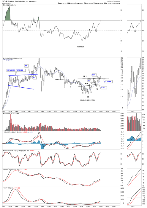
This week SCHN is breaking out from a six year double H&S bottom. You would have to go all the way back to 2011 to equal today’s high.
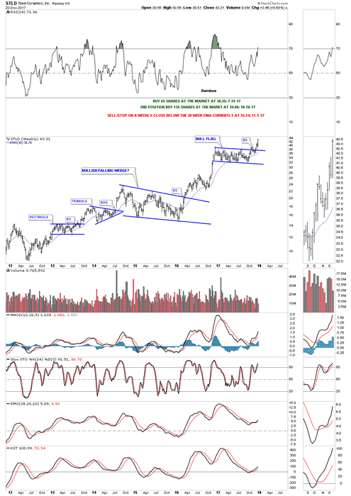
This weekly chart for STLD shows it broke out from a one year bull flag three weeks ago.
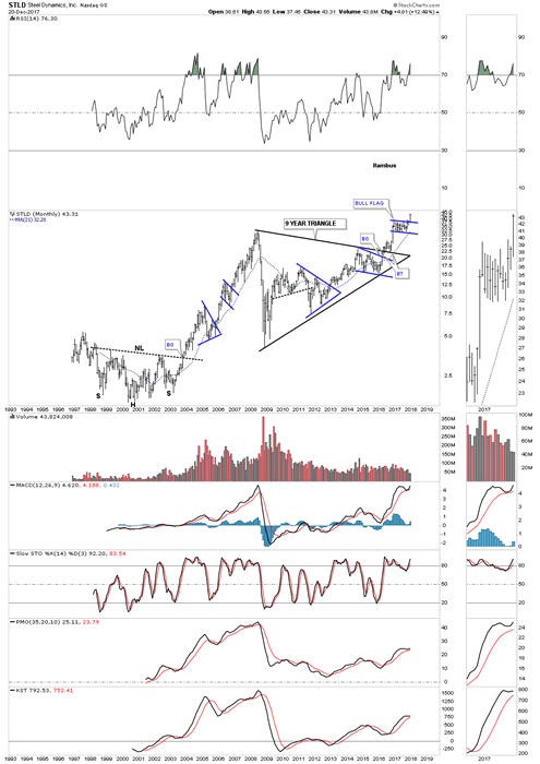
This 20 year monthly chart shows the entire history for STLD. This chart also has some nice Chartology on it. Note the 2000 H&S bottom which launched STLD on its first bull market which produced several consolidation patterns along the way. When that bull market ended in 2008 it took 9 years to build out the massive triangle consolidation pattern which is now launching STLD on its next bull market leg higher. If you stand back and look at this chart from a distance you can almost see the beginnings of a parabolic move taking place.
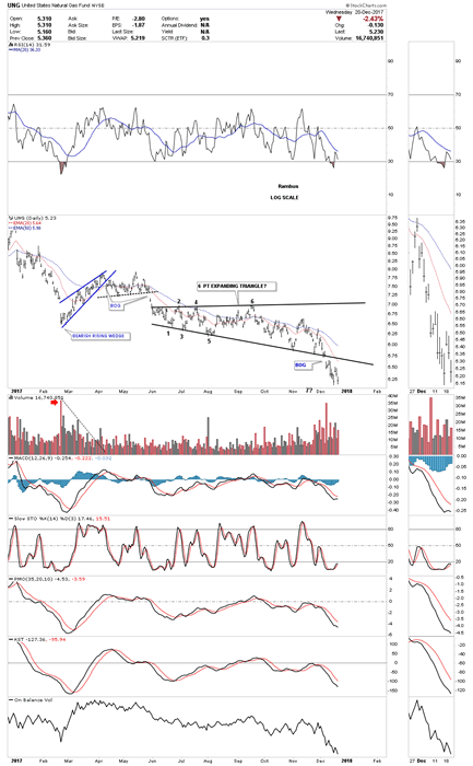
Before I run out of time I would like to show you one of the weakest areas in the commodities complex which is $NATGAS. Last week it finally broke down from a year and a half H&S top. We now have a clean line in the sand, above the neckline is bullish and below is bearish.
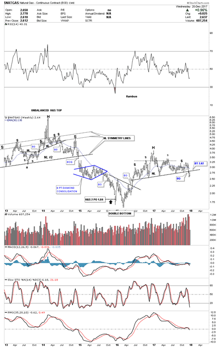
Several weeks ago I tried to go long UNG as it was testing the bottom rail of an expanding triangle. After five touches of the bottom rail I thought it would hold one last time, but that wasn’t the case. After getting a decent pop off the last touch the price action reversed straight down and then gapped the bottom trendline where I exited the trade. Again UNG is bullish above the bottom rail and bearish below.
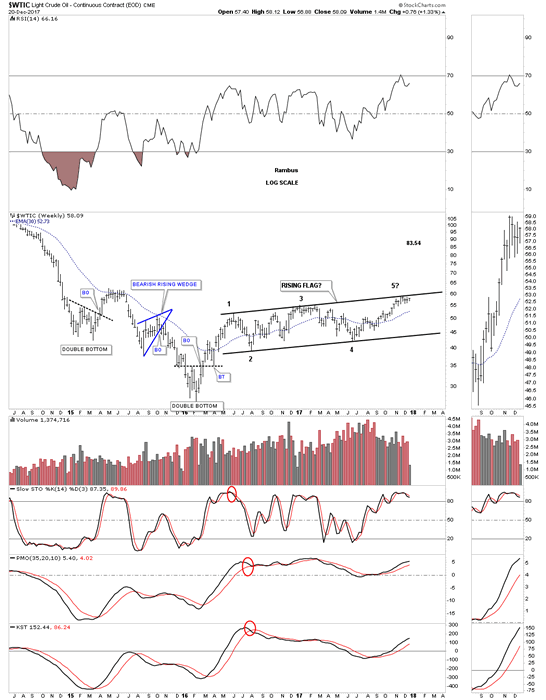
There are two patterns I’m keeping a close eye on for $WTIC. This first pattern is a rising flag formation which has just completed its fourth reversal point at the top rail. I would view the rising flag as a halfway pattern if the price action can take out the top rail.
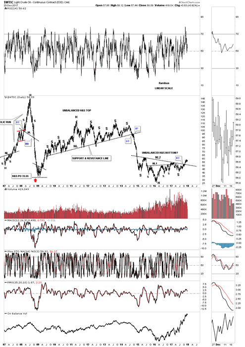
As we’ve seen with some of the other commodity related stocks tonight many have formed a double H&S bottom reversal pattern. This 10 year daily chart for $WTIC shows it too has a double H&S pattern in play with a breakout above the neckline. The last time we looked at this chart I suggested it looked similarly inverse to that massive unbalanced H&S top, only on a smaller time frame.
This 20 year monthly chart shows how the double H&S bottom fits into the big picture.
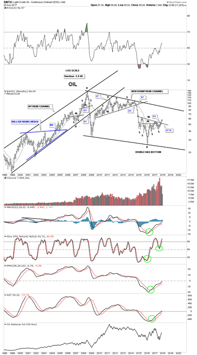
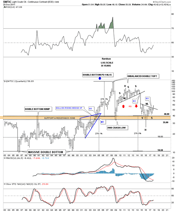
This last chart for tonight is a 35 year quarterly chart which puts everything in perspective. Keep in mind the measured move for a H&S pattern when you look at this chart. Time to get this posted
All the best
Gary (for Rambus Chartology)
FREE TRIAL - http://rambus1.com/?page_id=10
© 2017 Copyright Rambus- All Rights Reserved
Disclaimer: The above is a matter of opinion provided for general information purposes only and is not intended as investment advice. Information and analysis above are derived from sources and utilising methods believed to be reliable, but we cannot accept responsibility for any losses you may incur as a result of this analysis. Individuals should consult with their personal financial advisors.
© 2005-2022 http://www.MarketOracle.co.uk - The Market Oracle is a FREE Daily Financial Markets Analysis & Forecasting online publication.