


Five Charts That Show We Are on the Brink of an Unthinkable Financial Crisis
Stock-Markets / Financial Crisis 2017 Nov 30, 2017 - 02:55 PM GMTBy: John_Mauldin

 Bonfires are fun to watch, but they eventually burn out.
Human folly apparently doesn’t, so we just keep adding to the absurdities. The volume of daily economic lunacy that lights up my various devices is truly stunning, and it seems to be increasing (you can find a previous series of charts in my free newsletter Thoughts from the Frontline, which you can subscribe to here).
Let’s take a look at a series of charts I received from my “kitchen cabinet” of friends.
The Economy Is More Deleveraged Than Ever
First up is Grant Williams who sent me a monumental slide deck. Here is just one example of craziness.
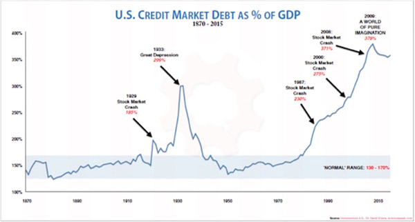
Source: Grant Williams
This chart is straightforward: It’s outstanding credit as a percentage of GDP. Broadly speaking, this is a measure of how leveraged the US economy is.
It was in a sedate 130%–170% range as the economy industrialized in the late 19th and early 20th centuries. It popped higher in the 1920s and 1930s before settling down again. Then came the 1980s. Credit jumped above 200% of GDP and has never looked back.
It climbed steadily until 2009 and now hovers over 350%.
Absurd doesn’t do this situation justice. We are mind-bogglingly leveraged. And consider what the chart doesn’t show. Many individuals and businesses carry no debt at all, or certainly less than 350% leverage. That means many others must be leveraged far higher.
While lending has been a very lucrative business in recent decades, it’s hard to believe it can last. At some point we must experience a great deleveraging. When that happens, it won’t be fun.
Cash Allocation Is Lowest Since 2007
“Contrarian” investors believe success lies in going against the crowd, because the crowd is usually wrong. My own experience suggests one small adjustment: Pay attention not to what the crowd says but to what it does. Words are cheap.
This next chart is a prime example.
We see here the amount of cash held by Merrill Lynch clients from 2005 to the present, as a percentage of their assets. The average is about 13%.
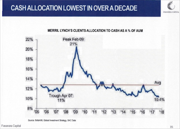
Source: Fasanara Capital
The pattern is uncanny. In 2007, as stock indexes reached their peak, cash holdings were well below average. They rose quickly as the crisis unfolded, peaking almost exactly with the market low in early 2009.
In other words, at the very time when it would have been best to reduce cash and buy equities, Merrill Lynch clients did the opposite. And when they should have been raising cash, they kept their holdings low. I don’t think this pattern is unique to Merrill Lynch’s clients; Market timing is hard for everyone.
The disturbing part is where the chart ends. Merrill Lynch client cash allocations are now even lower than they were at that 2007 trough. Interest rates are much lower, too, so maybe that’s not surprising.
Central banks spent the last decade all but forcing investors to buy risk assets and shun cash. This data suggests it worked. But whatever the reason, investor cash levels suggest that caution is quite unpopular right now.
So if you consider yourself a contrarian, maybe it’s time to raise some cash.
Michael Lewitt’s Reality Check
Michael Lewitt’s latest letter came in this morning. He began with the marvelous Ralph Waldo Emerson quote that I used at the beginning of this letter, and then he helpfully contributed this list of absurdities:
Anyone questioning whether financial markets are in a bubble should consider what we witnessed in 2017:
• A painting (which may be fake) sold for $450 million.
• Bitcoin (which may be worthless) soared nearly 700% from $952 to ~$8000.
• The Bank of Japan and the European Central Bank bought $2 trillion of assets.
• Global debt rose above $225 trillion to more than 324% of global GDP.
• US corporations sold a record $1.75 trillion in bonds.
• European high-yield bonds traded at a yield under 2%.
• Argentina, a serial defaulter, sold 100-year bonds in an oversubscribed offer.
• Illinois, hopelessly insolvent, sold 3.75% bonds to bondholders fighting for allocations.
• Global stock market capitalization skyrocketed by $15 trillion to over $85 trillion and a record 113% of global GDP.
• The market cap of the FANGs increased by more than $1 trillion.
• S&P 500 volatility dropped to 50-year lows and Treasury volatility to 30-year lows.
• Money-losing Tesla Inc. sold 5% bonds with no covenants as it burned $4+ billion in cash and produced very few cars.
This is a joyless bubble, however. It is accompanied by political divisiveness and social turmoil as the mainstream media hectors the populace with fake news. Immoral behavior that was tolerated for years is finally called to account while a few brave journalists fight against establishment forces to reveal deep corruption at the core of our government (yes, I am speaking of Uranium One and the Obama Justice Department). In 2018, a lot of chickens are going to come home to roost in Washington, D.C., on Wall Street, and in the media centers of New York City and Los Angeles. Icons will be blasted into dust as the tides of cheap money, cronyism, complicity, and stupidity recede. Beware entities with too much debt, too much secrecy, too much hype. Beware false idols. Every bubble destroys its idols, and so shall this one.
The Fed’s Balance-Sheet Unwind Spells Trouble
The next absurdity is absurd because it is so obvious, yet many don’t want to see it. Too bad, because I’m going to make you look.
This comes from Michael Lebowitz of 720 Global. It’s the S&P 500 Index overlaid with the Federal Reserve’s balance sheet and the forecast of where the Federal Reserve intends to take its balance sheet.
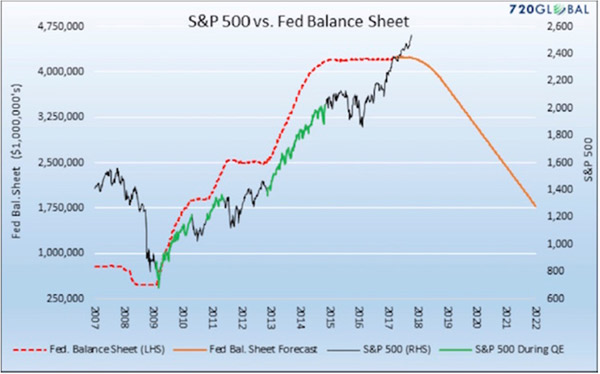
Source: 720 Global
The Fed and other central banks have practically forced investors into risk assets since 2008. You can see the relationship very clearly in this chart. The green segments of the S&P 500’s rise occurred during quantitative easing programs.
Correlation isn’t causation, but I think we can safely draw some connections here.
Ample low-cost liquidity drives asset prices higher. That’s not controversial. It makes perfect sense that the withdrawal of ample low-cost liquidity would also impact asset prices in the opposite direction.
The Fed has even given us a schedule by which it will unwind its balance sheet. Michael’s chart gives us a sense of how far the S&P 500 could drop if the Fed unwinds as planned and if the relationship between liquidity and stock prices persists. Either or both of those could change; but if they don't, the S&P 500 could fall 50% in the next few years.
Volatility-Linked Hedges Won’t Deliver in a Flash Crash
Many investors see all these warning signs but think they can keep riding the market higher and hedge against losses at the same time. It doesn’t really work that way.
Wall Street firms have rolled out all kinds of volatility-linked products that purport to protect you from sudden downside events. Most of these products are linked to the Volatility Index, or VIX.
Volatility has been persistently low as the market has risen in recent years. That has made it cheap to buy protection against a volatility spike. However, it’s not clear if the sellers of this protection will be able to deliver as promised.
My friend Doug Kass has been concerned about this for some time. He believes the risks of a “flash crash” are rising, and those who think they are hedged may learn that they are not.
He shared this Morgan Stanley graphic of how many VIX futures contracts would have to be bought to cover a one-day market drop.
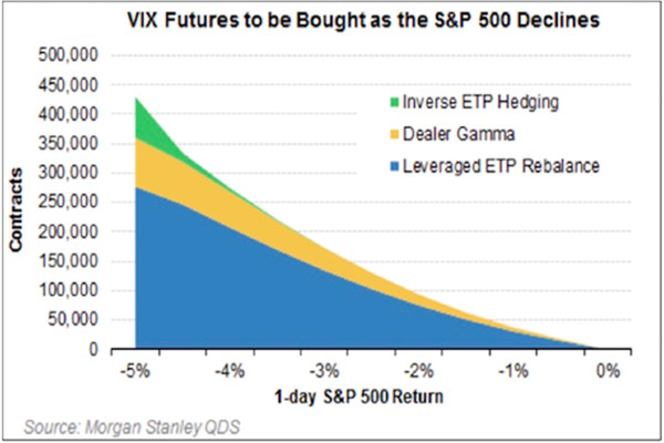
Between hedgers, dealers, and ETP sponsors, a one-day 5% downward spike in the S&P 500 would force the purchase of over 400,000 VIX futures contracts. This was in October, and the figure has probably risen more since then. Doug isn’t sure a market under that kind of stress can deliver that much liquidity.
I suspect the various VIX-linked products will disappoint buyers when the unwind occurs.
High-Yield Debt Might Be a Trigger for the Next Crisis
Doug also shared what will be the final graph for this week and observed, “This is the dreaded alligator formation, and the jaws always close.”
It’s just a matter of time. It could take another year and get even sillier, but when that gator snaps its jaws shut, a lot of people will get bitten.
I personally think the bubble in high-yield debt, accompanied by so much convenant-lite offerings, will be the source of the next true liquidity crisis.
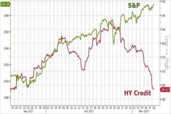
Source: ZeroHedge
The amount of money available to market makers to use to maintain some type of order in a falling high-yield market is absurdly low. Investors in high-yield mutual funds and ETFs think they have liquidity, but the managers of those funds will be forced to sell into a market where there is no price and there are no bids.
Oh, the bids will show up at 50% discounts. Distressed-debt funds and vulture capital will see opportunities, and they will be there. Talk about blood in the streets.
Get one of the world’s most widely read investment newsletters… free
Sharp macroeconomic analysis, big market calls, and shrewd predictions are all in a week’s work for visionary thinker and acclaimed financial expert John Mauldin. Since 2001, investors have turned to his Thoughts from the Frontline to be informed about what’s really going on in the economy. Join hundreds of thousands of readers, and get it free in your inbox every week.
John Mauldin Archive |
© 2005-2022 http://www.MarketOracle.co.uk - The Market Oracle is a FREE Daily Financial Markets Analysis & Forecasting online publication.