


What Financial Conditions Tell Us (Two Charts and a Prediction)
Stock-Markets / Stock Market 2017 Aug 25, 2017 - 11:47 AM GMTBy: F_F_Wiley

 It seems every bank, including central banks, publishes a financial conditions index these days. And because financial conditions typically lead the economy, it makes sense to track them. In fact, they might contain even more information than they get credit for. They might offer the elusive “crystal ball” that foretells our economic fortunes.
Sound far-fetched? Spend a few minutes with this week’s pictures and talk, and you’ll be well equipped to judge for yourself. We start with seven of our favorite indicators, shown in the table below:
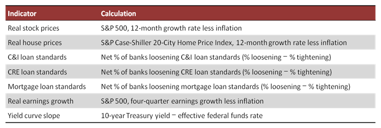
With one exception, all of the indicators measure a separate piece of the economy’s financial side. We add business earnings (the exception) because they interact closely with financial conditions. When earnings are healthy, stock prices and business credit conditions are usually healthy, too, whereas weak earnings usually weigh on stocks and credit.
Instead of melding the indicators into a single index, though, we think it’s more revealing to treat them individually. The chart below shows each indicator in the quarter before and the quarter of the last nine business cycle (BC) peaks, although with less data for lending standards, which the Fed began surveying for the first time in mid-1990.
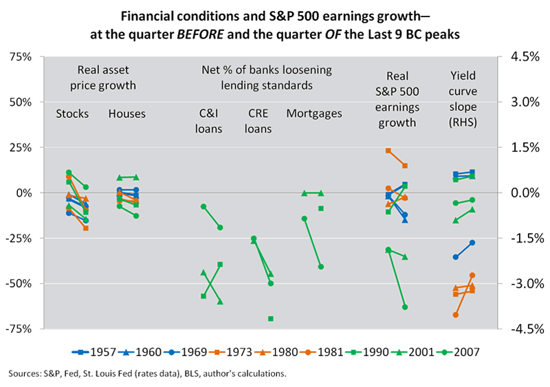
The chart gives us a dashboard-like screenshot of the circumstances that led us into past recessions:
- The left side shows either stock or house prices or both declining in real terms at the last nine BC peaks.
- The middle shows lending standards tightening before each of the last three BC peaks.
- The right side shows the last nine BC peaks coinciding with either weak earnings growth or an inverted yield curve or both.
With that history as our background (in charcoal gray), the next chart highlights the most recent data:
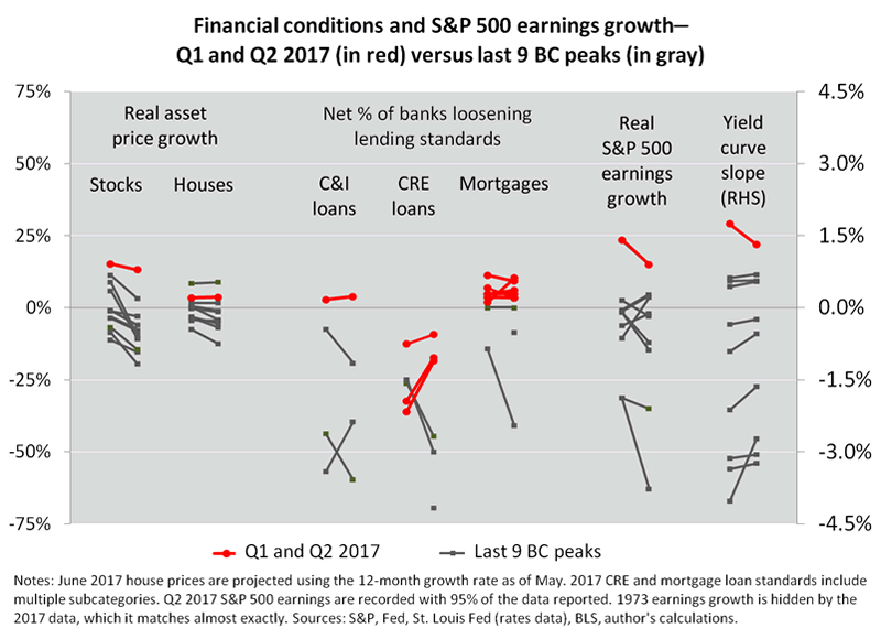
The above chart is, in our view, the best way to judge financial conditions—with a strong reminder of how current conditions compare to the conditions that shaped past recessions. As of today, that comparison looks favorable. If a recession was imminent, it would be first time in at least six decades that the economy tipped over with
- both stock and house prices having outpaced inflation over the previous four quarters,
- all but the smallest loan category (CRE) standing on the “easier credit” side of zero, and
- earnings growing strongly (in this instance, rebounding from a recent swoon) while the yield curve remains upwardly sloped.
Or, another way to look at it is to crisscross all of the indicators with all of the BC peaks, which shows only one instance (house price growth in 2001) of an indicator being clearly more expansionary at a peak than as of right now. Any statistician using only our seven indicators would conclude that further expansion is more likely now than at any of the past peaks.
And that’s not all. Financial conditions seem even more important than before, thanks to a private-sector balance sheet that over the last six decades has approximately doubled relative to GDP. As assets and liabilities grow bigger relative to GDP, financial volatility should be more impactful. Even mainstream economists—long held back by pathologies in economic theory—may be catching on, although that’s a topic for another day.
Of course, you may say our second chart has a limited shelf life, and we would agree. Any of our indicators could change over the coming weeks and months. They seem far enough from recession territory, though, to expect continued expansion through the rest of the year.
The outlook’s main blemish, in our view, is that the poobahs at the Fed would like financial conditions to tighten. The past year’s loosening in conditions—even as the Fed nudged policy rates higher—seems a happy coincidence. Eventually, policymakers should get their wish. Financial conditions, like many things in life, don’t remain winsome, warm and welcoming forever. And as the eventual tightening comes into view, we suggest using the “dashboard” charts to weigh the consequences. You might decide that they form the crystal ball that predicts the next BC peak. And that wouldn’t be surprising—in fact, it would make ten consecutive business cycles foretold by changing financial conditions.
F.F. Wiley
F.F. Wiley is a professional name for an experienced asset manager whose work has been included in the CFA program and featured in academic journals and other industry publications. He has advised and managed money for large institutions, sovereigns, wealthy individuals and financial advisors.
© 2017 Copyright F.F. Wiley - All Rights Reserved
Disclaimer: The above is a matter of opinion provided for general information purposes only and is not intended as investment advice. Information and analysis above are derived from sources and utilising methods believed to be reliable, but we cannot accept responsibility for any losses you may incur as a result of this analysis. Individuals should consult with their personal financial advisors.
© 2005-2022 http://www.MarketOracle.co.uk - The Market Oracle is a FREE Daily Financial Markets Analysis & Forecasting online publication.