Evidence That Stocks are More Overvalued than Ever
Stock-Markets / Stock Market 2017 May 19, 2017 - 04:40 PM GMTBy: Harry_Dent

 Tuesday morning, the Dow was just 27 points away from 21,000 again!
How can anyone believe this is NOT a bubble?!
Nobel Laureate and economist Robert Shiller developed the best valuation indicator I’ve seen. His cyclically adjusted price-earnings ratio is known as the Shiller P/E, or CAPE.
And he agrees with me: We’re clearly in bubble territory!
Yet Fed Chair Janet Yellen and investing legend Warren Buffett – and way too many other experts and investors – continue to believe otherwise!
They should take notice of what I’m about to say…
Shiller uses the average of the last 10 years’ earnings to smooth out wild fluctuations near tops and when earnings suddenly crash in major recessions or depressions. This makes the model more reliable than the simple price-to-earnings ratio (P/E).
Doing this shows us that we’ve only gone higher twice before, and there are specific reasons for that, which I’ll explain below.
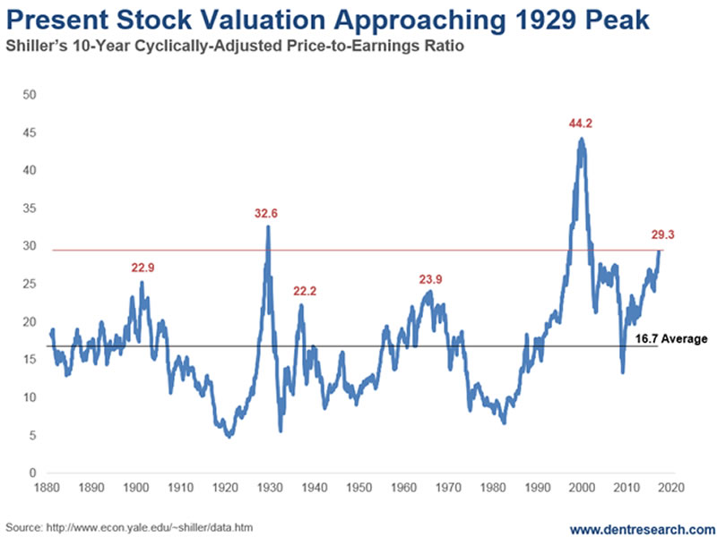
First, look at this chart…

As you can see, we’ve seen several peaks, biggest of which were in 1929, 1999, and now.
So, by saying that we’re not in a bubble, are the experts insinuating that 1929 wasn’t a bubble?
That the 90% crash, the greatest in U.S. history, was just bad luck… a “black swan?”
It certainly seems that way, but then again, most people can only see a bubble with 20/20 hindsight.
It’s true that today’s ratios aren’t as high as 1999, but that’s missing an important detail. That is, stock prices and valuations soared at the turn of the century because my four key cycles were moving up together.
A quick comparison of the 1925-29 bubble, the current bubble, and the tech bubble of 1995 to early 2000, shows what effect this different environment has on valuations.
The 45-year Innovation Cycle peaked in 1920, with the exact peak of the railroad industry. It then turned down into 1942.
The 39-year Generational Spending Wave pointed up strongly into late 1929, with a massive generation of immigrants. Then it crashed and had a secondary high again in 1937 before crashing once more.
The 34-year Geopolitical Cycle turned up in 1915 and peaked in 1930, converging with demographic trends through late 1929.
The 10-year Boom/Bust Cycle turned up in late 1923 and peaked in late 1929. Then it crashed into late 1933, the depths of the Depression.
So, three of my four key indicators converged in an upward arc into late 1929.
All four of them headed downward simultaneously from late 1930 into 1933. During this time, the Shiller CAPE indicator managed to reach only 32.6, but again well after the peak! It was only 18 at the peak in late 1929.
These four cycles converged again into early 2000.
The Generational Spending Wave turned up from late 1982 through late 2007. The 45-Year Innovation Cycle turned positive from late 1988 through 2010. The Geopolitical Cycle headed up from late 1982 into 2001 (until 9/11, to be precise). Finally, the Boom/Bust Cycle was up until February 2014 and has pointed down since then, with a bottom projected around early 2020.
All four cycles were heading up – together – into early 2000. This made the tech bubble of late 1994 into early 2000 the most favorable period in history, even more so than the Roaring 20s bubble… the greatest before it.
That’s why we witnessed the highest-ever valuations. It was baked into the cycles cake.
Now, all four cycles have converged on a downward path into early 2020…
The impact of the Geopolitical Cycle on stocks alone is to halve valuations from top to bottom. Based on this cycle, P/E ratios of 22 to 24 would be more normal at this point, with Dot-Com Era peak ratios of 44.2 unattainable.
There’s also another way to look at this…
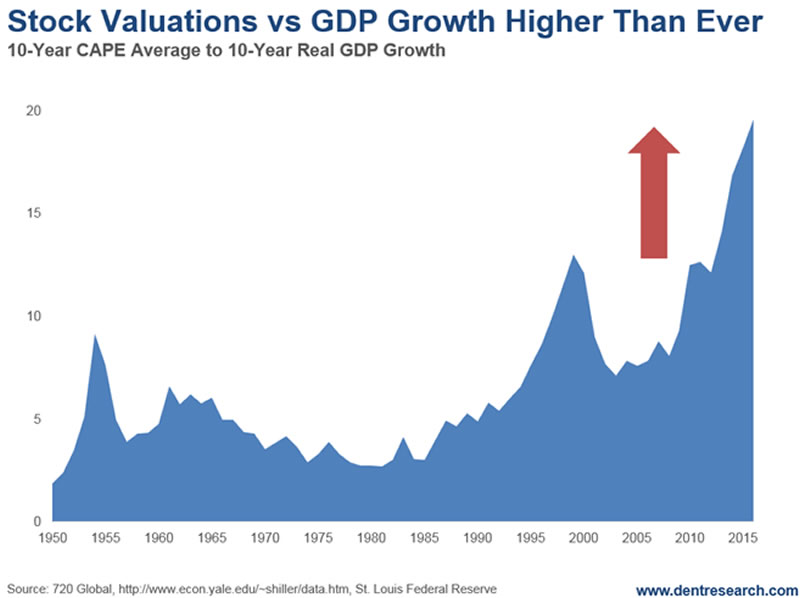
Here’s a chart that adjusts the CAPE ratios for GDP growth which is much lower in the recent boom than in the roaring 90’s.

The picture is clear: P/E ratios are higher than ever, and much higher that 1999 when you adjust for lower growth and economic momentum.
And if that’s not proof enough, there’s another valuation indicator that puts to rest any doubts that we’re in a bubble. You can read the May issue of Boom & Bust for the details.
Do yourself a favor: Don’t be lulled into a false sense of security by the experts claiming we’re not in a bubble.
We are in the largest and broadest bubble in modern history. And it will burst.
Harry
Follow me on Twitter @HarryDentjr
Harry studied economics in college in the ’70s, but found it vague and inconclusive. He became so disillusioned by the state of the profession that he turned his back on it. Instead, he threw himself into the burgeoning New Science of Finance, which married economic research and market research and encompassed identifying and studying demographic trends, business cycles, consumers’ purchasing power and many, many other trends that empowered him to forecast economic and market changes.
Copyright © 2017 Harry Dent- All Rights Reserved Disclaimer: The above is a matter of opinion provided for general information purposes only and is not intended as investment advice. Information and analysis above are derived from sources and utilising methods believed to be reliable, but we cannot accept responsibility for any losses you may incur as a result of this analysis. Individuals should consult with their personal financial advisors.
© 2005-2022 http://www.MarketOracle.co.uk - The Market Oracle is a FREE Daily Financial Markets Analysis & Forecasting online publication.


