A ‘Must-See’ Chart for Gold and Silver Aficionados
Commodities / Gold and Silver 2017 May 17, 2017 - 07:58 AM GMTBy: Peter_Degraaf
 Every now and then a chart appears that provides us with a great opportunity.
The following chart fits that mold.
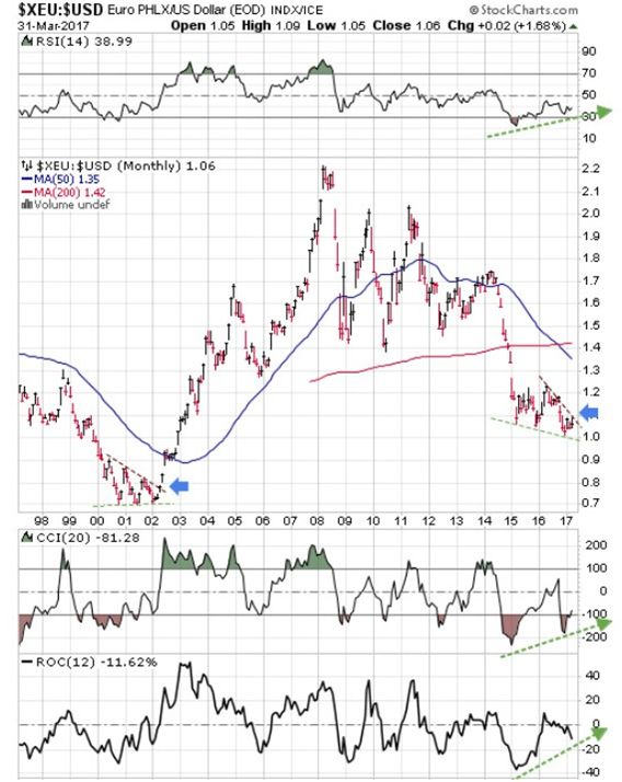
(Charts courtesy Stockcharts.com and Goldchartsrus.com). Featured is a chart that compares the EURO(DM) to the US dollar. When the trend is rising, it means the Euro is stronger than the US dollar and vice versa. History tells us that gold has a tail wind when the trend here is upward bound, and a head-wind when the trend in this index is falling. Please notice the upside breakout in 2002 from a multi-year triangle. It was at this time that gold began its rise from $260.00 to $1,925.00. Now notice a similar pattern (a falling wedge), developing on the right. Price is close to breaking out at the second blue arrow. The supporting indicators are giving off positive divergence (green arrows). A breakout could come at any day, and gold (and silver) stand to benefit. In the event of a repeat percentage performance in the price of gold, the long-term target (based on gold’s performance between 2002 and 2011), for this coming breakout, is $9,300.00.
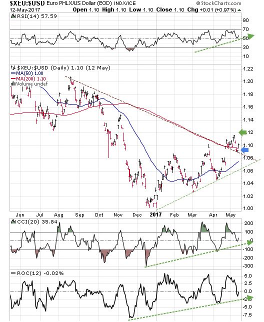
Here is a close-up of the first chart. Price is breaking out at the blue arrow and a close above the green arrow will confirm the breakout. The supporting indicators are positive (rising).
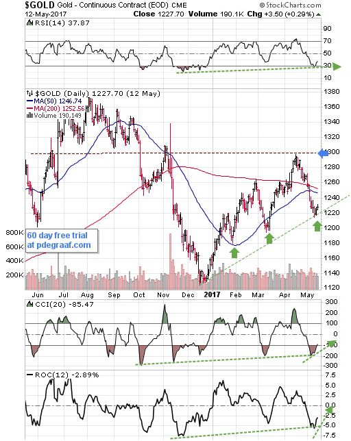
Featured is the daily gold chart. The vertical green arrows point to ascending bottoms. The pattern is an Ascending Right Angled Triangle. A breakout at the blue arrow will set up a short-term target at $1480. The supporting indicators are turning positive.
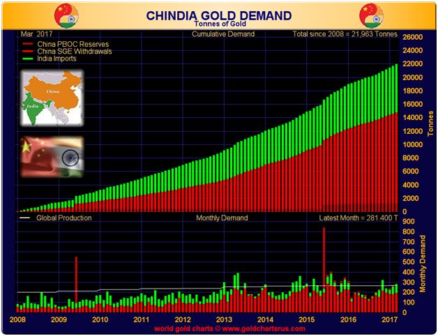
This chart shows the combined demand for gold in India and China during March (281 tonnes), equaled the amount of gold that was mined worldwide (white line on chart). Conclusion: These two nations combined are soaking up virtually all of the gold that is being produced. Whenever demand exceeds supply, price must rise.
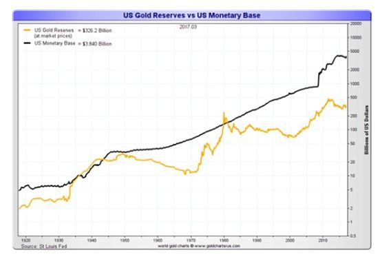
This chart compares dollar value of the (stated) US gold reserves to the US Monetary Base. The two are as far apart as they were in 1976, when a bull market in gold was just getting underway. In order for the value of the US gold reserves to match the comparison of 1940 and 1980, the gold price will have to rise 12 fold. Before we shrug that off, we must remember that it has happened before. 1940, 1980, - next 2020?
Peter Degraaf is NOT responsible for your trading decisions. Please do your own due diligence.
By Peter Degraaf
Peter Degraaf is an on-line stock trader with over 50 years of investing experience. He issues a weekend report on the markets for his many subscribers. For a sample issue send him an E-mail at itiswell@cogeco.net , or visit his website at www.pdegraaf.com where you will find many long-term charts, as well as an interesting collection of Worthwhile Quotes that make for fascinating reading.
© 2017 Copyright Peter Degraaf - All Rights Reserved
DISCLAIMER:Please do your own due diligence. Investing involves taking risks. I am not responsible for your investment decisions.
Peter Degraaf Archive |
© 2005-2022 http://www.MarketOracle.co.uk - The Market Oracle is a FREE Daily Financial Markets Analysis & Forecasting online publication.


