


2 Charts Show Just How Close We Are to US Healthcare Collapse
Politics / Healthcare Sector Apr 05, 2017 - 03:24 PM GMTBy: John_Mauldin

 BY PATRICK WATSON : Like it or not, Obamacare lives. The question is, for how long?
President Trump is right when he says the Affordable Care Act will collapse on its own. Its condition is terminal, and Congress declined treatment.
Maybe that’s no big deal to you. Maybe you’re on Medicare, or get group health coverage from your employer, or are independently wealthy, or you’re in good health and confident you will remain so.
Unfortunately, millions of Americans who don’t fall into any of those categories may soon find themselves in a tough spot.
I don’t want that to be you, so today I’m sounding the alarm. You may enter 2018 with no access to health insurance, which means you will be at risk both medically and financially.
Now is the time to prepare.
Some Perspective on Global Health Care
The first step to solving a problem is admitting you have one. Some of us are in denial, so here’s a hard fact: We Americans spend far more money on health care than any other developed nation, but we’re no healthier.
We’re even less healthy overall.
The chart below shows the bad news. The horizontal axis is years of life expectancy. The vertical axis is per capita healthcare spending.
Ideally, you want to be in the lower right quadrant. That means your population has a relatively high life expectancy and relatively low healthcare spending.
France, Japan, Spain, Chile, and a bunch of others are clustered in that area. Their money buys more health than ours does.
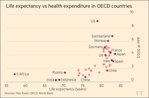
The United States is in the upper right, which shows that our per-person healthcare spending is significantly higher than that of the other OECD countries. Switzerland is a distant second place.
Our extra spending doesn’t help us live longer. We actually die a little earlier than our peers in Japan and most of Europe.
You can quibble over details in this data, but the broad facts are inescapable. We spend too much on healthcare relative to the health it buys us. As long as that is the case, no reform plan will work.
Did Obamacare cause this? No. It goes way back. Here’s another graphic showing the changes over time.
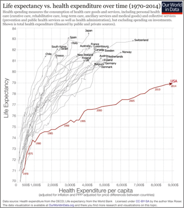
You can see that the United States began diverging from other developed countries back in the 1980s. The gap has only grown wider since then.
Stranger yet, we spend all this extra money yet still leave millions of low-income citizens with little or no access to healthcare. Kaiser Family Foundation says some 2.5 million working Americans make too much to qualify for Medicaid, but not enough to receive Obamacare tax credits.
Brace Yourself for the Death Spiral
I showed you that data to say this: Simply returning to pre-Obamacare conditions won’t solve the problem. Obamacare exists because the system wasn’t working and we needed something better.
Before 2014, people with preexisting conditions were simply out of luck. They couldn’t buy health insurance at any price, unless their employers offered group health, which many didn’t. This was hurting both those people and the economy at large.
Obamacare, for all its flaws, at least tried to solve the problem. It helped some people but hurt others—and now it’s reached its limits.
Insurance works only if the risk pool includes enough low-spending people to offset those with expensive claims. That’s Obamacare’s core problem. The legal mandate to buy insurance hasn’t brought enough young and healthy people into the pool.
This is the “death spiral” you hear about. People with serious illnesses will buy insurance no matter what it costs. This drives up claim ratios, which then drives premiums yet higher and discourages young and healthy people from buying.
That can’t work indefinitely.
Subscribe to Connecting the Dots—and Get a Glimpse of the Future
We live in an era of rapid change… and only those who see and understand the shifting market, economic, and political trends can make wise investment decisions. Macroeconomic forecaster Patrick Watson spots the trends and spells what they mean every week in the free e-letter, Connecting the Dots. Subscribe now for his seasoned insight into the surprising forces driving global markets.
John Mauldin Archive |
© 2005-2022 http://www.MarketOracle.co.uk - The Market Oracle is a FREE Daily Financial Markets Analysis & Forecasting online publication.