


6 Charts That Show We Are in a Long-Term Stocks Secular Bear Market
Stock-Markets / Stocks Bear Market Dec 25, 2016 - 05:56 AM GMTBy: John_Mauldin

 As I look out over the coming years, I am convinced that we’ll see the blowing up of the biggest bubbles in history—including those of government debt and government promises. And it’s not just in the US, but all over the world.
That will lead to an eventual global crisis of biblical proportions. Although, it isn’t clear what the immediate cause of the crisis will be.
Let’s start with some basics
The most common way to measure valuation is with the price-to-earnings ratio (P/E). Analysts compile P/E and other indicators from many companies to give us valuation metrics on entire markets and indexes.
You can see overvaluation and undervaluation in this chart from my friend Ed Easterling of Crestmont Research.
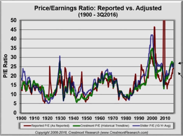
The red line is the combined P/E ratio of the S&P 500 as originally reported. The green and blue lines are adjusted Crestmont and Shiller versions, which occasionally diverge. The P/E ratio spent most of the last century between 10 and 25.
Presently, all three P/E versions are near or above 25, indicating overvaluation. This doesn’t mean the end is near—though it could be. But it does suggest that we are not at the beginning of another long-term bull market.
P/E adjusted to economic growth
The next chart illustrates the past and present trend in a different way.
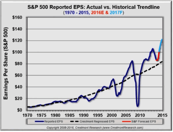
Direct your attention to the dashed line.
It’s Ed’s long-term earnings baseline, which he adjusts to reflect the relationship of earnings to economic growth. Reported earnings per share go below the baseline during bear markets and above it in bullish periods. Currently, it is way above trend and is projected by S&P and many others on Wall Street to become even more so.
The Buffett indicator
The Buffett Indicator is essentially the market value of all publicly traded securities as a percentage of GDP. Intuitively, it seems odd that the combined value of every public stock would be worth more than the country’s annual production. But sometimes it is. Those periods tend to mark overvaluation, as you can see here.
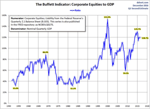
The interesting thing here is that right now, the Buffett Indicator—while down from its late 2014 peak—is still higher than it was before the 2008 financial crisis. That should not be encouraging if you’re a bull.
S&P 500 median since 1964
The next chart is from Ned Davis and shows us the S&P 500 median P/E back to 1964, which is 16.9 (dotted green line). The distance we are above or below the median is a valuation clue.
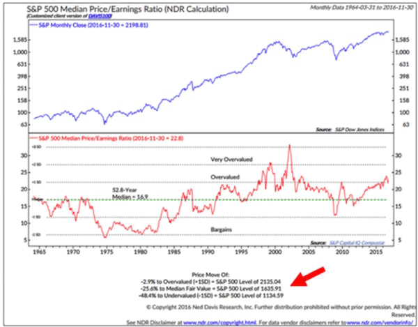
Could the market get more overvalued? Absolutely. It did in the tech bubble.
Household equity percentage vs. S&P 500 total return
The following chart takes some explaining.
It shows the percentage of household financial assets invested in stocks (blue line) versus the S&P 500 total return for the following 10 years (dotted line).
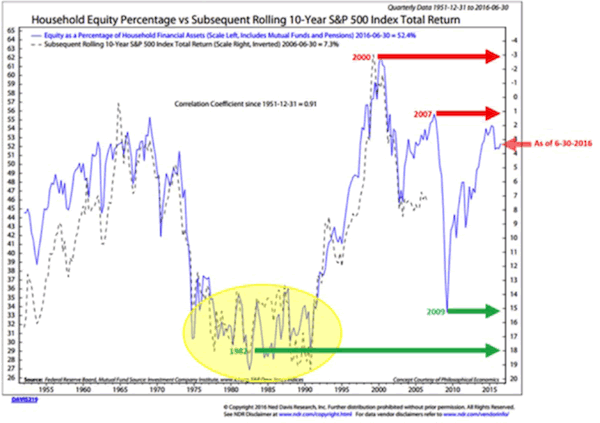
Notice that the right axis is inverted and the dotted line tracks pretty close to the solid blue one. The correlation is 0.91, which is extraordinarily high.
What the chart shows us is that a higher percentage of household assets in equities points to a lower annualized return over the next 10 years.
Note the green arrow at the 2009 low. It points off to the right scale just below 15. That suggests that someone who bought stocks at that low point and holds them until 2019 will realize a roughly 15% annualized return.
That’s the good news. The bad news is that the red arrow at 6-30-2016 means that the 10 years ending 6-30-2026 should produce a 3.25% annual gain. That’s not awful, of course, but it is nowhere near the 7% or more that many pensions and insurance companies think they can earn on their portfolios.
We are way overdue for a correction
Bottom line: We are way overdue for a correction. Again, our situation is not the worst it’s ever been, but we are beginning to bump up against historical lines in the sand.
Here’s the chart, which shows the number of days before the start of 5%, 10%, and 20% corrections.
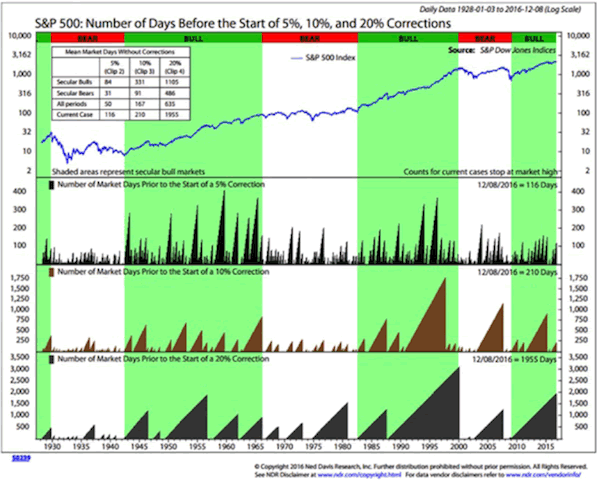
Here is how you read this chart:
The top section shows the history of the S&P 500 Index from 1928 to present. The next three sections show the number of days prior to the start of 5%, 10%, and 20% corrections.
I think we are still in a very long-term secular bear, although there has been a clear cyclical bull market since 2009. I think the next global recession (hopefully not a depression) will potentially give us a vicious bear market that will mark the end of this secular bear.
You can see that it has been 116 days since we had a 5% correction. Since 1928, the average number of days before a 5% correction occurred was 50. In secular bull periods, the average number of days was 84. In secular bear periods, the average number of days was 31.
Note that we have been 210 days without a 10% correction. Since 1928, the average number of days before a 10% correction occurred was 167. In secular bull periods, the average number of days was 331, while in secular bear periods, the average number of days was 91.
It has been 1955 days since we suffered a 20% correction. Since 1928, the average number of days before a 20% correction occurred was 635. In secular bull periods, the average number of days was 1105. In secular bear periods, the average number of days was 486.
The current case of 1955 days without a 20% correction is more than three times the average of 635 days (for the whole period from 1-3-1928 to 12-8-2016).
For this record number of days, let us all join hands and exclaim, “Thank you, Fed, BOJ, and ECB!”
FREE Report: How the Fed Is Leading Us to Monetary Hell
Contrary to common belief, it’s not greedy Wall Street brokers that are wrecking the US economy—but academic policymakers like the ones employed by the Federal Reserve. And they all have the best intentions… Read financial-bestseller author John Mauldin’s riveting special report, How the High Priests of Economics Are Leading Us to Monetary Hell. Click here to get your free copy now. John Mauldin Archive |
© 2005-2022 http://www.MarketOracle.co.uk - The Market Oracle is a FREE Daily Financial Markets Analysis & Forecasting online publication.