The Most Hated Stocks Bull Market in History
Stock-Markets / Stock Markets 2016 Nov 10, 2016 - 01:09 PM GMT I know some of you are wondering why I didn’t post many charts today. The reason being, when there is extreme volatility one can get whipsawed to death getting caught on the wrong side of the whipsaw. My experience has been to let things settle down for a day or two and see what happens. I always look for how the price action is interacting with a potential strong support or resistance line. Normally, whatever the direction the big trend is in, when you get a day like today, after the volatility subsides, the big trend will reassert itself again. It may take a few days or a few weeks but the big trend is your friend.
Earlier today I showed you a daily chart for the INDU which showed several small blue consolidation patterns forming on top of a one year black triangle consolidation pattern. There is another daily chart I haven’t shown you yet that shows the two small blue consolidations forming in a rising wedge formation. Until today I had the lower black rail of the rising wedge parallel to the top rail. With the big reversal taking place I adjusted the bottom rail up to catch this weeks low, which is now giving us a rising wedge formation. I’ve shown you many times in the past how bigger patterns can be made up from smaller patterns. This is now the case with the rising wedge formation.
This is where it gets interesting. Probably 95% of folks that follow chart patterns think that a rising wedge is always a bearish rising wedge and prices will breakdown. That is true in many cases, but not always. In strong moving markets a stock can create a rising wedge that will breakout to the upside in the case of an uptrend.
Below is a two year daily chart for the INDU which shows you why I have been sitting tight with some of the leveraged trades. If you recall the beginning of this year 2016, the stock markets took it on the chin and had one of their worst starts to a new year. Things looked pretty bad then. What happened was that the INDU built out a small double bottom reversal pattern, which is actually part of a much bigger double bottom going back to September of 2015. Starting with our small double bottom that built out at the beginning of this year, you can see how the price action wasted little time putting on a strong impulse move up to the first reversal point in the blue flag. That blue flag took about three months to complete. Note the spike down into the fourth reversal point which was the BREXIT bottom, which began the next leg up to new all time highs on the DOW.
When the price action failed to really takeout the previous all time high and reversed back down, that was a warning sign that a potential bigger consolidation pattern may be developing. If the blue bear flag was a stand alone consolidation pattern the price action should have run much higher before correcting lower.
Now fast forward to this weeks price action. Again, another big whipsaw took place which was very similar to the BREXIT vote low, the US elections low. How many could have imagined that the INDU would be up this strong today after it was down over 800 points last night. The moral of the story is the big trend is your friend regardless of all the noise that occurs within the big uptrend. From the January 2016 low you can see a series of higher highs and higher lows which constitutes an uptrend. Note the massive volume today on the breakout above the falling wedge.
It’s still too early to know yet, but if the bull market lives on and the top rail of the big black rising wedge gives way, that will create a bullish rising wedge halfway pattern as shown by the blue arrows. The price objective would be up around the 20,940 area. From a Chartology perspective, since the beginning of the year, you can see a classic uptrend forming, regardless of all the reasons it shouldn’t be happening.
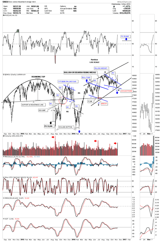
Below is a six year weekly chart which shows the black triangle as a halfway pattern with the two small blue consolidation patterns forming just above the top rail. A new buy signal was given when the 30 week ma crossed back above the 88 week ma.
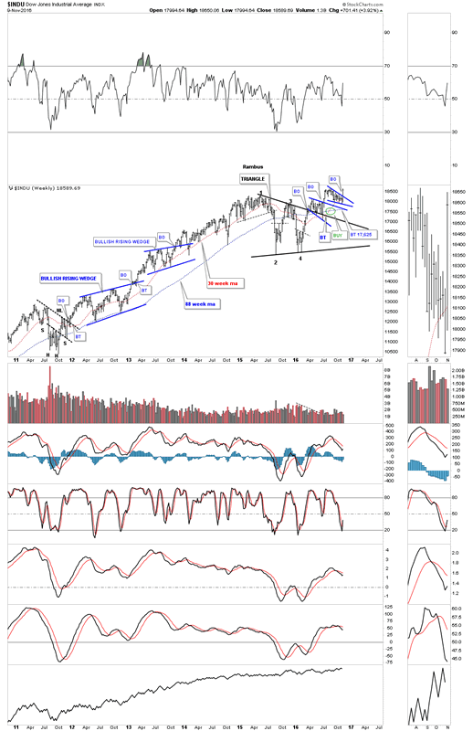
This next chart is a long term twenty year monthly chart for the INDU which shows the infamous JAWS OF LIFE consolidation pattern I’ve been showing you for longer than I care to admit. You can see how the triangle consolidation pattern we looked at on the chart above, fits into the big picture which is showing us the breakout and backtesting that has been going on since 2013. Keep in mind everything is big when you see a big pattern building out. Having the patience to ride out those price swings is a lot tougher to do in real time vs looking back in hindsight.
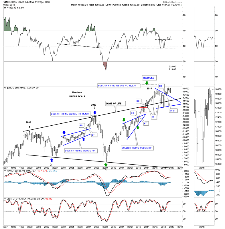
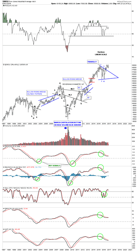
If you don’t like the JAWS OF LIFE consolidation pattern, below is another 20 year monthly chart, which shows the beautiful bull market that began at the 2009 crash low. After seven years of bull market action the INDU is on the verge of making a brand new all time high. Just think about that for a second before you dismiss it. This has been one of the most hated bull markets in history and has taken a lot of folks to the cleaners who have tried to short this market. This chart also shows you a good example of how trading in the direction of the major trend is so much easier to do than to try and trade against it. Virtually everyone who has shorted the INDU and is still holding on to those shorts are underwater. On the other hand, anyone who has bought this index has a profit if they are still holding on.
I keep on coming back to the 75 year quarterly chart for the INDU which helps keep me grounded in regards to the very big picture. I know many of you weren’t around during the 1970’s correction, but that too was a time of negativity which led to the greatest bull market in history at the time. I was hand building charts back then but didn’t know what would happen when the neckline finally gave way. If I remember right, it was 1051 or so. Pessimism was so thick back then you couldn’t cut it with a knife. The only person that I recall that had a bullish outlook for the stock markets was Robert Prechter, who thought the INDU might rally up to the 5000 area, if I remember correctly which everyone laughed at at the time. I know some of you are thinking I’m probably just as crazy as Robert Precther was at the 1982 backtest to the neckline, but are we in a current setup right now with the backtest to the top rail of the JAWS OF LIFE consolidation pattern? I haven’t said this in a long time. The only rule in the stock market is, there are no rules.
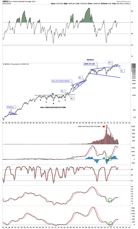
If the INDU is going to start a new impulse leg up, then the Transportation Average will need to come along for the ride, no pun intended, to confirm the bull market is alive and well. Below is the daily chart for the TA which shows the big H&S consolidation pattern which closed at a new high for the year today.
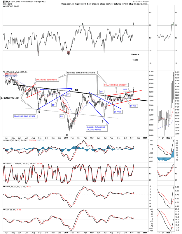
I know how exciting the short term charts can be at times, but it’s the longer term charts that really gives you perspective on the trend. Notice how pretty that one plus year H&S consolidation pattern looks on the weekly chart. As you can see the price action is only in its second week of the next impulse move higher after backtesting the neckline over the last seven weeks or so.
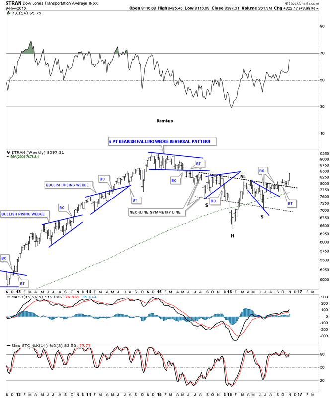
The 20 year monthly chart for the INDU shows you the massive H&S consolidation pattern that formed between 2007 and 2012. It was as pretty as it gets, as shown by the neckline symmetry line which shows the low for the left and right shoulders. The Transportation Average is now in the third month of breakout action above the neckline of our current H&S consolidation pattern.
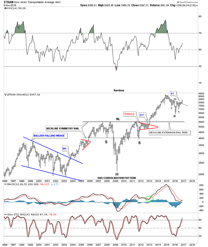
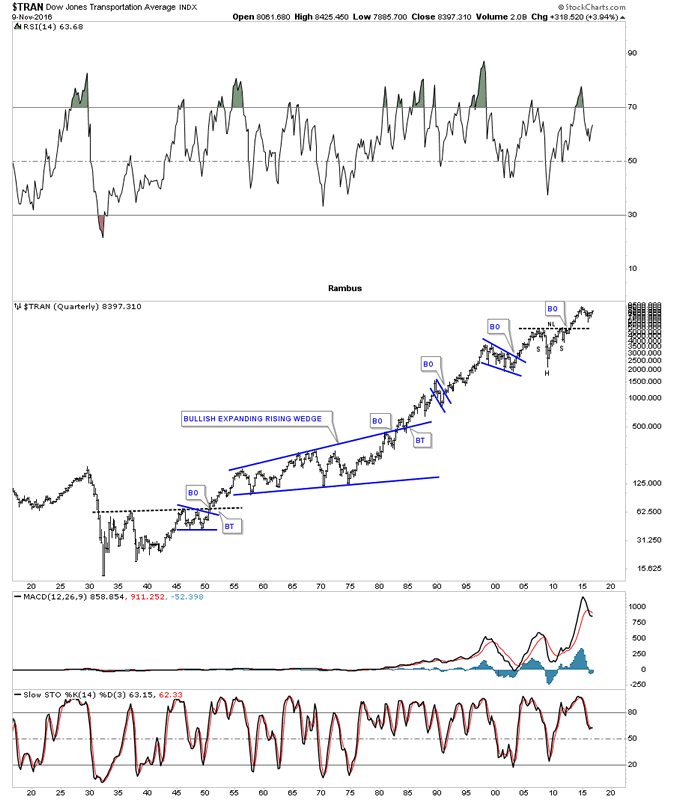
This last chart for the Transportation Average is a 100 year quarterly chart which shows you the big H&S consolidation pattern on the monthly chart above. This 100 year chart also shows you how investors still paint the same chart patterns based on investor psychology. We’ll see the same chart patterns building out 100 years in the future.
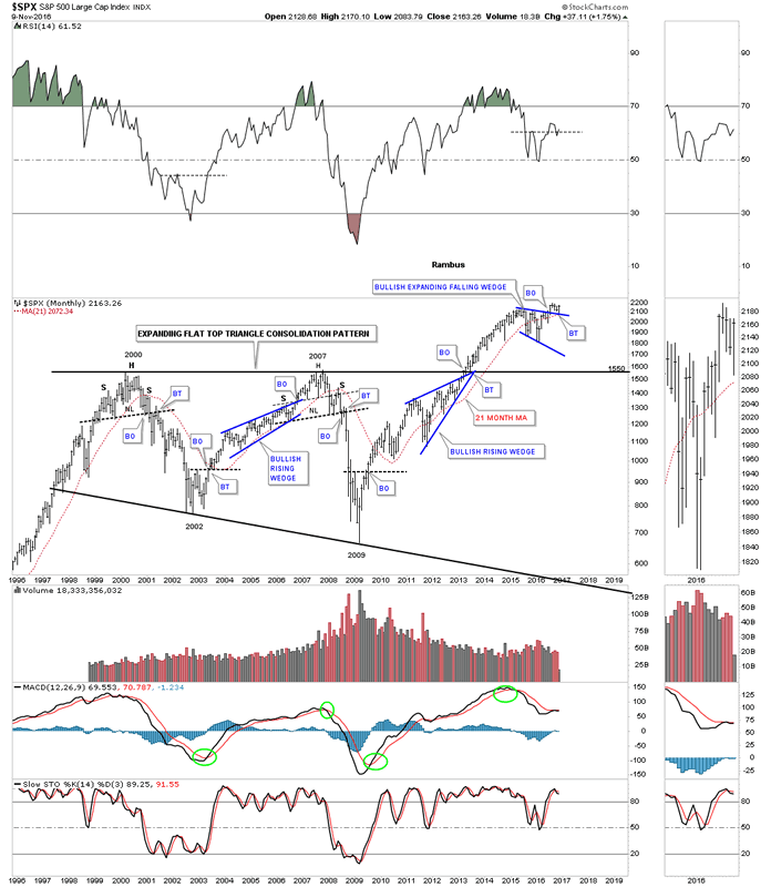
I’m going to go thru these next charts rather quickly so you can see how everything is lining up for a decent move to the upside in the stock markets. Below is a twenty year monthly chart for the SPX which shows it massive 12 year consolidation pattern with the breakout taking place back in late 2012 or so. Note our current blue bullish expanding falling wedge consolidation pattern that had a breakout and a backtest to the top rail, and the 21 month moving average this month. The top rail of the blue expanding falling wedge is a perfect line in the sand, above is bullish, and below is bearish.
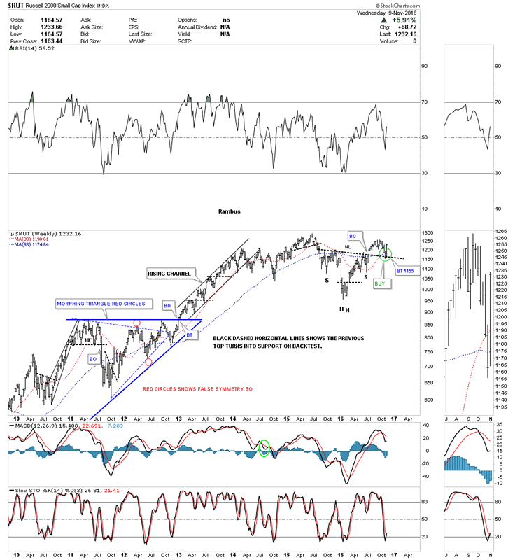
The weekly chart for the $RUT shows it has broken out from a H&S consolidation pattern and has backtested the neckline this week. Also note the 30 week ma has crossed above the 88 week ma for a buy signal.
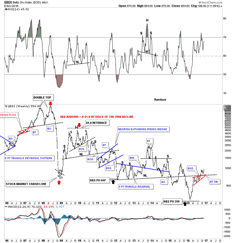
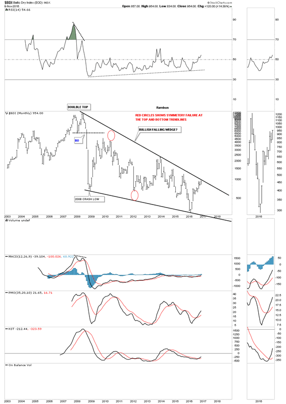
Next up is the BDI, Baltic Dry index which we haven’t looked at in some time but it looks like it may be starting to come to life. Just like the stock markets and commodities for the most part, the BDI built out a small red bullish rising wedge just below an important S&R line or neckline extension line. As you can see, there was a clean backtest last week to the S&R line.
The 15 year monthly chart for the BDI shows a potential massive bullish falling wedge building out with the price action getting close to testing the top rail. This would be a good index to see showing some strength, if the economy and commodities are going to have a decent run.
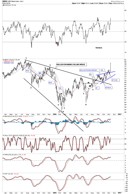
The daily chart for the $BKX, Bank Index, shows a very large expanding falling wedge with the current blue bullish rising wedge breaking out this week.
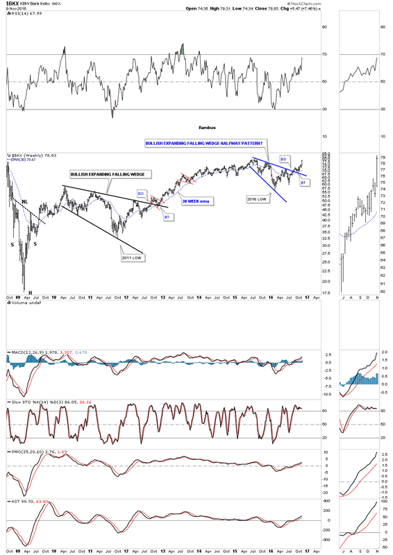
The weekly chart for the $BKX shows you two bullish expanding falling wedges that built out as consolidation patterns. The one that built out in 2010 – 2012 was quite a bit larger than our current one. Note how each one had a nice clean breakout and backtest to their respective top rails.
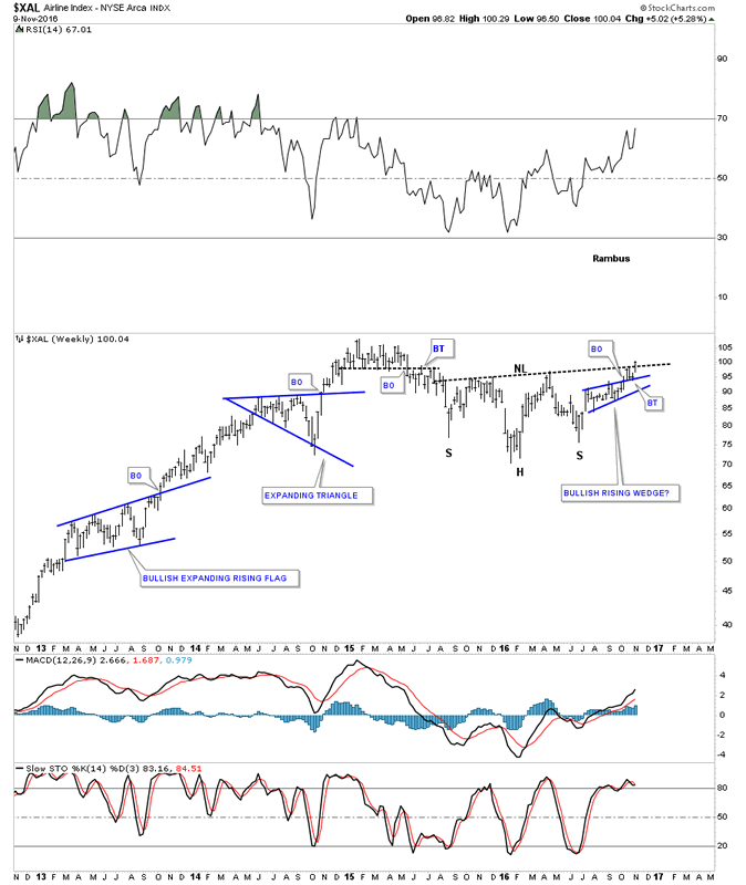
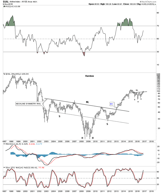
If the Transportation Average is embarking on a new impulse leg up the chances are pretty good the the $XAL, Airline Index, would also be looking bullish. The weekly chart below shows the $XAL breaking out above the neckline this week of a two year H&S consolidation pattern.
The monthly chart for the $XAL shows a very symmetrical ten year H&S consolidation pattern. Just like the Transportation Average we looked at earlier, you can see a similar H&S consolidation pattern building out, with the breakout taking place this week.
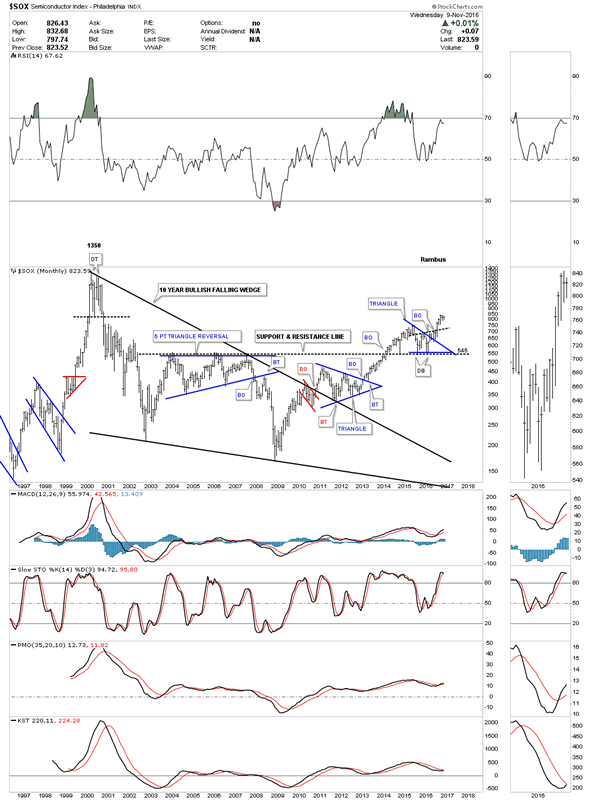
The $SOX, semiconductor index, is another area which has been very strong and is just a whisker away from making a new high, not seen since the 2000 mania bubble.
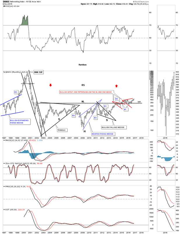
The $NWX, Networking index, we’ve been following for a very long time has taken its sweet ole time breaking out and backtesting that massive 12 year neckline. This has been a lagging sector which may finally come to life and play catch up.
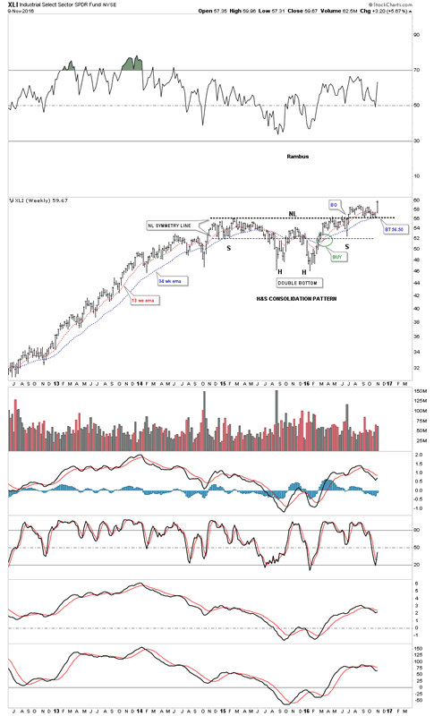
The XLI, Industrial Sector, has been in breakout and backtesting mode since earlier this spring. An all time new high was achieved today.
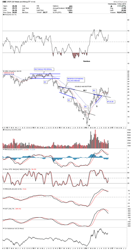
There are many more charts I could show you but I’m running out of time so we’ll look at one more chart which is the XME, metals and mining etf. This is another stock we’ve been following for a long time which shows a nice inverse H&S bottom in place. Like with most commodities and the PM complex, it to bottomed out in January of this year. As you can see it has been in breakout and backtesting mode since the middle of the summer. Today’s price action is finally moving the XME up to almost a new high for the move. This index should bode well for the PM complex and commodities in general.
These charts should give you a feel for how the Chartology looks in many different areas in the markets. There is a lot of confirmation taking place between the many different areas which helps confirm the bull market is still alive and well. All the best…Rambus
All the best
Gary (for Rambus Chartology)
FREE TRIAL - http://rambus1.com/?page_id=10
© 2016 Copyright Rambus- All Rights Reserved
Disclaimer: The above is a matter of opinion provided for general information purposes only and is not intended as investment advice. Information and analysis above are derived from sources and utilising methods believed to be reliable, but we cannot accept responsibility for any losses you may incur as a result of this analysis. Individuals should consult with their personal financial advisors.
© 2005-2022 http://www.MarketOracle.co.uk - The Market Oracle is a FREE Daily Financial Markets Analysis & Forecasting online publication.


