The Peak Oil Paradox Revisited
Commodities / Crude Oil Jul 19, 2016 - 06:54 PM GMTBy: Raul_I_Meijer
 It’s been a while since we posted an article by our friend Euan Mearns, who was active at The Oil Drum at the same time Nicole and I were. Is it really 11 years ago that started, and almost 9 since we left? You know the drill: we ‘departed’ because they didn’t want us to cover finance, which we said was the more immediate crisis, yada yada. Euan stayed on for longer, and the once unequalled Oil Drum is no more.
On one of our long tours, which were based around Nicole’s brilliant public speaking engagements, we went to see Euan in Scotland, he teaches at Aberdeen University. I think it was 2011?! An honor. Anyway, always a friend.
And there’s ono-one I can think of who’d be better at explaining the Peak Oil Paradox in today’s context. So here’s a good friend of the Automatic Earth, Euan Mearns:
Euan Mearns: Back in the mid-noughties the peak oil meme gained significant traction in part due to The Oil Drum blog where I played a prominent role. Sharply rising oil price, OPEC spare capacity falling below 2 Mbpd and the decline of the North Sea were definite signs of scarcity and many believed that peak oil was at hand and the world as we knew it was about to end. Forecasts of oil production crashing in the coming months were ten a penny. And yet between 2008, when the oil price peaked, and 2015, global crude+condensate+NGL (C+C+NGL) production has risen by 8.85 Mbpd to 91.67 Mbpd. That is by over 10%. Peak oilers need to admit they were wrong then. Or were they?
Introduction
It is useful to begin with a look at what peak oil was all about. This definition from Wikipedia is as good as any:
Peak oil, an event based on M. King Hubbert’s theory, is the point in time when the maximum rate of extraction of petroleum is reached, after which it is expected to enter terminal decline. Peak oil theory is based on the observed rise, peak, fall, and depletion of aggregate production rate in oil fields over time.
Those who engaged in the debate can be divided into two broad classes of individual: 1) those who wanted to try and understand oil resources, reserves, production and depletion rates based on a myriad of data sets and analysis techniques with a view to predicting when peak oil may occur and 2) those who speculated about the consequences of peak oil upon society. Such speculation normally warned of dire consequences of a world running short of transport fuel and affordable energy leading to resource wars and general mayhem. And none of this ever came to pass unless we want to link mayhem in Iraq*, Syria, Yemen, Sudan and Nigeria to high food prices and hence peak oil. In which case we may also want to link the European migrant crisis and Brexit to the same.
[* One needs to recall that GWI was precipitated over Kuwait stealing oil from Iraq, from a shared field on the Kuwait-Iraq border, leading to the Iraqi invasion of 1991.]
The peak oil debate on The Oil Drum was a lightning conductor for doomers of every flavour – peak oil doom (broadened to resource depletion doom), economic doom and environmental doom being the three main courses on the menu. The discussion was eventually hijacked by Greens and Green thinkers, who, not content with waiting for doomsday to happen, set about manufacturing arguments and data to hasten the day. For example, fossil fuel scarcity has morphed into stranded fossil fuel reserves that cannot be burned because of the CO2 produced, accompanied by recommendations to divest fossil fuel companies from public portfolios. Somewhat surprisingly, these ideas have gained traction in The United Nations, The European Union and Academia.
It is not my intention to dig too deeply into the past. Firmly belonging to the group of data analysts, in this post I want to take a look at two different data sets to explore where peak oil stands today. Is it dead and buried forever, or is it lurking in the shadows, waiting to derail the global economy again?
The USA and Hubbert’s Peak
The USA once was the poster child of peak oil. The Peak Oil theory was first formulated there by M. King Hubbert who in 1956 famously forecast that US production would peak around 1970 and thereafter enter an era of never-ending decline (Figure 1). Hubbert’s original paper is well worth a read.
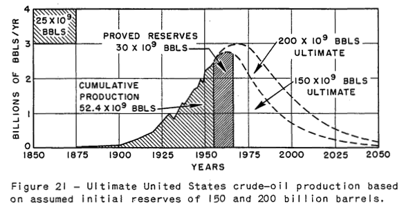
Figure 1 From Hubbert’s 1956 paper shows the peak and fall in US production for ultimate recovery of 150 and 200 billion barrels. The 200 billion barrel model shows a peak of 8.2 Mbpd around 1970 that proved to be uncannily accurate.
Looking to Figure 2 we see that Hubbert’s prediction almost came true. US production did indeed peak in 1970 at 9.64 Mbpd while Hubbert’s forecast was a little lower at 8.2 Mbpd. The post-peak decline was interrupted by the discovery of oil on the N slope of Alaska and opening of the Aleyska pipeline in 1977 that was not considered in Hubbert’s work. Herein lies one of the key weaknesses of using Hubbert’s methodology. One needs to take into account known unknowns. We know for sure that unexpected discoveries and unexpected technology developments will occur, it’s just we don’t know, what, when and how big.
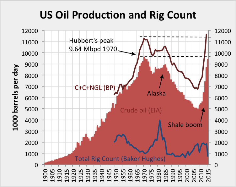
Figure 2 In red, US crude oil production from the EIA shows progressive growth from 1900 to 1970. The oil industry believed this growth would continue forever and was somewhat aghast when M. King Hubbert warned the party may end in 1970 which it duly did. The discovery of oil in Alaska created a shoulder on the decline curve. But apart from that, Hubbert’s forecast remained good until 2008 when the shale drillers and frackers went to work. Hubbert’s 1970 peak was matched by crude oil in 2015 and exceeded by C+C+NGL that same year.
Following the secondary Alaska peak of 8.97 Mbpd (crude oil) in 1985, production continued to decline and reached a low of 5 Mbpd (crude oil) in 2008. But since then, the rest is history. The shale drillers and frackers went to work producing an astonishing turnaround that most peak oil commentators, including me, would never have dreamt was possible.
Before going on to contemplate the consequences of the shale revolution, I want to dwell for a moment on the production and drilling activity in the period 1955 to 1990. 1955 to 1970 we see that total rigs* declined from 2683 to 1027. At the same time crude oil production grew from 6.8 to 9.6 Mbpd. It was in 1956 that Hubbert made his forecast and in the years that followed, US production grew by 41% while drilling rigs declined by 62%. No wonder the industry scoffed at Hubbert.
[* Note that Baker Hughes’ archive pre-1987 does not break out oil and gas rigs from the total.]
But then post 1970, as production went into reverse, the drilling industry went into top gear, with operational rigs rising sharply to a peak of 3974 in 1981. But to no avail, production in the contiguous 48 states (excluding Alaska) continued to plunge no matter how hard the oil and its drilling industry tried to avert it. Hubbert must surely have been proven right, and his methodology must surely be applicable not only to the US but to the World stage?
The oil price crash of 1981 put paid to the drilling frenzy with rig count returning to the sub-1000 unit baseline where it would remain until the turn of the century. The bear market in oil ended in 1998 and by the year 2000, the US drilling industry went back to work, drilling conventional vertical wells at first but with horizontal drilling of shale kicking in around 2004/05. Production would turn around in 2009.
Those who would speak out against peak oil in the mid-noughties, like Daniel Yergin and Mike Lynch, would argue that high price would result in greater drilling activity and technical innovation that would drive production to whatever level society demanded. They would also point out that new oil provinces would be found, allowing the resource base to grow. And they too must surely have been proved to be correct.
But there is a sting in the tail of this success story since drilling and producing from shale is expensive, it is dependent upon high price to succeed. But over-production of LTO has led to the price collapse, starving the shale drilling industry of cash flow and ability to borrow, leading to widespread bankruptcy. In fact informed commentators like Art Berman and Rune Likvern have long maintained that the shale industry has never turned a profit and has survived via a rising mountain of never ending debt. Economists will argue, however, that improved technology and efficiency will reduce costs and make shale competitive with other sources of oil and energy. We shall see.
Herein lies a serious conundrum for the oil industry and OECD economies. They may be able to run on shale oil (and gas) for a while at least, but the industry cannot function properly within current market conditions. Either prices need to be set at a level where a profit can be made, or production capped to protect price and market share. This of course would stifle innovation and is not likely to happen until there are queues at gas stations.
2008-2015 Winners and Losers
BP report oil production data for 54 countries / areas including 5 “other” categories that make up the balance of small producers in any region. I have deducted 2008 production (barrels per day) from 2015 production and sorted the data on the size of this difference. The data are plotted in Figure 3.
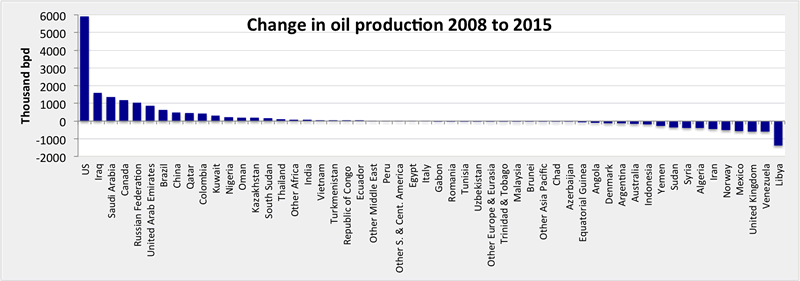
Figure 3 The oil production winners to the left and losers to the right, 2008 to 2015. The USA is the clear winner while Libya is the clear loser. About half of the countries show very little change. Click chart for a large readable version.
What we see is that production increased in 27 countries and decreased in the other 27 countries. One thing we can say is that despite prolonged record-high oil price, production still fell in half of the world’s producing countries. We can also see that in about half of these countries any rise or fall was barely significant and it is only in a handful of countries at either end of the spectrum where significant gains and losses were registered. Let’s take a closer look at these.
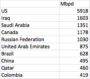
Figure 4 The top ten winners, 2008 to 2015.
The first thing to observe from Figure 4 is that the USA and Canada combined contributed 7.096 Mbpd of the 8.852 Mbpd gain 2008-2015. That is to say that unconventional light tight oil (LTO) production from the USA and LTO plus tar sands production from Canada make up 80% of the global gain in oil production (C+C+NGL). Iraq returning to market in the aftermath of the 2003 war makes up 18%. In other words expensive unconventional oil + Iraq makes up virtually all of the gains although concise allocation of gains and losses is rather more complex than that. Saudi Arabia, Russia, The UAE, Brazil, China, Qatar and Colombia have all registered real gains (5.258 Mbpd) that have been partly cancelled by production losses elsewhere.
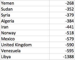
Figure 5 The top ten losers, 2008 to 2015.
Looking to the losers (Figure 5) we see that Libya, Iran, Syria, Sudan and Yemen contribute 2.828 Mbpd of lost production that may be attributed to war, civil unrest or sanctions. I am not going to include Venezuela and Algeria with this group and will instead attribute declines in these countries (0.979 Mbpd) to natural reservoir depletion, although a slow down in OECD technical assistance in these countries may have exacerbated this situation. That leaves the UK, Mexico and Norway as the three large OECD producers that register a significant decline (1.687 Mbpd) attributed to natural declines in mature offshore provinces. Let me try to summarise these trends in a balance sheet:
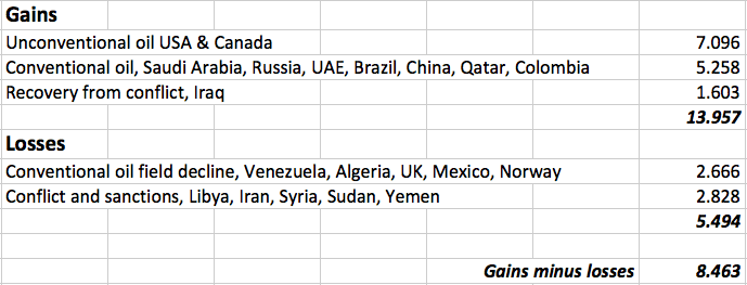
Figure 6 The winner and loser balance sheet.
We see that these 20 countries account for 8.463 Mbpd net gain compared with the global figure of 8.85 Mbpd. We are capturing the bulk of the data and the main trends. In summary:
- Unconventional LTO and tar sands + 7.096 Mbpd
- Net conventional gains + 2.592 Mbpd
- Net conflict losses -1.225 Mbpd
The sobering point here for the oil industry and society to grasp is that during 8 years when the oil price was mainly over $100/bbl, only 2.592 Mbpd of conventional production was added. That is about 3.1%. Global conventional oil production was all but static. And the question to ask now is what will happen in the aftermath of the oil price crash?
One lesson from recent history is that the oil industry and oil production had substantial momentum. It is nearly two years since the price crash, and while global production is now falling slowly it remains in surplus compared with demand. This has given the industry plenty time to cut staff, drilling activity and to delay or cancel projects that depend upon high price. In a post-mature province like the North Sea, the current crisis will also hasten decommissioning. It seems highly likely that momentum on the down leg will be replaced by inertia on the up leg with a diminished industry unwilling to jump back on the band wagon when price finally climbs back towards $100 / bbl, which it surely will do one day in the not too distant future.
For many years I pinned my colours to peak oil occurring in the window 2012±3 years. Noting that the near-term peak was 97.08 Mbpd on July 15 2015 it is time to dust off that opinion (Figure 7). The decline since the July 2015 peak is of the order 2% per annum (excluding the Fort McMurray impact). It seems reasonable to presume that this decline may continue for another two years, or even longer. That would leave global production at around 92 Mbpd mid 2018. It is nigh impossible to predict what will happen, especially in a world over run by political and economic uncertainty. Another major spike in oil price seems plausible and this could perhaps destabilise certain economies, banks and currencies. Should this occur, another price collapse will follow, and it’s not clear that production will ever recover to the July 2015 peak. Much will depend upon the future of the US shale industry and whether or not drilling for shale oil and gas gains traction in other countries.
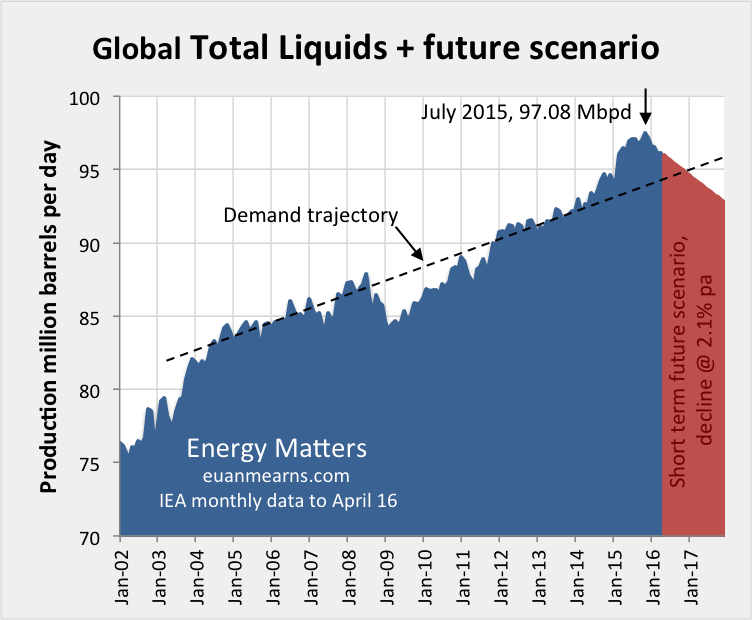
Figure 7 The chart shows in blue global total liquids production (C+C+NGL+refinery gains+biofuels) according to the Energy Information Agency (EIA). The near term peak was 97.08 Mbpd in July 2015. The decline since then, excluding the Fort McMurray wild fire impact, is of the order 2% per annum. In the current low price environment, it is difficult to see anything arresting this decline before the end of next year. In fact, decline may accelerate and go on beyond the end of 2017. The dashed line shows the demand trajectory and scheduled balancing of supply and demand by the end of this year. By the end of next year the supply deficit could be of the order 3 Mbpd which on an annualised basis would result in a stock draw of 1.1 billion barrels. But remember, forecasts are ten a penny
Concluding Thoughts
- M. King Hubbert’s forecast for US oil production and the methodology it was based on has been proven to be sound when applied to conventional oil pools in the USA. When decline takes hold in any basin or province, it is extremely difficult to reverse even with a period of sustained high price and the best seismic imaging and drilling technology in the world.
- On this basis we can surmise that global conventional oil production will peak one day with unpredictable consequences for the global economy and humanity. It is just possible that the near term peak in production of 97.08 Mbpd in July 2015 may turn out to be the all-time high.
- Economists who argued that scarcity would lead to higher price that in turn would lead to higher drilling activity and innovation have also been proven to be correct. Much will depend upon Man’s ability to continue to innovate and to reduce the cost of drilling for LTO in order to turn a profit at today’s price levels. If the shale industry is unable to turn a profit then it will surely perish without State intervention in the market.
- But from 2008 to 2015, oil production actually fell in 27 of 54 countries despite record high price. Thus, while peak oil critics have been proven right in North America they have been proven wrong in half of the World’s producing countries.
- Should the shale industry perish, then it becomes highly likely that Mankind will face severe liquid fuel shortages in the years ahead. The future will then depend upon substitution and our ability to innovate within other areas of the energy sector.
By Raul Ilargi Meijer
Website: http://theautomaticearth.com (provides unique analysis of economics, finance, politics and social dynamics in the context of Complexity Theory)© 2016 Copyright Raul I Meijer - All Rights Reserved Disclaimer: The above is a matter of opinion provided for general information purposes only and is not intended as investment advice. Information and analysis above are derived from sources and utilising methods believed to be reliable, but we cannot accept responsibility for any losses you may incur as a result of this analysis. Individuals should consult with their personal financial advisors.
Raul Ilargi Meijer Archive |
© 2005-2022 http://www.MarketOracle.co.uk - The Market Oracle is a FREE Daily Financial Markets Analysis & Forecasting online publication.


