


How Demographics Decided Brexit
Politics / BrExit Jul 12, 2016 - 12:15 PM GMTBy: John_Mauldin

 Stephen McBride, Garret/Galland Research
The June 23 decision by the United Kingdom to leave the European Union shocked many people. If we take a closer look at voter demographics, however, the reasons behind the Leave victory become much clearer.
Below, we look at the most significant voter patterns to emerge from the referendum.
Voting by Education Level
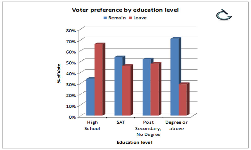
The demographic trend which had the strongest correlation to voting patterns was education level. Those who hold a degree voted 71% to remain in the EU, while 66% of those with no learning past high school voted to leave.
If we look at how local areas voted, these patterns show up again. In areas where less than 25% of the population holds a degree, the average Leave vote was 69%.
Compare this to areas where 45% of the population holds a degree and we see the average Remain vote was 74%.
Voting by Age
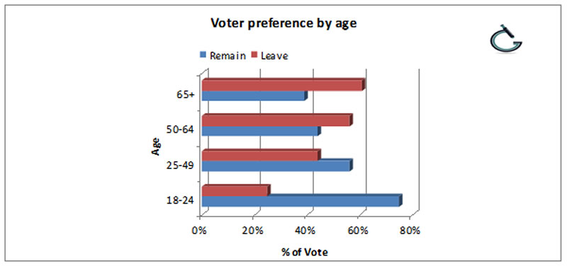
There was a clear divide in voting patterns when voters are grouped by age.
For the 50-and-older crowd, 64% of those 65 and older and 55% of the 50-64 group voted to leave. Of the 30 areas with the most elderly people, 27 of them voted to leave.
Compare that with the 71% of 18-24 year olds who backed Remain.
Voting by Income Bracket
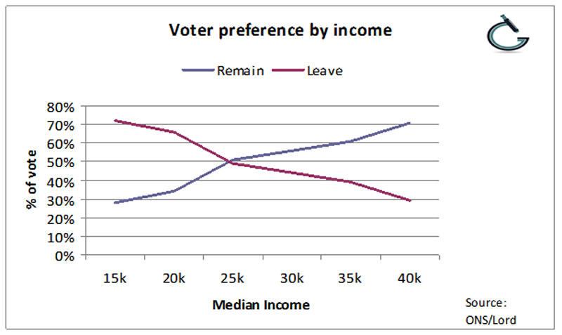
No measure of voter traits is more direct and linear than income. The above chart shows a near mirror image between higher-income Remain voters and lower-income Leave voters.
With few exceptions, areas with a median annual income of over £30,000 heavily backed Remain.
Were the high-earners swayed by the effect Brexit would have on asset prices?
Maybe, maybe not. But in every area where 40% or more of the local population earned less than £22,000 a year, the majority voted to leave. And those in lower income brackets generally have fewer assets.
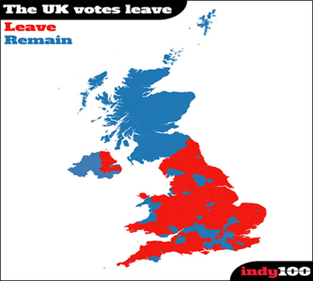
A macro look at the voting map shows other divergences. London split with England, and England split with Scotland.
Another voter angle of interest is marital status.
The young, single professionals from London and the inner cities strongly voted to stay in the EU. The majority of rural married voters chose to leave.
Immigration and Voting
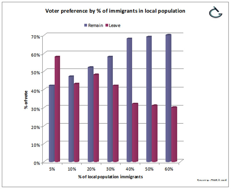
There was ample debate about immigration in this referendum, and there were clear divisions in voting patterns.
Of all the areas in the UK where the population mix is over 30% immigrants, only one (the town of Slough) voted to leave. Generally, the higher the immigrant population, the higher the Remain vote.
Immigration was a central issue for the UKIP political party in the 2015 general election. UKIP supporters voted 95% to leave.
Another stark divide: of the 30 areas where people most identified themselves as English, all of them voted to leave the EU.
The lack of physicians, long wait times to see a doctor, a crumbling national healthcare system, and an under-resourced education system have pushed these areas to the brink. They have had enough of the EU.
The Advantage of Numbers
Although Remain won big in many voter segments, Leave voters were victorious by over 1.2 million votes.
A close look at voting patterns and we can see the outcome came down to basic arithmetic.
The strongly Remain 18-24 year olds make up about 13% of the UK population. Whereas the over 65’s number over 16% of the population. The high “gray turnout” may have swung the balance.
Around 25% of the UK population has a degree. The highest number of graduates live in London, where the rate is 60%.
When we turn to household incomes, around 25% of the population earns between £15,000 and £24,000 annually. Only 8% of workers earn £45,000 or more.
It seems pretty clear that the size of each demographic segment played a decisive role in the Brexit vote. The British underestimated the voting power of the UK’s poor, older, and less-educated.
This group wanted change. They had the advantage of numbers, and they made it happen.
Subscribe to The Passing Parade
A rousing weekly romp on economics and markets with a dose of politics and other follies, The Passing Parade is published every Friday by Garret/Galland Research. Click here to get your free copy sent straight to your inbox.
© 2005-2022 http://www.MarketOracle.co.uk - The Market Oracle is a FREE Daily Financial Markets Analysis & Forecasting online publication.