


Gold and Silver - Are you still waiting for a pullback, so you can take part in the bull market?
Commodities / Gold and Silver 2016 Jun 01, 2016 - 03:35 PM GMTBy: Peter_Degraaf

 Well, your time has come! Gold is in the process of testing the February breakout at a very important moving average. Whenever the market tests a breakout, it affords those who missed the breakout an opportunity to get onboard, and it enables those who helped to create the breakout, an opportunity to double up.
Charts are courtesy Stockcharts.com unless indicated.
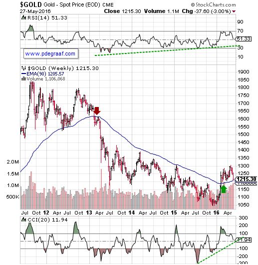
Featured is the weekly gold chart. The purple arrow points to the spot where the gold price broke down below the 90 week EMA in early 2013. This breakdown led to three years of lower prices. The green arrow points to the spot where gold broke out to the upside in February. During the past four weeks price has been pulling back from a temporarily overbought condition, back towards the breakout point. You will notice that at $1215 we are within ten dollars of this important moving average!
***
The rise in the price of gold since January 1st has been the most rapid in 30 years. Meanwhile commercial gold traders continue to hold a large ‘net short’ position. (Chart courtesy Cotpricecharts.com). The purple bars show a ‘net short’ (shorts minus longs) position of 225,000 contracts. Commercial traders usually sell into every rally, and then cap the rally by selling even more contracts, in order to depress the price and cover their short positions at a lower price.
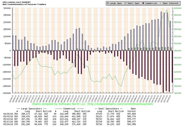
When the price of gold was declining, as it was from 2011 to 2015, it was relatively easy for commercial traders to depress the price, by flooding the futures markets with offers to sell. This was blatantly obvious on April 21st 2013 when someone, or a group, dumped 16,000 gold contracts worth 2 billion dollars, along with 7,500 silver contracts early in the morning and without attempting to get the best price for their product. Not being satisfied with the price, someone or a group on July 20th 2013 dumped 2.7 billion dollars worth of ‘paper gold’ in the space of 1 minute, just after midnight New York time. As amazing as it may seem, there are some who still deny that bullion banks and other commercial traders have manipulated the price of gold in the past. (Deutsche Bank recently admitted having taken part in price manipulations).
There are times however, when physical demand for gold is so strong that commercial traders begin to lose their grip, and start to absorb losses while they roll over their short positions, instead of being able to close them out.
A good example can be seen in this chart courtesy Goldchartsrus.com.
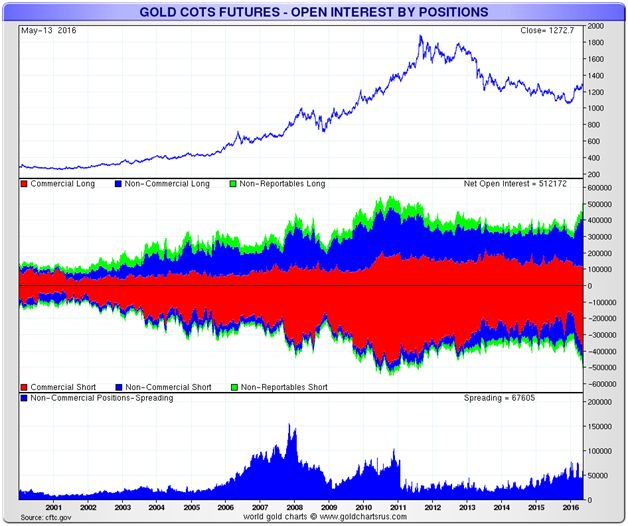
In the top rectangle we see the price of gold. In the third space the red area represents the commercial short position. You will notice that the short position increased from 2003 until 2011, while gold rose in price. During these 8 years the commercials had to back-track.
It is likely that we are currently entering another such period, very similar to the situation from 2003 till 2011, with gold rising and the commercials backing away. Several very successful billionaires are on record as having recently added substantial amounts of gold to their investment portfolio. Several grains, such as corn and soybeans have recently broken out on the upside and are trading at highs for the year. $GNX, the commodity index has been rising during all of 2016.
***
This next chart shows that the price of gold has already been bullish in 6 foreign currencies for almost two years!
The trend is up, supporting indicators are positive (green lines), and the 50DMA is in positive alignment to the 200DMA, and both are rising.
***
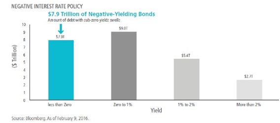
This chart courtesy Bloomberg.com shows a shift from bonds that yield interest, to bonds that do not. This makes for a 'negative interest rate' environment.
A 'negative interest environment' exists when the rate of price inflation exceeds the short-term rate of interest. Historically gold has always thrived in this kind of environment.
***
Next is another very important chart:
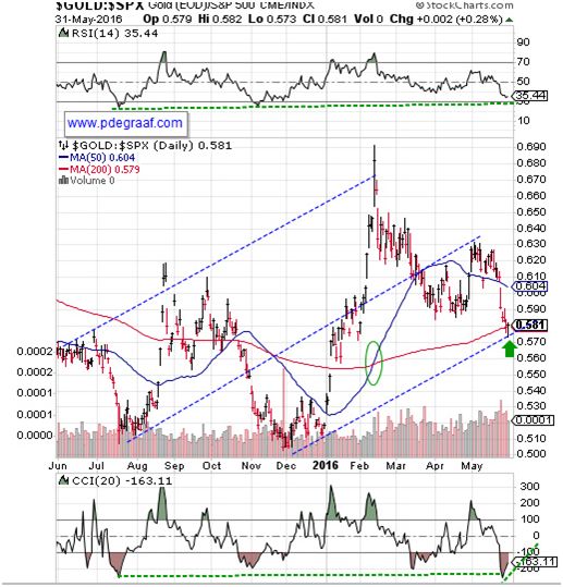
Featured is the index that compares gold to the S&P 500 index. Since 2011 the S&P outperformed, while gold corrected. Since December, gold has taken the lead again, and price is now back at the rising (for the first time in several years) 200 day moving average (red line). The green arrow points to an ‘upside reversal’ that occurred on May 31th. Reversals often indicate that a trend change is taking place. The 50 DMA has moved back into positive alignment with the 200DMA (green oval). The supporting indicators have landed at previous support levels (green lines).
***
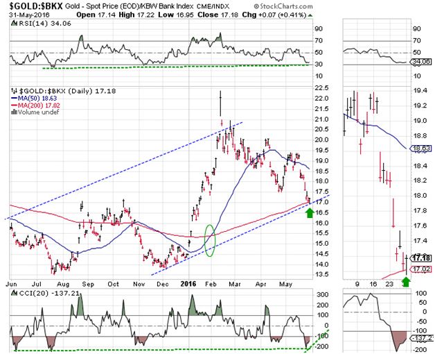
This chart compares gold to the US banking index. Notice the double bottom in July and December and the upside breakout at the moving averages in January. Price has now come back to test the breakout at the 200 day moving average (red line). Price produced an ‘upside reversal’ on May 31st (see green arrow in the close-up chart on the right). The moving averages are in positive alignment (green oval), and the 200DMA is rising. The supporting indicators are at previous support levels (green lines).
***
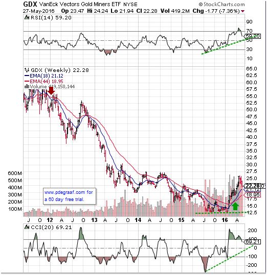
Featured is the weekly chart for GDX, the gold and silver miners ETF. The purple arrow points to the spot where the 18 week moving average slipped into negative alignment with the 44 week moving average, warning of a possible pullback. The green arrow points to the spot where in February, these moving averages moved back into positive alignment again. As long as the blue line stays above the red line, the long term trend is up. The RSI and CCI are working off a short-term overbought condition. The green lines show where support is expected to kick in for these indicators.
***
Silver will first be a beneficiary of the bull market in gold and then it will lead gold, as it usually does during bull markets.
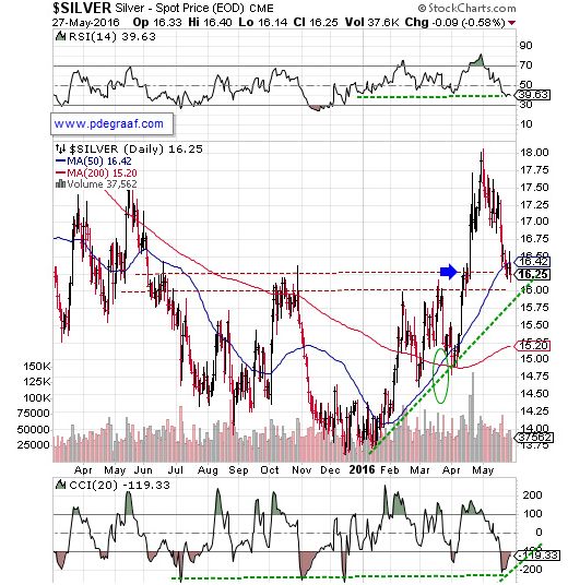
Featured is the silver chart. Price broke out at the blue arrow in April and after touching 18.00, pulled back to test the breakout area. The 50 day moving average is in positive alignment with the 200DMA and both are trending higher (green oval). Up volume exceeds down volume (bullish). Sales of US silver Eagles at the US Mint in May were the highest for any month of May in history, at 4.5 million.
***
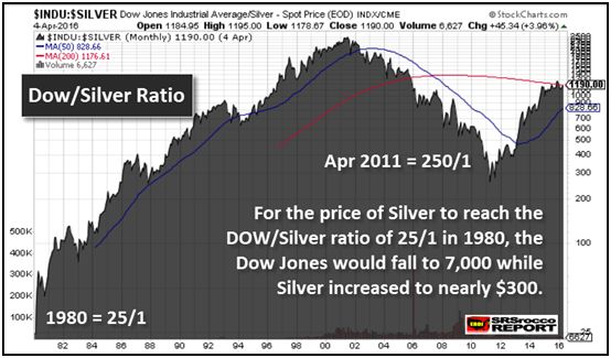
This chart courtesy SRSRoccoreport.com shows the historical ratio between the DOW and the price of silver. In 1980 when silver reached 49.00 an ounce, the ratio dropped to 25/1. Then in April 2011 the ratio rose to 250/1. In May 2016 the ratio is 1111/1. In order for the ratio to return to 25/1, (history does repeat), assuming the DOW stays at current levels, silver will trade at $700.00 an ounce. If the DOW falls by 50% the target for silver will be $350.00 an ounce. Before we dismiss this conclusion, we must remember that there are today billions of people of investing age who were not born yet in 1980. Meanwhile the billions of ounces of silver that were stockpiled in 1980 have been used up! Every time we scrap a cell phone, or computer, or TV set, or refrigerator, or launch a rocket, we say goodbye to the silver contacts that are part of that product. The US Geological Survey concluded a few years ago that silver could become extinct. It’s no wonder more and more investors are adding silver to their portfolio.
By Peter Degraaf
Peter Degraaf is an on-line stock trader with over 50 years of investing experience. He issues a weekend report on the markets for his many subscribers. For a sample issue send him an E-mail at itiswell@cogeco.net , or visit his website at www.pdegraaf.com where you will find many long-term charts, as well as an interesting collection of Worthwhile Quotes that make for fascinating reading.
© 2016 Copyright Peter Degraaf - All Rights Reserved
DISCLAIMER:Please do your own due diligence. Investing involves taking risks. I am not responsible for your investment decisions.
Peter Degraaf Archive |
© 2005-2022 http://www.MarketOracle.co.uk - The Market Oracle is a FREE Daily Financial Markets Analysis & Forecasting online publication.