The Magic of Gold Ratio Charts
Commodities / Gold and Silver 2016 May 01, 2016 - 02:44 PM GMT The first point I would like to make is that many of you are probably wondering how I could reverse my long term bearish view on the precious metals complex to a bullish view in such a short period of time. The other point I've been trying to make is to get you positioned and sit tight, as this new bull market is just getting started. Understanding the Chartology of this sector from the many different precious metals stock indexes, to individual PM stocks and especially the combo ratio charts, paints a picture that if one keeps an open mind and truly understands what is taking place right now, getting positioned and sitting tight makes alot of sense. This is easier said than done of course.
Many are surprised by the magnitude of this bull market rally in the precious metals complex and are trying to come up with all kinds of reasons why it should or shouldn't be taking place right now, based on whatever trading discipline they're using. Most are looking for at least a correction to relieve the overbought conditions before the bull market can make any progress higher. That may very well happen, but I've been showing you three very important combo ratio charts which are telling me a different story based on the Chartology and inter market ratios for the PM complex.
I coined the phrase "Reverse Symmetry" years ago when I first picked up on it after looking at literally thousands of charts and studying their price behavior. Once you become aware of this particular piece of Chartology you begin to look for it and will see it all over the place from short term minute charts to long term monthly charts. It's no big mystery why it works but it can tell you what to look for during certain market conditions. The precious metal complex is giving us a perfect example of reverse symmetry right now.
I've been showing you at least three different combo ratio charts for the PM complex which showed the end of the bear market and the beginning of the new bull market. Keep in mind this is unique to Chartology and my interpretation of the Chartology. There are many good trading disciplines out there in which some investors can master and be successful while most will give up the minute it doesn't work perfect. Sticking with whatever trading discipline you choose, whether it's cycles, Elliott Wave, Gann, or even watching the COT's numbers, give yourself the time to fully understand and grasp its principals before you give up on it. For me personally, Chartology is the road I chose to travel and after experimenting with several different trading disciplines I always came back to Chartology.
So why I'm I so bullish on the precious metals sector right now?
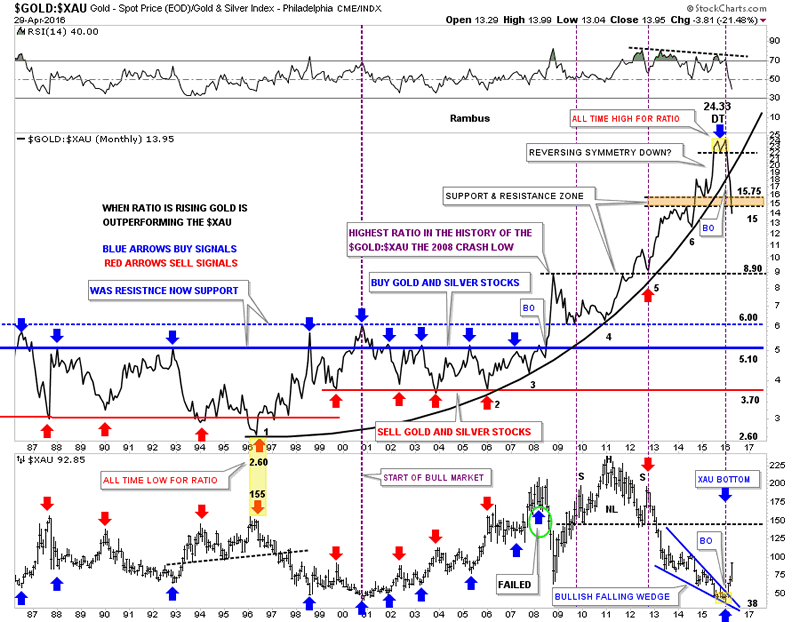
1...GOLD:XAU Ratio (When this is rising ,Gold is stronger than the Gold Stocks and when it is falling Gold Stocks are Stronger than Gold , which is Bullish for Gold)
This first combo ratio chart I've been trying to show you about once a week so you can follow the price action. I've been showing this combo ratio chart for years, but when I seen the double top put in place at the top of the chart, yellow shaded area, I know what a double top looks like and this double top formed at the end of a 20 year parabolic move where gold had been outperforming the XAU. The break below the double top hump came in January of this year, which was the first real clue that the nearly five year bear market maybe coming to and end, which would usher in a brand new bull market.
I won't go into detail again as I've been covering this chart in depth since the double top reversal pattern completed. When the ratio chart first broke down from the double top I said to look for reverse symmetry to the downside, as the rally leading into the double top was a near vertical move. In just three short months look at how the price action has been declining in a vertical move down, breaking below the parabolic arc and now the brown shaded S&R zone between 15 and 15.75. This is one reason to have gotten positioned and to sit tight. A break below a parabolic arc strongly suggests that the move to follow will be just as strong or stronger to the downside vs the upside. It's just the nature of a broken parabolic arc.
You can see what is happening to the XAU in the bottom chart as it bottomed at the exact same time as the ratio chart doubled topped. The ratio chart is unwinding its parabolic rise while the XAU is doing the very opposite by rallying in a near vertical move. Folks we don't get this kind of setup everyday. This is a rare phenomenon that is only being presented by Chartology. I doubt anybody on the planet is looking at the precious metals complex from this particular angle. This combo ratio chart shows you one reason the bear market has ended, and a new bull market has begun. This combo ratio chart also shows you why the vertical move up in the precious metals stocks is taking place and sitting tight is the prudent thing to do right now IMHO. We are dealing with a breakout of a 20 year parabolic uptrend that is reversing direction in favor of the PM stocks, which is a big deal. Getting positioned at a bottom like this in the PM sector or any stock market for that matter doesn't happen for most investors, it's only a dream.
GOLD:XAU Ratio

2...TLT:GLD Ratio:
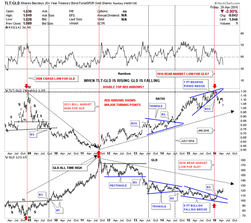
TLT is the ETF for US Treasury Bonds and GLD is the ETF that tracks Gold . When this ratio is rising Bonds are outperforming Gold , and when falling Gold is outperforming Bonds , which is bullish for Gold.
Now lets look at another combo ratio chart which compares the TLT:GLD on top and GLD on the bottom, which shows the inverse relationship these two have most of the time. Again I won't go into a lot of detail as we've been following this combo ratio chart pretty closely. Just a quick summary shows how the ratio chart on top formed a H&S top during the 2008 crash, while GLD formed a H&S bottom inversely to the TLT:GLD ratio chart. Then when GLD topped out in September of 2011 the TLT:GLD ratio chart shows it bottomed at the same time as shown by the red arrows in 2011.
Looking at the ratio chart on top we can see the one year blue rising wedge that ended up having seven reversal points, which is a reversal pattern that was confirmed with the breakout gap to the downside. Up until the blue rising wedge broke to the downside there was a potential that it could have just been a consolidation pattern if the price action had broken to the upside instead. But we got the breakout gap to the downside which sealed the fate for the bear market in GLD, which then gave rise to the new bull market in GLD.
Note the near perfect inverse correlation between the ratio chart on top and GLD on the bottom during the January 2016 reversal points on both charts. As the ratio chart gapped down out of its blue bearish rising wedge GLD broke out of its bullish five point falling wedge reversal pattern at the same time.
One last bit of interesting price action on the ratio chart which shows the recent top in January of this year matches the same high made back in 2008. That top on the ratio chart in 2008 shows the head of the H&S reversal pattern, which matches the head for GLD on the bottom. That important high on the ratio chart and low on GLD led to GLD embarking on its final move up to its September of 2011 all time highs at 1920 in just three years. Again January of 2016 comes into play as an important low for the precious metals complex based on the ratio chart.
TLT:GLD Ratio

This next combo ratio chart shows another good example of why I think the bear market is over and a new bull market has begun in the precious metals complex since mid January of 2016. What fascinates me the most about Chartology is how it can show the future price action before the fundamentals come into play. As most of you know the Japanese Yen has been on a rocket ride for the last week or so , faking out just about everyone. We'll hear stories of manipulation or Bank of Japan or the Fed or other fundamental reasons why it's doing what it's doing, which I do not get into because the Chartology already showed us what was coming. It constantly amazes me the Chartology knows before anybody what is coming down the pike.
3...US Dollar:Japanese Yen Ratio:
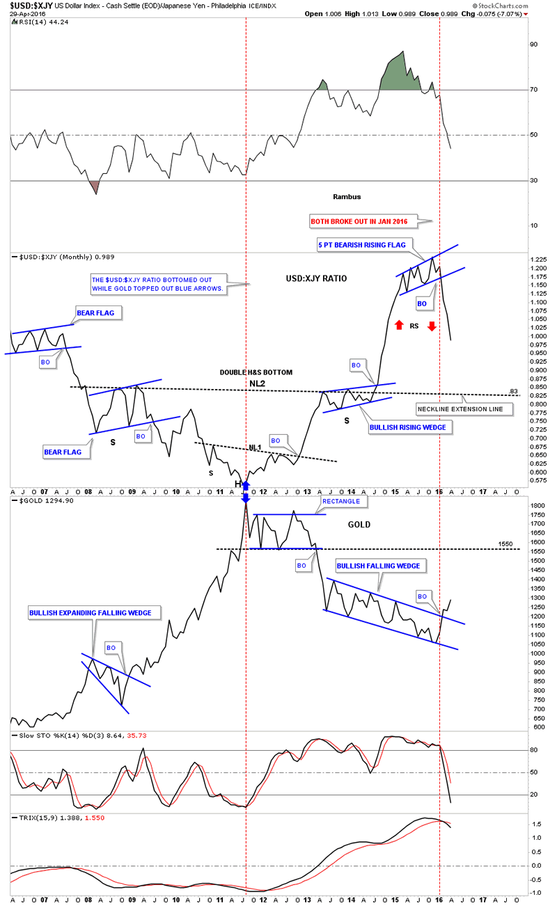
This ratio rises when the Dollar is rising against the Yen which is bearish for Gold and when it is falling the Yen is rising against the Dollar which is bullish for Gold.
Below is another combo ratio chart which has the $USD:$XJY ratio on top and gold on the bottom. I've been showing you this chart for many years but most importantly since the ratio broke down from that blue five point bearish rising flag reversal pattern in January of this year while Gold on the bottom chart was breaking out of its bullish falling wedge reversal pattern at the same time. If you recall back in late January of this year I said there was a good chance we could see some reverse symmetry to the downside in the ratio chart which would be bullish for Gold. I had absolutely no idea why the US dollar would collapse against the Yen but collapse it has.
Again note the parabolic rise the ratio chart made in 2014 to the top in late 2015. The rise was so steep no consolidation patterns formed on the way up so there is nothing to offer any support on the way down until neckline #2 comes into play around the .83 area. As the ratio keeps falling we should see gold rising which has been the case. If we see the ratio chart on top hit neckline #2 at .83 and gold hits the bottom rail of its blue rectangle consolidation pattern that formed on the way down at 1550 or so, it will most likely mark a period of consolidation for both the ratio and gold.
US Dollar:Japanese Yen Ratio

These three combo ratio charts above shows me how the bear market ended and how the new bull market began in the precious metals complex. There are never any guarantees when it comes to the markets, but by following the price action one can take out alot of the noise, which can can make things confusing at times.
What I believe is happening since the tops were put into place on these ratio charts above, is that the parabolic move leading into those tops is now reversing symmetry back down over the same area. This is the reason I've been so adamant about getting your favorite precious metals stocks bought, and to sit tight until some decent support is hit on these ratio charts. This could be one of the easiest or hardest trades you'll ever make. It could be easy because all you have to do is buy your favorite PM stocks and do nothing. The hard part would be if you try to outsmart the new bull market by over trading and finding yourself on the outside looking in.
A correction is coming , but what is going to surprise most folks is the strength of this first impulse leg up. Some are waiting for the right signal to call the new bull market in the PM complex, while many are trying to trade in and out of this strong impulse move which is just almost impossible to do. The move like we've seen since mid January of this year is frustrating the bulls and the bears alike. This is a perfect start to the second leg up of the secular bull market that began at the turn of the century.
All the best
Gary (for Rambus Chartology)
© 2016 Copyright Rambus- All Rights Reserved
Disclaimer: The above is a matter of opinion provided for general information purposes only and is not intended as investment advice. Information and analysis above are derived from sources and utilising methods believed to be reliable, but we cannot accept responsibility for any losses you may incur as a result of this analysis. Individuals should consult with their personal financial advisors.
© 2005-2022 http://www.MarketOracle.co.uk - The Market Oracle is a FREE Daily Financial Markets Analysis & Forecasting online publication.


