


Gold Ratio Chartology Quietly Suggesting a Bottom
Commodities / Gold and Silver 2016 Feb 22, 2016 - 11:27 AM GMT

 Tonight I would like to update a few of the ratio charts we've been following that are still showing an important low or bear market low is in place for gold. There are so many things we read where this analysis says this and that analysis says that but the more one reads the more confused they become. There is no Holy Grail when it comes to trading the markets although everyone is looking for one. Every trading discipline has its own unique characteristics that if one has the discipline to study it long enough they may eventually get pretty good at interpreting what it's saying. Find something that matches your own personality and through trial and error you maybe surprised at what you may discover.
Keep in mind we're playing the hardest game on the planet to win. There are investors from all over the world that want your money and they wont' be satisfied until they get every last penny. There are computer programs, hedge funds, you name it and they want to win just as badly as you if not more so. It's a dog eat dog business we're in and to the victor goes the spoils.
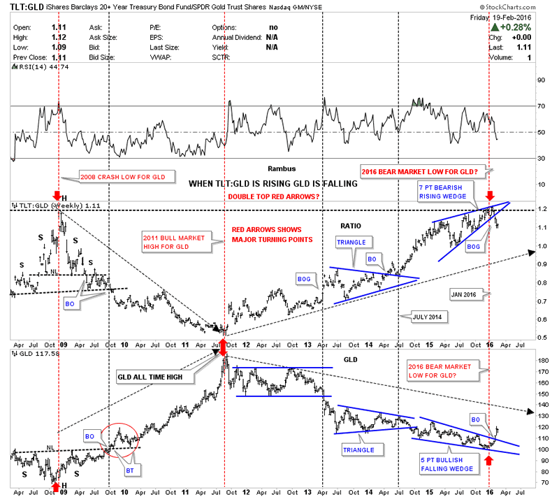
This first chart for tonight is the ratio / combo chart which has the TLT:GLD ratio chart on top and GLD on the bottom. The TLT:GLD ratio chart has served me well through the years. Lets start on the left hand side of the chart which shows the bottom for GLD during the 2008 crash low. As you can see GLD formed a beautiful and very symmetrical H&S consolidation pattern while the ratio chart on top formed a H&S top. It wasn't until GLD broke above the neckline in 2009 that the bottom was confirmed from a Chartology perspective. Even though the breakout didn't occur until October of 2009 there were still alot of clues that GLD was forming a very large H&S consolidation pattern. Waiting for the breakout would have cost you some good low risk entry points in many of the PM stocks that had crashed.
Study the breakout and backtesting sequence on GLD when it broke out above the neckline, red circle. Put yourself back in 2009 at the breakout point keeping in mind this is a weekly chart and each bar represents one weeks worth of trading. You can see right after the initial breakout GLD backtested the neckline about four weeks later and the neckline held support which told us the neckline was hot. GLD then rallied for about eight weeks which looked like the impulse move up was starting only to see a second backtest the neckline. That second backtest took about 12 weeks or so to complete but knowing the neckline was hot gave us something positive to look for and not let our emotions get in the way of what was going to be a near parabolic rise in gold to its bull market peak in September of 2011 at 1920. The reason I'm showing you the breakout and backtesting sequence in such detail is because our current breakout of the seven point bearish rising wedge is only in its third week. Patience is one of the hardest things to learn when it comes to trading the big trend. I will post the ratio chart here and look at it again for the bull market peak in 2011.
TLT:GLD Weekly Chart
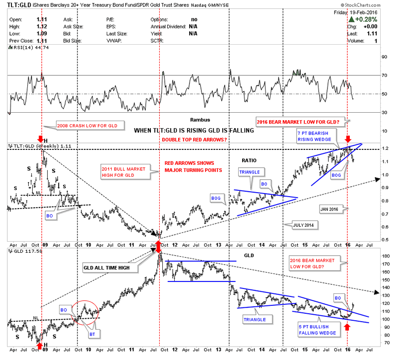
Now lets look at the exact same chart and follow the price action up on GLD and down on the ratio chat into the 2011 high for GLD and low the for the ratio chart. The red arrows shows how they both found their respective reversal points which led to the bear market in GLD. As the TLT:GLD ratio was rising GLD was falling. The bear market for GLD had been going on for well over four years until just recently. About three weeks ago the ratio chart on top broke below the bottom rail of the seven point bearish rising wedge while GLD broke above the top rail of a five point bullish falling wedge. This is where patience will come into play. Until either the ratio chart on top or GLD on the bottom breaks below their breakout trendlines the bull market is in place for GLD. Mentally prepare yourself for a backrest to the bottom rail of the seven point bearish rising wedge on the ratio chart and the top rail of the bullish falling wedge on GLD. We now have a very clean line in the sand in which to watch for a backtest to occur. Until those important trendlines fail it is what it is, a bull market for GLD. This is also the point where you have to have faith in your trading system in order to take advantage of the possible brand new bull market in the precious metals sector. This is also where the bargains are found.
TLT:GLD Weekly Chart 2
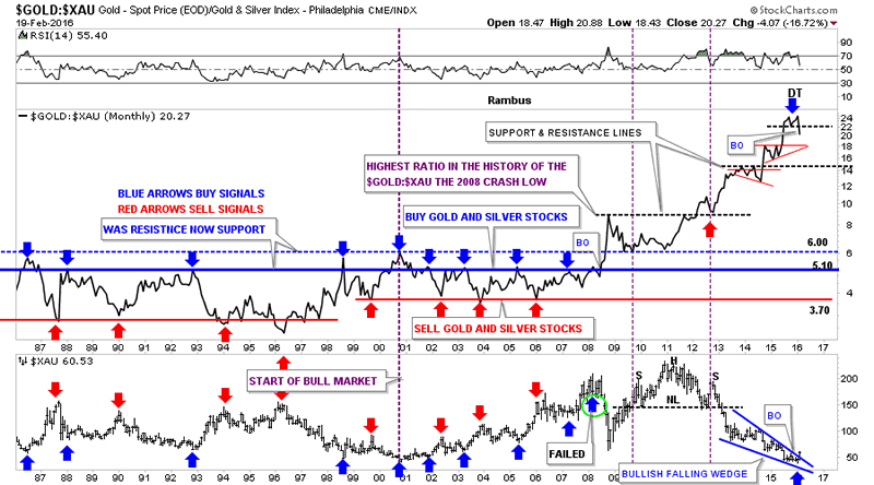
Below is another ratio combo chart which has the Gold:$XAU ratio chart on top and the $XAU on the bottom. We've already gone over this combo chart recently so I just want to focus in on the top right hand side of the chart. It doesn't look like much on this monthly chart but the ratio chart on top looks like it's putting in a double top reversal pattern which maybe reversing the uptrend that actually began in 2006. What that means is that gold has been outperforming the $XAU for ten years. That's pretty amazing when you think about it. Relative to gold the PM stocks have never been cheaper compared to gold.
During the bull market years I would add a blue arrow when the ratio chart would rally up to the 5.10 area where I would be looking for a reversal to the upside on the $XAU. As you can see I haven't added any blue arrows since the one that failed in 2008 which led to the crash, blue arrow with the green circle around it. That failure in 2008 on the ratio chart, when it broke above all the previous highs blue dashed horizontal line, was a history making event for the PM stocks. As you can see I've added a blue arrow at the double top high for the ratio chart and a blue arrow at the the recent low on the $XAU chart at the bottom.
Note the purple annotation I wrote back in 2008 right after the crash. I said this was the highest the ratio had ever been in history thinking it would move back down into the old trading range between 3.70 and 5.10 or so. Little did I know that was only the beginning of the move all the way up to the 24 area on the ratio chart. There was no way to know back in 2008 that the PM stocks would underperform gold on the magnitude it has. If there was ever a once in a lifetime event to get positioned for a new bull market this is it.
I had been looking for one last capitulation move down in the PM complex but with the recent developments on these ratio charts I have to go with the new information as it comes in. As the information changes so do I. If you have ever wondered what it feels like to buy at the bottom of a bear market I think now is a good time to find out. It always looks easy in hindsight but to live through the moment is another matter altogether.
In the Weekend Report we'll look at some of the changes that are taking place on some of the precious metals stocks which will show some more clues that the bear market low may well be in place. Have a great weekend. All the best...Rambus
Gold:XUA Monthly Chart
All the best
Gary (for Rambus Chartology)
FREE TRIAL - http://rambus1.com/?page_id=10
© 2016 Copyright Rambus- All Rights Reserved
Disclaimer: The above is a matter of opinion provided for general information purposes only and is not intended as investment advice. Information and analysis above are derived from sources and utilising methods believed to be reliable, but we cannot accept responsibility for any losses you may incur as a result of this analysis. Individuals should consult with their personal financial advisors.
© 2005-2022 http://www.MarketOracle.co.uk - The Market Oracle is a FREE Daily Financial Markets Analysis & Forecasting online publication.