US Dollar and US Treasury Bonds Big Picture
Interest-Rates / US Bonds Feb 01, 2016 - 11:51 AM GMT Since we covered the many different markets in detail last week I would like to focus back in on the US dollar and the TLT looking for clues for the big picture direction. The huge daily swings, in say the INDU last week, makes it very hard to keep and hold a short or long position unless you're perfect on your entry point. In a bull market it's two steps forward and one step backward and in a bear market it's two steps down and one step up. If an entry point in a bear market is not made in the first part of the two steps down sequence you'll find your self behind at some point in the trade if the entry point was made in step two. This is one reason why it's so important to know the direction of the big trend. Until something changes I believe the US stock markets are now in a bear market. There are a lot of things that can change that outlook but for today that's what the charts are suggesting.
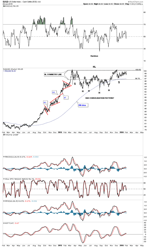
Last Friday the US dollar had a nice up day to end the month of January which was positive. There are two consolidation patterns I'm keeping a close eye on for the US dollar which is the bullish falling wedge and the H&S consolidation pattern. This first daily chart for the US dollar is the H&S consolidation pattern we've been following since December of last year. Even tho last Friday, the US dollar had a nice up day, the price action still hasn't broken above the neckline yet. It's getting close but not quite there yet.
US Dollar Index Daily Chart
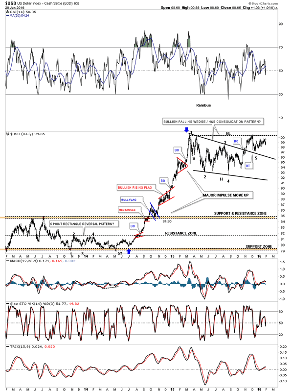
This next chart for the US dollar shows the combo bullish falling wedge and the H&S consolidation pattern being one of the same, a consolidation pattern. The blue arrows shows the last major impulse move up with several smaller consolidation patterns that formed.
US Dollar Index Daily Chart 2
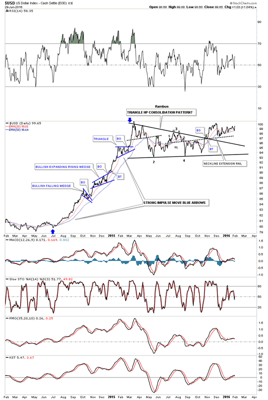
Below is a daily line chart for the US dollar which shows the price action still trading above the 20 and 50 day ema's.
US Dollar Index Daily Chart 3
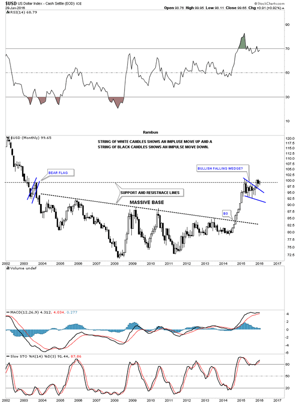
Last weekend I said I would like to see the monthly candlestick chart for the US dollar form a white candlestick and a new high for its bull market. We got the white candlestick but not the new high yet.
US Dollar Index Monthly Chart
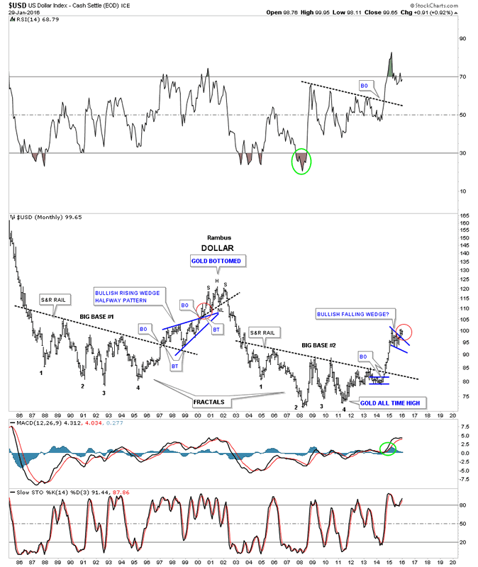
The 30 year chart for the US dollar puts our current big base and bullish falling wedge in perspective. Our current breakout and backtest to the top rail of the blue falling wedge looks very similar to the one that occurred during the breakout and backtest sequence of the 1999 blue bullish rising wedge which took about three months to complete. Tomorrow starts the beginning of the fourth month since the breakout of the blue falling wedge which is similar to the 1999 breakout as shown by the red circles.
US Dollar Index Monthly Chart 2
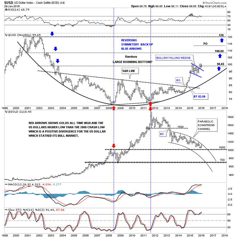
This last chart for the US dollar is a long term monthly combo chart which has the US dollar on top and gold on the bottom. As you can see a serious inflection point is right at hand. If the US dollar can breakout to new highs for its bull market, gold which is testing the top rail of its parabolic downtrend channel should decline inversely. Keep in mind this is a monthly chart. It will be interesting to see what the monthly bar looks like for both the US dollar and gold come the end of February.
US Dollar Index and Gold Monthly Charts
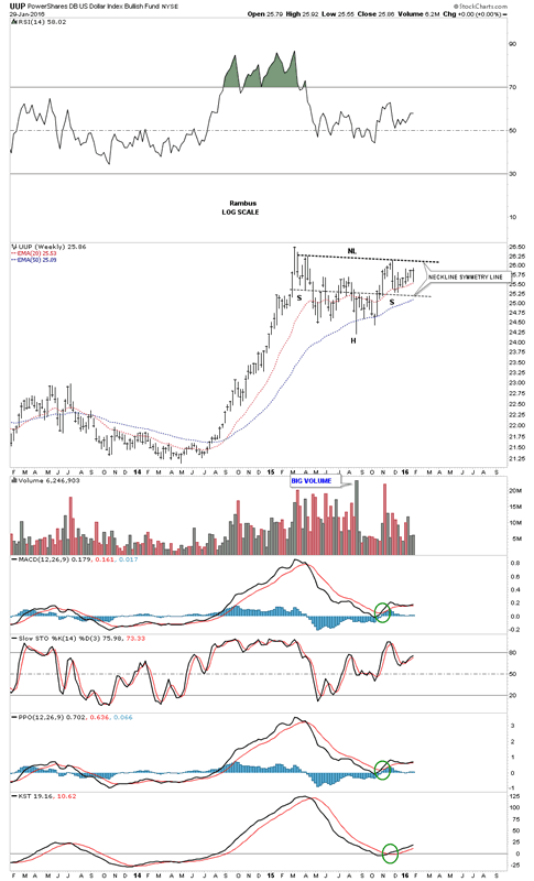
Below is a weekly chart for the UUP which shows the possible H&S consolidation pattern with alot less noise than a daily chart can make.
Powershars US Dollar Index Bullish Fund Weekly Chart
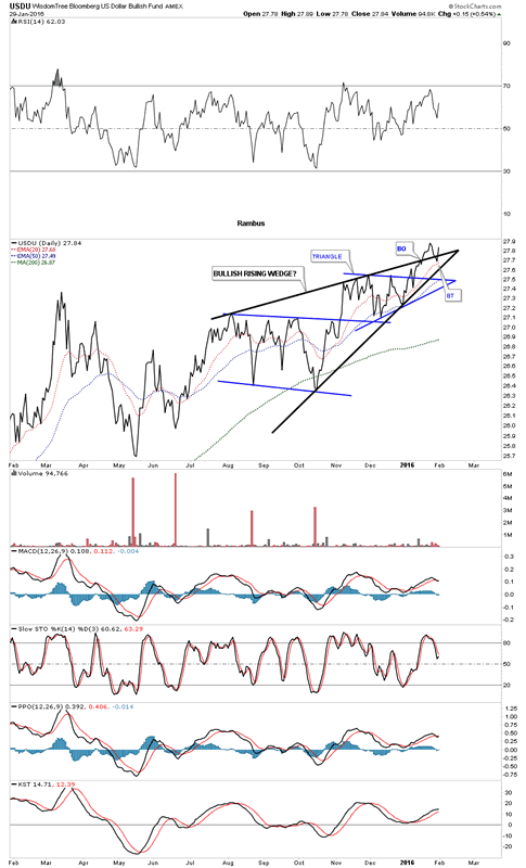
This next chart is the USDU which is the newer version for the US dollar which is more equally weighted. Several weeks ago it broke out topside from the black bullish rising wedge. This past week it backtested the top rail and is getting a bounce. This is a critically important area right here.
Wisdom Tree Bloomberg US Dollar Bullish Fund Daily Chart
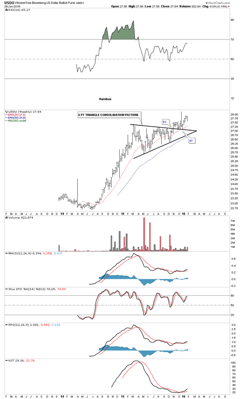
The weekly bar chart for the USDU shows it's ahead of the traditional US dollar index as it has made an new high for its bull market complete with the breakout and backtest.
Wisdom Tree Bloomberg US Dollar Bullish Fund Weekly Chart
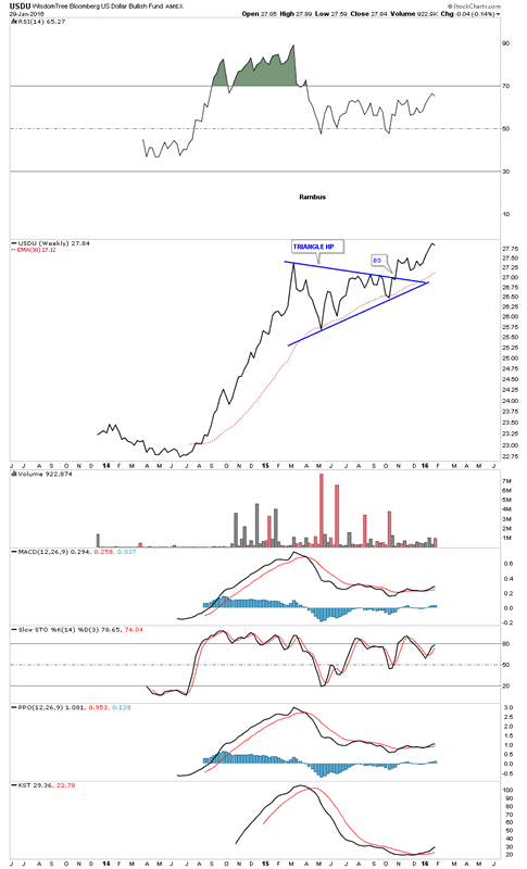
The weekly line chart for the USDU shows it actually broke out of its blue triangle consolidation pattern last fall with the 30 week ema giving strong support.
Wisdom Tree Bloomberg US Dollar Bullish Fund Weekly Chart 2
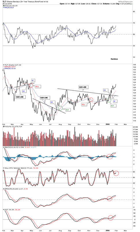
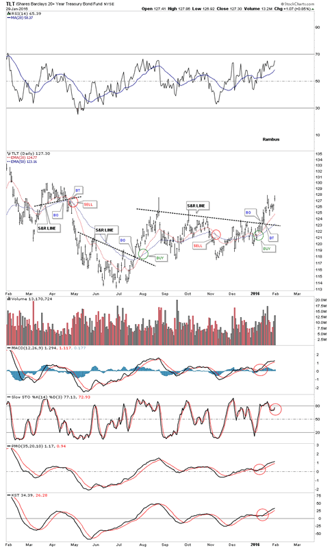
Next I want to focus in on the TLT, 20 year treasury bond fund, which is playing a big role in how I'm looking at commodities, the precious metals complex and the deflationary spiral we find ourselves in. The first thing we need to know is if the TLT is in a bullish or bearish mode right now. This first chart is a daily line chart which shows the TLT breaking out of a pretty nice base at the beginning of 2016. The 20 and 50 day ema's have a bullish crossover while all the indicator are positive. I'm going to show you this daily line chart first so you can see the difference between a bar chart, which can produce more noise sometimes, vs a line chart. Both charts will be identical except one will be a line and one a bar.
TLT Daily Chart
Now the bar chart.
TLT Daily Chart 2
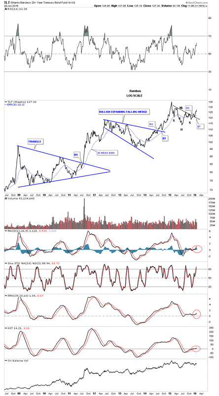
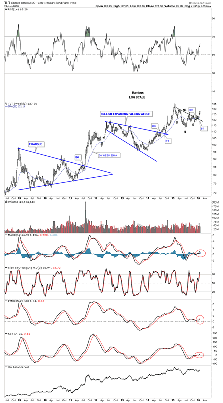
Next lets look at the weekly line chart for the TLT which shows its bull market consolidation patterns. Note the strongly slanted H&S consolidation pattern which has just completed the breakout and and backtest. Note how the backtest to the neckline found support right on the 30 week ema. All the indicators are positive.
TLT Weekly Chart
Below is the exact same chart using a bar chart.
TLT Weeky Chart 2
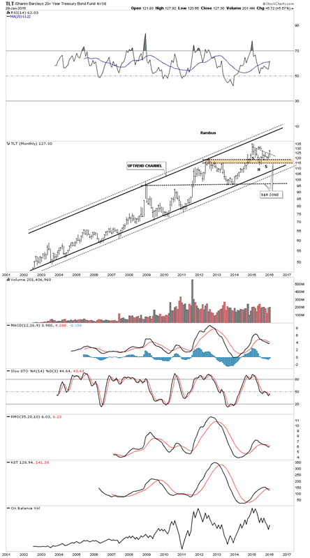
The long term monthly chart for the TLT shows its complete history which is a double trendline uptrend channel. Note how our current H&S consolidation pattern formed right on top of the brown shaded support and resistance zone. So far so good.
TLT Mnthly Chart
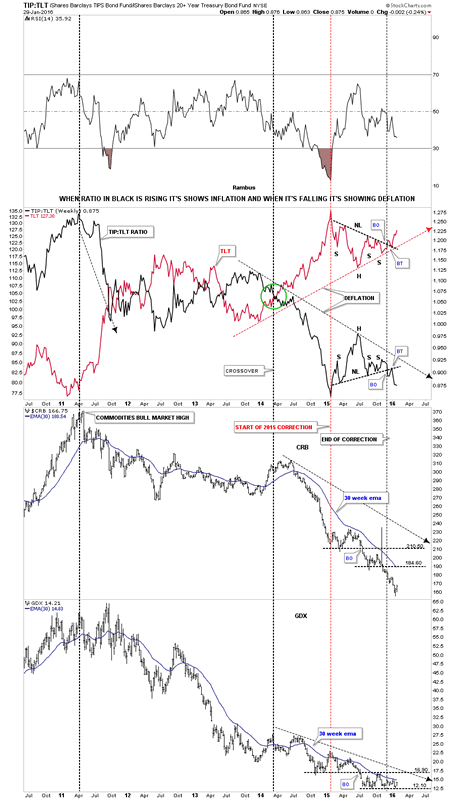
Now I would like to show you why it's so important to have a bullish looking TLT in regards to being short the commodities and the PM complex. This next chart is a ratio chart which compares the TIP:TLT on top with the $CRB and GDX below it. This is where the TLT charts we just looked at above come into play. I've overlaid the TLT in red over the ratio chart TIP:TLT in black. When the ratio chart on top in black is rising, it's showing general inflation and when it's falling deflation. Note the H&S consolidation pattern on the TLT, which we looked at earlier in red, and the inverse look which shows the ratio chart in black with a H&S consolidation pattern. As long as these keep moving in their current direction we should see deflation picking up. Note how the $CRB and the GDX have behaved during this deflationary cycle. Also note how the ratio chart in black topped out in 2011 along with the $ CRB index and the GDX. It's not a perfect correlation but close enough to get the sense of the inverse movement.
TIP:TLT Weekly Chart
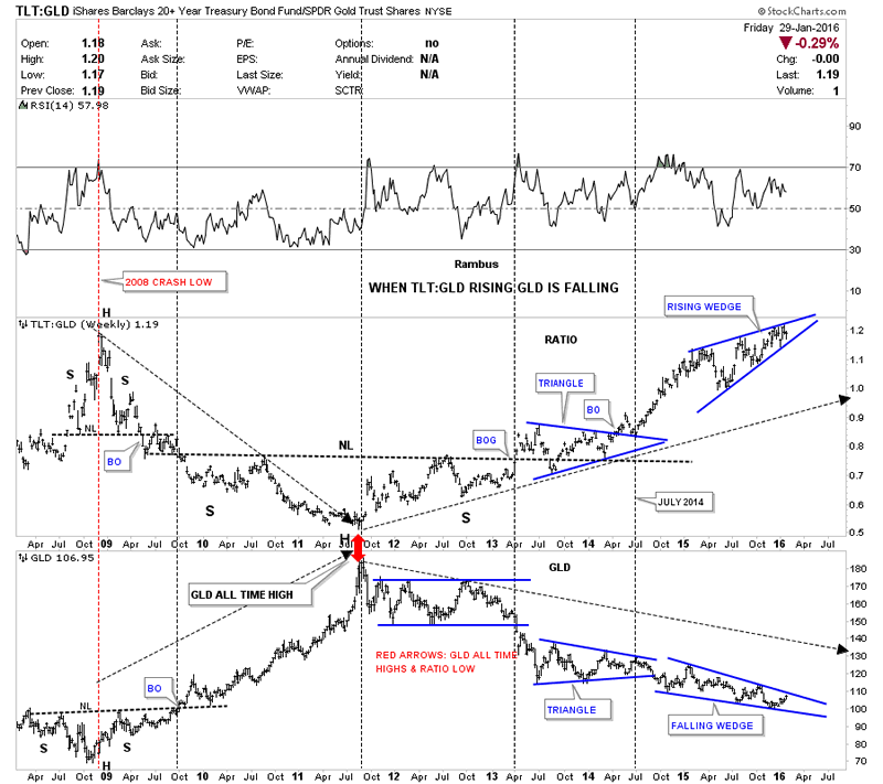
This last chart for tonight I'm going to use the TLT to GLD ratio chart on top and GLD on the bottom. When the ratio chart is rising, meaning the TLT is outperforming GLD, gold generally goes down. Note the inverse look at the 2008 crash low where the ratio chart made a high and GLD on the bottom made its low. From the 2008 crash low GLD then went on its near parabolic run to new all time highs while the ratio chart on top fell to its low. As you can see the ratio chart bottomed in 2011 while GLD topped out as shown by the red arrows. Note the three year H&S bottom the ratio chart made on top, with the head being the 2011 low. The ratio chart on top built out a blue triangle consolidation pattern as the backtest to the neckline which led to the next impulse move higher for the ratio chart. That brings us up to our current situation. Note how the ratio chart on top has formed the blue rising wedge while GLD on the bottom has formed a blue falling wedge. When the ratio chart on top breaks out from that blue rising wedge, whichever direction that is, a good move for GLD will most likely occur. If the charts for the TLT, which I showed you earlier prove to be bullish, then the TLT:GLD ratio chart on top should breakout through the top rail of the blue rising wedge. Until something changes with these ratio charts for the TLT this is the way I have to play the commodities and the PM complex. All the best...Rambus
TIP:TLT Weekly Chart 2
All the best
Gary (for Rambus Chartology)
FREE TRIAL - http://rambus1.com/?page_id=10
© 2016 Copyright Rambus- All Rights Reserved
Disclaimer: The above is a matter of opinion provided for general information purposes only and is not intended as investment advice. Information and analysis above are derived from sources and utilising methods believed to be reliable, but we cannot accept responsibility for any losses you may incur as a result of this analysis. Individuals should consult with their personal financial advisors.
© 2005-2022 http://www.MarketOracle.co.uk - The Market Oracle is a FREE Daily Financial Markets Analysis & Forecasting online publication.


