Gold Another Losing Year
Commodities / Gold and Silver 2016 Jan 01, 2016 - 12:37 PM GMTBy: Dan_Norcini
 Here is a long term chart (monthly) showing where the price of gold ended last year ( 2014 ) and where it is ending up this year.
Monthly Gold Chart
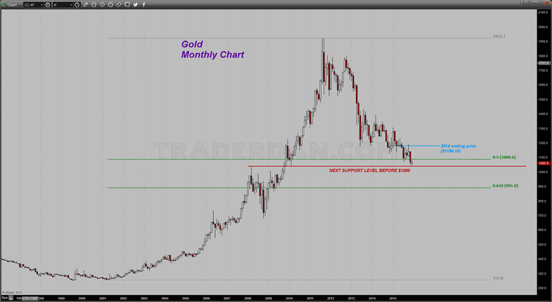
I have drawn in two Fibonacci retracement levels formed off of the entire rally beginning in 2001 to the final top in 2011. As you can see, the price looks to close out this year below the 50% retracement level. In other words, gold has lost more than half of its bull market gains since peaking in 2011.
You can also see why that region near $1080 is so significant from a technical analysis perspective.
I have no idea where gold might go next year as I am not in the business of making price predictions. We will leave that for the gold prophets and various gold cult websites since there is never any consequence for making yet another failed price prediction, especially when the ability to blame any such failure on "gold price manipulation by sinister bullion banks" is always a convenient foil.
What I can say is the last level of downside chart support before the psychologically significant $1000 level lies just below the current price. That level is between $1040-$1030. If gold loses this support level, it is going to $1000.
As unlikely as that might seem to some, below $1000, there is not much in the way of further chart support until one nears the 61.8% Fibonacci retracement level near $890 (let's call it $900 for round number purposes).
This market still shows no serious sign of having forged a long term bottom. From a pure chart perspective, that will not occur until or unless gold can at least get back above the closing 2014 level of $1184. Even at that, it might only mean another long period of a sideways moving market.
Monthly Gold Chart 2
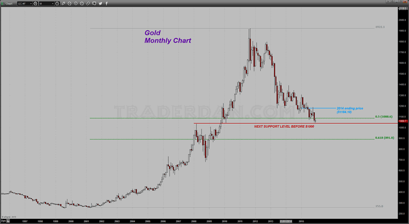
If you look at the left hand side of the chart you can see that prior to the onset of the bull market of the 2000's decade, the metal was mired in a listless $150 price range for many, many years. There is nothing to say that this pattern will not or cannot repeat itself again.
I am sure that regardless of what the metal does, every rally in price will be greeted by the gold cult with further cries of "this is it!" along the way. In all my time in this life, I have never met so many people wishing, hoping, and praying for their own house to burn down so that they can collect on their insurance policy. Being a gold bug necessitates that one have a morbid and depressing outlook on things and thus always viewing any glass as half empty. What a sad existence!
Look at that price chart again beginning with the breakdown in 2013 and the commencement of the current bear market and think back about all the wild claims that came out of the gold cult since that time. I remember each and every one of them since much of my time and effort was spent in rebutting those claims. Here are some of them:
1.) Gold is in backwardation meaning physical demand is so intense that it will soon swamp the paper Comex markets and gold will soar.
2.) The US Dollar is soon going to collapse with all the Quantitative Easing meaning that gold will soar.
3.) J P Morgan is cornering the gold market on the long side meaning that gold will soar.
4.) Comex gold inventories are so drawn down that a massive short squeeze is going to occur meaning that gold will soar.
5.) The European sovereign debt crisis means that gold will soar
6.) Russia's move into the Ukraine is the harbinger of WWIII meaning gold will soar
7.) The Fed is embarking on even more QE meaning gold will soar
8.) The Fed is secretly buying US Treasuries through Belgium and never actually ended QE meaning gold will soar
9.) The Fed cannot raise rates. If they do the system will collapse and gold will soar.
You get the gist of it. Every single one of these breathless and wild-eyed claims was made after the breakdown in price back in 2013. Not a SINGLE ONE of them ever came to pass. NOT ONE!
Yet, for some bizarre reason, those who made these claims, and those who parroted them speaking them as if they were some sort of oracular pronouncement from on high, still are given heed to by far too many. How many times must their victims be duped and lose so much of their hard-earned wealth before they realize that they have been had?
I have written it before and will write it yet again, the vast majority of those advocating gold, no matter what its chart pattern says, have a vested financial interest in seeing gold move higher. Thus they CANNOT BE OBJECTIVE. You might as well expect an apple farmer to speak negatively about the apple as most of the gold cult leaders and website hucksters to say the least derogatory thing about gold or about its future prospects. It will always move higher in price; if you doubt that, just ask them and they will assure you that such must be the case.
Those of us who live in the real world however do not have the luxury of recklessly throwing our precious investment capital or trading capital based on one wild theory after another. Instead we have to be hard-nosed realists who deal with what the markets are telling us and attempt to decipher that elusive entity known as SENTIMENT.
The only way one can truly understand the sentiment of the market is to study the action of price and that can best be understood by looking not only at the price chart of an actual asset but also at the charts of other/additional markets that influence its price movement.
When it comes to gold, that is why we look at the interest rate markets, especially the yield curve and the TIPs spread. We also track the currency markets as well as the general commodity sector. We also look at the big gold ETF, to see how it is faring and what is happening with it. It is by combining these things, in careful and objective study, that we can reach some conclusions as to what the broad consensus is of the market at any given time.
The trick or the challenge I should say, in ascertaining sentiment is that it is constantly changing. That is where the money is to be made; namely by recognizing those changes and moving with them as fighting a market is a sure-fire recipe for financial ruin.
This has already been a rather lengthy set of comments but I would be remiss if I did not close it out with some charts to illustrate this principle as we end the year.
Here is a chart comparing the gold price with the reported holdings of GLD. The gold cult may pooh-pooh this with their usual cries of "price manipulation" or whatever but the simple fact remains - as the reported holdings of GLD have fallen, so too has the price of gold. When those were rising, as they were from late 2008 until that time, the price of gold also rose. There is simply no getting around this if one wants to be honest ( we cannot help those who are mentally dishonest).
GLD Holdings versus Gold Price
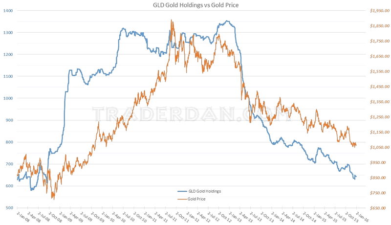
To date, this giant gold ETF has shed over 65 tons of gold since the start of the year. The result has been to bring the amount of gold in custody to levels last seen SEVEN YEARS AGO, to September 2008 to be more precise. This gauge of Western-based investment demand tells us a great deal when it comes to sentiment towards gold here in the West. Without this source of demand, gold simply cannot embark on any sustained rise in price.
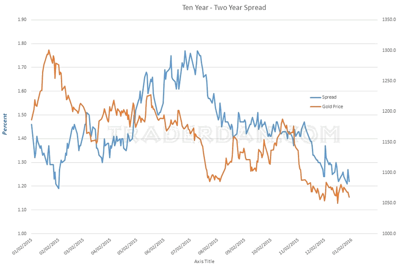
One more chart, once again, this is a representation of the US Treasury yield curve using the spread between the yield on the Ten Year Treasury and the yield on the Two Year Treasury.
As you can see, the curve has continued to flatten with gold following this curve very, very closely for most of this year.
Two Year - Ten Year Spread
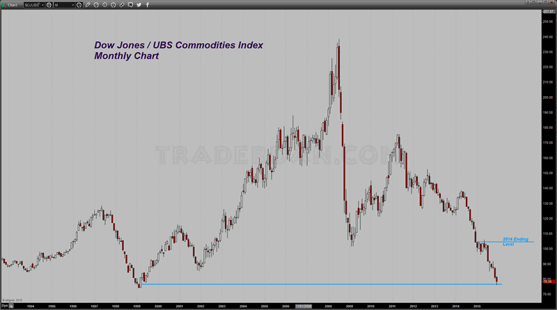
Here is a look at the yearly performance of the Dow Jones/UBS Commodity Index. As you can see, it was another rough year for this asset class as the oversupply that arose from the extremely high prices that followed the inception of the Fed's QE program in early 2009 met up with the harsh reality of contracting global growth. Too much supply and not enough demand means falling prices!
It is going to take a combination of falling supply and rising demand to turn this vicious downtrend around.
Dow Jones UBS Commodities Index
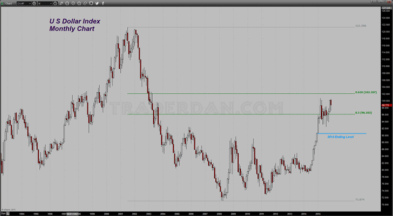
Lastly, the US Dollar Index...
US Dollar Index Monthly Chart
Happy New Year to all my readers, and my best wishes for a prosperous 2016 in your trading accounts.
Dan Norcini
Dan Norcini is a professional off-the-floor commodities trader bringing more than 25 years experience in the markets to provide a trader's insight and commentary on the day's price action. His editorial contributions and supporting technical analysis charts cover a broad range of tradable entities including the precious metals and foreign exchange markets as well as the broader commodity world including the grain and livestock markets. He is a frequent contributor to both Reuters and Dow Jones as a market analyst for the livestock sector and can be on occasion be found as a source in the Wall Street Journal's commodities section. Trader Dan has also been a regular contributor in the past at Jim Sinclair's JS Mineset and King News World as well as may other Precious Metals oriented websites.
Copyright © 2015 Dan Norcini - All Rights Reserved
All ideas, opinions, and/or forecasts, expressed or implied herein, are for informational purposes only and should not be construed as a recommendation to invest, trade, and/or speculate in the markets. Any investments, trades, and/or speculations made in light of the ideas, opinions, and/or forecasts, expressed or implied herein, are committed at your own risk, financial or otherwise. The information on this site has been prepared without regard to any particular investor’s investment objectives, financial situation, and needs. Accordingly, investors should not act on any information on this site without obtaining specific advice from their financial advisor. Past performance is no guarantee of future results.
Dan Norcini Archive |
© 2005-2022 http://www.MarketOracle.co.uk - The Market Oracle is a FREE Daily Financial Markets Analysis & Forecasting online publication.


