Gold's Technical Buy and Sell Signals
Commodities / Gold & Silver Jul 06, 2008 - 08:11 PM GMTBy: Brian_Bloom
 Short term buy signals are being given by the gold share indices
- This, in context of medium term sell signal for gold itself, with a price target for gold at $780 an ounce
- This, in context of a long term buy signal and a visible price target of $1400 an ounce
Conclusions:
- If you own gold, hold it. If you don't yet own gold you might get be able to get it at a lower price after the current up-move reverses itself.
- The Hindenburg sell signal in the equity markets is shouting a very loud warning that we might soon be in for a rocky ride. Now is not the time for taking speculative positions.
************
Theoretically, the ranking of the relative volatility within the gold universe should be:
- $HUI – highly leveraged to the gold price
- $XAU – Leveraged to the gold price
- $Gold – Gold Price
With this in mind, the sequence in which technical buy and sell signals should be given is as follows:
- First: $HUI:$Gold
- Second: $HUI:$XAU
- Third: $XAU:Gold
So let's look a the chart ratios (Charts courtesy stockcharts.com)
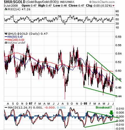
The rising MACD bottoms on the above daily chart are not confirming falling bottoms in the ratio chart
The MACD may have broken up through a falling trend line.
This has not yet been confirmed by the weekly chart of the same ratio below:
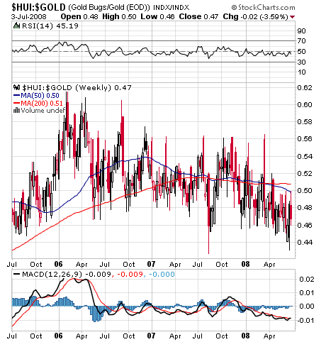
The MACD shows falling bottoms relative to a “possible” double bottom in the ratio chart. This type of non-confirmation is typically more bearish than bullish.
The potential bearishness is validated by the 50 week MA which is below the 200 week MA and is pointing down
As expected, the daily ratio of the $HUI:$XAU is showing a similar – but lagging – picture.
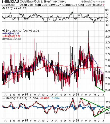
There is a bullish non confirmation between the MACD (rising bottoms) and the ratio chart (falling bottoms), but there has not yet been an upside break through the falling trend line.
On the other hand, an interesting picture emerges from the weekly chart below:
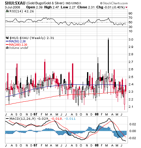
First, the 50 week MA is tracking above the 200 week MA. Perhaps more importantly, the bars on the MACD are contracting towards the zero line and the MACD itself may have bottomed. Arguably, the $HUI has bottomed relative to the $XAU.
Now lets look at the ratio of the $XAU to the Gold Price
This reflects a much more bullish picture that one would expect:
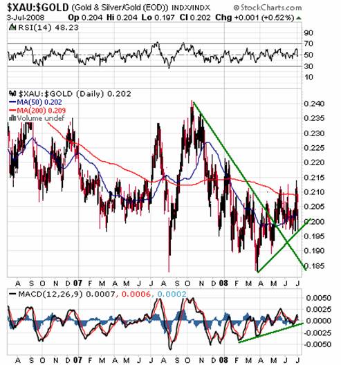
- The falling trend line on the daily chart was penetrated on the upside in mid April
- The 50 day MA is rising strongly towards the 200 day MA
(Note: This may be nothing more than an upward technical reaction. No conclusions can be drawn yet)
Unfortunately, the weekly chart below is not bullish:
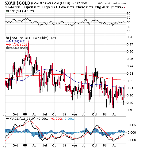
MACD bars are contracting downwards
50 week MA is below 200 Week MA and is pointing downwards.
Finally, let's take a look at the most bullish Relative Strength chart above, namely the weekly ratio of the $HUI:$XAU – but this time in a 3% X 3 box reversal Point & Figure Chart
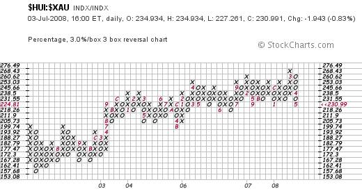
Interestingly, it has been in a trading range since 2004; and the trading range has had a slightly bullish bias. The level of 225 seems to have strong support and, arguably, it is bouncing off that support. Arguably, the $HUI may bounce up from its low level.
Ultimately, whilst the Gold Price is almost certainly in a Primary Bull Market, the chart below – the 2% (two percent) X three box reversal chart is still showing that the most recent (and therefore prevailing) signal is a sell signal. – with $708 per ounce as the downside target on the vertical count method, and $782 per ounce as the downside target based on the horizontal count method.
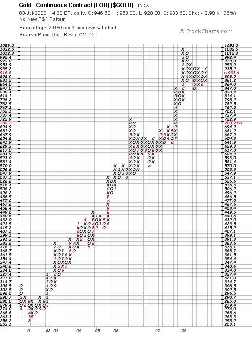
For the position to change, the gold price would have to break up above the $950 an ounce level.
Given that gold appears to be in a Primary Bull Market I place greater faith in the horizontal downside count and the vertical upside count (of $1400 an ounce in the 3% X 3 box reversal chart that is not shown here) than in the vertical downside count. A fall to $780 would bring gold back to its rising trend line, as can be seen from the bar chart below. (courtesy Decisionpoint.com). This would be a very healthy development.
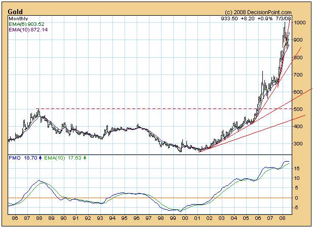
Also of interest in the above monthly chart is the upside gap. This gap could, theoretically, be a breakaway gap – which does not need to be covered – or it could result from a trading aberration and, therefore, will be covered.
A clue seems to come from the position of the PMO oscillator which is in very rarefied territory. If the gap is a breakaway gap then it would have to be signalling the onset of an emotional panic to overcome the overbought level of the PMO.
Given the recent Hindenburg signal on the Industrial Markets (see: http://www.marketoracle.co.uk/Article5334.html ) the question is whether investors will panic “into” gold or whether gold will pull back in sympathy with generally bearish sentiment.
The view of this analyst is that gold is a commodity. It is very likely the most valuable commodity on the planet given its amazingly superconductive characteristics in modified physical format. Nevertheless, it is a commodity which derives its financial value from the financial environment; and the most significant “signal” in the financial environment appears to be the Hindenburg signal.
Conclusion
Whilst the $HUI is showing signs of wanting to bounce upwards relative to Gold and the $XAU, the overall (medium term) universe of gold must be seen to be bearish because of the prevailing sell signal on the 2% X 3 box reversal Point and Figure chart. This bearishness will remain unless and until a $950 per ounce price is breached on the upside. At this stage, a pullback of gold to $780 seems more likely than a breakup through $950. Such a pullback would be technically healthy and should be welcomed. Conversely, a break above $950 an ounce would have sinister implications regarding the prevailing level of confidence in the world's financial system.
Post Script
The chart below is a Point and Figure chart of the oil price.
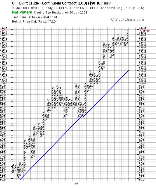
This chart has an upside target of around $150 a barrel based on the horizontal count technique.
The reader's attention is drawn to the last time the oil price rose so far away from its rising trend line. After reaching a price of $100 a barrel, it pulled back to $86 a barrel. Technically, after it reaches $150 a barrel, the oul prices might pull back to as low as $116 a barrel.
The “fundamental” problem with oil at $150 a barrel is that oil can be synthetically produced from coal at less than $50 a barrel. If you go to http://www.commondreams.org/archive/2008/07/01/10017/ you will discover that this disconnect in logic is being caused by hysteria over climate change. “Logic” seems to have flown out of the window for the time being.
Unfortunately, in an atmosphere of emotional hysteria, anything can happen. This is not a time for “gambling” on projected movements in the stock and commodity markets.
By Brian Bloom
My novel, Beyond Neanderthal, is now available to be ordered via www.beyondneanderthal.com and will soon be available via Amazon. Via its entertaining storyline, it attempts to inject some sanity and level headedness into what is emerging as a hysterically fearful environment. Things are not as bad as they seem. There are practical solutions as well as theoretical solutions.
Copyright © 2008 Brian Bloom - All Rights Reserved
Disclaimer: The above is a matter of opinion provided for general information purposes only and is not intended as investment advice. Information and analysis above are derived from sources and utilising methods believed to be reliable, but we cannot accept responsibility for any losses you may incur as a result of this analysis. Individuals should consult with their personal financial advisors.
Brian Bloom Archive |
© 2005-2022 http://www.MarketOracle.co.uk - The Market Oracle is a FREE Daily Financial Markets Analysis & Forecasting online publication.


