


Can Big Cap Gold and Silver Stocks Go Any Lower ?
Commodities / Gold and Silver Stocks 2015 Sep 08, 2015 - 07:04 AM GMT

 In this I’m going to take an indepth look at some the individual precious metals stocks so we can see where they’re at from a short to long term perspective. We’ll start by looking at some of the more important big cap PM stocks as the precious metals stock indexes can’t have a significant rally until this group is ready to run. Anything can happen in the very short term but the further you go out in time the less likely the big trend is going to change on a dime.
The first stock we’ll look at will be a daily chart of the ABX which is one of the biggest of the big caps. From late last year to July of this year ABX built out a shallow bear flag consolidation pattern. The breakout led to our most recent lows around the 6.50 area. Last Friday it gapped below the bottom black dashed S&R line and backtested it at the end of the day. So on the very short term time frame ABX is testing overhead resistance at 6.50.
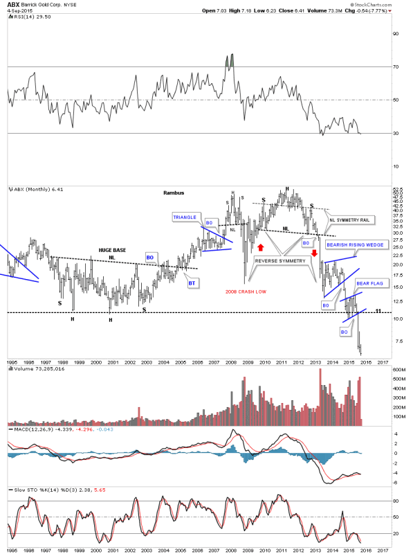
The long term weekly chart shows the massive H&S top ABX built out that reversed its bull market reversing the uptrend into a downtrend as shown by all the consolidation patterns. The close on Friday marked the lowest closing price since the bear market started in 2011 which is a milestone in its own right. You can see how the blue bear flag on the daily chart above fits into the bear market downtrend.

The 20 year monthly chart shows the massive inverse H&S bottom ABX built out in the late 1990’s – earlier 2000’s which led to its bull market run. That major low came in around eleven. What this chart so clearly shows is that ABX has now taken out the major low in 2008 and now the other major low at the bear market bottom in the late 1990’s. Note how the recent blue bear flag formed right on that important bottom rail in the 1990’s signalling that if it broke to the downside new lows would quickly follow. As you can see ABX has been in free fall since the break below the bottom rail of the blue bear flag and the horizontal support and resistance line at eleven. This move down could very well mark the capitulation move is underway.
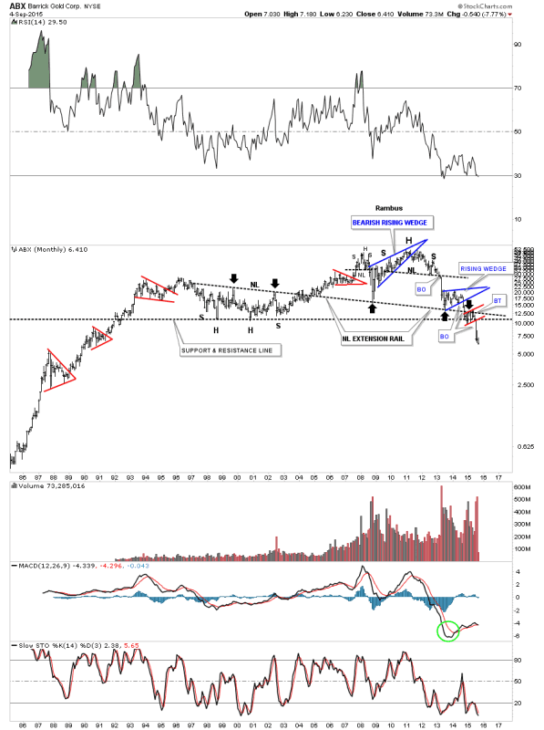
Lets look at one last 30 year monthly chart for ABX which shows us how important that late 1990’s – early 2000’s bottom is that I’ve labeled as the support and resistance line. The number one rule in Chartology is that once an important support line is broken to the downside it then reverses its role and acts as resistance on any counter trend rally. That S&R line is almost 25 years old which makes it very important.
There is one other piece of Chartology on this long term monthly chart and that is the neckline extension rail that I took off of the 2000 inverse H&S bottom and extended all the way out to the right hand side of the chart. The black arrows shows you how it has reversed its role several times from resistance to support and back to resistance again. The bearish setup here on this very long term chart is how ABX formed the blue bearish rising wedge on top of the neckline extension rail and the red bearish rising flag formed just below it which I’ve shown you in the past is a bearish situation. That neckline extension rail is the same concept that I’ve been showing you on the long term chart for gold where I extended the neckline, all the way out to the right hand side of the chart, made during the 2008 crash low. I have to say this chart is a little scary looking to me once we broke below the all important 2000 low.
…………………………………….
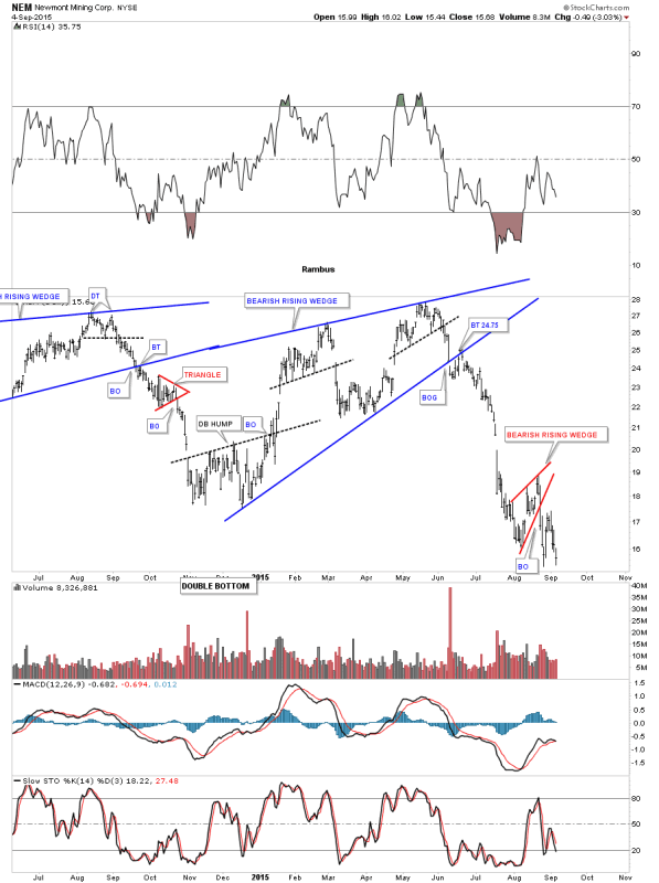
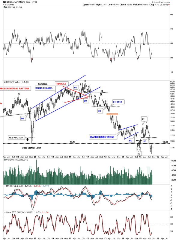
NEM is another big cap PM stock that in not looking very healthy at the moment on the short term daily chart. After forming a six month bearish rising wedge NEM broke to the downside finding initial support at the August low. At this point it looks like it has broken down from a small red bearish rising wedge and is testing the previous August low again.
The weekly line chart for NEM does a good job of showing you how support and resistance works. Initially NEM bounced off of its 2008 crash low building out the blue bearish rising wedge. After cracking the 2008 crash low late last year NEM put on a surprising rally that broke back above the 2008 crash low that looked like it may have some legs to run higher. As you can see it barley moved above the top of the blue bearish falling wedge where it put in a double top that reversed the little counter trend rally that I’m sure trapped alot of gold bugs looking for higher prices. The initial low made late last year worked as resistance two weeks ago as shown by the black arrow. At the close of trading last Friday NEM made a new multi year low on a closing basis.
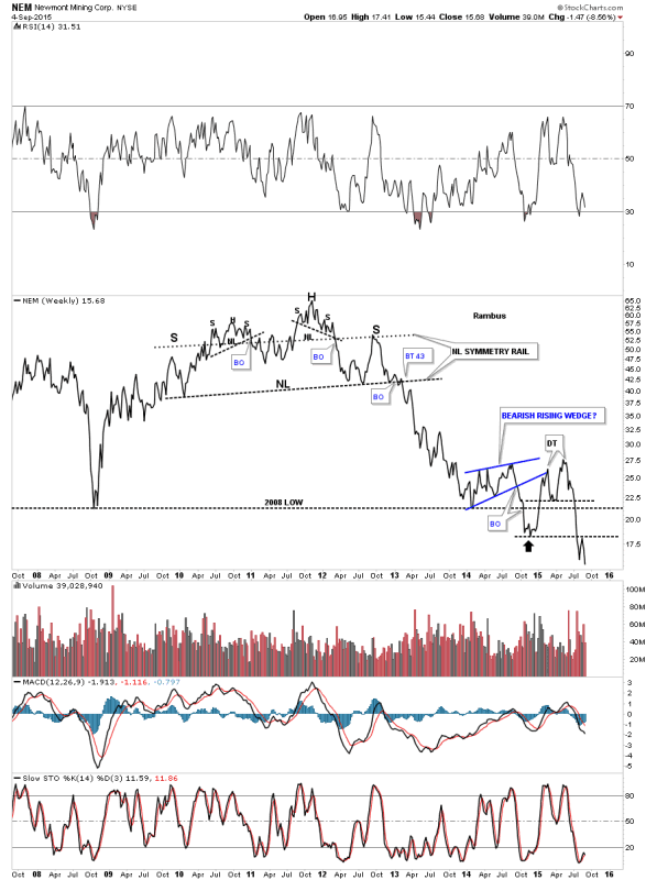
Next is weekly bar chart for NEM which shows how it’s interacting with the 2008 crash low. It formed a small double bottom on the 2008 trendline which led to a small counter trend rally where it built out a small double top which led to our most recent multi year low. Note the one last backtest to the horizontal 2008 crash low trendline at 19.00. That’s how you takeout an important trendline. You get a bounce followed by the break and then one last test from below to complete the breakout process.
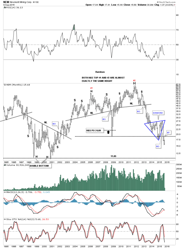
The 20 year monthly chart for NEM shows a possible interesting setup from the long term perspective. NEM built out a big H&S top that marked the beginning of the 2008 crash. After finding the bottom NEM rallied right back up again to form a second H&S top that matches the first one in height. On this monthly chart I labeled the most recent consolidation pattern as a Diamond. Note the big breakout bar that occurred once the bottom rail of the blue Diamond gave way and then the subtly backtest last month to the 2008 crash low. There really isn’t much support until the big bottom in 2000 is reached
………………………………………………………
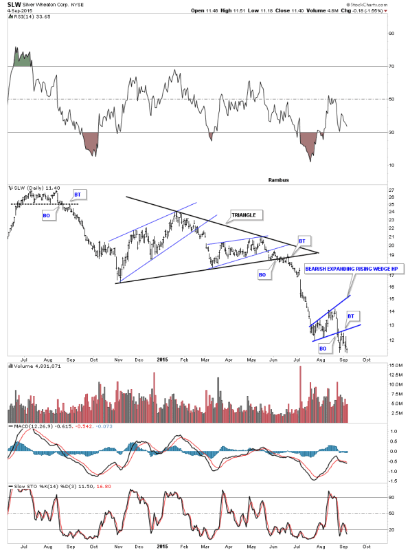
Lets look at one last royalty company that is everyone’s favorite stock during the bull market years, SLW. This daily chart shows the triangle consolidation pattern that broke down in June. This stock shows one of the reasons I bought the Kamikaze stocks last week. As the GDM and GDX are showing a possible H&S consolidation pattern SLW formed a small blue bearish expanding rising wedge pattern that I’m looking at as a possible halfway pattern between the breakout from the black triangle to where the next low comes in
There are several different ways we can look at the long term charts for SLW. Below is a weekly chart which shows the black dashed support and resistance line that defines, bullish above and bearish below
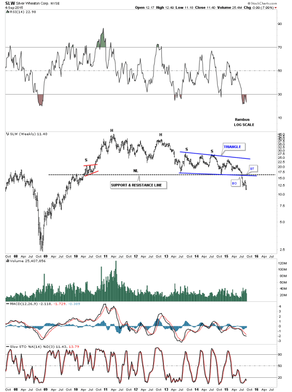
This next long term weekly chart shows a possible expanding falling wedge which SLW tested the bottom rail again last week. This looks like a promising pattern but I’m seeing similar patterns where the price action is breaking below the bottom rail. At this point the bottom rail has held support which we have to respect.
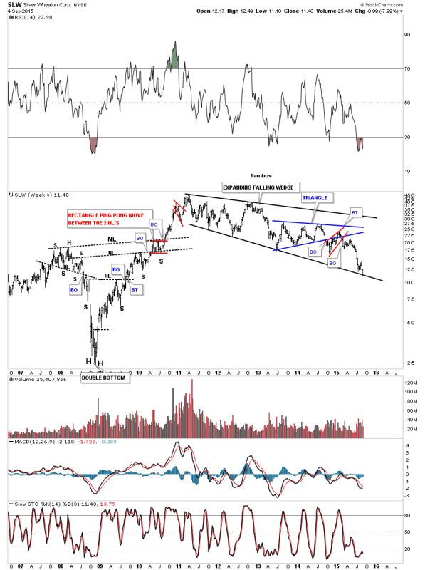
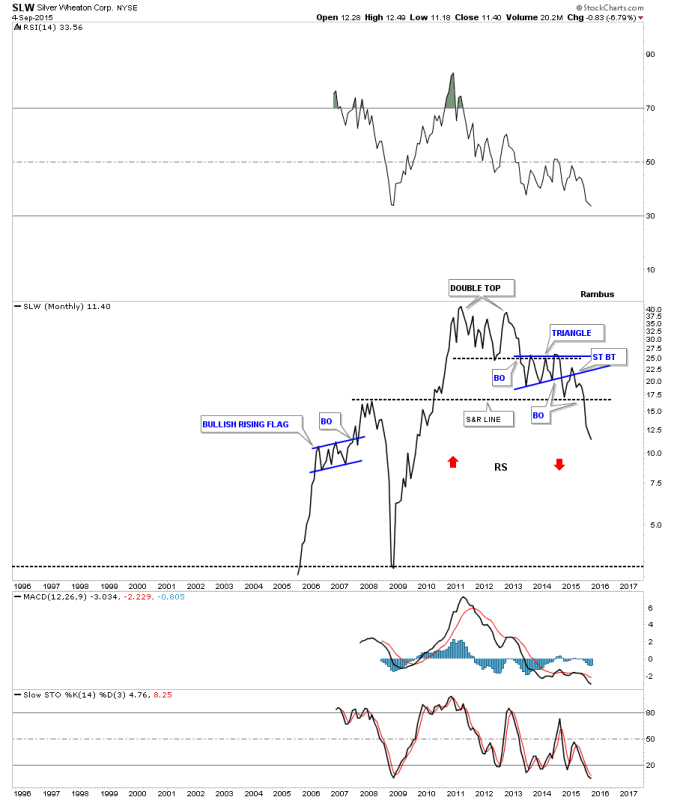
When I look at this long term monthly line chart for SLW I don’t get a warm fuzzy feeling that the worst is over for this darling PM stock. It formed a rather ugly double top that reversed its bull market. It then formed a six point blue triangle consolidation pattern which broke out to the downside and had a strong backtest. The strong backtest started at the S&R line which was holding support from the 2007 high. If there was ever a place to look for some reverse symmetry this monthly chart shows how it may play out, red arrows.
……………………………………………………
Some of you may remember this long term weekly chart for the HUI to gold ratio chart. Several years ago I flagged the .13 low as a very important low for this ratio. It seemed like it would never get down there but it did and formed a small H&S consolidation pattern on that low that goes all the way back to the beginning of the bull market for the HUI. And That just had to be as low as this ratio could possibly go right ? Gold Stocks versus Gold had finally bottomed , a 15 year round trip was finally over and now the PMs could finally go up again right ? Well actually the ratio has now hit .10 with no bottom pattern as yet .

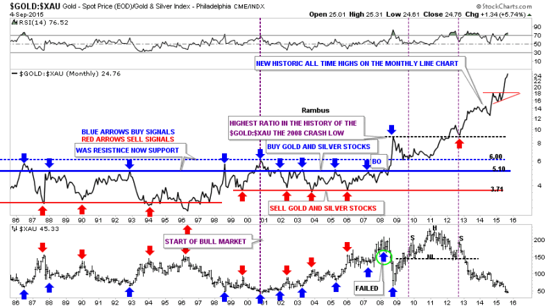
This last chart for tonight compares gold to the XAU which has the most history of all the PM stock indexes we follow. This 30 year ratio chart shows gold is still outperforming the XAU which is unbelievable in its magnitude. Whatever happened during the 2008 crash had a profound impact on this ratio. Up until then this chart was money in the bank. Whenever this ratio got up to the blue line you would buy the PM stocks and when it got down to the red line you would sell them. I marked the failure back in 2008 with the green circle around the blue arrow. That’s when everything changed for this ratio chart. The under performance of the stocks that make up the XAU is truly amazing. As you can see even to this day the XAU is still under performing gold. This chart doesn’t tell us what the issue is with the PM stocks only that something is very wrong. I believe some day we’ll know the answer to that question.
I hope everyone had a great three day break from the markets and enjoyed some time with family and friends. All the best…Rambus
All the best
Gary (for Rambus Chartology)
FREE TRIAL - http://rambus1.com/?page_id=10
© 2015 Copyright Rambus- All Rights Reserved
Disclaimer: The above is a matter of opinion provided for general information purposes only and is not intended as investment advice. Information and analysis above are derived from sources and utilising methods believed to be reliable, but we cannot accept responsibility for any losses you may incur as a result of this analysis. Individuals should consult with their personal financial advisors.
© 2005-2022 http://www.MarketOracle.co.uk - The Market Oracle is a FREE Daily Financial Markets Analysis & Forecasting online publication.