Are Stocks the Next Oil (or Uranium, Copper, Silver)?
Stock-Markets / Stock Markets 2015 Aug 12, 2015 - 12:46 PM GMTBy: Gary_Tanashian
 See: Oil collapse couldn't come at a worse time for industrySee: 2007, when everyone was convinced of 'Peak Oil' and there were websites named 'Peak Oil', 'Oil Drum', etc. constantly reinforcing the mania.
I remember being away on business one day in 2007, with nothing better to do in my hotel room than watch the congressional debates about 'peak oil' and what to do about the evil speculators that were driving prices up. I enjoy watching a good mania as much as the next guy. I realized that what we were seeing was 'Peak Hysteria' with respect to this phenomenon. I thought, 'Yup, Prechter's right'.
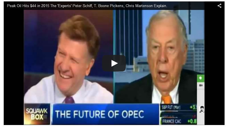
See: This hilarious video someone made about those who promoted the pitch to the public. Some of these people have re-tooled their scripts for a deflationary world today and others keep fighting the good fight I guess, or are living in a hole somewhere. Joe Kernan actually did a great job with the mania's star promoter. "I'm the expert you guys, not you..." -T Boone Pickens (ha ha ha).
Video: Peak Oil Hits $44 in 2015 The 'Experts' Peter Schiff, T. Boone Pickens, Chris Martenson Explain.
Moving on, what do the charts below say about the stock market? The oil mania was a manifestation of inflation. Inflation is willfully deployed against what is a structural global deflation that is always in play and trying to exert pressure. The charts below show where the inflation went on this cycle.
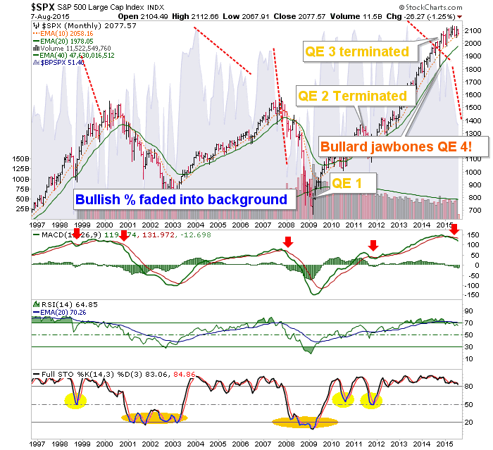
Oh, it's Biiwii... he's a perma bear! Well maybe, I sure do not think the stock market is sustainable and I sure do think it is getting the same treatment as Oil circa 2007, Uranium 2007, Copper 2010, Silver 2011, etc. But I am more than willing to call it ready to bounce or even not yet ready to end its bull market, if only an interim correction ends up being the most probable view. But tuning out all that casino patron stuff, what does this big picture monthly chart say to you?

What does this chart say to you?

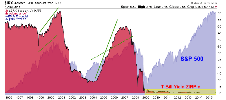
I keep hammering this chart in particular not because the Fed should do something or should not do something with respect to ending ZIRP. I hammer it because whether it was the Fed's intention or not, a large and conspicuous distortion has manifested. Period. Here is what NFTRH 355 had to say about it...
"Pardon me if I hit you over the head too often with the following chart. But we have just wrapped up a couple of weeks that saw the Fed receive congratulations again for doing nothing (FOMC) and speak out of both sides of its mouth (Lockhart and Powell). We also saw another okay Payrolls report come and go.
Of course, with commodities crashed and inflation expectations well contained, must the Fed actually do anything? One might imagine that they also look at some representation of this chart and think 'golly, that's one hell of a distortion built into this market'.
I can't think of many other reasons why a rate hike would even be on the table. They've seemingly got it all; a booming stock market, no inflation and no need for stern monetary policy. I believe that the Fed is as aware as we are that there is an imbalance of epic proportion out there somewhere. Will they try to repair the imbalance now, after 6 years?
The chart is the chart and while I cannot speak in details (since I don't know them), I can see what historical imbalance looks like. Either the market's laws have been repealed or something is going to seek equilibrium one day. If the former, well, how does it feel operating in a remotely guided market? Risky, if you ask me. If the latter, the risk in finding equilibrium is almost unfathomable. This is not meant as hyperbole, it is a chart."
Back to real time. We have noted (as the chart above shows) that in normal times the stock market goes up as the Fed Funds rate is increased, until one day it breaks and the Fed steps on the gas (drops the Funds rate) in response. The market could follow the rate up again on this cycle, but the distortion has severed ties with the historical comp of the last 2 cycles and that is the concern. Oh and the Fed has not even tapped the break yet. The stock market is in uncharted waters.
[edit] So we noted the Hammer (bullish reversal) candles on Friday, and as if by magic in flies Stanley Fischer for a little micro management and a bullish reversal (bounce). It is sort of a low grade Bullard per the chart above. We also note that these jawbone parties are not real and that the S&P 500 is going to break one way or the other soon... Hammer Time Foretells Bounce Time; Now What?
Subscribe to NFTRH Premium for your 25-35 page weekly report, interim updates (including Key ETF charts) and NFTRH+ chart and trade ideas or the free eLetter for an introduction to our work. Or simply keep up to date with plenty of public content at NFTRH.com and Biiwii.com.
By Gary Tanashian
© 2015 Copyright Gary Tanashian - All Rights Reserved
Disclaimer: The above is a matter of opinion provided for general information purposes only and is not intended as investment advice. Information and analysis above are derived from sources and utilising methods believed to be reliable, but we cannot accept responsibility for any losses you may incur as a result of this analysis. Individuals should consult with their personal financial advisors.
Gary Tanashian Archive |
© 2005-2022 http://www.MarketOracle.co.uk - The Market Oracle is a FREE Daily Financial Markets Analysis & Forecasting online publication.


