Bulletin: It’s a Credit Bubble!
Stock-Markets / Liquidity Bubble Jul 14, 2015 - 02:05 PM GMTBy: Gary_Tanashian
 You may have caught the title’s little inside joke.
Sometimes you (well, I anyway) can look at a graph representing data that is a culmination of history (i.e. reality) and just let it settle in for some perspective and even some conclusions.
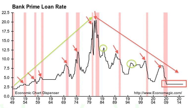
Whether these conclusions are right or wrong is subjective and open to debate. But what I see here when viewing the Prime Rate historical is summed up after the graph (graphs courtesy of Economagic, mark ups mine).

In the pre-Greenspan era, every rise in Prime rates was eventually corrected through recession. This makes sense as the Federal reserve would, through its Funds Rate, make borrowing by banks more expensive during economic up cycles and hence, this was passed on to the borrowing public by the spread between FFR and Prime.
As rates rose along with the value of money, borrowing for consumption would pull back. Viola! Recession (pink bars). Recessions were healthy and necessary (for the economy to naturally rejuvenate). Today they are regarded about as highly as the Plague.
Recessions were more common pre-Greenspan, but they are more volatile intra and post-Greenspan. And why not? When your seed corn is all devoured and you are living on credit backed by an inability to repay said credit (without massive macro parlor tricks employed by ever more ingenious policy making), the busts that follow the booms are not only unpleasant, they are existentially significant; as in, the next one could terminate the system as we know it.

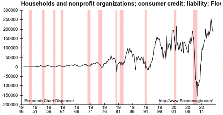
Reference 2001, which spawned a massive bubble in commercial credit and 2008, which spawned a massive bubble in official (government) credit. The post-2008 bubble is now back on trend after a little err, blip in ’08. Move along, nothing to see here. The consumer is back as the tail end of the economy, the vast services sector, carries the day.
Except that there will be something to see here when the next recession arrives. Will it be worse than 2008 or perhaps not as bad on this cycle? You tell me what new an innovative toxic clean up methods policy makers will employ and then I’ll tell you how bad it will be.
But the bottom line is that graph #1 shows that a deflationary phase began after the last great inflation was whipped in 1980. Now, for our purposes deflation has been defined as a solid backbone or undercurrent against which all manner of inflation has been unleashed by policy makers. That continues to this day in the maturing inflationary operation that has truly gone global.
Enjoy the ride. Mr. Toad’s Wild Ride…
“Near the end of the scene, a towering green dragon emerges and attempts to burn the riders to a crisp.” –Wikipedia
Subscribe to NFTRH Premium for your 25-35 page weekly report, interim updates (including Key ETF charts) and NFTRH+ chart and trade ideas or the free eLetter for an introduction to our work. Or simply keep up to date with plenty of public content at NFTRH.com and Biiwii.com.By Gary Tanashian
© 2015 Copyright Gary Tanashian - All Rights Reserved
Disclaimer: The above is a matter of opinion provided for general information purposes only and is not intended as investment advice. Information and analysis above are derived from sources and utilising methods believed to be reliable, but we cannot accept responsibility for any losses you may incur as a result of this analysis. Individuals should consult with their personal financial advisors.
Gary Tanashian Archive |
© 2005-2022 http://www.MarketOracle.co.uk - The Market Oracle is a FREE Daily Financial Markets Analysis & Forecasting online publication.


