


U.S. Dollar, Commodities and the Gold Miners GDXJ ETF Analysis
Commodities / Gold and Silver Stocks 2015 Mar 30, 2015 - 05:25 AM GMT

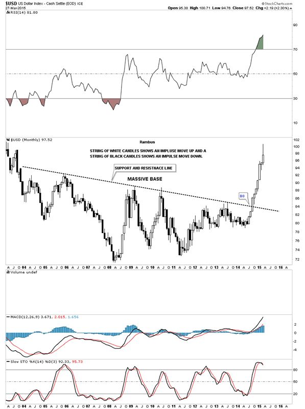
 In this Weekend Report I would like to show you some charts for Natural gas, oil and the GDXJ. First though lets take a quick look at the US dollar and the Euro which have started to consolidate their most recent near straight line moves. The monthly chart for the US dollar shows the impulse move out of the big base with a string of nine white candles all in a row. That's pretty impressive. When looking at the last white candle you can see a possible long wick forming which could be bearish. There are still two more trading days left for this month so things can change but it sure looks like the US dollar is looking for a place to rest for awhile.
US Dollar Index Monthly Chart
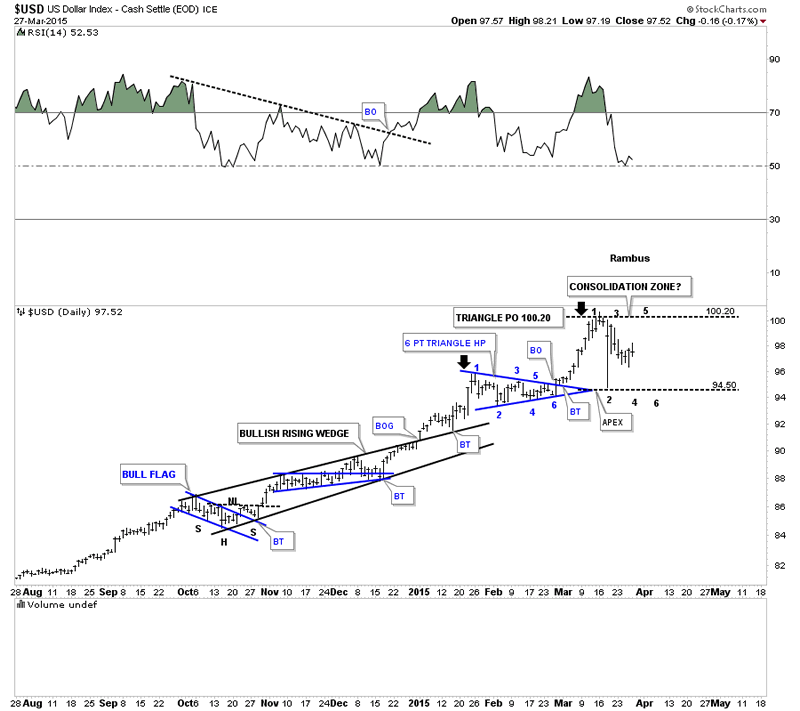
This daily chart for the US dollar we've been following since last October when it started the strong impulse move up with the blue bullish rising wedge giving us a heads up that the move would be a strong one. It seems like just a few days ago the US dollar broke out of that little blue 6 point consolidation pattern but it has already been a month. After reaching its price objective at 100.20 it has started to consolidate. Right now there is very little information to work off of but the dollar could be at the early stages of a possible consolidation zone. You can see the dollar may have put in reversal points #1 and #2 which may set up a horizontal trading range that could last for sometime to come which would be healthy. Right now it's time to watch the US dollar for more clues that will eventually give us something to work off of.
Now lets look at a monthly chart for the $XEU that shows the entire history going back 25 years. The first eight years of the 2000's was a very good time for the euro but that all changed when it formed a small double top in 2008. The decline has been a series sharp advances followed by bigger declines creating a downtrend channel. The last monthly bar on the right hand side of the chart shows the euro broke below the bottom rail of the downtrend channel in what looks like a final capitulation thrust. As you can see it's now trading back inside the downtrend channel. Like the monthly chart for the US dollar it certainly looks like the euro is ready to build out some type of consolidation pattern. How big and how long it takes remains to be seen yet.
Euro Monthly Chart
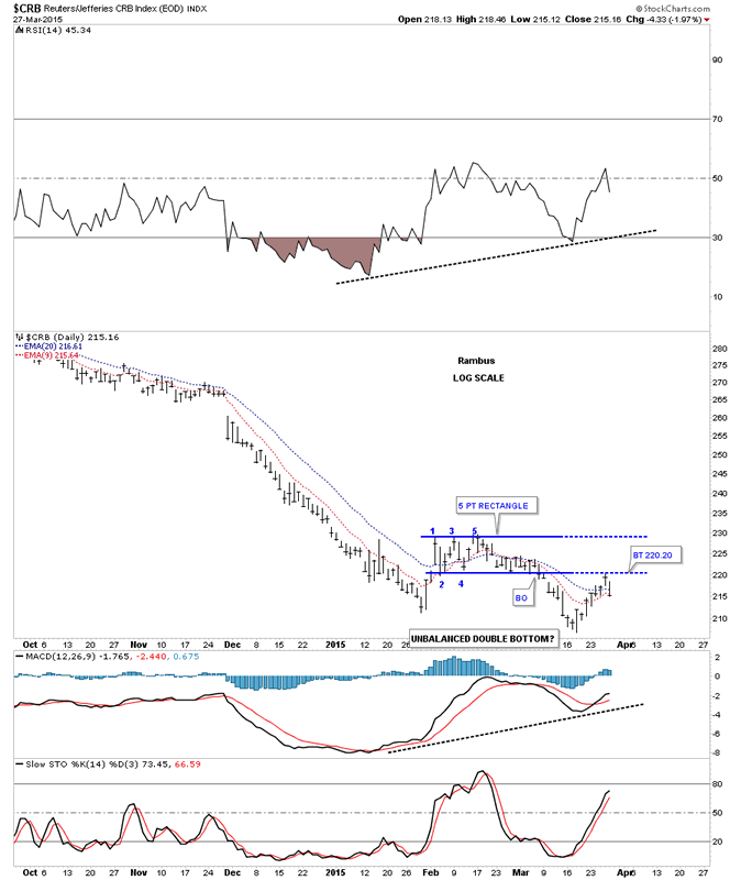
If the US dollar and the euro are at the beginning stages of correcting their big moves how might that affect some of the commodities that have taken it on the chin recently. Lets start by looking at the CRB index that is in the process of bottoming or consolidating it's big move down. The daily chart shows the CRB index has been trading sideways since early February of this year forming a possible unbalanced double bottom. In February it looked like the CRB index was making a rectangle consolidation pattern but the price action couldn't break above the top rail and formed the 5th reversal point which created a rectangle reversal pattern instead. After making a slightly lower low in March it started another counter trend rally but failed on Thursday to trade back above the bottom rail of the blue 5 point rectangle reversal pattern. So far the initial hit and decline is to be expected. Now though if the potential unbalanced double bottom is in play we should see the price action trade back above the bottom rail of the blue rectangle that will tell us the bulls are back in charge at least for awhile.
CRB Daily Chart
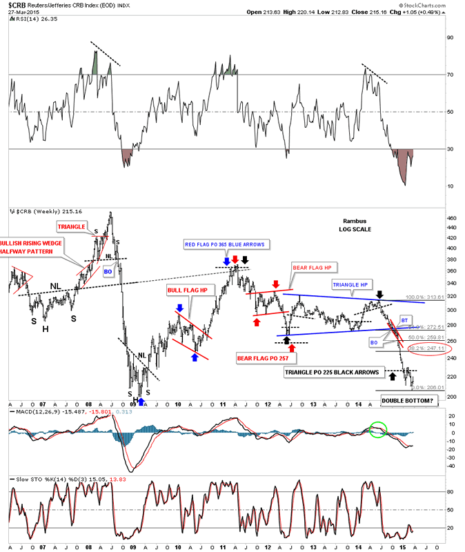
Below is a weekly chart that shows the three major impulse moves the CRB has made over the last 5 1/2 years or so. The blue arrows measures the big impulse move up in 2009 to 2011 with the red bull flag as its halfway pattern. The red arrows shows the impulse move down in 2012 with the red bear flag showing the halfway area of that impulse move down. The black arrows shows the last impulse move down that started at the top in 2011 with the big blue triangle as its halfway pattern. So far the CRB exceeded the price objective by about 20 points or so trading all the way down to 206 area. There is still no definitive way to tell yet if we are going to see some type of bottoming formation or a consolidation pattern. So far we still have lower lows and lower highs in place which by definition is a downtrend.
CRB Weekly Chart
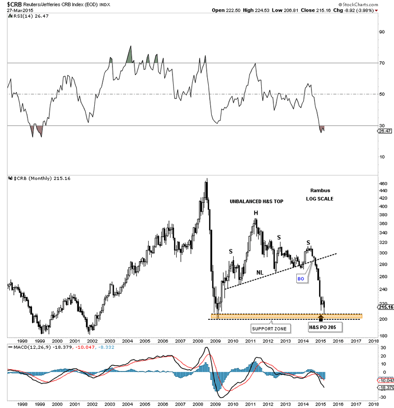
The monthly chart for the CRB index shows it has reached the price objective of its big H&S top pattern down at 205. The brown shaded support zone shows you a good place to look for some type of reversal pattern such as a double bottom or inverse H&S bottom. It's really looking like how the US dollar goes so goes the CRB index. As they say we'll know in the fullness of time.
CRB Monthly Chart
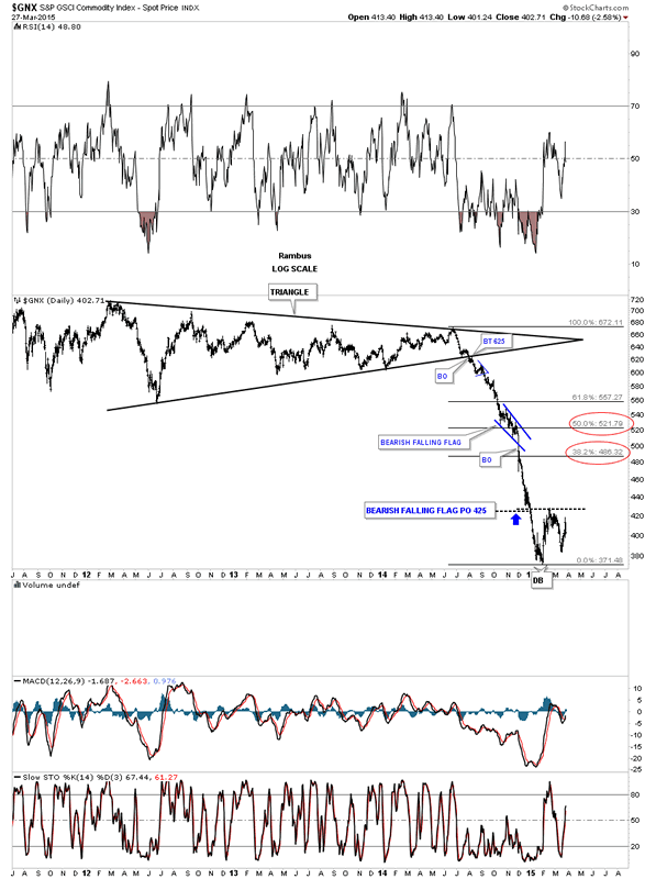
Lets look at another commodities index the GNX which is building out a possible unbalanced double bottom with a higher right bottom. It's still too early to tell yet if the trading range since the first of the year is going to be a consolidation pattern or a reversal pattern. More time will equal more clues.
GNX Daily Chart
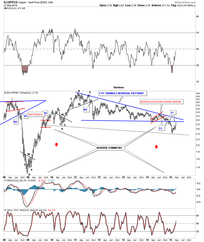
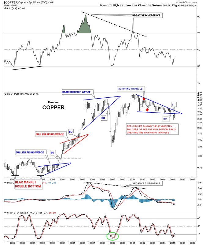
Lets look at copper to see if we can find any clues that can help us understand the short to intermediate term movement in commonalities. Copper built out a massive 7 point triangle reversal pattern which broke to the downside late last year. This week it backtested the bottom rail leaving a long tail behind on the weekly bar. This chart isn't very encouraging if your a commodities bull, at least for copper. I've added the reverse symmetry annotations because of the strong rally off of the 2008 crash low. How copper went up maybe how it comes back down.
Copper Weekly Chart
The monthly chart for copper shows its bull market years when it built out two bullish rising wedges after creating a three year double bottom between 1999 and 2002. You can see the last bar on the right hand side of the chart that shows the backtest taking place on the monthly look. Bottom line is copper isn't really showing us much in the way a bullish bias for the commodities complex in general unless it can take out the top rail of the triangle.
Copper Monthly Chart
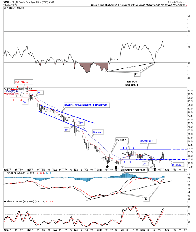
Lets now take a look at oil which looks alot like the CRB index in that it has a somewhat ugly looking trading range building out at the bottom of its big impulse move down. Originally it looked like oil was building a very small double bottom as shown by the two black arrows on the left side, initial low. Oil then rallied above the double bottom hump only to form a 5 point rectangle reversal pattern. That reversal back down maybe forming the second bottom of a bigger double bottom. You can see last Friday's price action closed back on the bottom rail of the 5 point blue rectangle reversal pattern. Needless to say this is a critically important test right here for oil. If oil can hold support right here that gives the possible double bottom scenario more credence. To actually complete the double bottom oil would have to take out the top rail of the 5 point rectangle which then would reverse its role to support on any backtest and we would call it the double bottom hump.
Light Crude Daily Chart
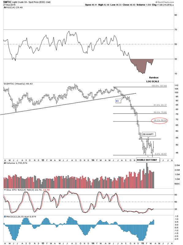
Below is a simple weekly chart for oil that shows how the possible double bottom is developing. Again it's still too early to call a double bottom as this trading range could end up being a consolidation pattern to the downside. It looks promising but that's all we can say about it right now.
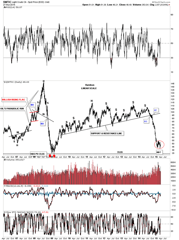
This long term daily chart shows you what happens when a long term support and resistance line gives way. All that pent up energy is released in a short period of time and you get a waterfall decline. The red circle shows the trading range that started to build out from the first of the year. Double bottom or consolidation zone? Note oil's parabolic rise and collapse on the left side of the chart. That big H&S top nailed the price objective down at the 33 area which was the top of the old trading range that went back many years.
Light Crude Daily Chart 2
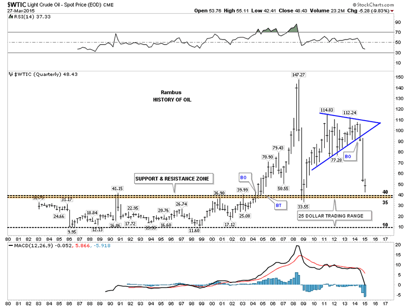
This last chart for oil shows its entire history going all the way back to 1983. This quarterly chart shows you the long term resistance zone that held oil in check until it finally broke out in 2004 which eventually led to the parabolic blow off to 147. You can see how the brown shaded support and resistance zone reversed its role to support during the 2008 crash. There is still some room for oil to move lower before it hits the S&R zone. Does oil rally first and then declines to the S&R zone or does it form a consolidation pattern that breaks down to reach or exceed the brown shaded S&R zone first?
Light Crude Quarterly Chart
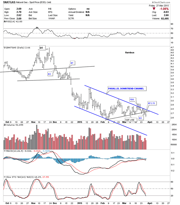
Moving on to Natural gas lets start by looking at the $NATGAS which is the spot price chart. It had been trading in a nice tight parallel down trend channel but then had a false breakout of the top rail which I had to respect and sold the positions I had. It was the last thing I wanted to do but I had no choice. As you can see NATGAS turned right around and traded back inside the original downtrend channel. All is not lost yet as we maybe seeing a backtest to the black dashed S&R line which would come in around the 2.75 area. I think that would represent a good low risk entry point.
Natural gas Daily Chart
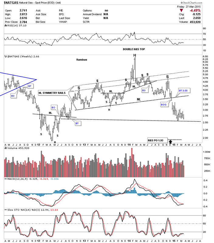
The reason I like Natural gas so well on the short side is because of the big two year H&S top pattern. This weekly chart shows a lot of chopping action since it broke out with a nice big breakout gap from the H&S neckline which makes it difficult to hold on to unless you have a longer term mindset. I'm still keeping a close eye on Natural gas from the short side waiting for a good entry point.
Natural Gas Weekly Chart
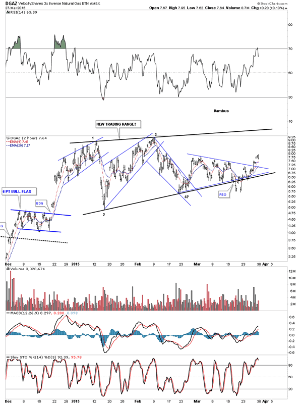
Below is a 2 hour chart that shows DGAZ's new trading range since the first of the year. You can see that false breakout through the bottom rail that forced me to sell out. So far it looks like a bear trap.
Velocity Shares 3X Inverse Natural Gas 2-Hour Chart
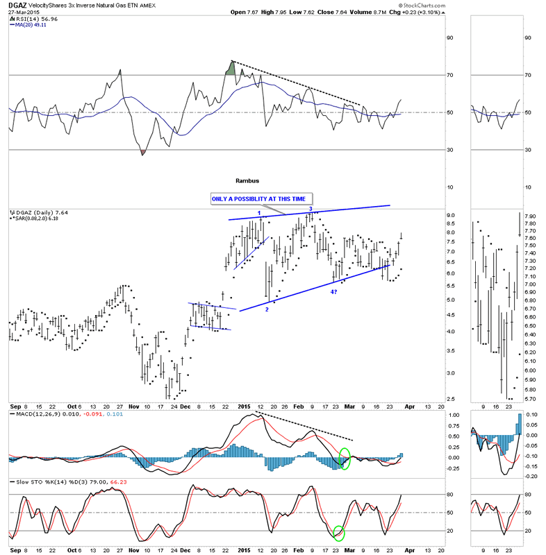
The next chart for DGAZ shows the new trading range with the PSAR on a buy signal for the last 5 days. PSAR works very good during strong impulse moves but in sideways chopping ranges you can get a lot of whipsaws.
Velocity Shares 3X Inverse Natural Gas Daily Chart
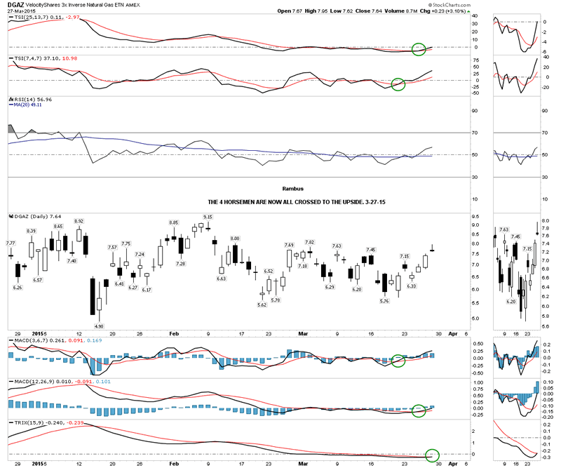
The four horsemen have now all had a positive cross to the upside.
Velocity Shares 3X Inverse Natural Gas Daily Chart 2
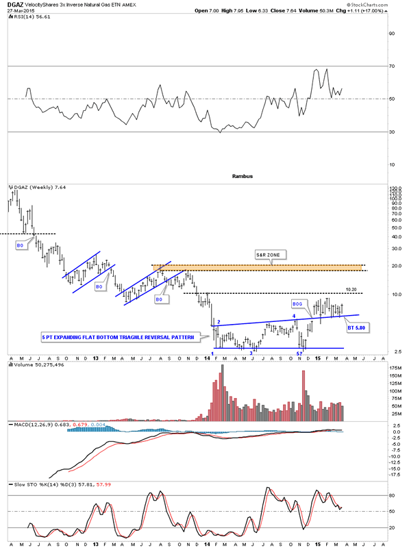
The weekly chart shows its big blue 5 point expanding flat bottom triangle reversal pattern. You can see the nice breakout gap and then the first backtest which I thought would probably be enough. Was I ever wrong. DGAZ has been backtesting that top rail for 16 weeks now which is still holding support. It just goes to show you you never know how long and how many times a stock can have backtests before it's finally finished and the impulse move you were looking for finally takes off.
Velocity Shares 3X Inverse Natural Gas Weekly Chart
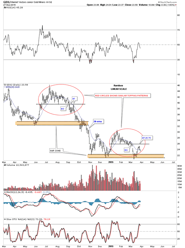
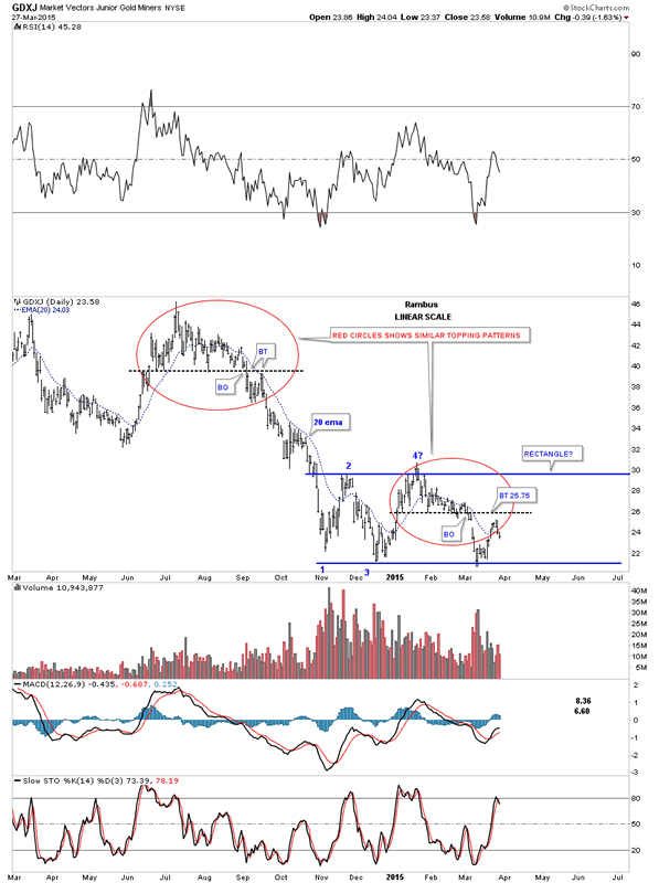
Lets finish up this Weekend Report by taking an in depth look at the GDXJ that I know a lot of folks are interested in. This first chart is a daily look that I first showed you several months ago that have a similar topping pattern as shown by the red circles. The black dashed horizontal line on the higher top shows the breakout from the top with a backtest several weeks later before the impulse move down began in earnest. The lower red circle shows you a very similar setup as it looks like it had a backtest this past week to the black dashed horizontal line. Next we need to see the brown shaded S&R zone give way to get the next impulse move going. The upper red circle shows some chopping action when it came time for GDXJ to break below the brown shaded S&R zone. Once it was finished it wasted little time in falling to the lower S&R zone. Note how the 20 ema has worked as resistance during the topping patterns. Last week GDXJ broke back above the 20 ema but closed Friday just below it.
Market Vectors Junior Gold Miners Daily Chart
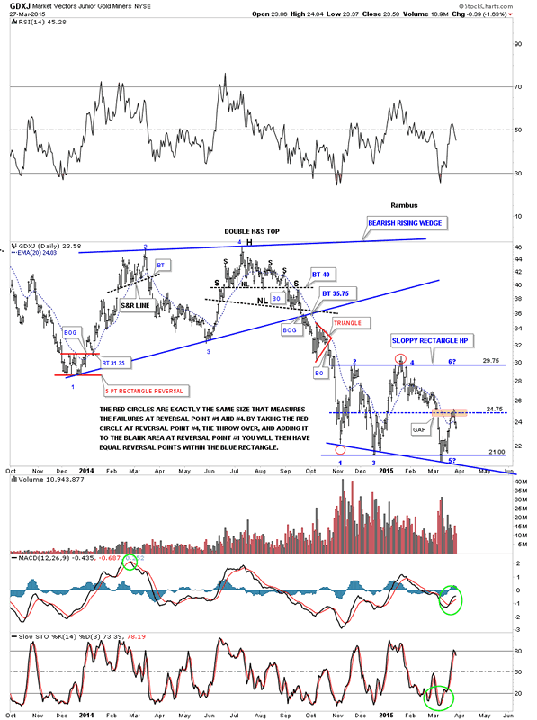
This next chart is just about the same as the one above but I put the blue rectangle as a consolidation pattern on this one. The blue rectangle is a little objective as I could slope the bottom rail to the downside giving us a flat top expanding triangle. For the time being I'm going to leave the blue trendlines in a horizontal position.
Market Vectors Junior Gold Miners Daily Chart 2
Lets step back in time a little further so you can see how our current trading range, rectangle or flat top expanding triangle, fits into the bigger picture. First notice the blue bearish rising wedge at the top of the chart and the impulse move down once the bottom rail was broken. November of last year marked the beginning of our current consolidation zone which has completed the mandatory minimum of four reversal points so we can call this latest trading range a consolidation pattern. Whether it's a rectangle or flat top triangle makes very little difference as it's the essence of the consolidation zone that is most important to grasp. Another important point to note on this next chart is the rally back up to the middle of the blue rectangle that closed that gap. What is also important to note is the latest rally also stopped at about the halfway point within the rectangle. I have shown you many instances in the past where the last move in a rectangle will fail at the halfway point telling us, in this case, the bulls have run out of gas. Just the opposite can happen when you see a breakout to the top side. The last decline will only make it to the middle of the rectangle before the rally begins. Now we need to see some follow through to the downside to really get the impulse move going.
Market Vectors Junior Gold Miners Daily Chart 3
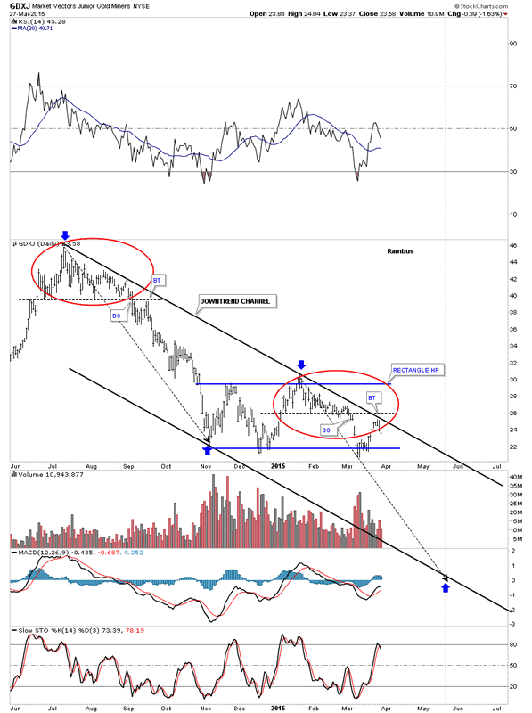
This next daily chart for the GDXJ I decided to add a top and bottom trendline that is forming a short term downtrend channel. If the blue rectangle turns out to be the real deal it should mark the halfway point in the decline that started at the top red circle as shown by the blue arrows. You can see last Thursday GDXJ tested that top black trendline before falling on Friday. The black arrows are the exact same length which measures time and price. Sometimes these types of move, that have a halfway pattern in the middle, will have the upper and lower half looking very similar. We should know something this next week.
Market Vectors Junior Gold Miners Daily Chart 4
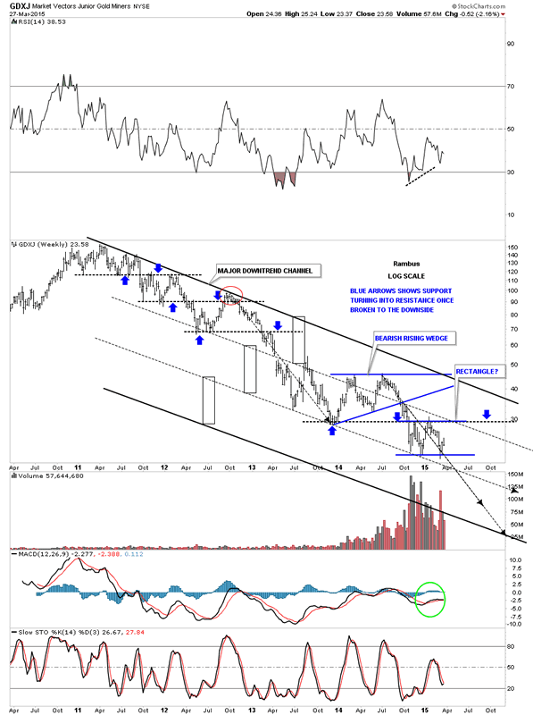
Below is a long term look at GDXJ that shows almost its entire history. Sometimes in strong moves down there can be multiple channels that are built with each one being just about the same width. As you can see the black rectangles are the exact same size that shows the two upper channels being equal in size. Note the bottom black trendline that has no touches on it. If the GDXJ is going to end its bear market there is a good chance that the bottom rail may get hit as the last leg finishes up. Keep in mind this is only a possibility at this time. If we see the lower dashed trend line give way then we'll have this chart on our radar screens to watch and see what happens. This is the same principal I showed you in regards to the upper channel on the US dollar chart a while back.
Market Vectors Junior Gold Miners Weekly Chart
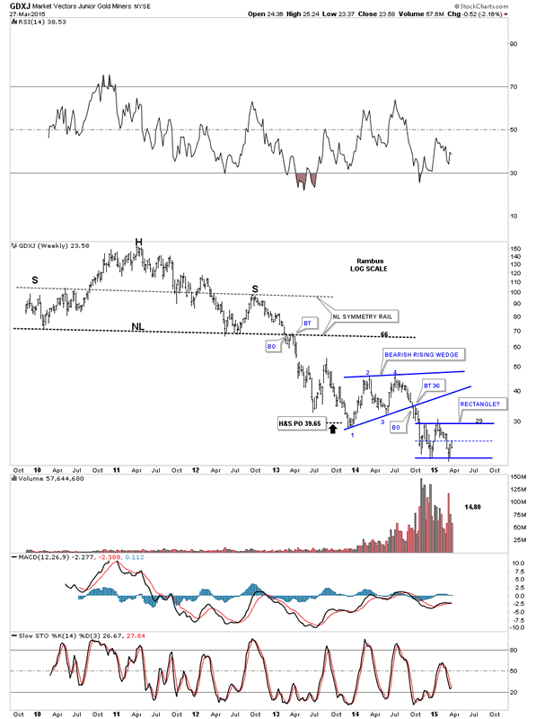
This last chart for GDXJ shows its entire history with its massive H&S top. You can now see the blue bearish rising wedge and our possible rectangle consolidation pattern and how they fit into the very big picture. Just under three weeks ago GDXJ hit a fresh new all time low before getting our current bounce. When I look at this long term chart it still looks to me like the GDXJ still has some unfinished work to do on the downside. All the best...Rambus
Market Vectors Junior Gold Miners Weekly Chart 2
Gary (for Rambus Chartology)
FREE TRIAL - http://rambus1.com/?page_id=10
© 2015 Copyright Rambus- All Rights Reserved
Disclaimer: The above is a matter of opinion provided for general information purposes only and is not intended as investment advice. Information and analysis above are derived from sources and utilising methods believed to be reliable, but we cannot accept responsibility for any losses you may incur as a result of this analysis. Individuals should consult with their personal financial advisors.
© 2005-2022 http://www.MarketOracle.co.uk - The Market Oracle is a FREE Daily Financial Markets Analysis & Forecasting online publication.