Coffee Anyone? A Commdity Chart Technical Outlook
Commodities / Coffee Jan 13, 2015 - 04:12 PM GMTBy: Austin_Galt
 Being based in a country renowned for some of the world’s finest coffee, Colombia, I have acquired a taste for the green bean. So just what do I expect to be paying for the fine blend going forward?
Let’s take a top down approach to the technicals beginning with the yearly chart.
COFFEE YEARLY CHART

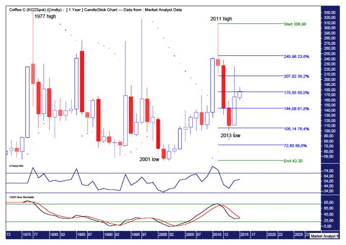
This long term chart goes back to 1972 and shows what appears to be a massive sideways consolidation. The high was set in 1977 at $337.50 while the low was set in 2001 at $42.20. So that is quite a range to work with in itself.
The Parabolic Stop and Reverse (PSAR) indicator is yet more evidence of this consolidation with the dots being busted every which way. These dots are currently exhibiting a bullish bias being underneath price but I suspect will be busted in the next year or so in line with the big consolidation pattern.
Both the Relative Strength Indicator (RSI) and Stochastic indicator are not that helpful with both being more or less in no man’s land. That is not surprising considering price is right around the middle of the consolidation zone. The RSI is just in positive territory but has come down from its peak while the Stochastic is just in negative territory with a bearish bias but does look to be threatening a bullish crossover. But until that happens…….
I have added Fibonacci retracement levels of the move up from 2001 low to 2011 high. Price has already come down and found support around the 76.4% level. Price still looks to be on the up so perhaps it is headed back to the 38.2% level at $207.02 or even the 23.6% level at $245.96. And if the 2013 is not the final low, which I suspect to be the case, then a move back to the 88.6% level at $72.60 has to be on the cards.
Let’s move on to the monthly chart to see if we can get more clarity.
COFFEE MONTHLY CHART

This chart looks to give us a bit more to work with. Where to begin?
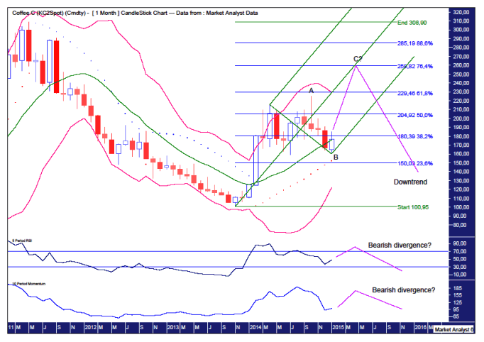
The Bollinger Bands show price is currently around the middle band after coming off the upper band. The move from the upper band to middle band looks corrective in nature compared to the move up to the upper band from the lower band which took place around the start of 2014. That move looks very impulsive by comparison.
This leads me to believe the current monthly trend is up and hence the middle band is a key area of support before price moves back up to the upper band in impulsive style.
However, we must keep in mind the overall trend appears to be down. We can see price has traded down from the high at the start of the chart which was set in 2011. The downtrend into the end of 2013 was without mercy for the bulls.
I suspect the price action over the last year or so is an ABC correction and we may well be at the beginning of wave C with the recent low being the end of wave B.
This recent low was just above support given by the PSAR indicator. These dots stand at $152.51 and breaking below there now would look bearish.
I have added an Andrew’s Pitchfork which should hold the current wave C move if that is indeed what is occurring. I am looking for a move up that stays within the lower pitchfork channel. Price moving up into the upper channel would be an indication of strength and considering I believe this to be part of a corrective phase then price should not exhibit such strength. In fact, it would not surprise to see the wave C high come right around the middle pitchfork trend line as it’s attempt to crack into the upper channel is rejected. Let’s see.
I have added Fibonacci retracement levels of the move down from 2011 high to 2013 low. I am targeting the 76.4% level at $259.82 for the wave C move to end. That can be investigated in more detail if and when price gets up around there.
I have added the lower indicators, the RSI and Momentum indicator, and I would like to see the wave C high be accompanied by less strong readings in both of these indicators – bearish divergences.
Once the expected wave C high is in place, then price should resume the overall bear trend which should see price eventually crack below the 2013 low and head for the 88.6% as outlined in the yearly analysis.
Let’s move on to the weekly chart.
COFFEE WEEKLY CHART

Nice. Further clarity is provided here. Let’s work through it.
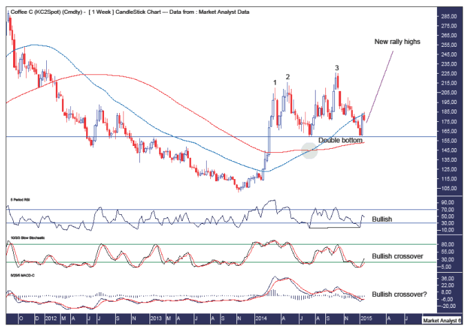
We can see a “three strikes and you’re out” top formation in place. This consisted of three consecutive higher highs and once the third high was in place a significant decline of over 25% took place.
Interestingly, the decline was halted at support given by the previous swing low. This has set up a bullish double bottom with the trend. This double bottom is at the $159 level and until price breaches that level we should be expecting new rally highs.
I have added moving averages with time periods of 50 (blue) and 100 (red) and we can see they have crossed over in bullish fashion as can be seen in the green highlighted circle. This is further evidence of the current bullishness in force.
The RSI is showing a double bottom and is now trending up and looking bullish.
The Stochastic indicator is showing a recent bullish crossover and looking relatively bullish.
The Moving Average Convergence Divergence (MACD) indicator looks to be threatening a bullish crossover.
So, it looks like I might be forking out a bit more for my caffeine hit over the coming months while looking further afield rock bottom prices look set to test those hard working Colombian “campesinos” that toil in the coffee plantations.
By Austin Galt
Austin Galt is The Voodoo Analyst. I have studied charts for over 20 years and am currently a private trader. Several years ago I worked as a licensed advisor with a well known Australian stock broker. While there was an abundance of fundamental analysts, there seemed to be a dearth of technical analysts. My aim here is to provide my view of technical analysis that is both intriguing and misunderstood by many. I like to refer to it as the black magic of stock market analysis.
© 2015 Copyright The Voodoo Analyst - All Rights Reserved
Disclaimer: The above is a matter of opinion provided for general information purposes only and is not intended as investment advice. Information and analysis above are derived from sources and utilising methods believed to be reliable, but we cannot accept responsibility for any losses you may incur as a result of this analysis. Individuals should consult with their personal financial advisors.
© 2005-2022 http://www.MarketOracle.co.uk - The Market Oracle is a FREE Daily Financial Markets Analysis & Forecasting online publication.


