Dow Mini Stock Market Megaphone Top
Stock-Markets / Stock Markets 2014 Dec 17, 2014 - 06:08 PM GMTBy: Austin_Galt
 The Dow made marginal all time highs in early December before turning back down. Many people are now jumping at shadows with every correction that takes place. This is understandable given the Dow’s precarious position but it is my opinion that the ultimate top is still yet to be seen.
Let’s examine the situation using the daily and weekly charts.
DOW DAILY CHART

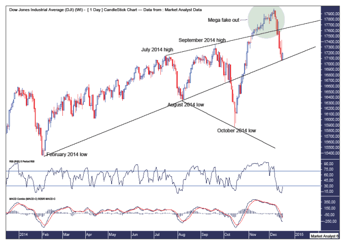
There has been a lot of talk about the massive megaphone top in the Dow on the long term chart. I showed this pattern in the recent December newsletter. This pattern has also set up on a much smaller scale on the daily chart which can be seen here.
Just as I am viewing the current price action on the long term chart to be a mega fake out of the megaphone pattern, I believe we are ahead of time in the pattern on the short term daily chart.
I have drawn a green highlighted circle which shows price breaking out above the top trend line of the megaphone pattern. I believe this was a fake out move and price has now dropped back into the megaphone pattern.
I have also drawn a trend line connecting the February 2014 and August 2014 lows. Price has come back to this support line now and turned up. This may well be the start of the next leg up to new all time highs.
I suspect the exact same pattern is playing out right now as that which I laid out in the long term Dow Logarithmic Yearly Chart in the December newsletter.
The Relative Strength Indicator (RSI) shows this low to be extremely oversold while the Moving Average Convergence Divergence (MACD) indicator looks like it may be turning back up after a steep run down.
DOW WEEKLY CHART

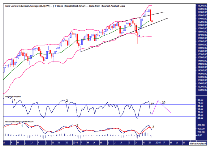
We can see once again price making a false break of the upper trend line and price now finding support at the lower trend line.
I have also added Bollinger Bands which show the top candle had already moved away from the upper band with price now finding support around the middle band. A break to new lows now would likely signify price is headed to the lower band and a potential downtrend. And perhaps the expected final surge to new highs will get back up to the upper band for one last kiss goodbye.
I have added the RSI and MACD indicator to show the triple bearish divergences that have formed or are still forming. Now it is possible for the RSI to go back up and make a new high which is still below the second bearish divergence. The MACD has less room to trade and I suspect its triple bearish divergence is now in place.
This correction in December now means I am looking for a top in early January. So let’s leave price to go through the motions and then we can investigate further any likely topping pattern as it takes place.
Austin Galt is The Voodoo Analyst. I have studied charts for over 20 years and am currently a private trader. Several years ago I worked as a licensed advisor with a well known Australian stock broker. While there was an abundance of fundamental analysts, there seemed to be a dearth of technical analysts. My aim here is to provide my view of technical analysis that is both intriguing and misunderstood by many. I like to refer to it as the black magic of stock market analysis.
© 2014 Copyright The Voodoo Analyst - All Rights Reserved
Disclaimer: The above is a matter of opinion provided for general information purposes only and is not intended as investment advice. Information and analysis above are derived from sources and utilising methods believed to be reliable, but we cannot accept responsibility for any losses you may incur as a result of this analysis. Individuals should consult with their personal financial advisors.
© 2005-2022 http://www.MarketOracle.co.uk - The Market Oracle is a FREE Daily Financial Markets Analysis & Forecasting online publication.


