Australia Stock Market and AUD Dollar Analysis (ASX200 and AUDUSD)
Stock-Markets / Stock Markets 2014 Nov 21, 2014 - 12:27 PM GMTBy: Austin_Galt
 The Australian stock index, the ASX200, bounced nicely off its October lows while the last couple of weeks has given up some of those gains. So is this the start of a downtrend or just a correction before price heads up to new rally highs? I favour the latter.
Let's investigate beginning with the weekly chart.
ASX200 Weekly Chart
Much of this was covered in the November newsletter but there is some new information.
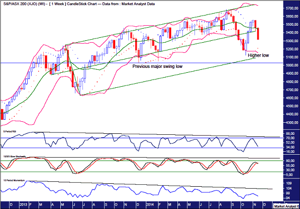
I have drawn a horizontal line which denotes the previous major swing low which was set in December 2013 at 5028. The low of the recent move down only got as far as 5122 so we have a higher low in place. That should mean new rally highs are dead ahead.
I have drawn a horizontal line which denotes the previous major swing low which was set in December 2013 at 5028. The low of the recent move down only got as far as 5122 so we have a higher low in place. That should mean new rally highs are dead ahead.
I have drawn an Andrew's Pitchfork which shows the beautiful uptrend that has been in place. Price has generally stayed within the confines of the upper pitchfork channel. The recent move down extended into the lower channel but didn't have enough ticker to break below the lower channel line.
With a higher low in place, I favour a move up to new rally highs which should do and "up and over" of the higher pitchfork channel line. This may well be a false break top with the move above the pitchfork only fleeting. Let's see.
The Bollinger Bands show price moving away from the lower band and now oscillating around the middle band. Perhaps after consolidating this area price will make its way up to the upper band. The end of bull moves often see price trade above the upper Bollinger Band so perhaps price can do an "up and over" here as well. Then some regression to the mean would be in order that sees price reverse back down.
The Parabolic Stop and Reverse (PSAR) indicator shows the dots to the upside being busted a few weeks ago so there is now a bullish bias here. As often happens after busting PSAR resistance, price then pulls back to test the the dots which are now on the downside and represent support. This support is currently at 5210 and should be around 5240 next week.
The lower indicators, being the Relative Strength Indicator (RSI), Stochastic and Momentum indicators all showed multiple bearish divergences before the recent major move down. Perhaps we may see these indicators also do an "up and over" before getting hammered back down. A lower indicator fake out move perhaps? That would involve the indicators going back up above the downtrend lines I have drawn before reversing and heading sharply lower. Something to keep in mind anyway.
Let's move on to the monthly chart.
ASX200 Monthly Chart
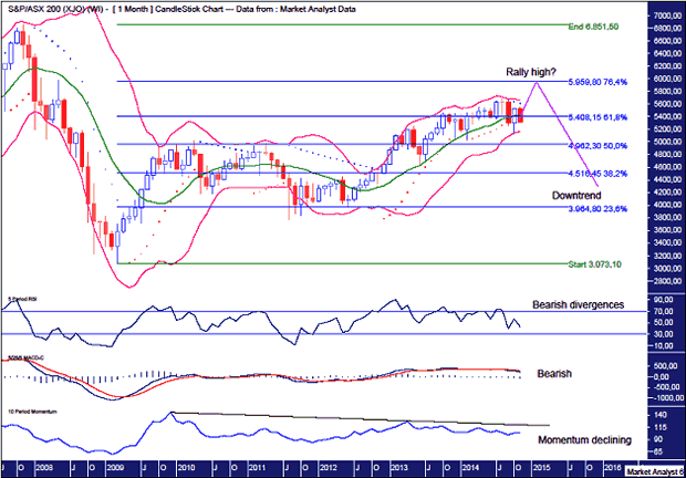
The Bollinger Bands show price bouncing right off the lower band. In effect, price was rejected immediately by support which is a bullish sign. Price is now consolidating the October candle around the middle band. Perhaps price can shortly trade back to the upper band and continue on to new rally highs.
I have added Fibonacci retracement levels of the whole move down from the all time high in 2007 to the 2009 low. Price has already rallied back to above the 61.8% level and seems to have the 76.4% level in its sights. That level stands at 5959 and that is where I'm targeting for the final rally high.
There are quite a few bearish signs however that need to be heeded. What are they?
Firstly, the PSAR indicator has a bearish bias with the dots to the downside being busted in September. Price will have to bust this PSAR resistance in order to get to new highs.
Also, the lower indicators being the RSI, Moving Average Convergence Divergence (MACD) and Momentum indicator, are all showing bearish divergences and looking wobbly. A big move down shortly will be of no surprise to these indicators.
Now let's look in more closely with the daily chart.
ASX200 Daily Chart
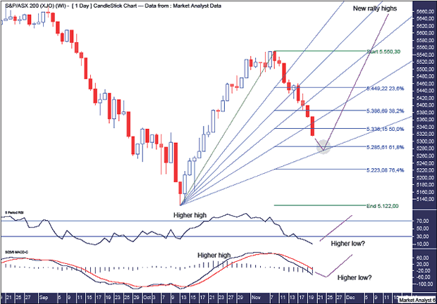
The lower indicators being the RSI and MACD indicator show a pattern of higher highs and potentially higher lows if price bottoms shortly. That often means price is in a bullish position or at least becoming bullish.
So is price likely to make a low shortly? I believe so.
I have added Fibonacci retracement levels of the move up from October low to recent high. Price looks headed to the 61.8% level at 5285. Now what I often find is price dips a bit below this Fibonacci level. This is because it is one of the most popular retracement levels so it is obvious to many technicians. Price dipping below this obvious level is the market's way of giving these technicians a touch of the heebie jeebies.
I have added a Fibonacci Fan and a common place for price to retreat to on its first pullback is the 76.4% angle. Interestingly, price would hit this angle early next week just under the 61.8% retracement level. This is where I'm targeting the pullback to end and is shown in the green highlighted circle.
Once the low is in I expect a move up to new rally highs.
Let's wrap it up by zooming back out for some big picture analysis with the yearly chart.
ASX200 Yearly Chart
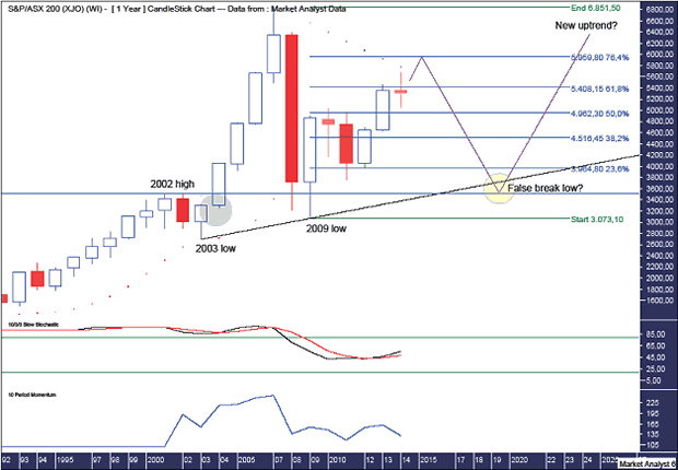
The high so far this year was just below the resistance from the PSAR indicator which pertains to the dots. These dots currently stand at 5783 and I think price can crack them before a more substantial correction begins.
The Stochastic indicator is showing a bullish bias and trending up although it is not exactly looking too strong so a big move down shortly may be on the cards.
Momentum is also looking weak so a multi-year drop in price shortly would not look out of place here.
I have added the Fibonacci retracement levels shown in the monthly analysis. The 76.4% level is just above the dots. So reaching this level would essentially be a fake out bust of the PSAR resistance.
I'd like to see the PSAR dots busted this year with price rallying further and putting in the new rally high in early 2015. Then with the dots of the PSAR providing support on the downside, price can head down to test that support in the ensuing years.
And where might price eventually find support?
I have drawn an uptrend line along the bottoms of 2003 and 2009. If and when price gets down there, this support line will be very obvious so I favour price cracking below there in a fake out move.
Old tops often provide support in the future and I favour the 2002 high at 3506 doing just that. This level will be just below the uptrend line making a false break low at old top support an excellent possibility. This can be seen in the yellow highlighted circle.
Is it possible for price to go below the 2009 low at 3073?
Anything is always possible in the market. However, I feel the 2009 low is a solid low and will hold any decline. Why?
The green highlighted circle shows where price exploded higher in a parabolic move. When correcting, price often returns to the level where price exploded. This has already happened with the 2009 low. That low consolidated this area and moving below there now would look extremely bearish. I doubt it.
One possibility is price gets all the way down to the 2009 low and sets up a massive double bottom with the trend. That could be expected to lead to new all time highs in the following years. While I don't favour this scenario, it is certainly a real possibility and worth bearing in mind.
So the analysis is done. Now it's up to Santa to come and deliver the present in the form a Christmas rally.
AUDUSD
The Australian dollar (AUDUSD) has been all over the place this year and I expect this corrective style trading to continue with a nice rally into the end of the year. Let's investigate using the weekly and daily charts.
AUDUSD Weekly Chart
Once again, most of this was covered in the November newsletter but there is some new information.
I've been following the AUDUSD and waiting for price to trade up above 96c for the next opportune moment to short it. I've been waiting a long time. It's lucky it's not the only instrument I follow.
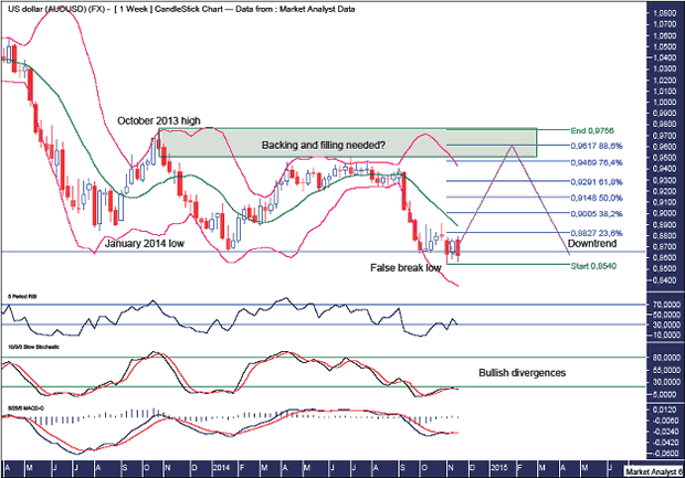
Price nearly got there back in July but shortly thereafter price plunged lower and subsequently took out the January 2014 denoted by the horizontal line. It wasn't by much though and I suspect we have a false break low in place.
This low has been accompanied by bullish divergences in the Relative Strength Indicator (RSI), Stochastic and Moving Average Convergence Divergence (MACD) indicators. So a rally now will certainly be no surprise.
I have added Fibonacci retracement levels of the move down from October 2013 high to recent low. I am looking for a rally back up to the 88.6% level which stands at 96.17c.
This level is in the green highlighted rectangle I have drawn. Ever since the October 2013 high, price has been all over the place and looks messy. This is normal for a big corrective phase which I think is occurring.
To finish off this corrective phase, I would like to see price trade back up into this area denoted by the green highlighted rectangle and do some backing and filling. Once that is done, price can resume normal transmission and crack to new lows in impulsive style.
AUDUSD Daily Chart
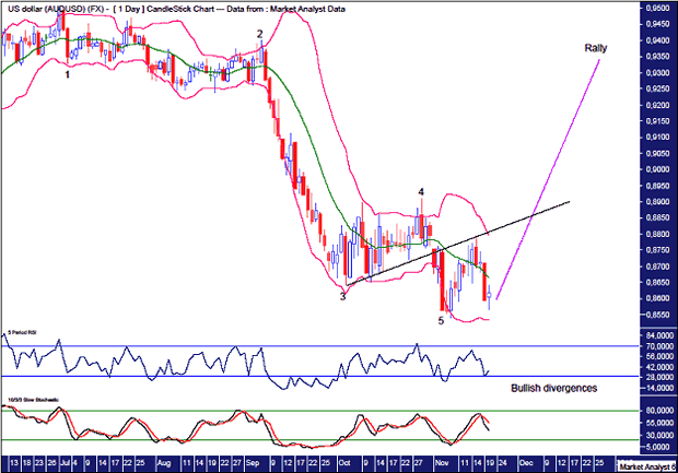
I have added simple Elliott Wave annotations which suggest a five wave move down is complete. So a move up is now expected.
This wave 5 low was also accompanied by bullish divergences in the RSI and Stochastic indicator.
The Bollinger Bands show price moving away from the lower band and finding resistance just above the middle band.
This resistance stemmed from the black trend line I have drawn along the bottoms from the wave 3 low. In this type of setup it is normal for price to find resistance at this trend line the first time it hits it.
So price has come back down and looks to have just tested and been held by the recent low. If my analysis is correct, price should now head back up and bust above the trend line which will confirm the rally is on. A move to new lows now will likely nullify this analysis.
And if the rally plays out as expected, I might finally get that shorting opportunity I've been waiting for all year.
By Austin Galt
Austin Galt is The Voodoo Analyst. I have studied charts for over 20 years and am currently a private trader. Several years ago I worked as a licensed advisor with a well known Australian stock broker. While there was an abundance of fundamental analysts, there seemed to be a dearth of technical analysts. My aim here is to provide my view of technical analysis that is both intriguing and misunderstood by many. I like to refer to it as the black magic of stock market analysis.
© 2014 Copyright The Voodoo Analyst - All Rights Reserved
Disclaimer: The above is a matter of opinion provided for general information purposes only and is not intended as investment advice. Information and analysis above are derived from sources and utilising methods believed to be reliable, but we cannot accept responsibility for any losses you may incur as a result of this analysis. Individuals should consult with their personal financial advisors.
© 2005-2022 http://www.MarketOracle.co.uk - The Market Oracle is a FREE Daily Financial Markets Analysis & Forecasting online publication.


