


Gold's Smoking Gun
Commodities / Gold and Silver 2014 Nov 13, 2014 - 01:32 PM GMT

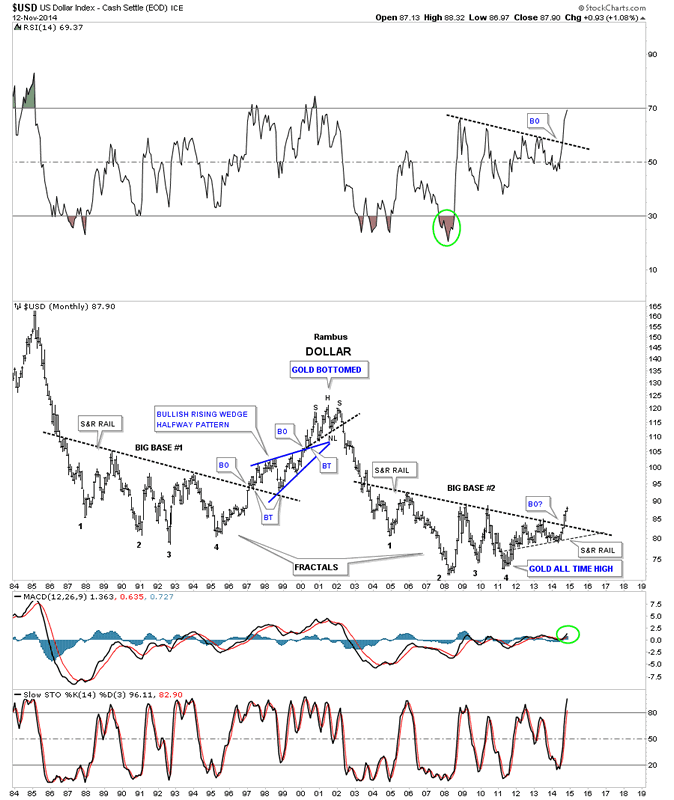
 Tonight I want to explore the relationship between the US dollar, the Japaneses Yen and gold. Most investors know that a rising US dollar is usually a bad sign for commodities and the precious metals complex. When the US dollar is falling commodities and the precious metals complex usually do pretty well. When the US dollar topped out in 2000 that's when gold and commodities started their bull markets that lasted until 2011. Since that time the US dollar has been slowly trending higher while most commodities and the precious metals complex have been moving lower. This long term monthly chart for the US dollar shows you the high in 2000 which marked the beginning of gold's bull market. At the bottom left hand side of the chart, in big base #2, point #4 marks the high for gold's bull market. Since that low at point #4 you can see how the US dollar has been slowly rising since 2011 which was the peak for gold and most commodities. One last note on the chart below. The US dollar is now in its third month of a breakout move from big base #2 which is a fractal of big base #1. If you've been wondering why the US dollar has been so strong lately it's because it's in breakout mode. This is what a breakout looks and feels like.
US Dollar Index Monthly Chart
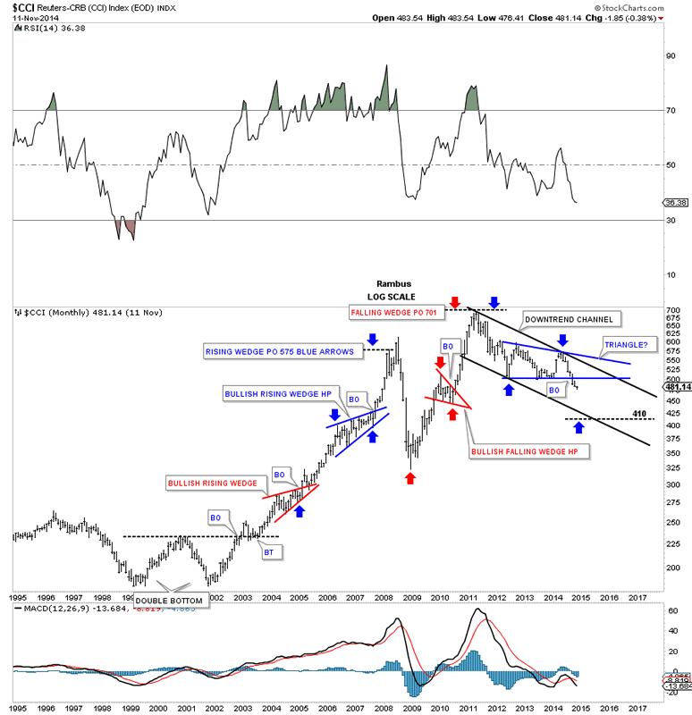
Below is a beautiful long term monthly chart for the CCI (Continuous Commodity) Index that that shows its bull market that started with the massive three year double bottom. The Chartology on this chart is truly amazing as it shows you what a true bull market looks like. When you see consolidation patterns that slope up in the same direction as the major trend, in this case a bull market, that is the market talking to you. It's the market saying, I want to go higher and in a big way. Normally a corrective pattern, such as a bull flag or wedge will slope against the main trend which is the way most chartists learn from the books they study. Sometimes everything about charting isn't in the books but is learned from many years of drawing lines on a chart in every conceivable market condition. Note the top in 2001 which coincides with the top in the US dollar on the chart above. I showed you on the US dollar chart above it's in its 3rd month of breaking out of big base #2. The CCI chart below shows it too is in its 3rd month of breaking out from its big blue triangle consolidation pattern. Coincidence?
CRB Index Monthly Chart
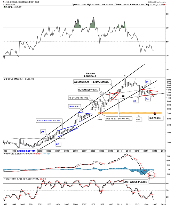
Lets now look at a long term monthly chart for gold that shows its bull market that started out with a three year double bottom reversal pattern just like the CCI index. You can see several bullish rising wedges that were telling the story of gold's bull market move. Again, like the CCI index, gold also topped out in 2011 and has been in a bear market ever since. Unlike the US dollar and the CCI index, gold is only in its second month of a breakout move to the downside. Most folks can't or won't acknowledge that massive H&S topping pattern that extends all the way back to the left shoulder, which is the red bullish rising wedge which formed in 2010. The big neckline is taken from the 2008 crash low H&S consolidation pattern where I extended the neckline all the way to the right side of the chart more than a year ago. The top of the right shoulder is taken from moving the neckline up to the top of the left shoulder that often times gives you the height for the right shoulder. As you can see the neckline symmetry rail nailed the height for the right shoulder. After a very long wait the breakout in now coming to fruition.
Gold Monthly Chart
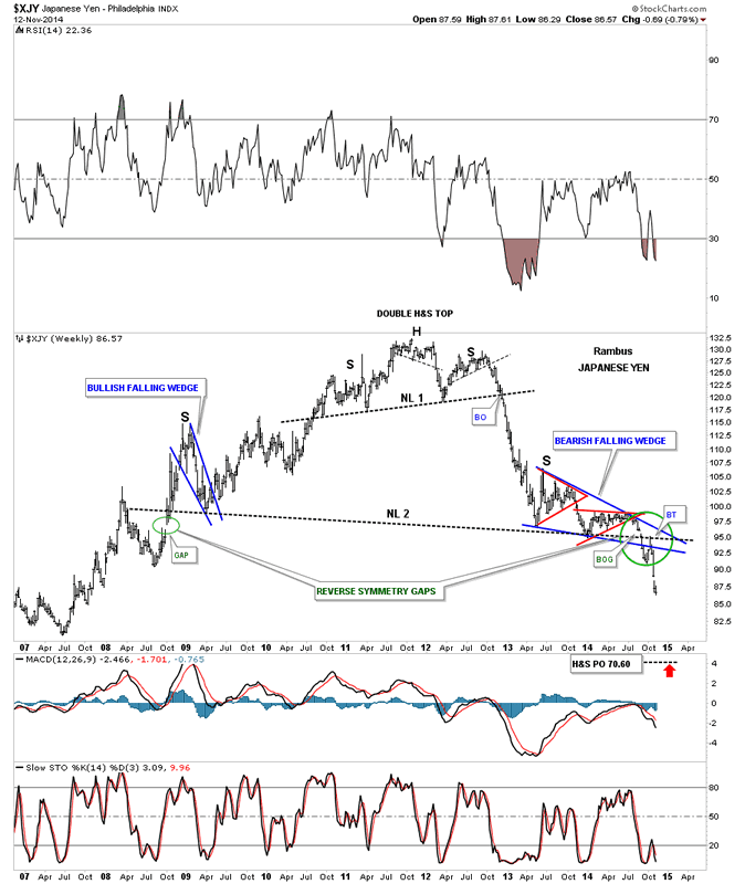
This next chart is a long term weekly look at the Japaneses Yen that shows a massive double H&S top pattern with a small H&S top that is actually just the head part of the much bigger six year H&S top. We've been watching this chart with great interest for several years now watching the blue bearish falling wedge mature as the right shoulder. The green circle shows you the breakout and backtesting process to the big neckline, that we watched play out in real time. The big patterns always take longer than you think to play out but it was well worth it, seeing the full breakout and backtest completing and now the impulse move lower. All the work is finished now except to watch the impulse move lower.
Japanese Yen Weekly Chart
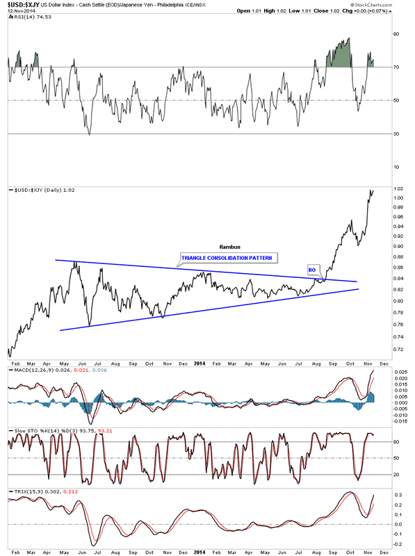
Now on to the smoking gun. We've been watching the US dollar to the Yen ratio chart that has given us guidance as to the direction for gold. When the ratio is rising gold is generally falling and visa versa. It's not absolutely perfect but close enough that you don't want to bet against it. Below is a daily line chart that shows the USD:XJY which is going nearly vertical. This means the US dollar is outperforming the YEN in a big way.
USD/JPY Daily Chart
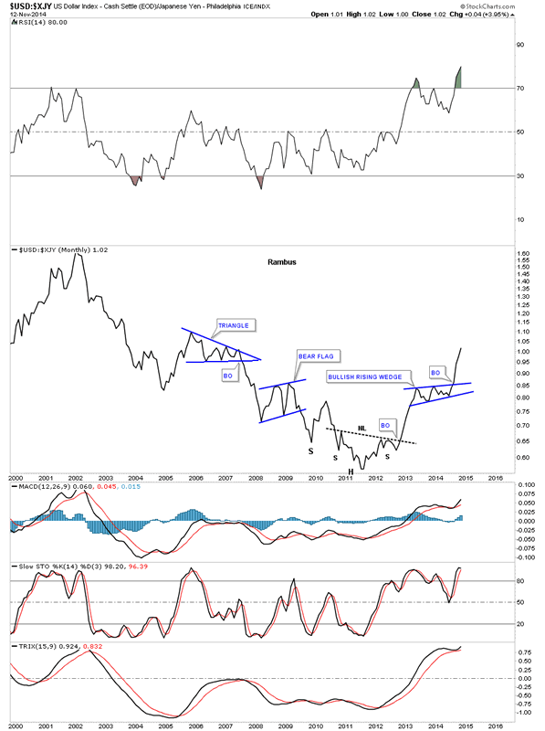
Below is a long term monthly look that goes all the way back to the beginning of gold's bull market that started in 2001. As you can see the ratio fell for most of gold's bull market except for the occasional consolidation period. Note where this ratio bottomed out, does 2011 ring a bell? From that low the ratio has been steadily rising and gold has been heading in a southerly direction.
USD/JPY Monthly Chart
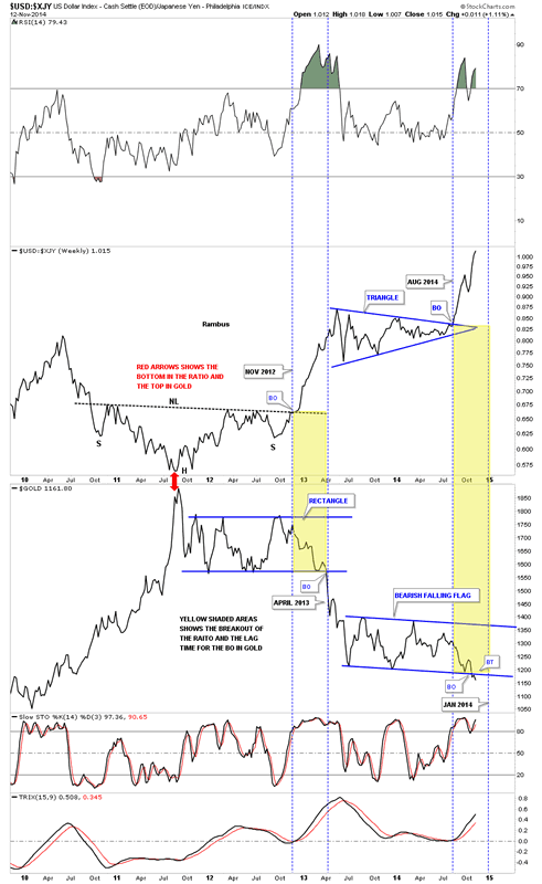
In analyzing the markets one needs to become a private investigator and try to get all the clues you can find to make a case before it goes to court or in the markets case, to buy or sell. This next chart is a combo chart that has the USD:XJY ratio chart on top and gold on the bottom. At first glance it doesn't look like anything special but that is not the case. When we compare the ratio chart to gold we find some interesting things. The two red arrows shows where the ratio chart bottomed out and gold topped out. At the time you wouldn't have known that this was the end of gold's bull market but maybe a correction of some kind might develop.
This is where it gets really interesting folks. Note the massive inverse H&S bottom that the ratio chart built out over two years while gold was consolidating it's gains from the near parabolic run it had into the 2011 high. Note that the massive inverse H&S bottom that broke out in November of 2012 while gold was still in its rectangle consolidation pattern. There was about a 5 month lag time before gold finally broke out of its massive rectangle consolidation pattern. Even though gold was moving lower it still hadn't broken out of its consolidation pattern. The ratio chart on top was telling us to expect gold to breakdown a full five months before it actually did.
Now using the same principal lets look at our current setup in both the ratio chart and gold. As you can see the ratio chart on top broke out of its blue triangle back in August of this year while gold was still in its own blue triangle consolidation pattern. The ratio chart was giving us a big heads up to expect gold to eventually breakout to the downside out of its blue triangle. It's only November but you can see on this weekly line chart that gold has indeed broken down and has shown a small backtest to the bottom blue rail. You can see gold started falling once the blue triangle brokekout on the ratio chart. It wasn't until just about two weeks ago that gold actually broke out of its blue consolidation pattern.
USD/JPY Weekly Chart
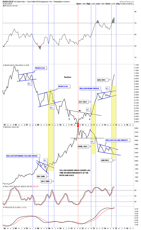
Lets look at one last combo chart for the ratio and gold that is a long term monthly look. Notice how the ratio fell during the bull market years as gold rallied. What's interesting here is that gold was leading the ratio by about five months or so. When gold broke out of its blue bullish expanding falling wedge the ratio chart on top was still working on building out its blue bear flag. Now lets look at the center of the chart that shows the USD:XJY ratio chart building out a massive inverse H&S bottoming pattern. If you knew then what we know now you would have been selling out all your gold and gold stocks when you seen the inverse H&S bottom breaking up and through the neckline. Again on this monthly chart the ratio broke out in October of 2012 while gold didn't actually breakout from its massive rectangle consolidation pattern until that infamous day in April of 2013. You can see gold did start to drop when the ratio broke out above the neckline but you had about 5 or 6 more months to get ready for the real breakout that was coming in April. Now lets look at our current situation. As you can see the ratio broke out in August of this year telling us that gold was going to break down form its blue triangle. It was only a matter of time. The ratio chart is calling for a breakout of gold's consolidation pattern come January of 2015. As subscribers of Rambus Chartology already know the breakout is already underway in gold. The ratio chart on top gave us an early heads up on what to expect going forward with gold.
USD/JPY Weekly Chart 2
By putting all the pieces of the puzzle together we have a working model that will tell us how much time we have before gold makes a big move down. If you're not prepared for the next decline in gold I wish you all the luck in the world as this next decline is set up to be just as painful if not more so than the April of 2013 crash that caught many of the gold investors off guard. All the best...
All the best
Gary (for Rambus Chartology)
FREE TRIAL - http://rambus1.com/?page_id=10
© 2014 Copyright Rambus- All Rights Reserved
Disclaimer: The above is a matter of opinion provided for general information purposes only and is not intended as investment advice. Information and analysis above are derived from sources and utilising methods believed to be reliable, but we cannot accept responsibility for any losses you may incur as a result of this analysis. Individuals should consult with their personal financial advisors.
© 2005-2022 http://www.MarketOracle.co.uk - The Market Oracle is a FREE Daily Financial Markets Analysis & Forecasting online publication.