Stock and Commodity Market Ratio Messages
Stock-Markets / Financial Markets 2014 Sep 02, 2014 - 01:23 PM GMTBy: Gary_Tanashian
 Using monthly charts I want to update more big picture views of where we stand in the financial markets. This is just a brief summary [edit; okay it's not so brief. In fact it had to be ended abruptly or else it would have just kept on rambling] and not meant as in depth analysis with finite conclusions.
I was listening to Martin Armstrong talk about his ‘economic confidence’ model and realized that the way he views gold is similar to the way I do (and very dis-similar to the way inflationists and ‘death of the dollar’ promoters do). I don’t love the way he writes, and I usually avoid these weird interview sites, but checked it out (linked at 321Gold) anyway and found him enjoyable to listen to.
Anyway, this prompted another big picture look at gold vs. the S&P 500 and as with the shorter-term views, the picture is not pretty.
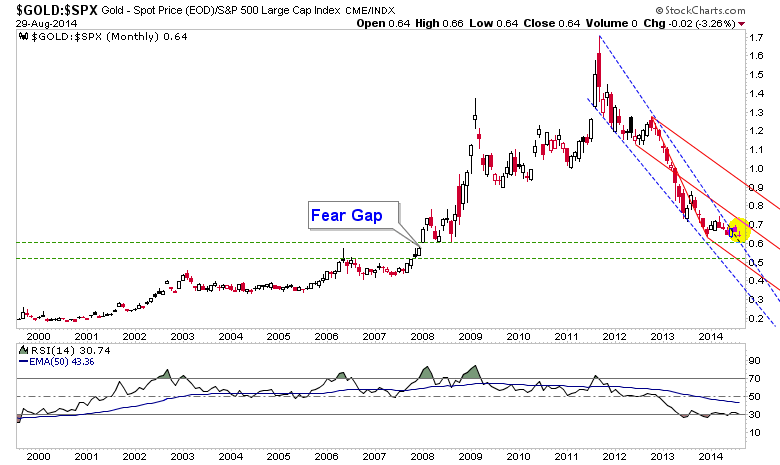
Well, it is pretty if you have patience and no need to promote gold as a casino play. Gold will be ready when gold is ready and that will not be until confidence in policy making and by extension the stock market, starts to unwind.
Gold vs. SPX has meandered out of a long Falling Wedge (blue dotted) with 2008′s Fear Gap still lower. On the big picture the risk vs. reward is with gold over the stock market. But it is a funny thing about big pictures; they move real sloooow. A fill of that gap may not feel so good to anyone vested in an immediate conclusion to gold’s bear market vs. SPX.
Moving on, let’s look at some ratios of components of the stock market…
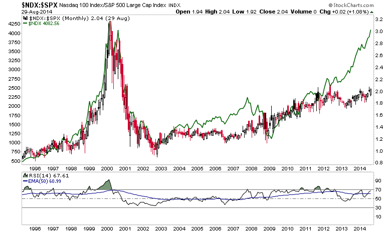
Nominal NDX (green line) is looking somewhat like it did in 1999 but its post-crash leadership to the SPX (candlesticks), beginning in 2002, has been just a steady incline that holds to this day. So if there is a bubble in stocks (we’ll continue to note there is no general bubble in stocks, but rather a big one in policy) it is not being instigated by big tech.
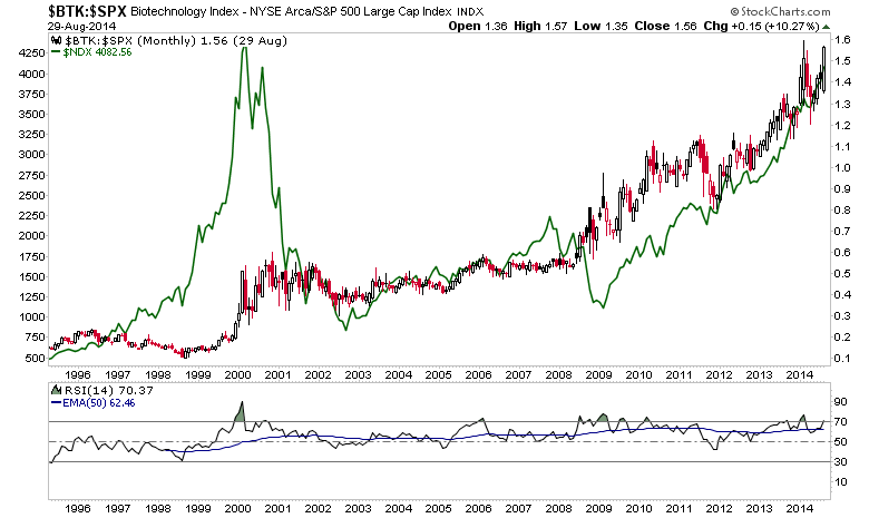
Here is an interesting one, however. In NFTRH 306 we talked about the Biotech index and how it appears that hedge funds may be causing rolling bubble speculations in stocks, much like they have done over the years in commodities (uranium, copper, REE’s, crude oil, silver…). Check out the BTK-SPX ratio with the NDX still juxtaposed (green line).
BTK, which certainly was not a bubble instigator in the late 90′s has taken over today and is mimicking the impressive rise of the nominal NDX by its ratio to SPX.
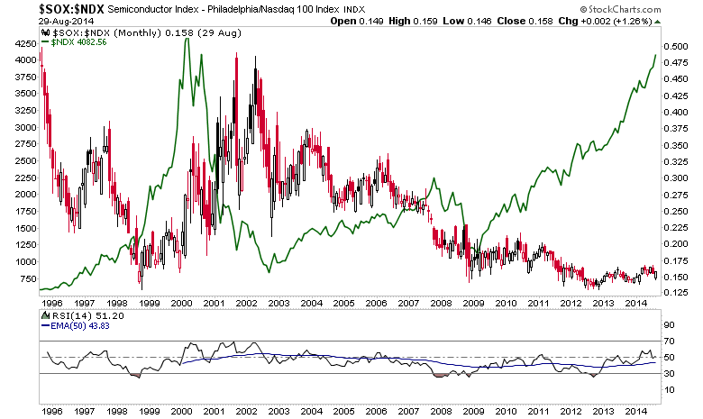
Let’s go further and take the Semiconductors, for which we have a measured target of 900 (it’s a simple measurement bears, don’t maul the TA) on the nominal SOX. SOX had a lagged out performance to NDX in 1999-2001. Look at how badly it has under performed vs. NDX ever since. Yet the low on the ratio was 2 years ago and RSI has been stair stepping higher ever since and is above its EMA 50. Seems like a pretty good risk vs. reward compared to the NDX, when considering nominal SOX’s measurement to 900.
Closing Thoughts
Gold bugs ruled the financial asset world for 10 years from 2001 to 2011. But gold is not an asset so much as it is a barometer to the climate in the asset and currency worlds. Its function is to provide liquidity when confidence erodes in the traditional sources of liquidity, which in our system, is centrally planned interest rate policy. It is not supposed to do well when policy is working as planned.
This chart is the Gold-CCI (commodities) ratio, which has broken upward over the last 3 months, with the nominal SPX (green line). Gold-CCI says that short-term trouble could be coming for the stock market, but in referencing other work in NFTRH it is not clear whether this would be a terminal event or a healthy correction of excesses paving the way for higher stock prices in 2015.
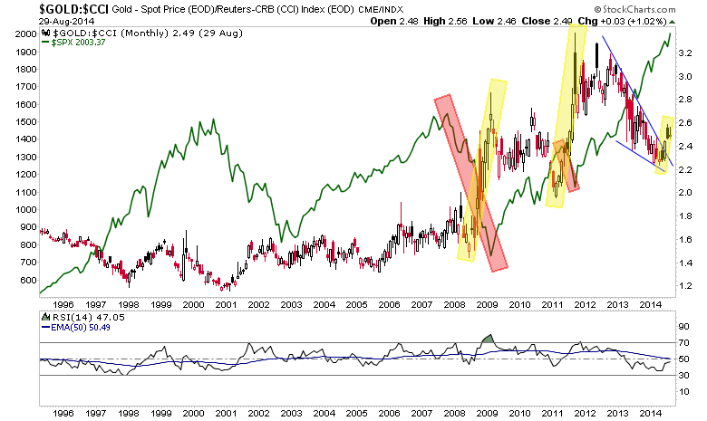
General commodities (oil, gas, grains, base metals, etc.) are assets and building blocks in correlation with society in general and its growth prospects in particular. Gold is the counter weight or the thing that the progress of positively correlated things is measured against.
Gold-CCI is turning up and indicating caution. Yet US and some global stock markets remain bullish. I think the weeks post-Labor Day are going to bring a knock down of some kind. Gold-CCI brought US stock market destruction in 2008 (US financial meltdown) but only a healthy correction in 2012 (Euro meltdown).
For the US stock markets to invalidate the upside potentials noted in this post, market disruptions would probably have to originate in the US. The US economy is fine, credit markets are on mixed signals and stocks are obviously fine in the face of QE tapering, but with ZIRP’s end point still way out on some hazy horizon.
If disorder were to center on Europe again, as it did in 2011/2012, the ‘safe haven’ US would probably only take a healthy variety correction, as it did in 2011. If the disruptive force is Russia and Ukraine or some combo platter of geopolitical events, bears should book gains nimbly because stocks would likely be headed directly for new highs when the hype wears off.
Once again a post starts out one way and just rambles on until it exhausts itself. The thing with today’s complex markets is that there is so much to write about and so many different angles from which to view and write about the markets. So on a day when I am not watching closely, a rambling post tries to make a bunch of points and hopefully makes some sense to you.
There is plenty time to sort it all out if you do not lean too strongly one way or the other. Time and perspective are good things in a complex environment because they keep you free from the grips of firmly embedded viewpoints based on outmoded information. Or something like that.
One thing for sure, the environment is getting fun (fun for me being an environment in which I feel totally engaged) for me personally because the stock market’s current robo trend aside, it appears that going forward people committed to doing real analytical work – as opposed to assumptions based stuff – will get by just fine as the bearish and bullish turns to come play out.
Subscribe to NFTRH Premium for your 25-35 page weekly report, interim updates (including Key ETF charts) and NFTRH+ chart/trade ideas!
By Gary Tanashian
© 2014 Copyright Gary Tanashian - All Rights Reserved
Disclaimer: The above is a matter of opinion provided for general information purposes only and is not intended as investment advice. Information and analysis above are derived from sources and utilising methods believed to be reliable, but we cannot accept responsibility for any losses you may incur as a result of this analysis. Individuals should consult with their personal financial advisors.
© 2005-2022 http://www.MarketOracle.co.uk - The Market Oracle is a FREE Daily Financial Markets Analysis & Forecasting online publication.


