Gold And Silver Charts Proving More Reliable Than Fundamentals
Commodities / Gold and Silver 2014 Jul 05, 2014 - 03:59 PM GMTBy: Michael_Noonan
 Pick your poison for knowing what news is impacting gold and silver these days. Both
have been in year-long TRs, [Trading Range], within a broader down trend context. That
may be in the process of changing, but change takes time to turn a trend.
From our limited point of view, the list of events that are impacting the suppression of gold and silver all revolve around the NWO [self] destruction of the petrodollar, that fiat Federal Reserve Note, commonly [mis]called the “dollar,” and soon to lose its status as the world’s reserve currency.
Almost all the events in the news, these days, reflect the symptoms of Western countries to hang on to their dwindling-but-still-powerful control over their Ponzi-scheme central banking system, all totally insolvent, a “secret” they keep from everyone else. Until that fully unravels, gold and silver will remain on the defensive.
Instead of trying to “connect-the-dots” from negative news all over the world, the most important of which is kept undercover, a read of how the markets are reflecting the activity of all participants shows the indecision of when the elites will lose control of the fiat dollar and crash the United States economy, in the process.
If you are not buying physical gold and silver, you are playing a dangerous game of financial Russian roulette. Do not be concerned about price. The take-over of most markets by central planners has destroyed their “free-choice” nature. It is impossible to price anything from a rational perspective. The two markets that have been “immune” to inflation-adjusted pricing are gold and silver, and that is because the elites will not let them compete as an alternative to their fiendish fiat control and resulting theft of everyone’s financial property.
This is going to end badly, and events, while still distorted, are reaching an inevitable end to the game played out by the elites. The Western world continues to devolve into a downward spiral of financial despair. Corruption is deeply embedded in every Western nation. All governmental decisions are being made to stave off their inevitable failure, and it is all at the expense of those not in government, the people
If you know nothing else, know this: everything held in banks, pensions, retirement accounts are all at risk of being confiscated and/or turned into worthless government bonds in exchange. If anyone still believes holding paper assets makes sense, over the accumulation of time-proven hard assets, that game is almost over.
The seeming indecision of events and where they are headed, near term, is reflected in the charts. For those whose eyes glaze over at the prospects of reading a chart, it is in your best interest to view them from a common sense perspective. For those who have read our articles for any length of time, you know we place primary consideration on looking at developing market activity, as best seen in a chart.
What is developing market activity? When the collective of all decision-makers, from the most informed to the least informed, from the well-heeled to those barely getting by, and everyone in between makes a decision to buy or sell in any market, that decision is then recorded as to price and volume, to reflect the numbers of decisions made at any given price level on any given day. The results of these decisions is what creates a high, low, and closing price for any selected time period. This is what creates a chart.
What is important to understand is that the collective decision-making process takes in those with the most access to information, those professionals who have the best and most reliable facts and data in their research capabilities. This smaller collective is what moves any market directionally. It is what creates a trend.
In addition to the above, there are myriad other participants: those who look at news and events, those who consider fundamentals, those who employ conventional technical tools, those who think they can outguess the market, pick tops and bottoms, those who are short term traders, long-term traders, day traders, and those who may use any combination of everything available, all with a single objective: Placing their bet and hoping to win. Smart money does not rely on hope. They have specific rules for engagement, and if those rules are not met, they do not engage.
Developing market activity is the way in which to read what all of the best minds and those with the best capitalization behind them are doing. They will not tell you what they are doing, but you can “see” what they are doing once they make a decision to buy or sell in the market. You can “see” where/when they bought/sold and at what price, [volume]. All one need to is follow the [visible] trail left behind by reading price and volume.
Once you begin to [appreciate and] understand that these observations are “messages” from the market, as a result of smart money decision-makers, you are now looking at the most current and most reliable information available for anyone and everyone to “see!” Sometimes, the best place to hide something is under the brightest light. People do not pay attention to it. Who would believe the best available information to be right under their nose, [eyes]?
The above is basic but extremely important to grasp in order to understand the important information that can be gleaned from a chart. Almost all of the known fundamentals for gold and silver say the price for both should be higher. How much higher is subjective, but the fact that both should be priced higher, for inflation-adjustment alone, says higher. Yet, we all know gold and silver remain at recent lows. This tells you there are other influences at work. There are these seemingly exogenous forces that remain unseen that are impacting the market.
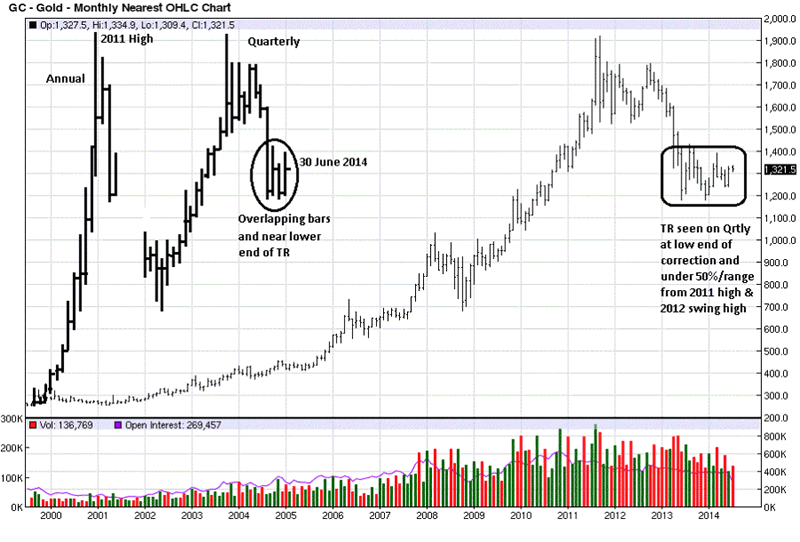
The annual and quarterly prices have been updated onto this monthly chart. Not very many traders/investors look at a monthly charts. Hardly anyone looks at an annual or quarterly chart. That they cannot be used for timing is probably the best reason, but rest assured, smart money uses them in ways few can understand.
When you look at the annual activity, the decline from the 2011 highs, while relatively large, looks like a correction in an up market, and it is. When you take a look at the quarterly, with more detail, the current lows are still well above the last swing high, at the beginning of that chart. This would be an example of bullish spacing on this larger, and more controlling time frame.
What is bullish spacing? It occurs when the last swing low, just under 1200 on the Qtrly chart, stays above the last swing high, just above 1,000 at the beginning. This says that buyers are willing to buy, [and support], prices without waiting to see a retest of the last swing high. Here you have an important piece of market information, a message from the market, that buyers are willing to buy in without waiting, a bullish indication in the overall pricing scheme.
Why is this important to know on these rarely looked at, [by the public], larger time frames? Because larger time frames are more controlling over smaller time frames, and it takes more time and effort to change the pattern of a larger time frame. Where do the bulk of traders spend their time? Looking at daily and intra day charts, the smallest time frames and easiest to change. These time frames also are where most people lose money in their decision-making.
Some things never change, and people’s buying/selling patterns never do. Ever wonder why?
Despite people’s views on gold and silver being in a down trend, from a larger perspective, both are in up trends, and that is what the overall news is saying and what everyone senses: gold and silver should be higher. Well, they are. It just depends on your frame of reference. From a larger time frame, gold and silver are working higher. The problem is people are looking through the wrong prism and making the wrong decisions, as a consequence.
Most of the activity of the last several quarters has been near the lower end of the wide range bar down, 4th bar from the end. Even though the broader picture is bullish, the current last few quarters are under 50% of the range of the 4th bar, and even lower when using the range from the all-time high to the recent low. Conclusion? Price has not demonstrated an ability to rally back higher, yet. We see that more clearly on the lower time frames.
The monthly chart shows the price in a down trend, and most recently, trading sideways. Again, the market is sending a message, if you care enough to heed it. The market, which we have defined as the collective of all decision-makers, is saying, regardless of what you read in the news, regardless of your belief that gold and silver should be higher, for whatever reason, valid or not, the message from participants is: it ain’t ready to go higher, at this point.
Ignore the message at your own peril. Forget about those pundits who are saying both PMs are ready to take off, and they draw a huge arrow point higher. How has that been working out? If you apply a little bit of common sense, and you look at these charts, can you draw any other conclusion[s]?
Always remember: Markets never lie.
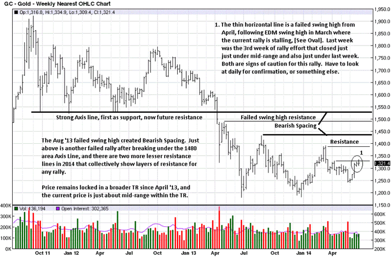
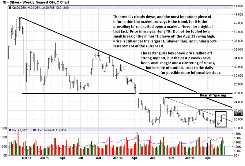
The weekly chart provides an example of the opposite of the bullish spacing discussed above: bearish spacing. It is when the most current swing rally high fails to reach the last swing low, creating a gap between them. Here, bears are confident enough that the trend will stay down that they do not need to wait and see how the last swing low will be retested before selling. It is a message from the market to expect lower prices.
You can also expect future resistance when price does eventually rally to that level. These are pieces of the market puzzle that fall into place when you let the market tell you what to expect moving forward. This also presents a conflict between the higher time frames and the lower ones. The lower ones are used more for timing. If you are trying to time a long position, the market is telling you to wait, for paper futures.
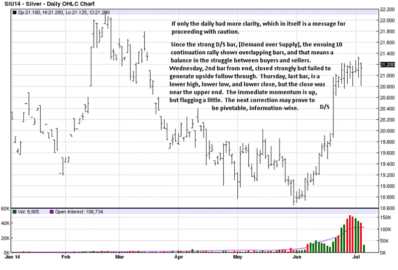
Comments on the charts need not be repeated. What they do suggest is a lack of clarity for continuation higher next week, or not. This is why we state a note of caution should be observed. The short-term momentum is up, granted, but within downward pressure that is still apparent, so one has to respect this cautious tone.
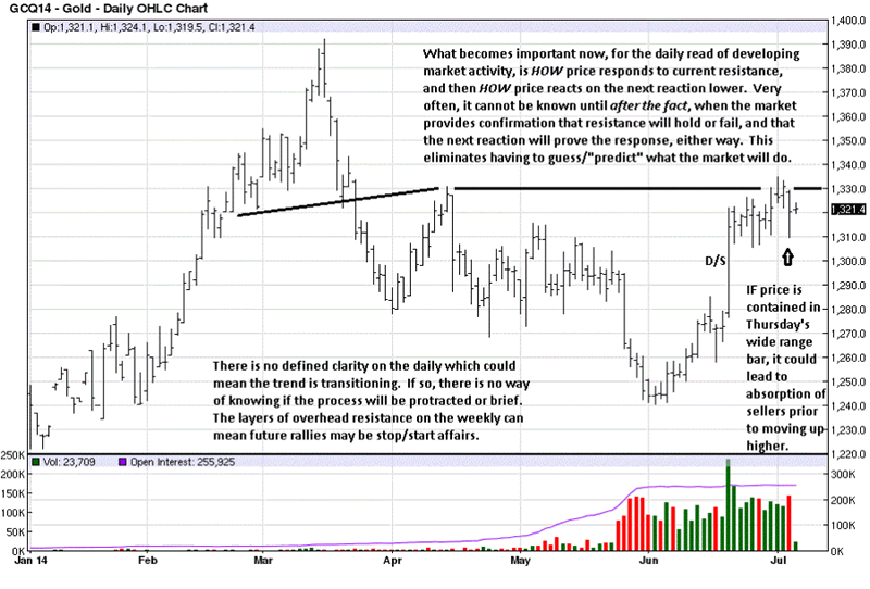
Getting into finer details of the market’s information, what is important to observe is HOW price responds at resistance. So far, it has not backed away like it did in mid-April and near the end of May. What this rally has going for it is the D/S bar, [Demand overcoming Supply], a wide range rally and strong close on very high volume, [effort]. We could be seeing a change of behavior where buyers are taking control from sellers. This cannot be known for certain until confirming evidence shows up.
It is possible that Thursday’s wide range bar may contain price activity over the next several TDs, [Trading Days]. If so, buyers could be absorbing the efforts of sellers in preparation to go higher. If price sells off, next week, how it sells off will matter. If the ranges are small and volume is lower, that will indicate a lessening of selling and buyers can step back in and take price higher and break overhead resistance.
If a sell-off occurs next week on wider ranges down and increased volume, buyers near last week’s rally will be trapped, depending on how low, if at all, price declines. There could be a high volume washout to the downside, similar to Thursday, or that may have been a washout. We cannot know for certain until the market confirms the behavior just described. You always want to wait for the market to confirm its most recent action before taking new action.
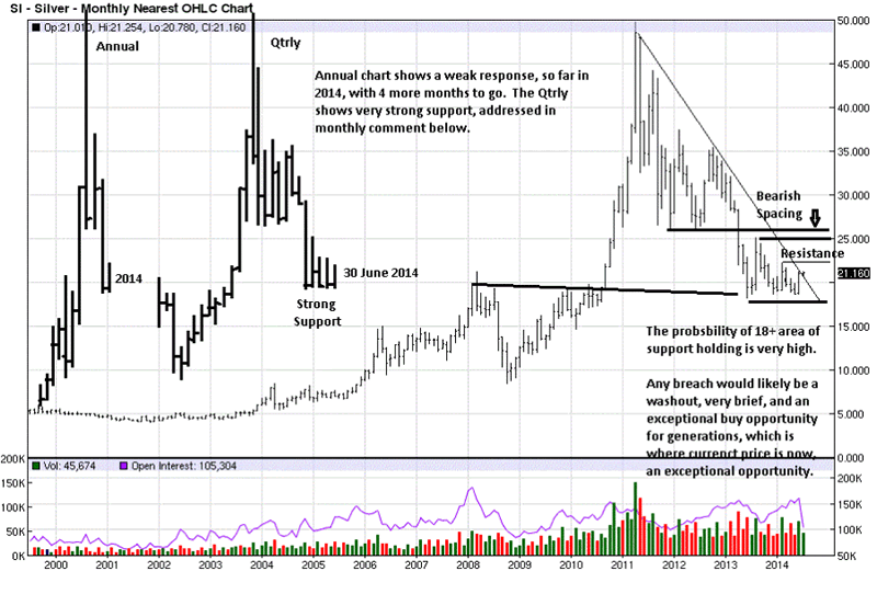
Silver is showing similar characteristics to gold, as just described. So far, on the annual chart, the response for 2014 has been weak, relative to the decline of 2013, but anything can happen in the next 6 months. What is known for certain is that silver is struggling, and possibly basing on the higher time frames.
The monthly chart is more in concert with the quarterly, in that regard. There are still layers of overhead resistance and bearish spacing. Regardless of what one’s outlook is for silver, current developing market activity is sending a message that price is nowhere near ready to rally.
That can change next week or next month or sometime after. We do not know what next week, month, or longer looks like, for now. What can be determined with a high degree of certainty is what the chart message says “right now.”
Amplifying the chart comments, the small ranges of the last two weeks make this a not so clear read. The small ranges say buyers could not extend each weekly range higher, yet the closes are both in the upper half of each week’s range, and that says buyers were more in control than sellers. Because the overall trend is down, near term, the onus is on buyers to prove change, and that appears lacking here, or at least questionable. This is why the note of caution is given.
Price can continue higher next week, or decline, with no argument. That makes for very low probability odds, either way, and reason enough to not participate until odds improve.
It can sometimes be difficult to divorce one’s hopes, opinions, or anticipations from expectations, but if one wants to make money instead of being “right,” one has to go with the information known and deal with what is. If anyone missed the recent rally, and we certainly did, you can see that there will be many opportunities ahead because of all the resistance waiting at higher price levels.
Do not be distracted by the “noise,” [news/events]. Let the market be your guide.
We had a minor computer time out, last week, and some sites did not receive our article. You can read it, here, if interested: Gold and Silver – No Defined Bottom
By Michael Noonan
Michael Noonan, mn@edgetraderplus.com, is a Chicago-based trader with over 30 years in the business. His sole approach to analysis is derived from developing market pattern behavior, found in the form of Price, Volume, and Time, and it is generated from the best source possible, the market itself.
© 2014 Copyright Michael Noonan - All Rights Reserved Disclaimer: The above is a matter of opinion provided for general information purposes only and is not intended as investment advice. Information and analysis above are derived from sources and utilising methods believed to be reliable, but we cannot accept responsibility for any losses you may incur as a result of this analysis. Individuals should consult with their personal financial advisors.
Michael Noonan Archive |
© 2005-2022 http://www.MarketOracle.co.uk - The Market Oracle is a FREE Daily Financial Markets Analysis & Forecasting online publication.


