Is This What a Credit Bubble Looks Like?
Stock-Markets / Liquidity Bubble Apr 22, 2014 - 10:14 AM GMTBy: F_F_Wiley
 There’s been some buzz recently about a pick-up in business lending. The six largest banks increased business loans at an average annual rate of 8.5% in the first quarter, according to a Wall Street Journal report last week. Other first quarter data reported by the Fed shows commercial and industrial loans jumping 12% from last year. Charles Schwab’s chief strategist went so far as to call a chart depicting the Fed’s broader lending data “the most important chart in the world.”
Unlike some pundits, though, we’re not convinced that a surge in business credit is such a good thing. We don’t doubt that more lending to small businesses, in particular, might do some good if it doesn’t go too far. Lending to large corporations, on the other hand, is a different story. Corporations are already borrowing at a pace that’s only before been seen near cyclical peaks:
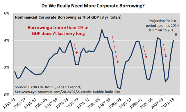
At over 4% of GDP, you might say that borrowing is too high, not too low, especially as this pace never lasts long. The bigger issue, though, is that companies are choosing not to invest borrowed funds back into their businesses. You may have seen recent posts by David Stockman or Tyler Durden, breaking down financial statements for IBM, in particular. They showed that IBM’s borrowing in recent years was matched almost exactly by stock buybacks. Clearly, this isn’t the kind of borrowing that helps the real economy, and IBM’s not alone.
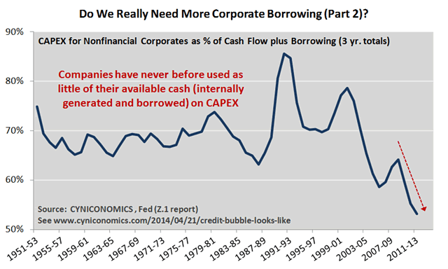
We’ll take a broader look at the use of borrowed funds with the Fed’s flow of funds data, which includes a measure of the internal funds generated by all US corporations. We add the internal funds figure (with an adjustment for dividends) to corporate borrowing to estimate the cash that’s available for all purposes: capital expenditures (capex) versus acquisitions, dividends, buybacks and other financial strategies. Normally, capex accounts for between 2/3rds and 3/4ths of the total. Here’s the latest update:
Needless to say, attitudes about capex aren’t quite what they used to be (see here for more discussion). Financial engineering now consumes almost half of available funding, with the implication that companies are piling more debt than ever before on each dollar of productive assets. Although debt-to-asset ratios for the broad corporate sector aren’t yet available for 2013 (the BEA doesn’t update fixed asset data until August), we can make a decent estimate using fixed investment data. Here’s a 60 year history with our 2013 figure tacked onto the end:
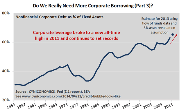
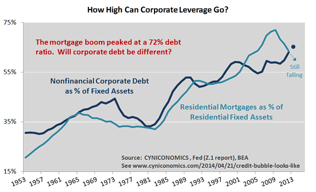
We pegged the debt-to-asset ratio at 65% in 2013, 6% above the housing boom peak of 59% in 2007. That’s a big jump in a short period of time. By comparison, the ratio also climbed 6% over the 11 years from 1989 to 2000, and barely rose at all from 2000 to 2007. Glancing at the chart just four years ago without the latest results, you might have guessed that leverage was finally leveling off. Apparently not. Together with weak capex, data describes a leverage-earnings-debt spiral that looks something like this:
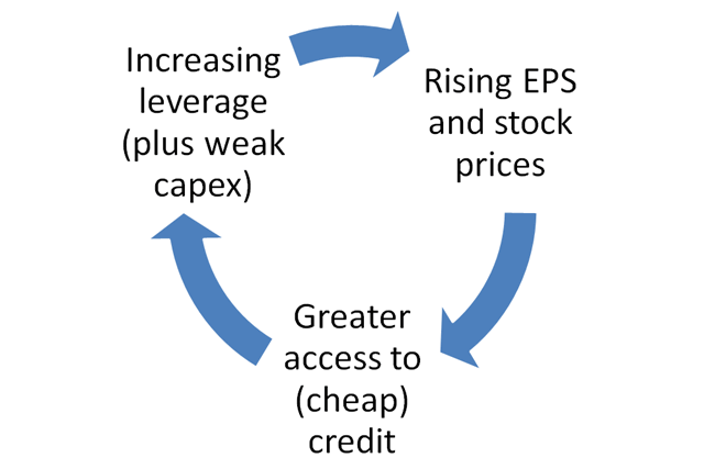
The spiral could continue awhile longer, and probably will, but it’s not sustainable. The longer it circles in one direction, the more strongly it circles back in the opposite direction once the inevitable cracks appear in credit markets. In other words, not only does the spiral explain much of what we’re seeing in today’s financial markets, it also describes part of the process that leads to the next recession.
When will the debt super-cycle end?
What’s more, the data also begs the question: When does the roller coaster of leverage peaks and troughs fly completely off the tracks? The idea that we may be in the late stages of a debt super-cycle isn’t welcome in some circles, but the fact is that leverage can’t trend upwards forever. Eventually, we’ll reach a point where the normal reflation no longer works. We may then begin a secular downtrend (as in the period from the Great Depression to World War 2) or, at a minimum, we’ll establish a sideways pattern that fails to make new highs. Either way, the business cycle won’t look quite like it did over the last 70 years of rising leverage, nor will it look like the last few decades of increasing financialization.
Back to the question, can companies lever up as much as, say, 70% of assets? 75%? Maybe so, but it says here that the super-cycle ends well before debt reaches 100% of assets. It’s hard to say exactly where the breaking point is, but we’ll continue to share clues as we find them. In the meantime, one clue may be the bursting of the mortgage bubble in 2008. As you look at the last chart below, keep in mind that residential mortgage debt (backed by properties) and corporate debt (backed by productive assets) are fundamentally different. Or, maybe they’re not so different? You decide.
Sidenote: Regular readers know that we’ve already taken a position on critical thresholds for government debt. See our Fonzie/Ponzi theory and follow-up posts here and here.
(Update: Note that the fixed investment and fixed asset figures used in the charts include intangible investments such as R&D, software and entertainment/artistic assets, per new methodology implemented by the BEA last year.)
F.F. Wiley
F.F. Wiley is a professional name for an experienced asset manager whose work has been included in the CFA program and featured in academic journals and other industry publications. He has advised and managed money for large institutions, sovereigns, wealthy individuals and financial advisors.
© 2014 Copyright F.F. Wiley - All Rights Reserved
Disclaimer: The above is a matter of opinion provided for general information purposes only and is not intended as investment advice. Information and analysis above are derived from sources and utilising methods believed to be reliable, but we cannot accept responsibility for any losses you may incur as a result of this analysis. Individuals should consult with their personal financial advisors.
© 2005-2022 http://www.MarketOracle.co.uk - The Market Oracle is a FREE Daily Financial Markets Analysis & Forecasting online publication.


