Stock Markets Bubbles and Parabolic Slope Theory
Stock-Markets / Stock Markets 2014 Apr 05, 2014 - 11:12 AM GMTBy: Dan_Stinson
 Parabolic Slope Theory
There has been extensive discussion questioning the current rally and if it has reached bubble status. Firstly, what is a bubble from a technical standpoint? A bubble is a parabolic advance in a market or stock where the price appears to move straight up without normal corrections. The corrections or pullbacks are small, sending the stock or index straight up. Greed and euphoria are high and complacency is low. The higher the market or stock moves, the bigger the bubble and the more pain on the way back down.
As we have seen, bubbles can occur in stocks, stock markets, commodities, debt, Real Estate and derivatives. Parabolic advances can't be sustained and always end poorly, with the price usually falling below the starting point of the parabolic move. What goes straight up, comes straight down faster and usually further. So, to determine if a bubble is in play, we need to analyze the advance to determine if it has gone parabolic. We know that parabolic advances always fail, so a parabolic advance in a market where it is questioned to be a bubble, will also fail or burst. [Parabolic advance = Bubble]
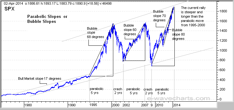
I have a number of charts illustrating past and current bubbles and have identified many common aspects of a bubble, which we have named as Parabolic Slope Theory (PST), with more information coming. For now, we can see that bubbles have an average parabolic slope of 70 degrees, but can range from 60 to 85 degrees depending on the starting point of that slope. We can sometimes see a 60 degree slope when starting at the beginning of the rally, but can see a 70 degree slope at the start of the parabolic advance. The slope becomes steeper as the rally matures and can reach 80 degrees or higher near the top. This 80 degree slope on some charts can be counted as as wave (5) up.
The first chart illustrates three bubbles for the S&P500, starting with the 2000 bubble with a slope of 68 degrees. The slope for the 2007 bubble ran at 60 degrees to the top. The current rally is running at an average of 70 degrees and has moved further and steeper than the parabolic advance from 1995 to 2000. It would appear that the markets are stronger now than in 1999, but it sure doesn't feel like 1999. We can also see that the parabolic advances into the bubble tops lasted for about 5 years, with the declines taking 2 years. We can't really utilize the 70 degree slope rule to determine where the top is in a bubble, but if we see a pullback and then see the parabolic advance turn higher at an 80 degree slope or more, then we could assume that the final wave up is in play. We also know that the markets are currently in the 5th year of this rally where the previous cycles suggest a top is due. Just knowing that it is a bubble will help us make the right decisions before the bubble bursts. Our previous newsletter adds insight on the timing for a top with the DOW and Nikkei relationship.

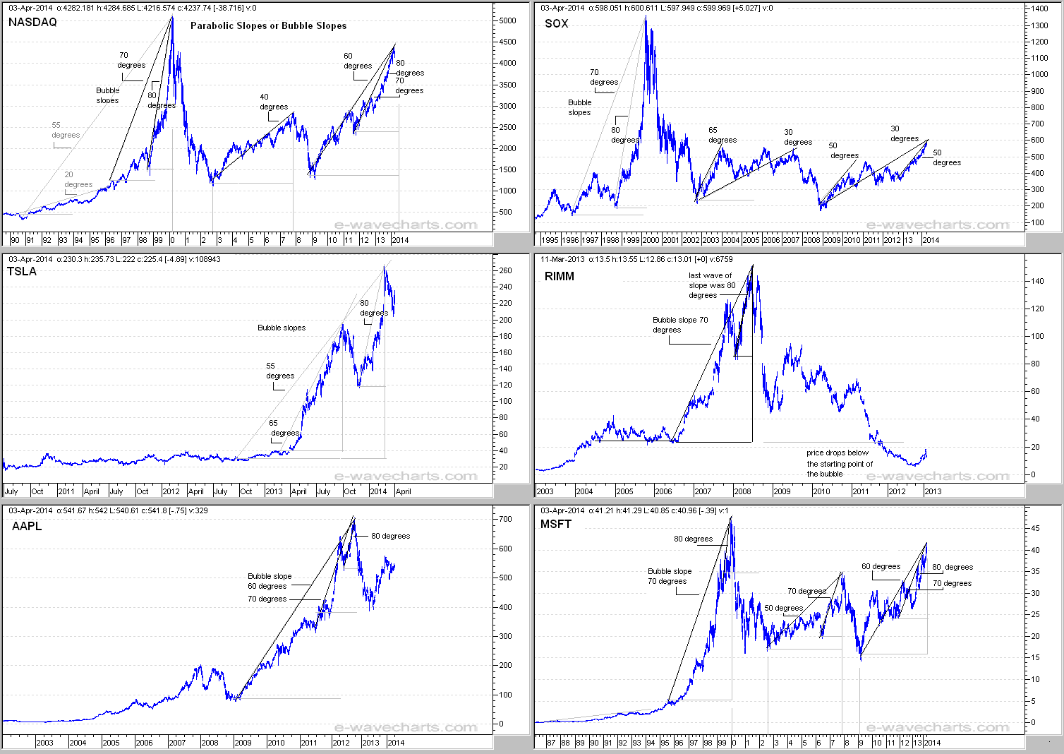
The chart below illustrates market bubbles on 9 charts, so wait for them to rotate through.
Parabolic Slopes and Market Bubbles including Gold - Nasdaq - SOX - Nikkei and a few stocks

We can see similarities on these charts to determine if a bubble is in play on any chart. Parabolic advances that are near the 70 degree slope range always fail. In fact, some of the charts only had a 30-60 degree slope rally into the 2007 high. We can see that some of the charts had a major bubble in 2000 and have had smaller bubbles in 2007 and currently in 2014. We can see that some of the stocks are in bubbles now which have pushed the indices into bubble status as well. We can also see the classic 70 and 80 degree slope rule for Gold into the 1980 bubble top and again into the 2011 bubble top. Parabolic advances or (bubbles) always end poorly and usually retrace the entire advance. We can use our 70 degree parabolic slope rule to determine if an index or a stock is in a bubble. If the last advance of the move is running at an 80 degree slope or higher, then this could suggest that the last wave up is in play and possibly as wave (5) up.
The markets are in another smaller bubble, although the S&P500 chart would suggest that this bubble is larger than the 2000 bubble. This bubble call is supported by our 70 degree slope rule and many stocks that have also gone parabolic and are in the 70 degree range.
So, the next time we want to determine if a bubble is in play, we can
1: examine the slope of the advance and determine if it is parabolic move.
2: examine the corrections and determine if they are small. This will also be determined by the slope. If the slope is steep then the corrections will be small.
3: determine if greed and euphoria are high and complacency low.
These charts are only a guide so that you can follow the action and monitor the expected outcome. The action could play out exactly as illustrated or it may need minor adjustments as we follow it through.
If you are interested in viewing these updated charts and other detailed charts with targets on a daily basis, please see the registration details below.
Elliott Wave Chart Site - IntraDay Market Updates on the DOW, Nasdaq, S&P500, Gold, Silver, HUI and the USD.
To learn more on the status of Gold, Silver, HUI and the USD, please visit the link below for registration details. The commentary and forecasts are updated daily, including intraday commentary and chart updates. Fibonacci pivot dates and cycle analysis are also utilized to forecast reversal dates. The indices covered include the NASDAQ, DOW, S&P 500, SOX, Nikkei, DOW Transports, TSX, BSE, KSE, AORD, HSI, DAX and FTSE. Commodity charts include Copper, XOI, Crude Oil, Nat Gas, Gold, GLD ETF, Silver, SLV ETF, HUI and/or the XAU (Gold and Silver index). Additional Elliott Wave charts cover the US Dollar (USD), EURO FXE ETF, Canadian Dollar (CAD) FXC ETF, 10 Year Treasury Note Yield (TNX), Bank Index (BKX)
With market timing and Elliott Wave Forecasts, we can be on the right side of the market.
Happy Trading!!!
Dan Stinson
Elliott Wave Chart Site e-wavecharts.com
(AEM) and Denison Mines.
Dan Stinson Archive |
© 2005-2022 http://www.MarketOracle.co.uk - The Market Oracle is a FREE Daily Financial Markets Analysis & Forecasting online publication.


