


U.S. Real Disposable Income Per Capita Analysis
Economics / Economic Statistics Mar 04, 2014 - 10:34 AM GMTBy: PhilStockWorld

 Courtesy of Doug Short: This morning I posted my latest Big Four update, which included today’s release of the January data for Real Personal Income Less Transfer Payments. Now let’s take a closer look at a rather different calculation of incomes: “Real” Disposable Personal Income Per Capita.
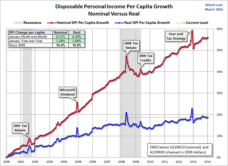
The first chart shows both the nominal per capita disposable income and the real (inflation-adjusted) equivalent since 2000. This indicator has been significantly disrupted by the bizarre but not unexpected oscillation caused by 2012 year-end tax strategies in expectation of tax hikes in 2013.
The January nominal 0.31% month-over-month is encouraging, after when we adjust for inflation, the real MoM change is a smaller 0.20%. The year-over-year metrics are more relevant than last month, now that the tax strategy blip is behind us. They are 3.28% nominal and 2.08% real.
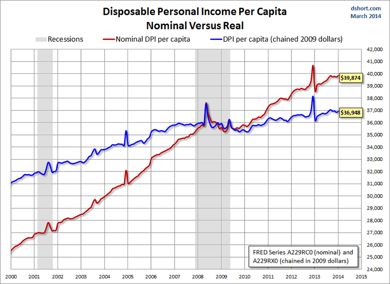
The BEA uses the average dollar value in 2009 for inflation adjustment. But the 2009 peg is arbitrary and unintuitive. For a more natural comparison, let’s compare the nominal and real growth in per capita disposable income since 2000. Do you recall what you were doing on New Year’s Eve at the turn of the millennium? Nominal disposable income is up 56.0% since then. But the real purchasing power of those dollars is up only 18.8%.
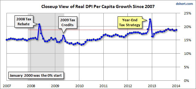
Here is a closer look at the real series since 2007.
Year-Over-Year DPI Per Capita
Let’s take one more look at real DPI per capita, this time focusing on the year-over-year percent change since the beginning of this monthly series in 1959. I’ve highlighted the value for the months when recessions start to help us evaluate the recession risk for the current level.
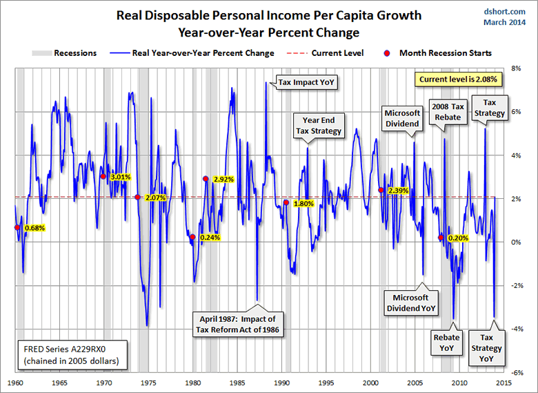
Of the eight recessions since 1959, five started with a YoY number higher than the current reading. However, the volatility of Real DPI militates against putting very much emphasis on this metric. There are a number of other downward spikes in addition to the more conspicuous results of tax planning or Microsoft’s big dividend payout in 2004.
Suffice to say that we need this indicator to show continuing improvement in the months ahead.
The Consumption versus Savings Conflict
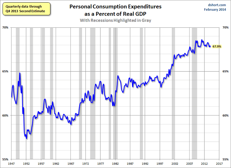
The US is a consumer-driven economy, as is evident from the percent share of GDP held by Personal Consumption Expenditures.
But the money to support consumption has to come from somewhere, and a growth in real disposable income would be the best source. An alternative is to spend more by reducing savings. Given the long timeframe, I’ve used a log scale vertical axis to give a better view of the relative savings rate.
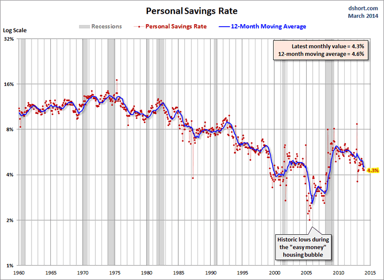
As the chart above illustrates, the US savings rate had generally declined since the early 1980s, a trend no doubt supported by the psychology of the secular bull market from 1982 to 2000. After stabilizing for a couple of years following the Tech Crash, a new surge in asset-growth confidence from residential real estate was probably a factor in that trough in 2005 — along with the “easy money” financing of those years. But in 2008 the Financial Crisis reversed the trend … for a while. The red dots are the actual monthly data points with a callout for the most recent month. They illustrate that the saving rate has been slipping back to the 2002-2004 range. The blue line is a 12-month moving average, which helps us understand the underlying trend of this rather volatile indicator.
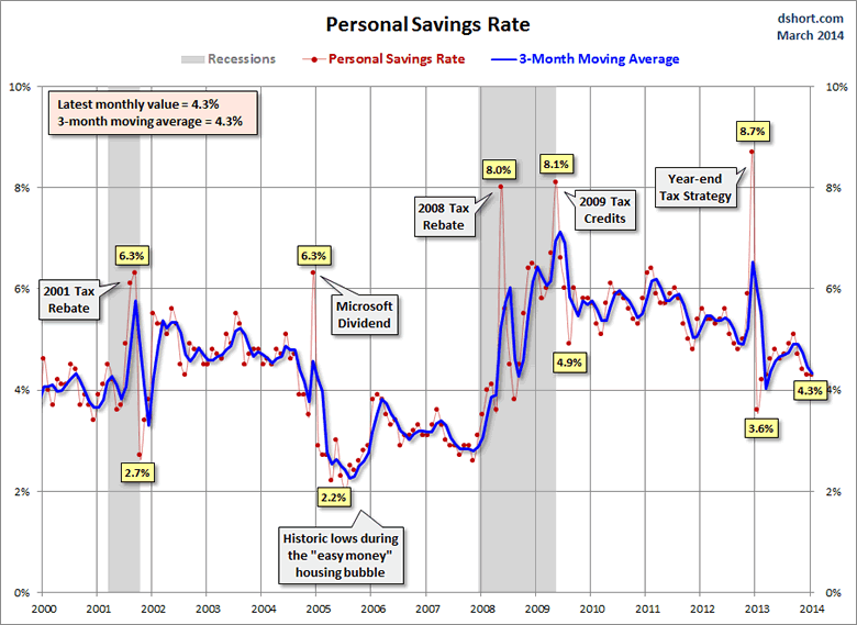
Here is a close-up of the 21st century, in which I’ve switched to a more familiar linear vertical axis. The addition of the callouts helps to explain the outlier months when a one-off surge in income momentarily showed up as savings. These are typically followed by a sharp drop-off in the savings rate in the following months as the one-off dollars are spent. Note that in this chart, I’ve used a 3-month moving average unlike the 12-month MA in the chart above, hence the greater volatility in the trend.
Can this low savings rate be maintained? Perhaps. However the probability of reductions in retirement entitlements in the years ahead may eventually discourage the trend toward saving less.
- Phil
Philip R. Davis is a founder of Phil's Stock World (www.philstockworld.com), a stock and options trading site that teaches the art of options trading to newcomers and devises advanced strategies for expert traders. Mr. Davis is a serial entrepreneur, having founded software company Accu-Title, a real estate title insurance software solution, and is also the President of the Delphi Consulting Corp., an M&A consulting firm that helps large and small companies obtain funding and close deals. He was also the founder of Accu-Search, a property data corporation that was sold to DataTrace in 2004 and Personality Plus, a precursor to eHarmony.com. Phil was a former editor of a UMass/Amherst humor magazine and it shows in his writing -- which is filled with colorful commentary along with very specific ideas on stock option purchases (Phil rarely holds actual stocks). Visit: Phil's Stock World (www.philstockworld.com)
© 2014 Copyright PhilStockWorld - All Rights Reserved Disclaimer: The above is a matter of opinion provided for general information purposes only and is not intended as investment advice. Information and analysis above are derived from sources and utilising methods believed to be reliable, but we cannot accept responsibility for any losses you may incur as a result of this analysis. Individuals should consult with their personal financial advisors.
PhilStockWorld Archive |
© 2005-2022 http://www.MarketOracle.co.uk - The Market Oracle is a FREE Daily Financial Markets Analysis & Forecasting online publication.